

Under the Red Top
making the best of life & wood


The T-Shirt

Picking up on a prior post, let me share a new endeavor with you.
After reading my recent analysis of a William Morris quote, you might be thinking: “Wait! If ‘win back art’ is such an important mission, how come I am only learning about it now, some 150 years after it was proposed?” I was thinking the same thing, too; and then it began to gnaw at me. Not that it matters, but I’ve never seen the phrase on a poster or a T-shirt where it might raise awareness, or at least expose itself in places we expect bold ideas to reside. To me that felt like a miss. And so I decided to design that T-shirt - why not?
Design
Now, I have never created a T-shirt before but I have watched my sons make several. In high school they had taught themselves the craft of screen printing and occasionally turned our basement into a “sweat shop of friends” cranking-out fund raising shirts for their school’s bands. I had always admired their stick-to-it-iveness on these projects, as well as their skills, and it continues to inspire me. My plan for the current shirt was to stop after the design phase and project manage the rest of the endeavor using trained professionals.

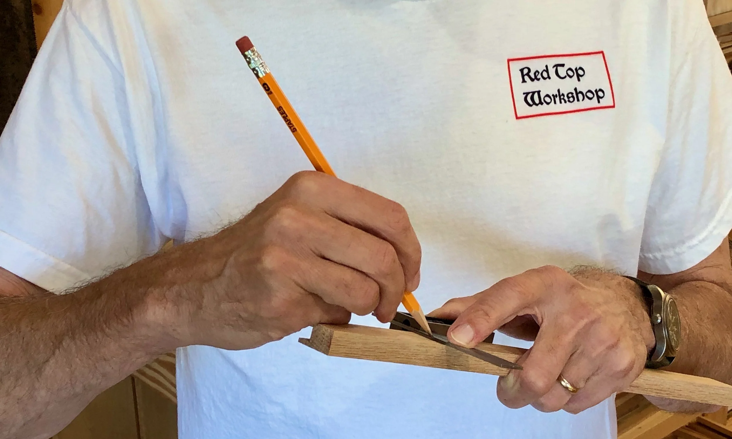
“Winning back art” in the basement (2010)
Following a discussion with my friend, Bob, and a brief internet search, I learned that there are plenty of companies out there ready to create custom printed shirts for those with an idea and extra cash. Heck, they’ll even supply the idea; they really just want to make T-shirts. With an idea in hand, all that’s required is: 1. a properly formatted file of your graphic; 2. a method (direct print, screen print, embroidery); 3. a position for printing (front/back); 4. an ink color scheme; 5. a shirt choice (style/color); and 6. the quantity (by size). They also need a credit card number, which I imagine one is happy to supply after having successfully burrowed all the way to level 7. Seriously, the whole thing is made as simple as possible. Now understanding the process, and with a couple production companies in mind, I set about creating my design.
The graphics for this one will just be text. Easy, right? … you try it. The challenge here is that, if all you have is text and you want your message to stimulate something, you had better get that font right. Fonts are the product of typography; a complex & nuanced art form, or a cunning & manipulative science depending on your perspective. And perspective - the way we look at things - is key. After all, you are trying to send a message that will stick!

Fonts help the message stick
And here’s where fortune smiled upon this Project. William Morris was, himself, a self-taught typographer. During his printing days at the Kelmscott Press, a high end book publishing business and the last of his creative endeavors, he developed three new fonts (Golden, Troy and Chaucer), as well as a series of elaborate initial letters for use at the beginning of chapters. Morris thought carefully about typefaces and was among the first to use photography in their development. His most treasured of the Kelmscott types was Troy. Described as “semi-Gothic” this design was modeled after a few of his favorite medieval typefaces. In his own words, Morris intended Troy to “redeem the Gothic character from the charge of unreadableness which is commonly brought against it”.

Morris’s Troy font
I decided to make Troy the font for this shirt and found a free download for my Mac. I also downloaded the William Morris Initials font too, just for fun. As to the actual design, my idea was that the text could be displayed on the back of the shirt in three lines. I started with no capitals as the quote, itself, was merely a sentence fragment. However, Morris did choose to capitalize the word “Art” at all instances in that 1884 pamphlet. Anyway, a bunch of iterations were sampled, six of which are shown below.

Trial designs
They all looked fine but, in order to pick one that I would be willing to live with, I needed to think more deeply about the function of the font.
1. The font should make the words memorable, and spark interest - all designs check that box.
2. The font should make the message unambiguous - uh-oh. There is potential for confusion with the unpunctuated fragment “win back art”, due to the polysemantic nature of the words back and art. For instance, given the dorsal location of printing, might one wonder about some sort of “back” art contest underway? What does it take to win it? Or, a reader might ask: who is this Art guy? Is he being held hostage? It’s tricky. I think a no caps version could serve here as that assigns “art” to be an improper noun, but that also happens to be the most boring choice. Using color for the capital “A” in Art would properly focus attention on that word, instead of “back”, and perhaps indicate it to be other than a person’s name. I liked that. A red colored initial letter was used frequently during the heyday of medieval monastic calligraphy. However, according to Fiona MacCarthy in her captivating 1994 book, William Morris: A Life For Our Time, Morris did not favor this practice and only used it on one occasion when publishing a collection of poems by Wilfred Scawen Blunt, a middling poet who at the time was also moonlighting as Morris’s wife, Janey’s, lover. Hmm … Despite the dubious endorsement, I think that is the right choice for this shirt. As a final touch, I tried giving the text a background block so that it might look good on dark colored T-shirts, as well.
And that is where I left things for the summer as I worked to finish some deadline projects and jetted off on vacation. Back in June, I had told my sons of the idea, thinking they would get a kick out of it, and even shared my test creations for their comment. They must have feared that I would let this idea languish for they secretly took it into their own hands and finished the Project for me. Much to my surprise I was gifted with the T-shirt on my recent birthday. What a nice surprise! They used a T-shirt vendor this time, and also added a new “Red Top Workshop” logo, in Troy, on the front. I love it, and plan to print more (let me know if you are interested).
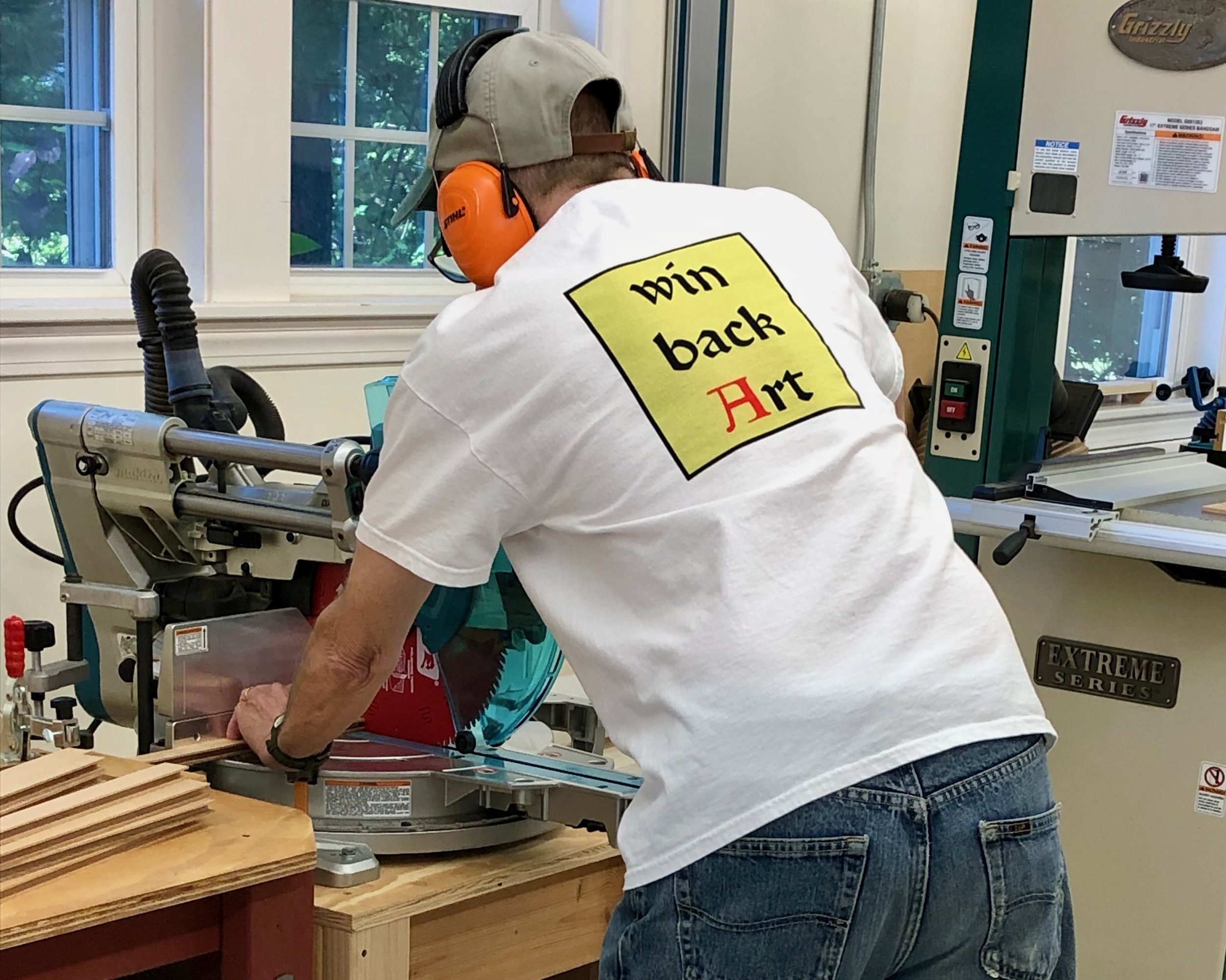
Thanks Ben & Andrew!
The Karabitsu
Here’s an interesting item that’s been on my build list for a few years. It’s a modest sized chest from Japan that I will use for storing firewood next to the hearth. Like most Projects, a little background research is rewarded with new appreciation for the enduring influence of former times. The story follows.
Karabitsu (or kara-bitsu) is a Japanese term that reportedly translates to '“foreign coffer”. I’ve also seen it expressed as “Chinese coffer” or “Chinese chest”, and some believe that kara may even come from kan which, for a time, was a word used to refer to the Korean peninsula. I don’t think we need to propagate confusion here, though. According to the book, Tansu: Traditional Japanese Cabinetry, the karabitsu has existed as a recognized form in Japan since the Nara Period (645-794) and I would imagine that “foreign” in eighth century Japan pretty much meant “Asia”, anyway. Still, it is curious that no non-Japanese examples of the “foreign” coffer pre-dating the Nara era have been found. The term wa-bitsu (Japanese coffer) dates back to the year 1050 and describes a legless form of the karabitsu. Even alongside the “native” wa-bitsu, and the wealth of tansu forms that followed, the karabitsu remained popular in Japan for centuries, serving as storage chests for special objects, often highly decorated with inlays or painted lacquer. I discovered this form while perusing the wonderful reference book: Traditional Japanese Furniture, A Definitive Guide, and there are many fine karabitsu examples to be found on the internet. Some versions sat on tall legs, often six in number, which grew stouter as the form became more ornate. It is a striking chest.

Karabitsu example reproduced from: Koizumi K. Traditional Japanese Furniture, A Definitive Guide, K. Koizumi, Kodansha International: Tokyo, 1986.
Design
My karabitsu would sit on four legs and be unpainted. That makes it closer to the eighth century original in form, and, as fortune would have it, an example from that time still exists. It seems an imperial warehouse on the grounds of the Todai-ji temple in Nara, dating from that eponymous period, was discovered to contain four intact furniture pieces, and included in these was a karabitsu from which the construction techniques could be gleaned. Quite a find! I show a photo of that piece along with an exploded-view diagram below (reproduced from Tansu: Traditional Japanese Cabinetry).

Earliest known karabitsu?
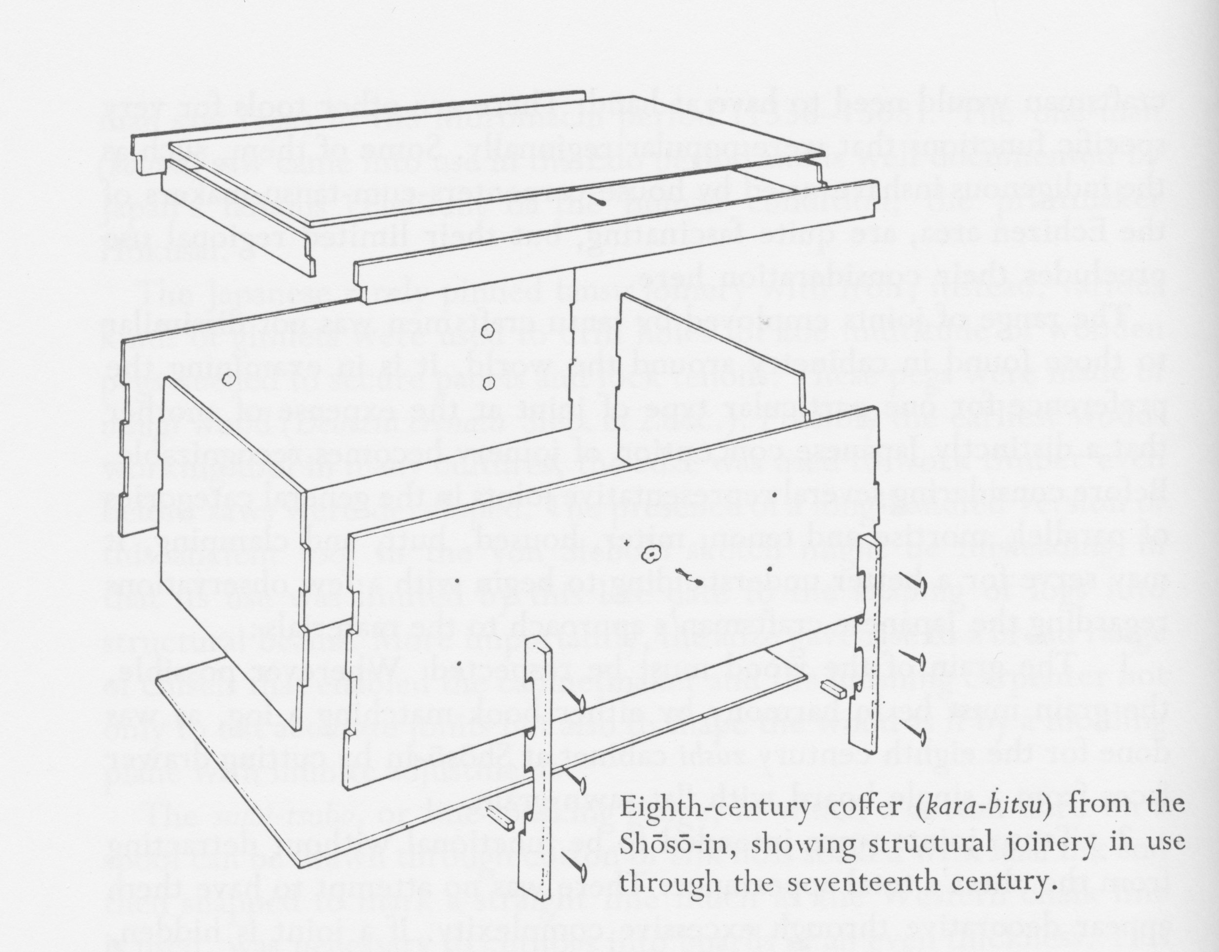
Anatomy of an early karabitsu
I’ll use this plan as a starting point. The corner joinery was my biggest question and it appears they used simple “box joints” here. I’ll do the same. Iron nails were used to attach the leg pieces to the sides and a brace ran between these legs to support the floor board. The legs of the original also contained cut-outs through which rope could be threaded, allowing the chest to be carried by two people using a cross pole. Instead, I’ll opt for the decorative metal handles used on later examples and lengthen those legs a bit for height. Likewise, I will hinge the top for ease of access, as was the practice in subsequent centuries, and mine will also have a floor board housed within a dadoed groove for strength. In the end, the design will have a few changes brought about by what has become possible with new tools and materials over the millennia, but not wholly different from ancient times.

Karabitsu firewood box, rough plan
Materials
The thirteen hundred year-old karabitsu used zelkova (a member of the elm family) for the legs and cryptomeria (Japanese cedar) for the box parts. These are common woods in Asia, used extensively for tansu and other furniture pieces. However, they are not common in North America and so I would need to find substitutes. I wanted to use special wood for this chest; something that would look nice with a simple oil finish and that would be resistant to insect damage. I decided to try Spanish cedar for the legs and Southern cypress for the box. Not common boards, but ones carried by my favorite yard for unusual lumber, Goose Bay Sawmill and Lumber, Inc. For the handles I would use some authentic hardware picked-up on my last trip to Korea, and I would source the hinges from an Etsy-based craftsman.
Spanish cedar and Southern cypress boards (in lock-down)
Dimensioning
Construction on this Project divides itself neatly into three jobs: the box; the lid; and the cradle (for lack of a better descriptor). They should be made in this order, too, for the dimensions of the box dictate those of the subsequent elements.
the Box
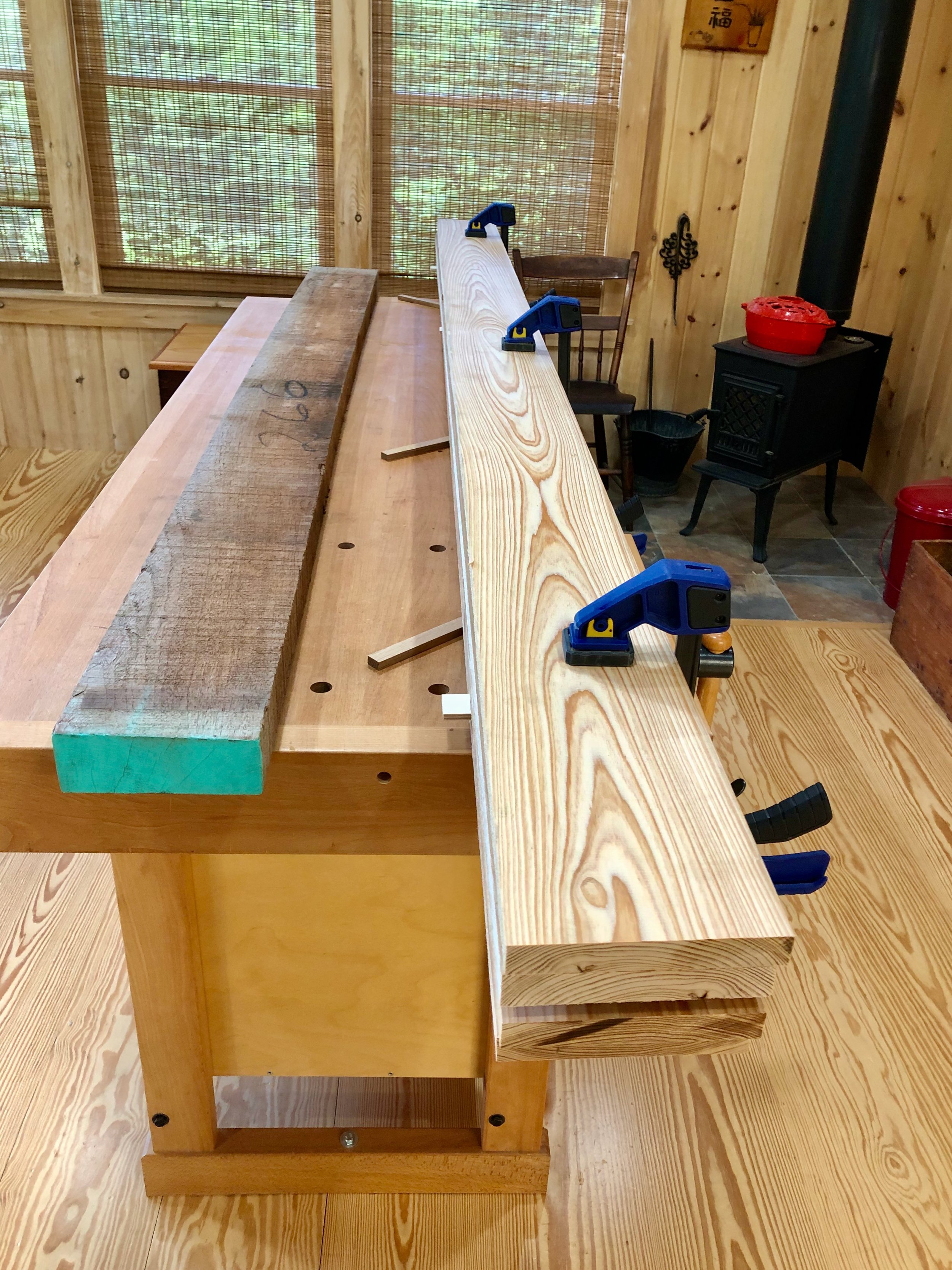
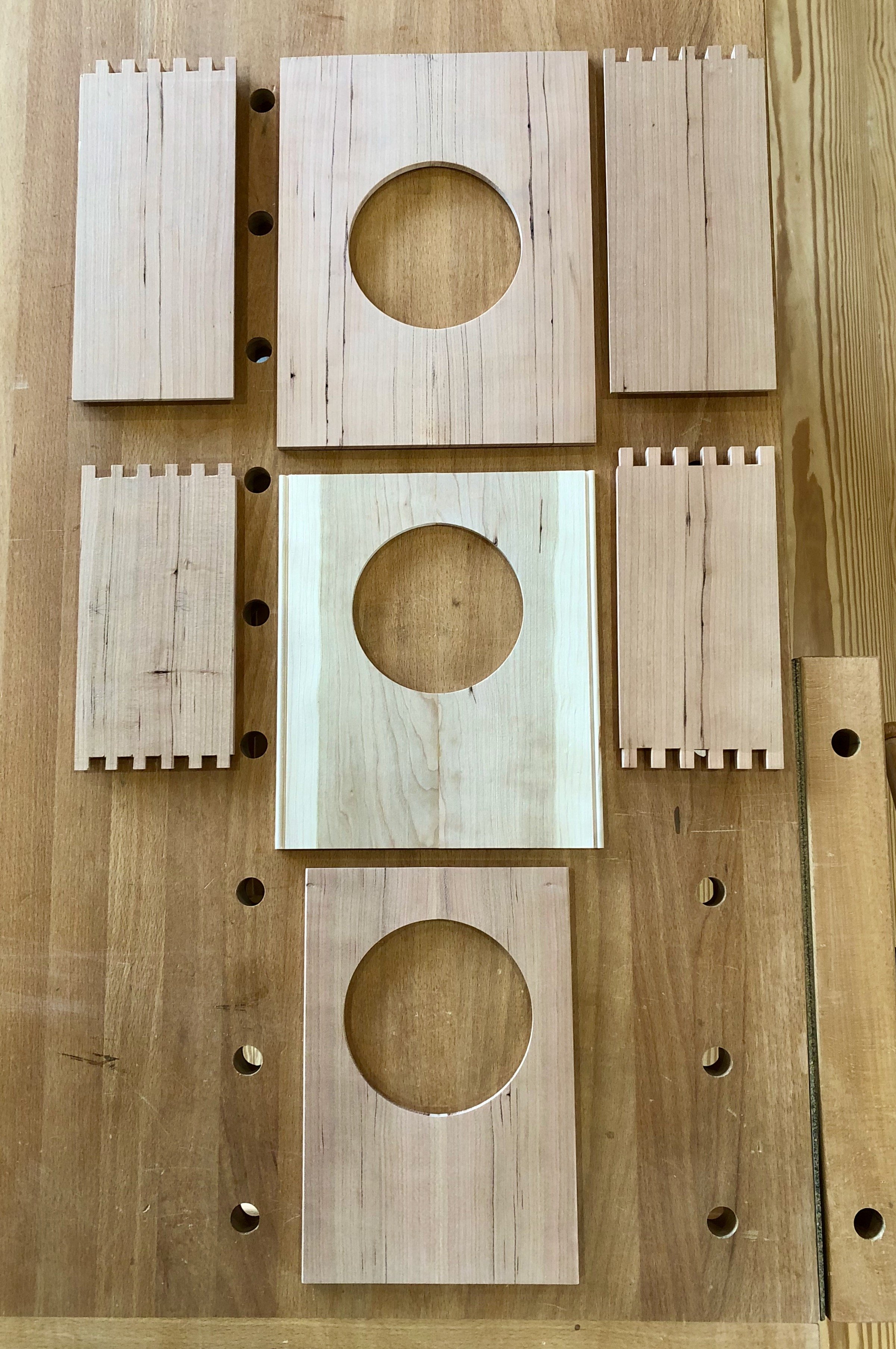
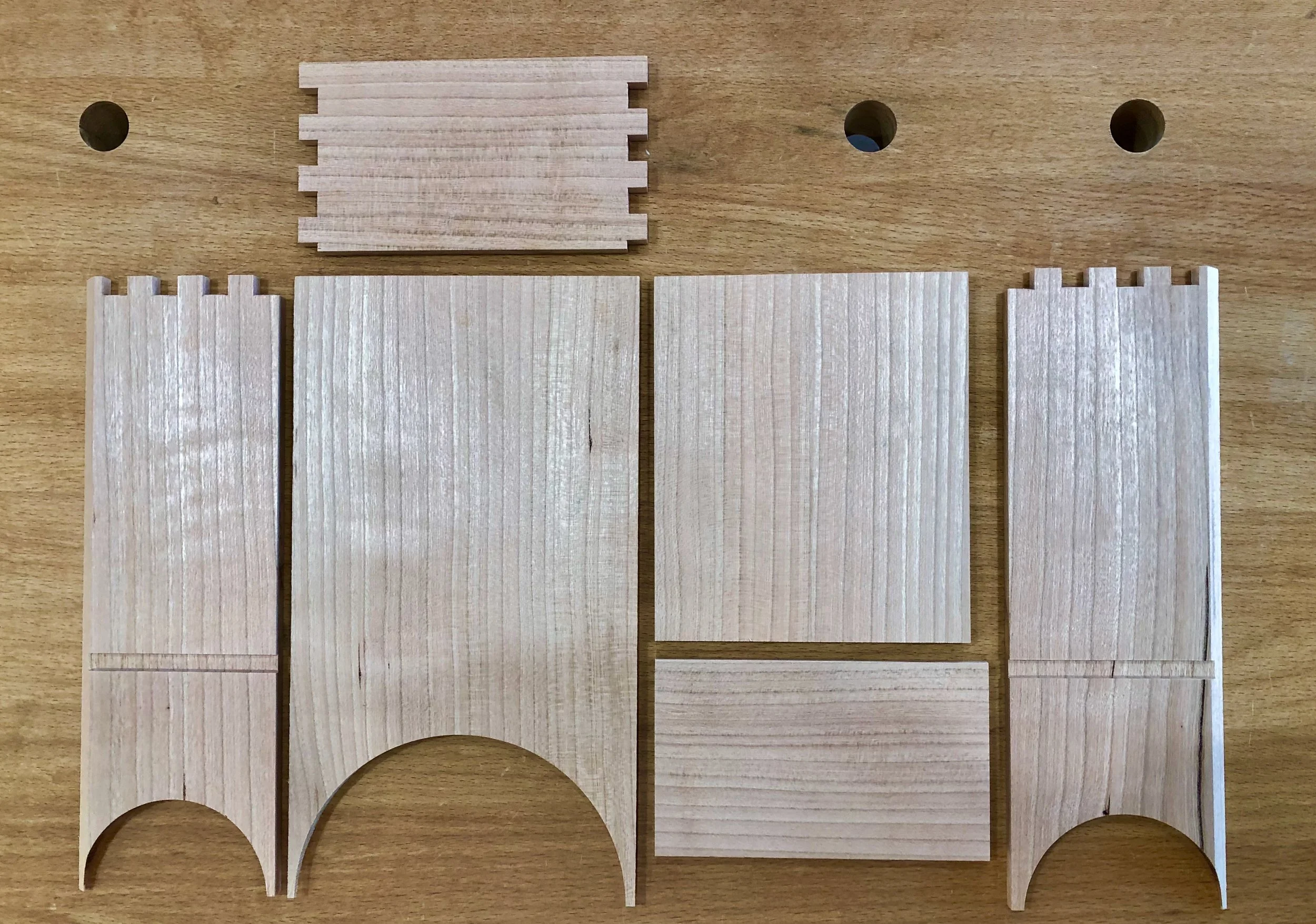
To make the box I first prepped cypress boards to be 5 in. wide, 5/8 in. thick and “square” all around. Before cutting to final length, though, I needed to make a decision on where each board would be placed. I wanted to show off the wonderful grain, of course, but do so in a way that would alternate the orientation of the growth rings to reduce the effects of warp. Once the position puzzle was solved each board was labelled with tape.

Cypress boards positioned and labelled
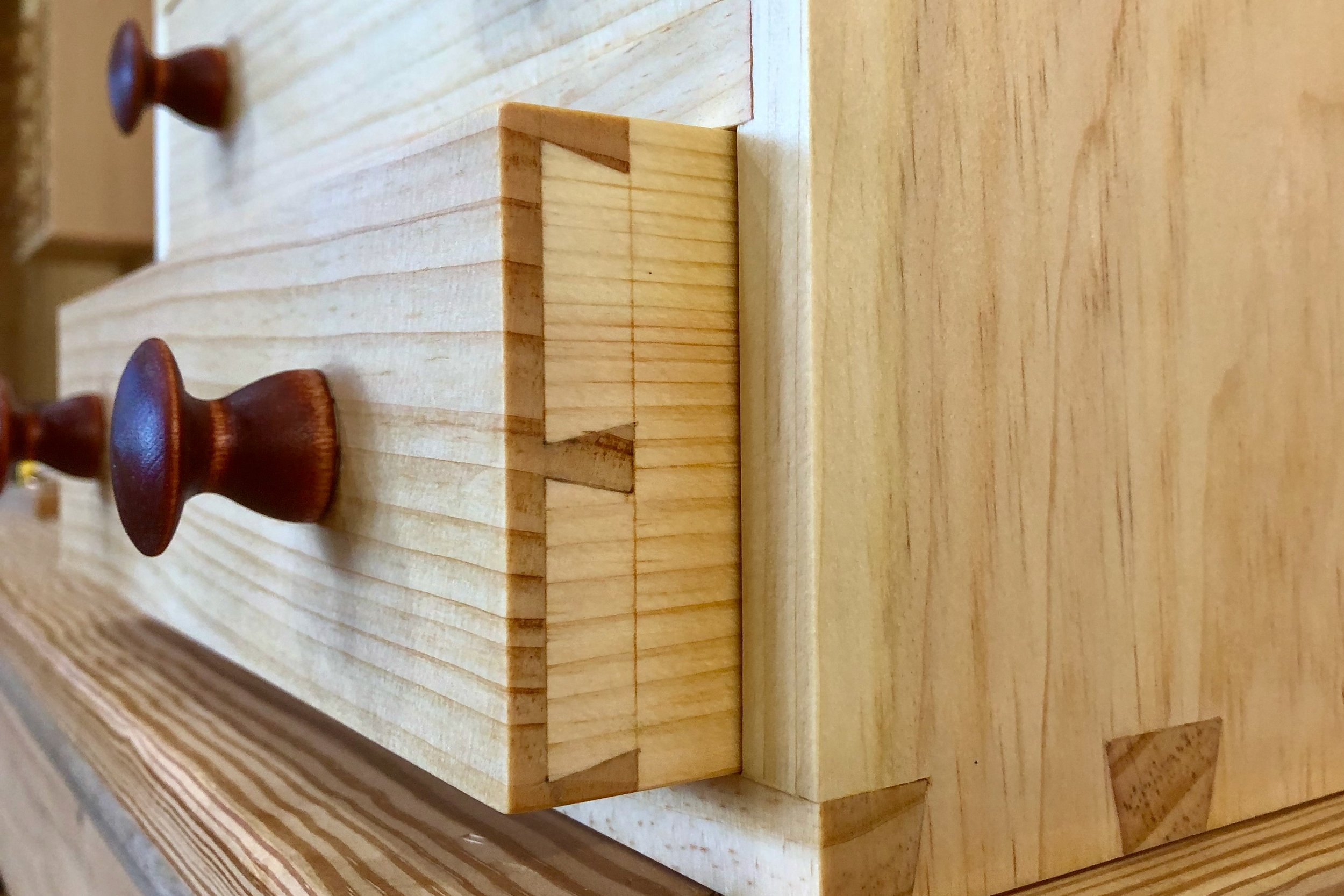
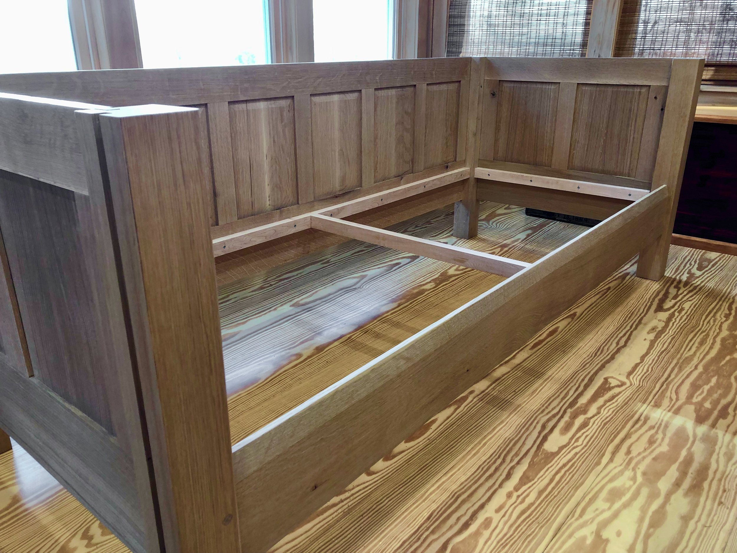
In order to form the box joints, the top and bottom boards from the front and back faces and middle board from each side face were cut to their exact lengths, 24 and 15 in., respectively. These define the length and depth dimensions of the box. Using a dado blade at the table saw I then created a 5/16 x 5/16 in. rabbet on the backside of both ends of the boards. When mated at the corners, these would form a double rabbet joint, a bit stronger and better looking than the butt joint connection found in a typical box-jointed case. With the “long” boards rabbeted I could make an exact measure of their interior spans, which would define the lengths of the “shorter” boards. Weaving together side boards of alternating length serves the function of a box joint, mating edge grain with edge grain, to form a stronger glue bond. The shorter boards were cross-cut to size and then dadoed to form the same rabbets on their ends. One final cut to house the plywood floor board was needed prior to assembly. For this, I used a dado blade at the table saw to create a 1/2 in. wide x 5/16 in. deep groove near the bottom of the four lowest boards. A piece of 1/2 in. furniture grade birch plywood was then cut to fit the final dimensions. Lastly, I added biscuit slots along the board edges to assist in the assembly.
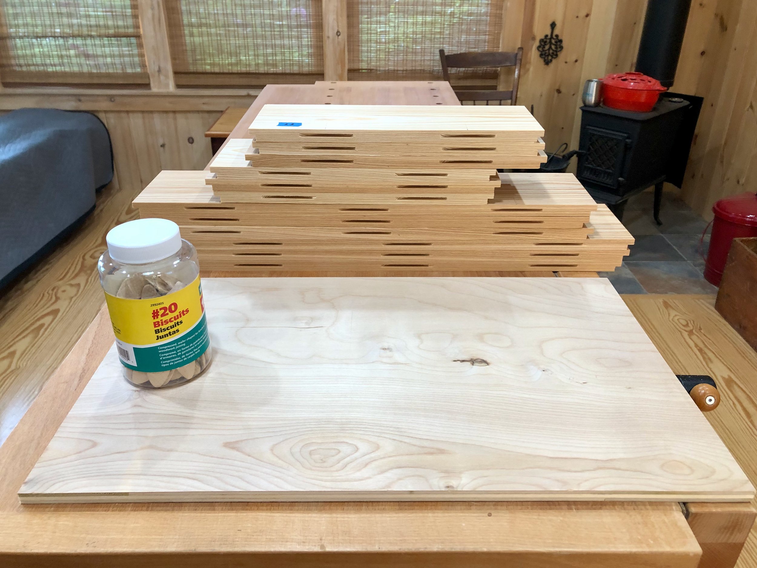
Box parts cut to final dimension
Assembly of the box proceeded in layers, beginning at the bottom. There are no box joints nor biscuits in this layer and so the floor board is the primary reference for squareness. It was sequentially snugged into the glue-filled groove on each side board and this construct was then squared-up by adjusting the diagonal dimensions across the top. Once all was good, clamps were employed to hold everything tight during the cure. Getting the first layer “right” is key.

Glueing and clamping layer One
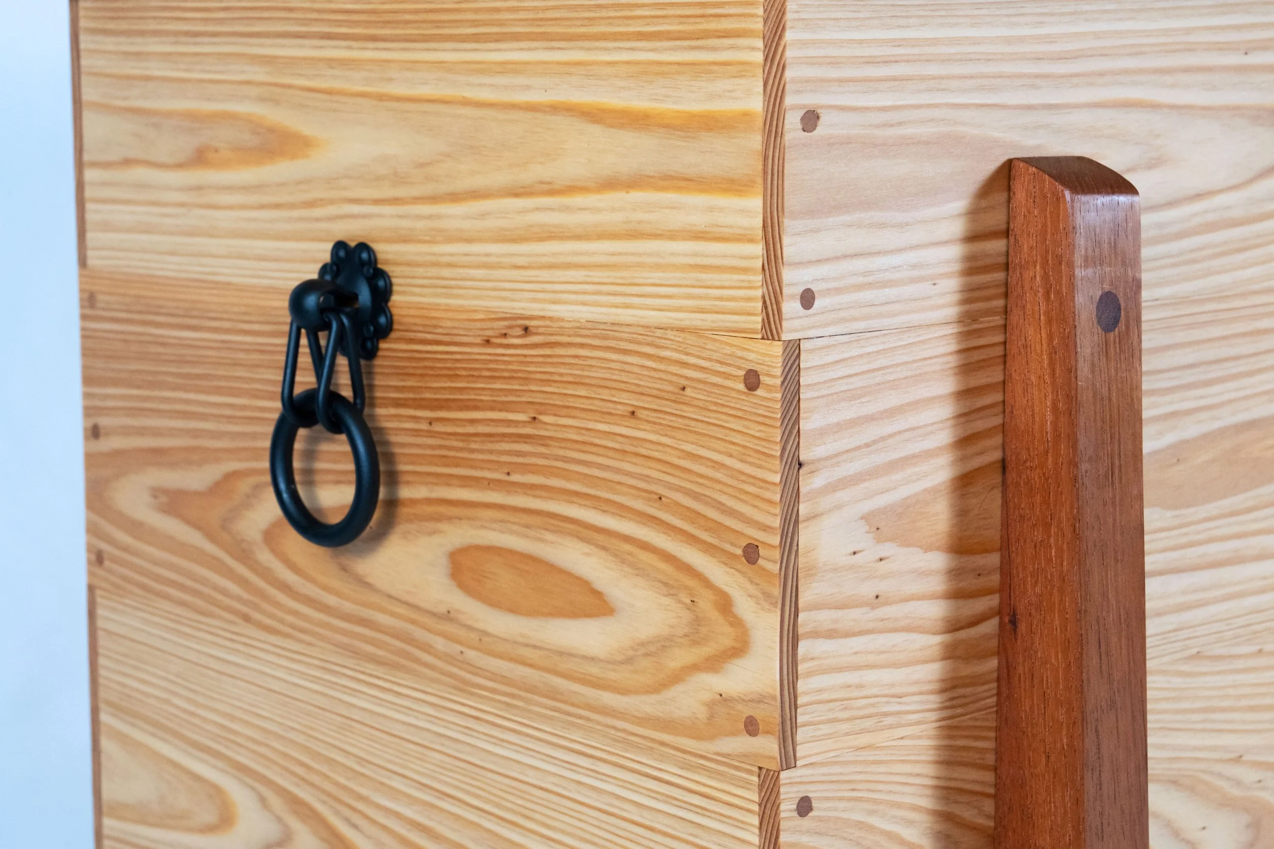
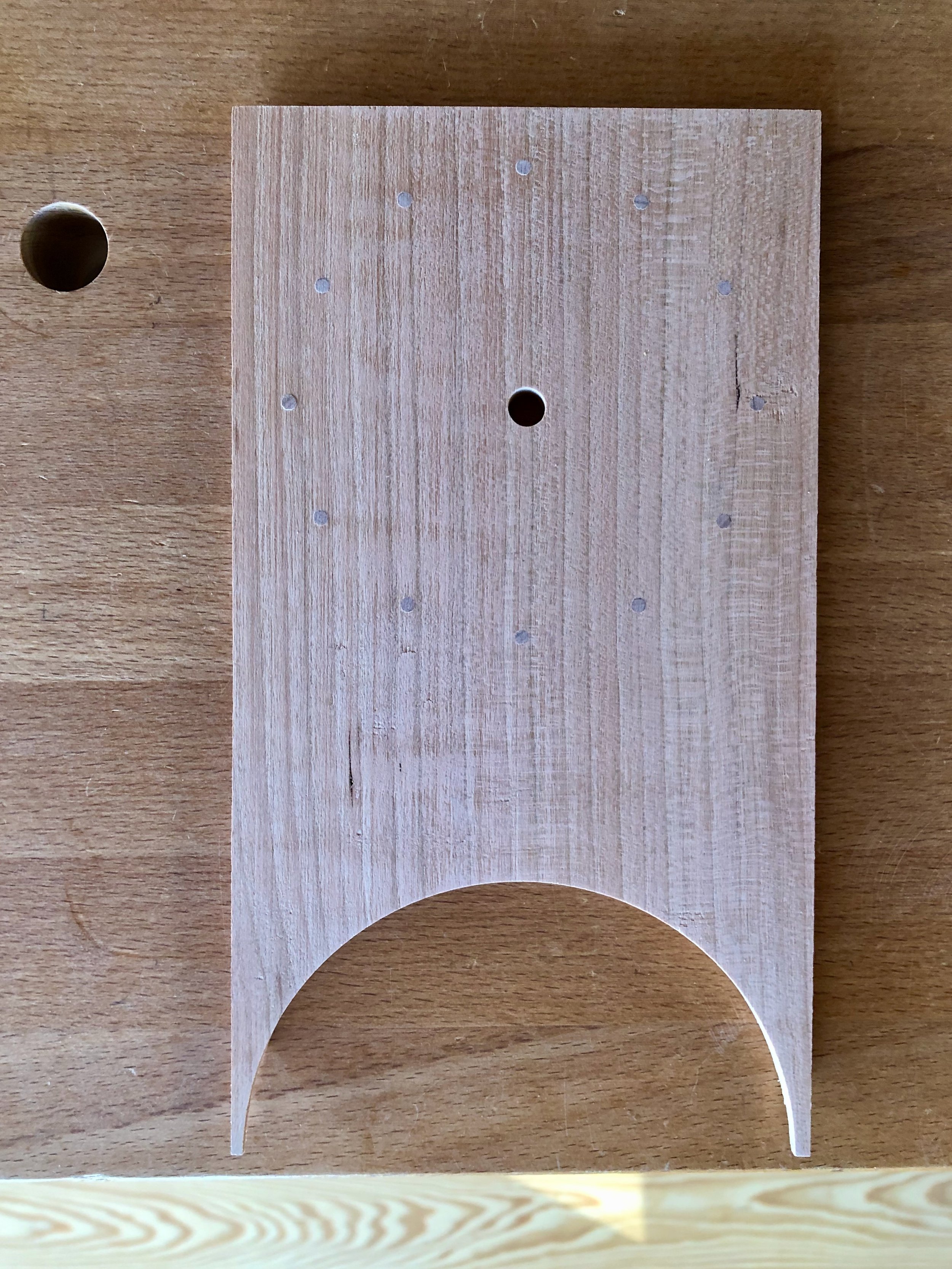
The second and third layers stacked on easily with the biscuits to keep everything aligned. After all of the glueing was finished, the sides were hand planed a bit to level everything off and then 3 cherry pegs were inserted on the ends of every long board, in keeping with the Japanese method. The whole body was then sanded to 220 grit.

Completed box
the Lid
The lid for this box will consist of a platform top surrounded by trim around the edges. The original karabitsu appears to have had the top resting atop the “trim”, which acted as a surround for the box. But, since I would be using hinges to keep the top in position I did not require the surround feature and so I decided to use the trim to hide the end grain of the top boards and overlap just a bit with the box when closed. I also decided to make the trim from Spanish cedar to provide a bit of color contrast there.
Construction of this element was simple. I first prepped four cypress boards to be 4 in. wide, by 5/8 in. thick, by 25 in. long. The boards were then positioned to get the desired grain orientations and biscuit slots were cut to assist during assembly. Following glue-up, the ends were trimmed to 24 1/4 in. using a track saw. I prefer this tool to the table saw for cross cuts on large boards such as these, given that I do not have an extension on my saw’s table, however, the rip cut to fix the top’s width at 15 1/4 in. was performed there. Once cut to the final size the platform was sanded to 220 grit.
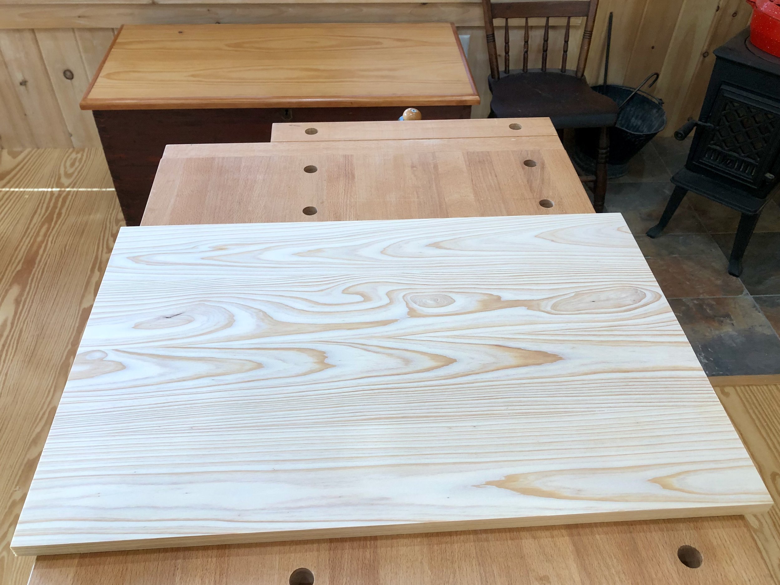
Platform complete
There are many ways to hinge a lid of this type. My desire was to not show hardware on the exterior of the chest, and so I opted for full inside mount strap style hinges, procured from the Lock and Box Shoppe, a small business found on Etsy.
To attach the hinges I first knife-marked their ideal location along the top edge of the back side and then scribed a 1/8 inch depth mark at this location. The knife marks were sawn down to the scribe line and the interior portion removed with a chisel to create mortises. The result of this operation is to allow the top to sit level when closed. The hinges were then inserted and the screw holes drilled into the back of the box. Next, double-stick tape was applied to the strap portion of each hinge and the lid was laid down carefully into position. With the hinge now taped to the interior of the lid it was lifted free of the box and screw holes were drilled into the lid. The hinges were then temporarily affixed to the lid with a couple of steel screws and this was placed back on top of the box. With my wife, Joung, supporting the open lid I was able to temporarily mount the interior hinge straps with a couple more screws. Everything worked as it should.

Hinged lid in place
Lastly, it was time to fashion the trim. For this I sliced a 1 3/4 in. slab from the side of a 5 ft. long, 2 in. thick Spanish cedar plank. This was re-sawn at the band saw into four ~1/2 in. thick boards which were subsequently thickness planed to a 3/8 in. depth and then ripped to a final 1 1/2 in. width at the table saw. For the joinery, I decided to hide the two front corner seams with miters. Assembly started by cutting the front strip to length on a 45° bias and then fastening it to the top board using finishing nails and a bit of glue. Next the two sides were cut to length and added. The back, ripped at a narrower, 5/8 in. depth to accommodate the hinges, was applied last. Once everything was put together, the top edge was rounded-off and the other edges broken to feel smooth while looking sharp. This completed the lid.
Box and lid
the Cradle
The cradle is my name for the four legs and “chassis” that supports the box. The legs are the stars here so I decided to fashion those first and then figure out the rest of the joinery afterwards. Karabitsu legs act as “stilts”, whose function, I presume, was to lift the box off of a damp, stone Chinese floor. I wanted them to add character to the piece, but nothing overwhelming. After some doodling, I came up with a tapered flare that looked appealing (see rough sketch). This shape was drawn on a piece of 1/2 in. mdf and then cut-out at the band saw and smoothed with a drum sanding bit at the drill press to provide a template. The leg material came from a Spanish cedar board, prepped to 1 1/2 in. thickness. Tracing the template four times onto the cedar and then cutting out these shapes at the bandsaw gave the rough members in a very simple and satisfying operation.
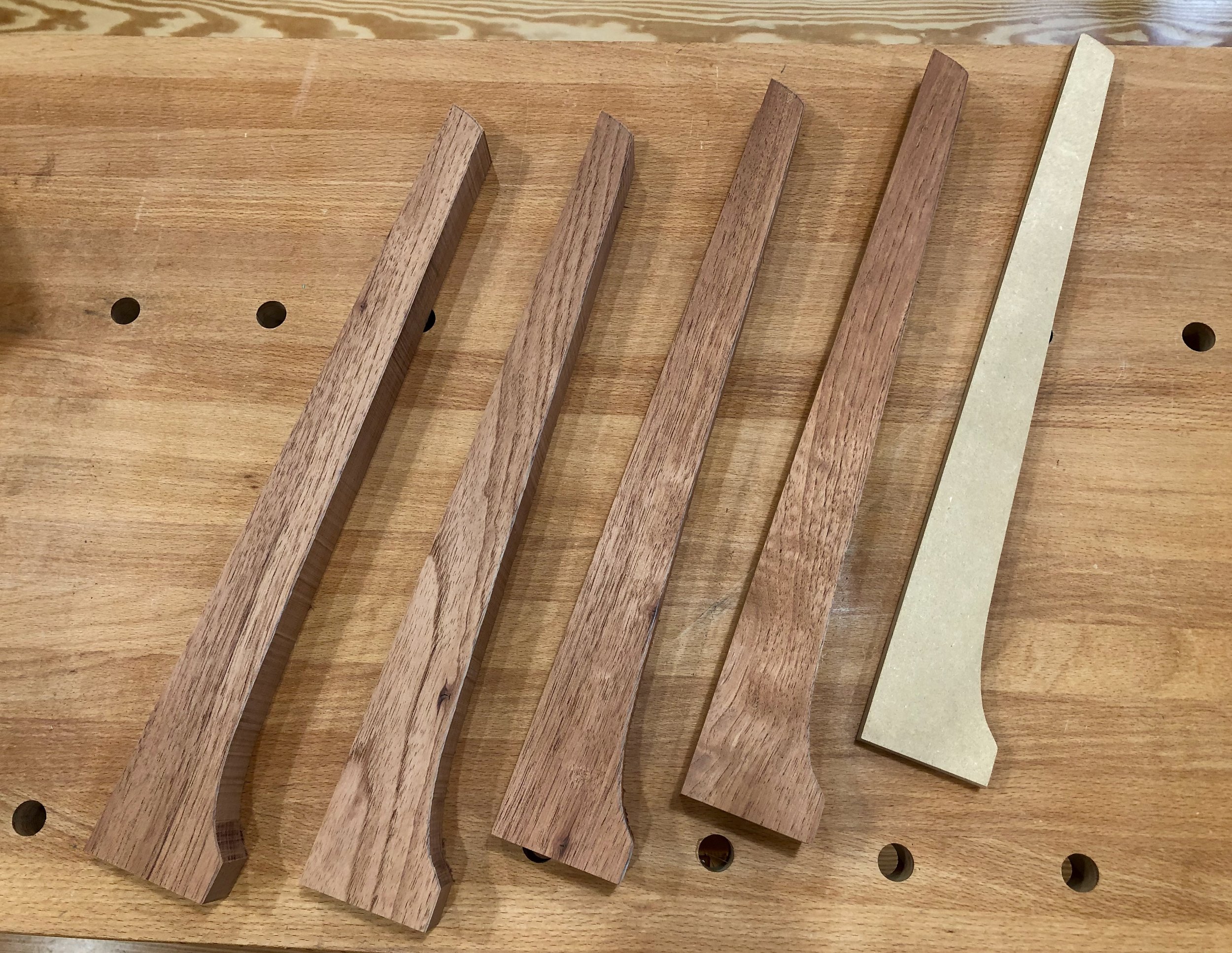
Rough cut legs and template
Next, I glued sides onto the flat edges of the mdf template to convert it into a pattern which could be employed at the router table to convert the rough cuts to a uniform and smooth shape using a flush-trim bit. The edges were then further refined with a card scraper and sandpaper.
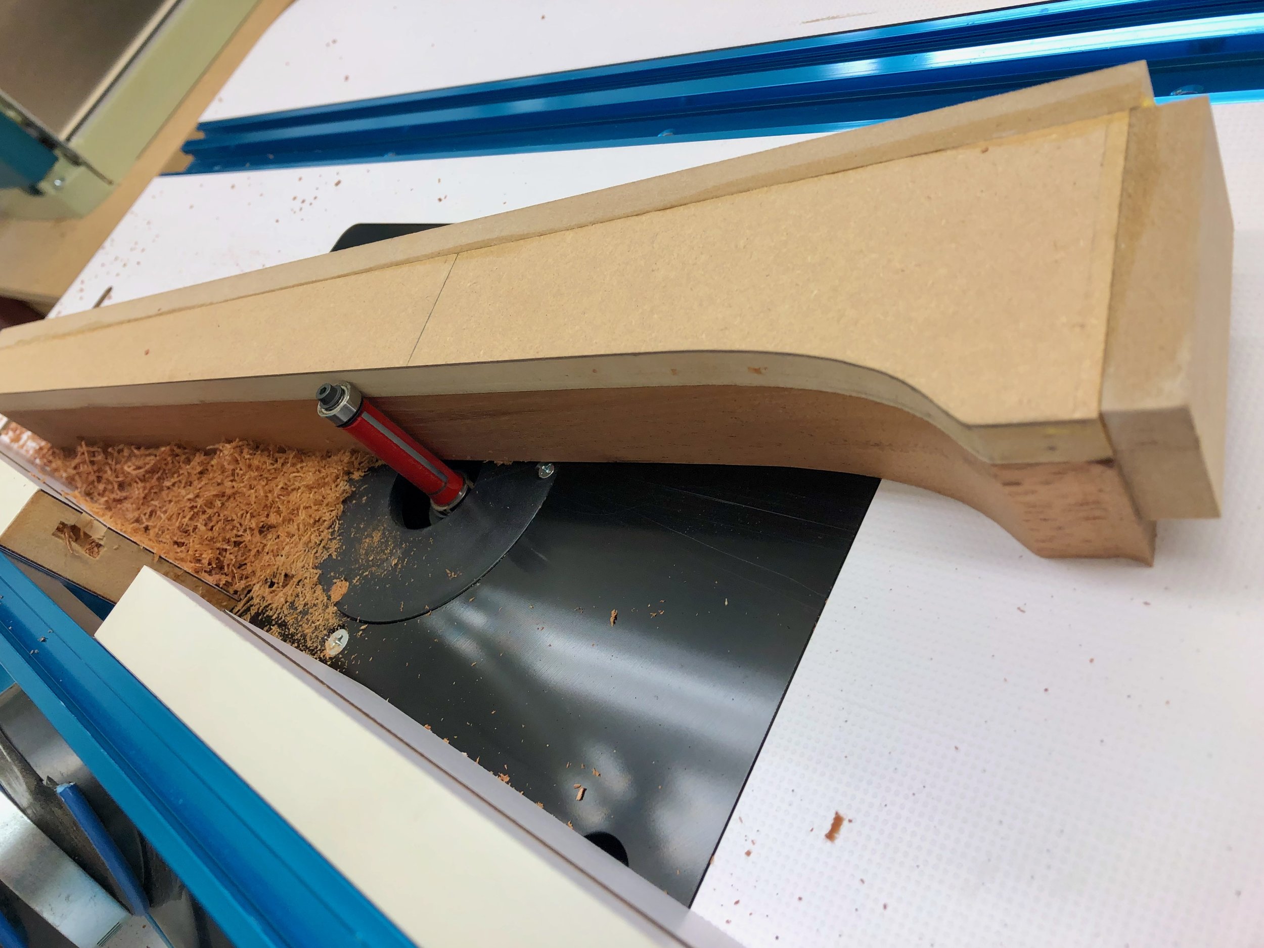
Smoothing the bandsaw cut at the router table
The legs would be connected to one another by stretchers made of Spanish cedar. Here I opted for mortise and tenon joinery to keep everything solid and square. It would be tricky to cut the mortises on the curved leg pieces and so I brought out the pattern once again. After attaching an additional mdf leg this could now be used as a jig to hold the karabitsu legs level during the mortising operation. One by one, the cedar leg pieces were screw-mounted to the jig and then a 1/2 x 1/2 x 1/2 in. mortise was cut at the desired position. Easy!

Cutting the mortise with assistance from a jig
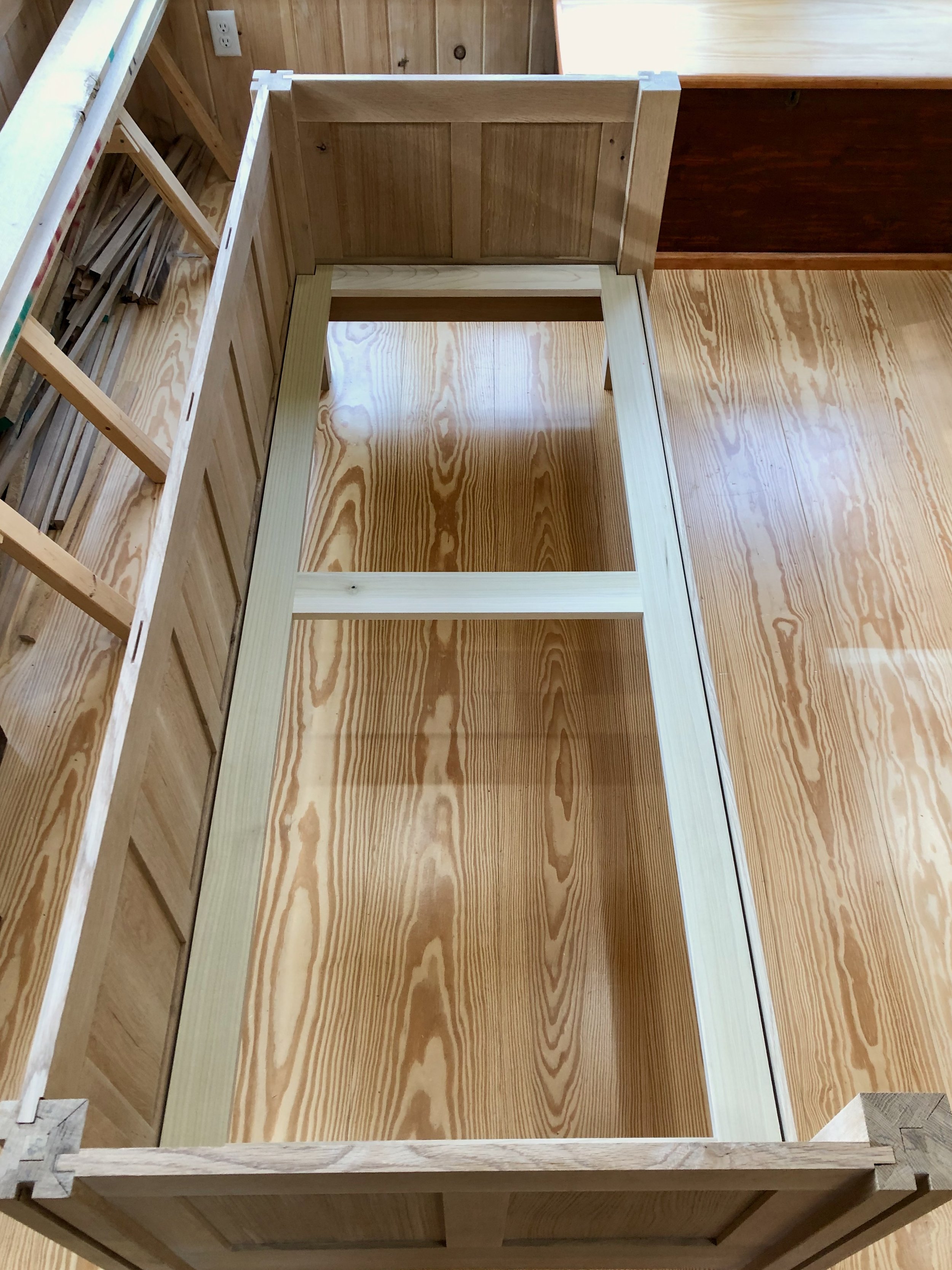
For the stretchers I prepped some Spanish cedar to 1 1/2 in. x 1 3/8 in. and then cut two parts to 16 in. length. The tenons were fashioned using a dado blade at the table saw, with the top face of the stretcher cut back further to also accommodate the box edge. For added strength I decided to connect the stretchers with two 1 1/2 in. x 1/2 in. cedar supports. These would keep the cradle structure “square” in the absence of the box and prevent sag of the bottom board. Half-lap joints were used to attach them to the stretchers.

Dry-fit cradle with box in background
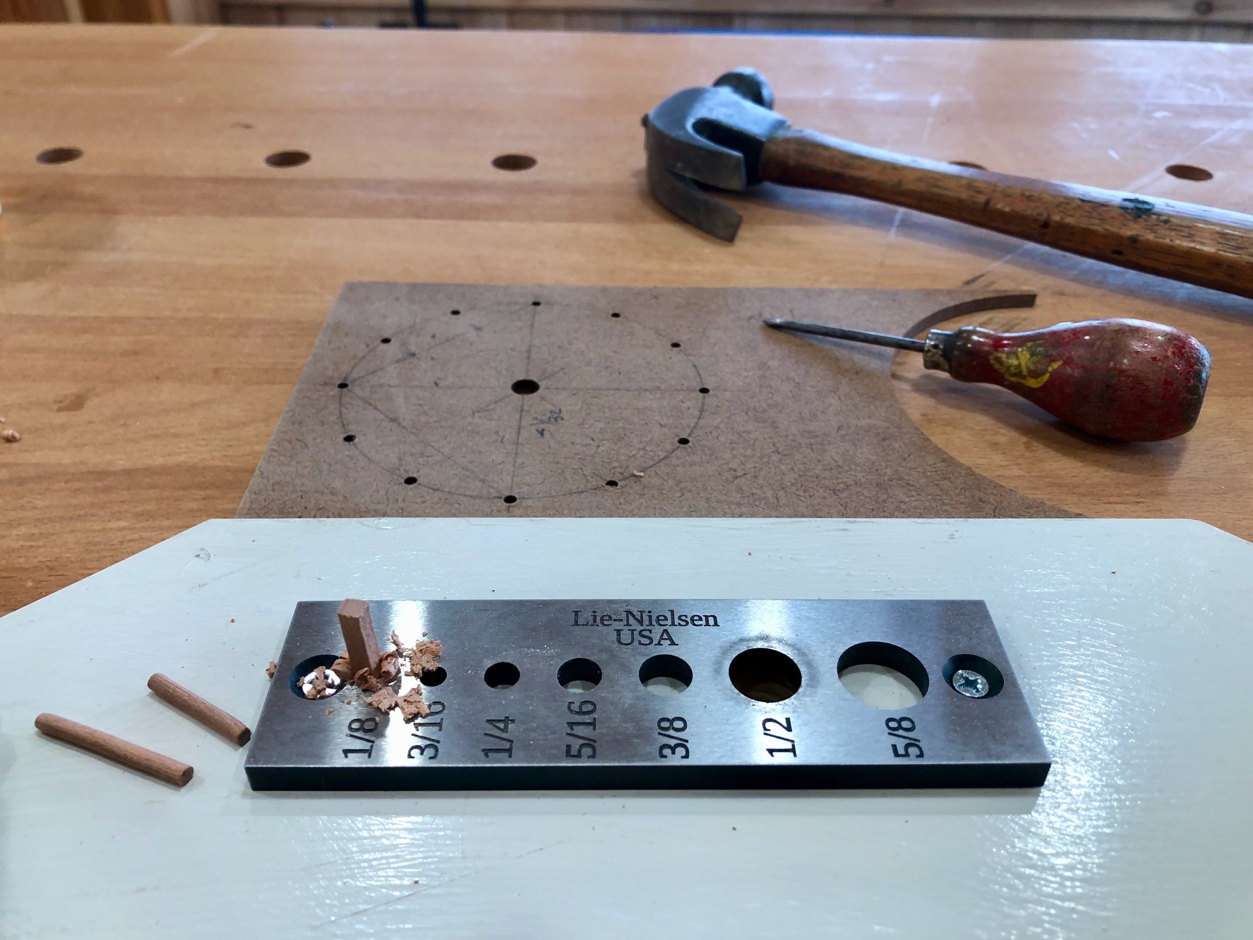
Lastly, the design called for visible pegs along the legs. The legs of the original karabitsu were affixed to the box with iron nails, and as the piece was coming together I had decided to use screws here, instead. Screws applied from the outside of the box could have their heads covered with a short dowel cap to achieve the design intent, but I felt that a screw mounted from the inside was the better approach for securing a board to a post. Thus, the pegs would be purely decorative and maybe just one up near the top of each leg would provide the best look. To accomplish this I pounded out a few 1/2 in. diameter Spanish cedar dowels with a dowel plate and used a homemade jig to reproducibly drill a shallow hole into each leg part. The dowels were then glued into place, sawn flush and hand planed smooth.
Final Assembly & Finish
To begin assembly, the half-lap joints of the stretchers and supports were glued together while sitting on the overturned box. This ensured that they would eventually fit, again, during the final assembly. I then decided to finish all components at this stage to better seal the overlapping wooden parts. The plan was to use some sort of colorless product for this but that hardly narrows down the field of contenders. There are a host of appropriate oils, varnishes and oil/varnish blends available these days and so some research was in order. Never having worked with either wood I first queried online and discovered that both are “well-behaved” and easily preserved in a manner that enhances their look. Great! And while that narrows nothing, it also makes it hard to go wrong. On scrap Spanish cedar I tried some boiled linseed oil (BLO) and a product advertised to be a tung oil finish, which is actually an oil/varnish blend that, for all I know, may even contain tung oil. It’s not like they list the ingredients or anything, and I’ve read that snake oil sharps now thrive in the paint aisle. Anyway, this product sold by Minwax gave a nice, subtle luster, less orange coloration compared with BLO and it did well on cypress scraps, too. I liked the look and so I removed the hinges and got to work.
The underside of the box and the cradle chassis were finished first. Once dried, the chassis was aligned and mounted to the box using 4 stainless steel screws through the bottom board. After masking the tenons with tape, I then gave all the remaining parts three coats of the “tung oil” finish over the course of three days.

Finishing the parts
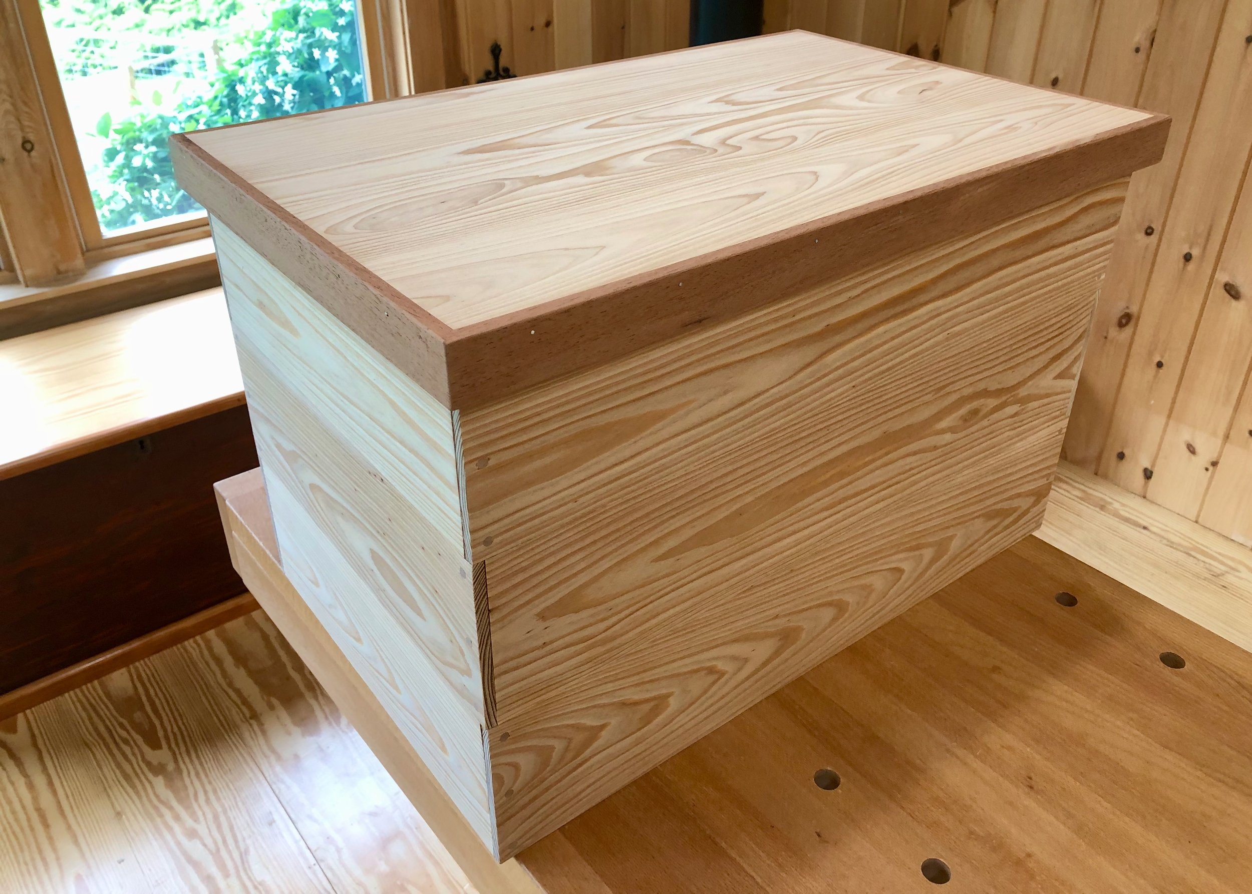
Final assembly proceeded in this order. With the box flipped upside-down, the four legs were glued to the chassis at the mortise and tenon joint. They were then each aligned to be perfectly upright and held in that position by means of a band clamp. I also used this opportunity to drill two 1/2 in. “air holes” in the back, near the bottom, to guard against any hide-and-seek mishaps.
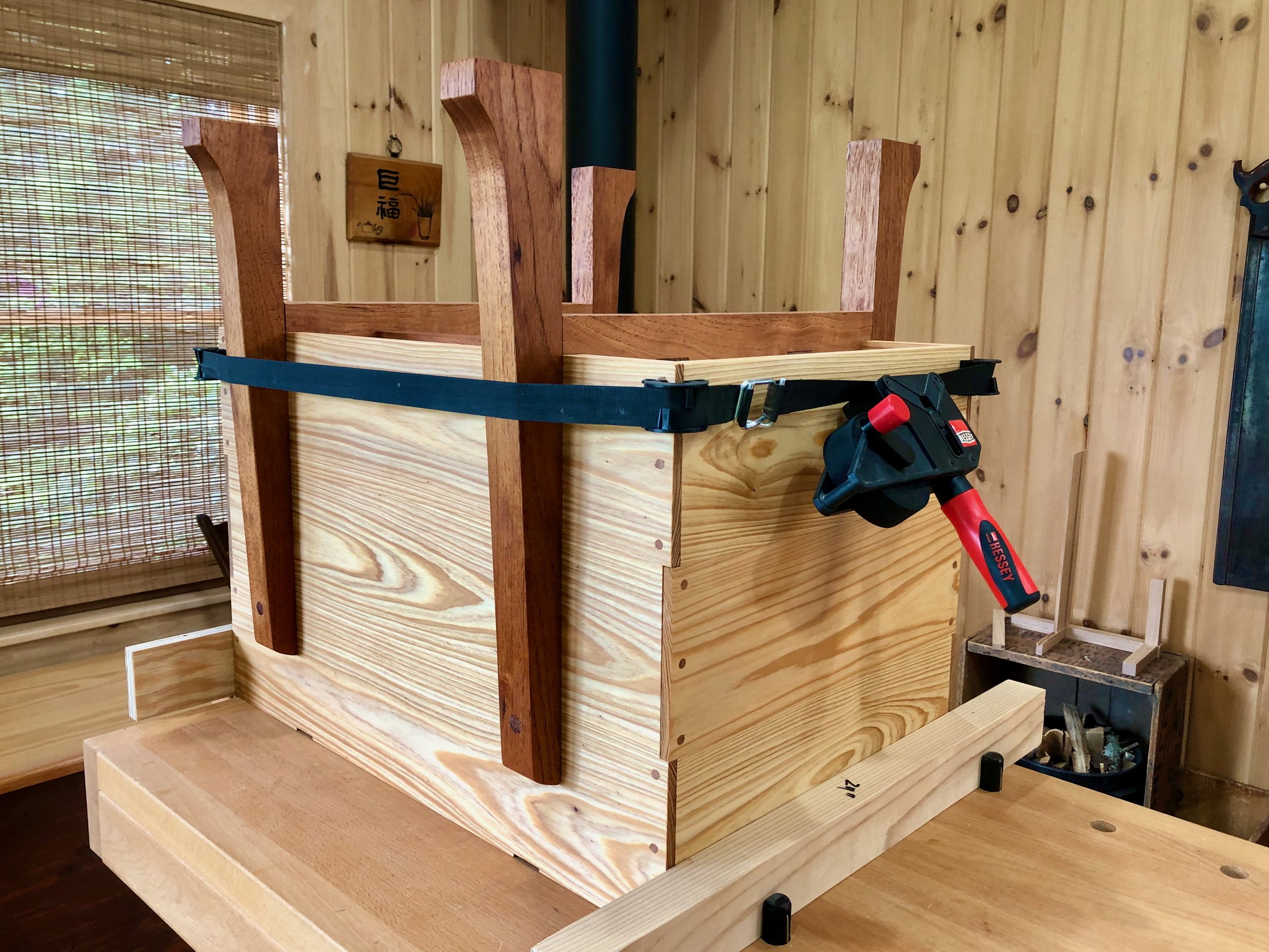
Scene during glue-up
Before the glue cured, I tipped the piece upright and fixed the legs to the cypress box with one screw, each, applied from within. Next, the hinges and lid were attached as before, using the proper screws this time. Finally, reproductions of a classic Korean handle pattern were added to the sides to complete the karabitsu.

This American version of the “foreign” coffer exudes a new pride of heritage, posted by the fireplace to serve today’s special storage needs.

Fireside friend

L'horloge Cerise

Take this lesson to thy heart; That is best which lieth nearest; Shape from that thy work of art.
- Henry Wadsworth Longfellow
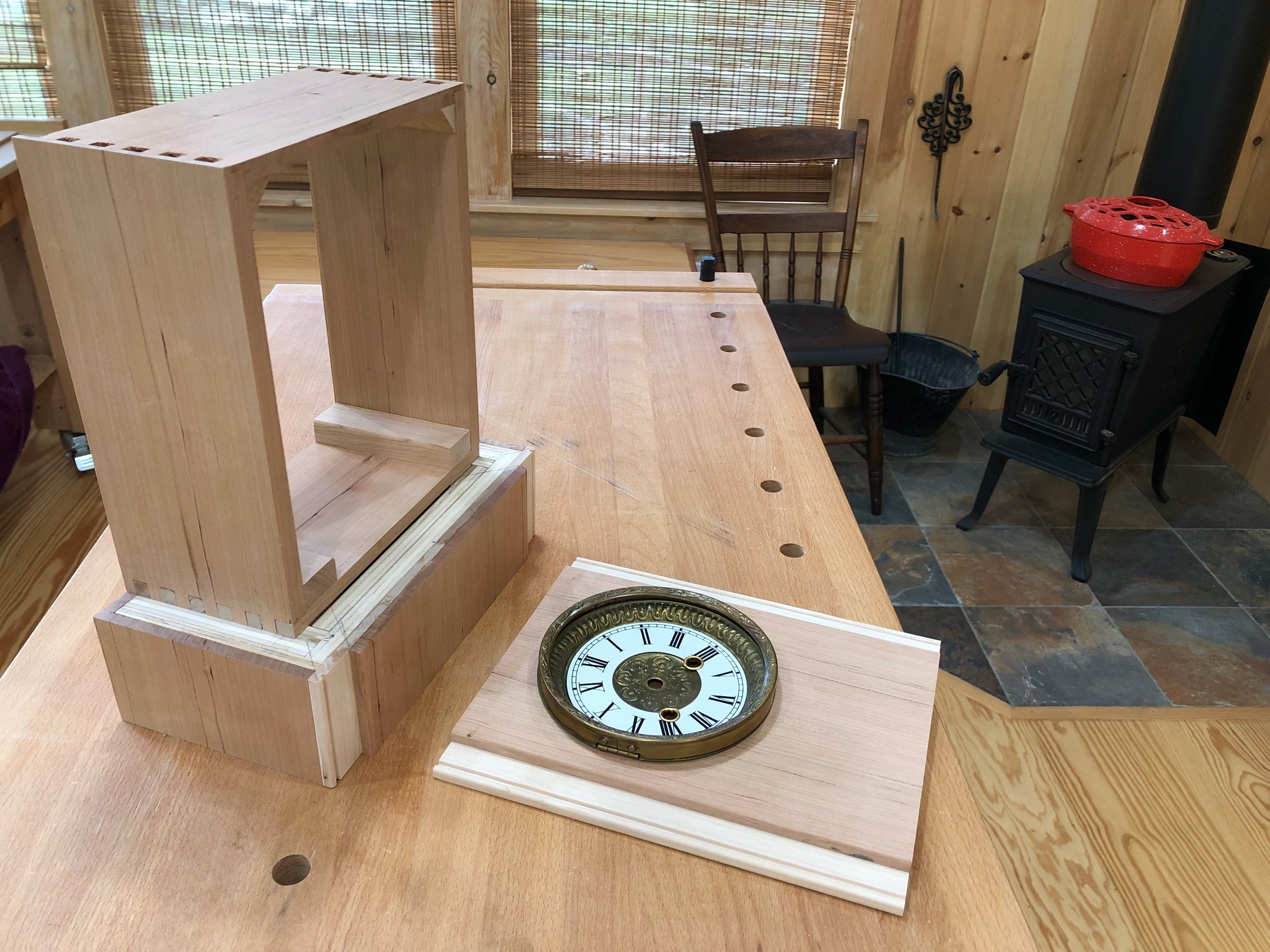
“The cherry clock” would also be a fitting title for this special Project, a wedding present for my nephew Sam and his wonderful bride Jill, but I prefer the French version, don’t you? It fits, too, for this Project is all about the Americanization of a revered French clock.
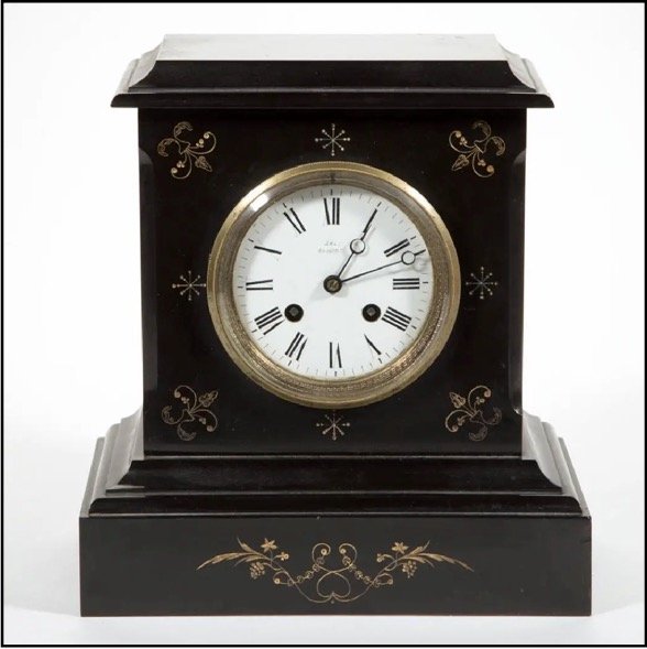
Recently, I described the features of an archetypical French marble clock, the favorite of our house. While admiring this object one day it bothered me that in the age of Dick Tracy devices and rechargeable (ahem) “pocket watches” nothing remotely as captivating as this timepiece is being made for sale anywhere on earth. I’m sure there are some specialty clockmakers out there who would differ, but let’s not quibble. The fact is that today it would be impossible to reproduce this nineteenth century gem. Even if a clockmaker could locate the proper marble and some means to carve the decorative patterns, he/she would find the brass and porcelain face very hard to come by, and I would bet the “pendule de Paris” movement, with its conspicuous Brocot escapement, has not been manufactured for over a century. Sadly, with no means of production, the French marble clock will one day become extinct. The only way to re-produce this species would be to conjure up a version using today’s materials. That is the undertaking here.
French marble clock (1850-1899)
Design
Often when trying to copy an antique the craftsperson is left with the task of divining dimensions from an old picture using calipers, a calculator and plenty of conjecture. What made this build so special was that I had the real object before me. In rendering the design I became a portrait artist, obsessing about the details of his subject en pose, quantifying every aspect and coming to know each individual feature of the object I had so long admired as a whole. It was fun! I then took these numbers and drew a rough plan on paper.
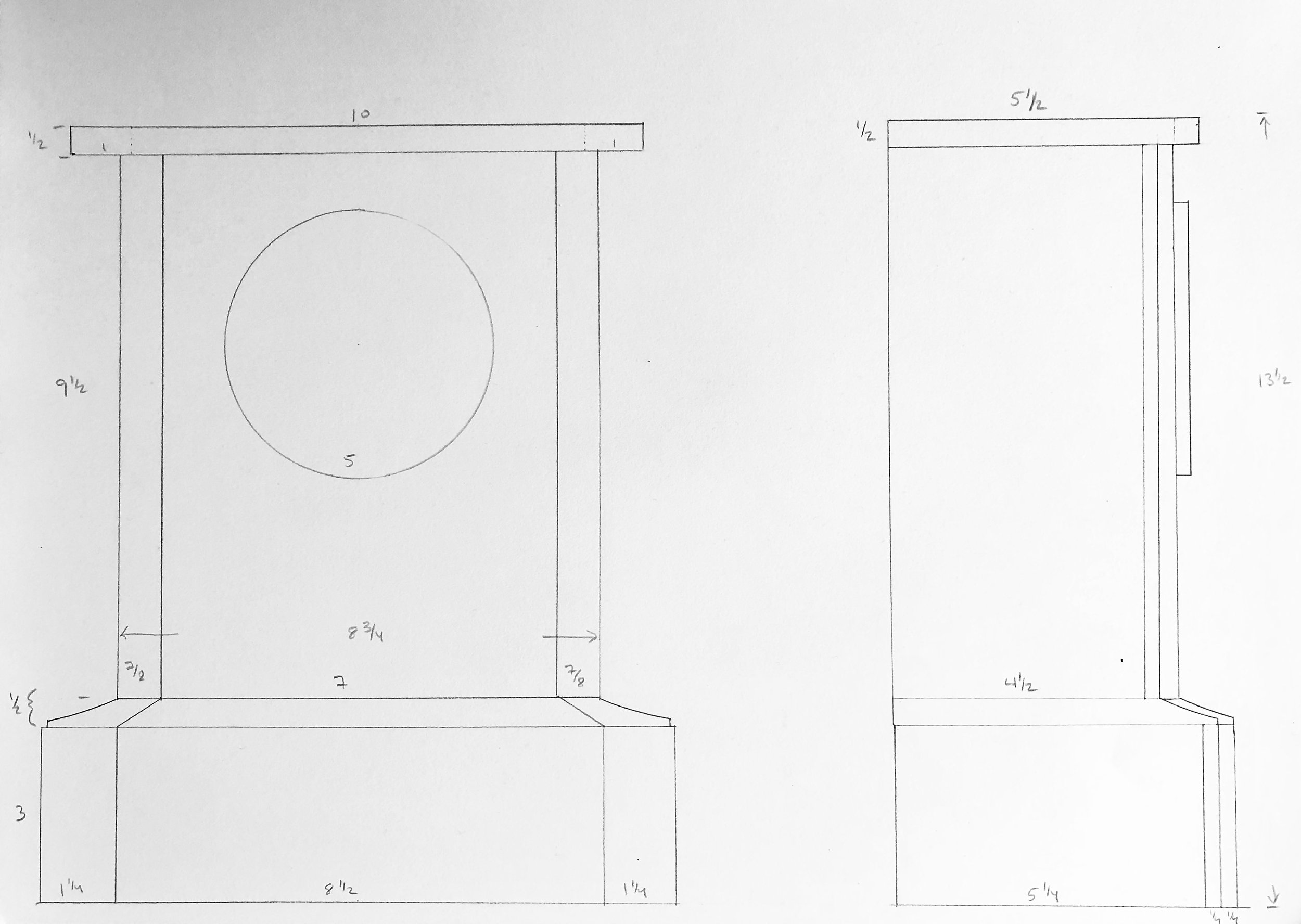
The Cherry Clock: rough plan
While the interior construction (i.e., the attachment of marble to marble) remained a mystery, I reckoned that all of the stone elements could be fashioned from wood and then joined in the typical woodworking manner. The clock case would have an interior base made of plywood that, in addition to providing mass to lower the center of gravity, could furnish a platform for the decorative molding to rest upon. This base would ultimately be clad in the same cherry material used for the remainder of the case. My vision is that the lighter-colored marble surround on the original clock could be mimicked using sapwood from the edge of a cherry board.
Materials
This clock would be made from black cherry lumber (Prunus serotina) but not just any version of this native American hardwood. The boards I selected were quarter sawn, for use in constructing a stable box and top, and also a plain sawn plank to furnish the sapwood reveals. Some birch plywood parts were incorporated to provide out-of-sight support.
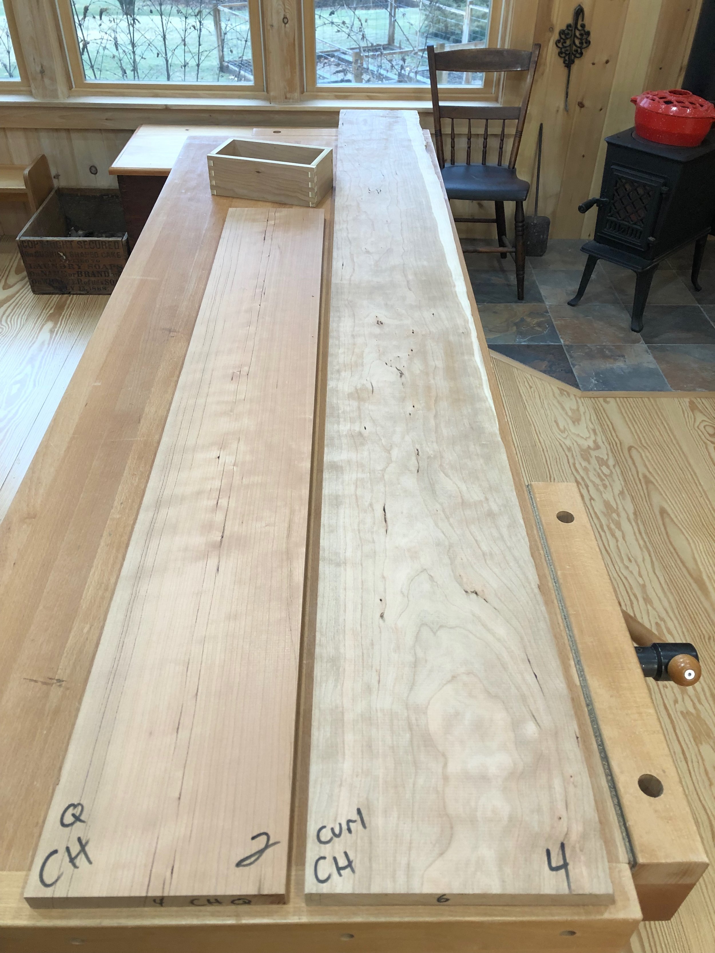
Cherry lumber (note sapwood along the far right edge) with base box constructed of plywood
The remaining clock components would, as best as possible, mimic the original. These French clocks used a cuplike bell strike, as opposed to a gong, and so I was on the lookout for movements with this comparatively rarer feature. I found a nice one at my favorite online shop, Clockworks, where I was also able to procure a French style key, pendulum, clock hands and grommets. The Roman numeral porcelain and brass dial was impossible to obtain, but a modern replica of a nineteenth century American knock-off was found complete with the characteristic flat glass bezel (thank you! Ronell Clock Co.). They also had the metal back plate I required.
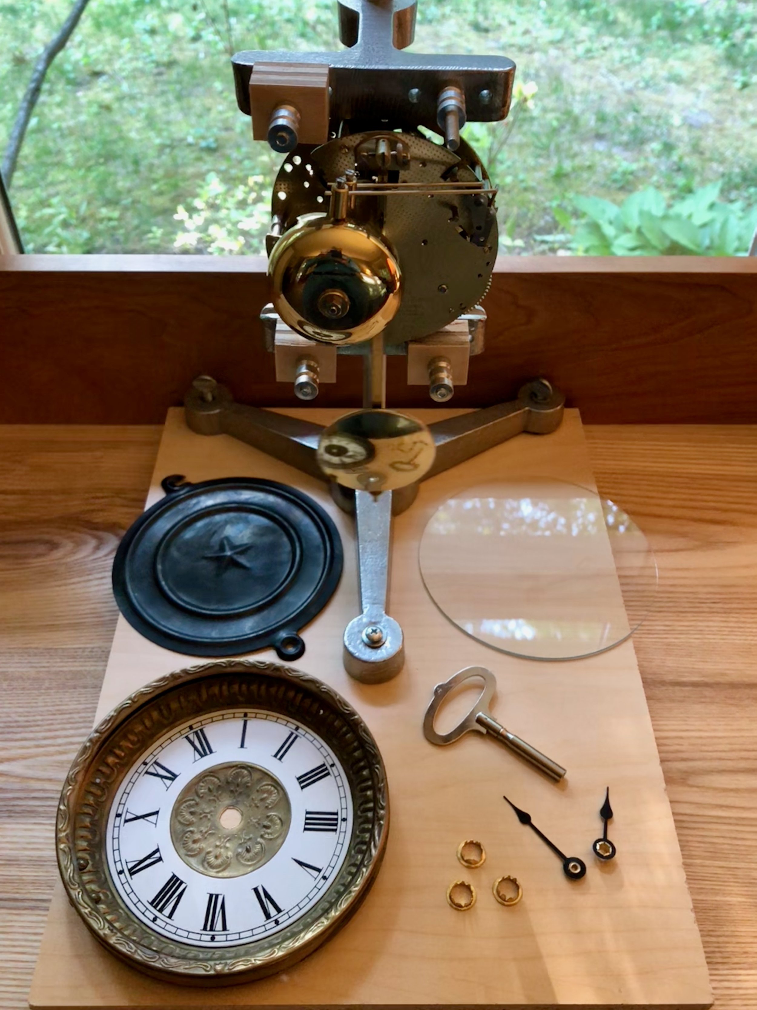
Clock components
At last, with the preliminaries behind us and filled with the exhilarating notion that anything is possible, we take the plunge. (gratuitous wedding analogy)
Dimensioning
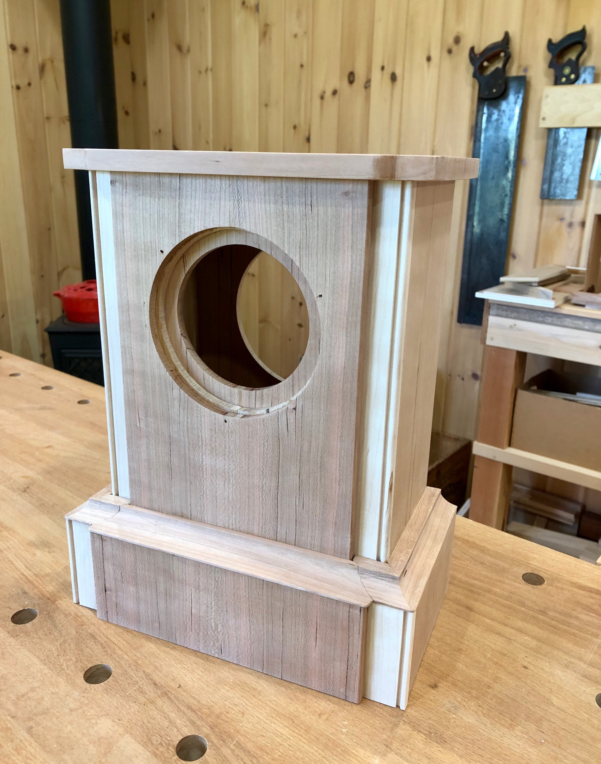
This clock case would be built from the inside-out and so the first job was to construct a rectangular plywood box to serve as the base. After joining four pieces together with box joints a few extra layers of plywood material were cut to augment the front and sides. Next, the cherry boards were chopped to rough length and then resawn and thickness planed to 1/2 in. (top, bottom and sides) and 1/4 in. (front, back). This “stock” would be further trimmed and refined during the course of construction.
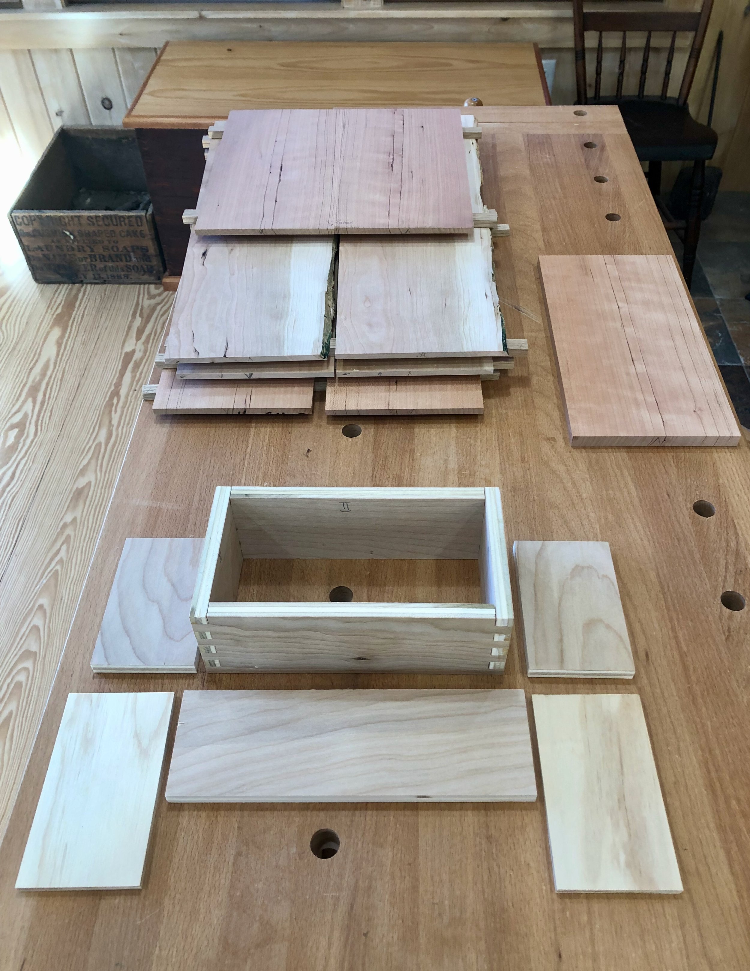
Clock case components
To build-up the base, a layer of 1/2 in. plywood was laminated using glue onto the sides and front. The sides then received an extra 1/4 in. layer of plywood and the top and bottom of the thickened box was then leveled smooth with a block plane. Next, the cherry sides of this base were cut from quarter sawn stock. Once these were dry-fit into place the first of the two front layers could be measured for exact width. In the end, this layer will largely be covered by another cherry panel; the exposed sapwood edges are the purpose of the underlying board. The light, unstained marble edges of the original case also had an accenting bead carved along the side which I did my best to replicate at the router table. The beaded boards were then trimmed to proper height. The second panel was prepared from quarter sawn stock by edge-glueing two small boards together in a book match fashion and then trimming to the proper height and width. I would still need to round-off the edges before final glue-up but this phase of the operation was all about creating parts. Finally, the back of the base was prepared from two quarter sawn boards and then the back and sides were trimmed to their final lengths.

Base with cladding in place (dry fit)
With the base components in hand, I next needed to create the case tower. Like the base, the tower’s sides and back would be made from quarter sawn boards and the front would have a quarter sawn piece over another cherry panel sporting a beaded sapwood edge. The front and back parts were constructed much like those in the base, except that the half-panels would need an opening cut out for the dial and pendulum access before they could be glued together. The sides and bottom were prepared from thicker quarter sawn stock and joined with a box joint. A shallow rabbet on the top edge of the sides was created into which a ‘false’ top could be inserted to help hold the tower together. In the end, this would be covered by the actual top board. The sides were also rabbeted along their back edge to receive the back board. The dry-fit box could be used to determine the exact dimensions for the front and back panels, which were then trimmed to final width, the semi-circular holes cut-out at the bandsaw, the panel halves glued together, and the parts trimmed to final length at the table saw.
Tower parts
The seam between the base and tower is covered by a cove molding which provides the only ornamentation in an otherwise restrained assembly. It pleasingly elevates the structure, which means that the four mitered joints along its length should be executed with care so as not to distract. But first the molding must be fabricated.
The concave face of the original molding was flatter than a true circle and I also wanted to achieve this elongated profile in my version. I found a router bit online that matched the desired shape and used it at the router table to create the profile from 1/2 inch thick quarter sawn cherry boards. There is a lot of wood to rout (i.e., subtract) here, much more than should be shaved in a single pass, and so to save time I removed the bulk of the cavity with three passes over the dado blade at the table saw before finishing at the router table. The pictures below illustrate the approach. To complete the molding strips the boards were ripped on both edges at the table saw.
Interior wood removed at the table saw
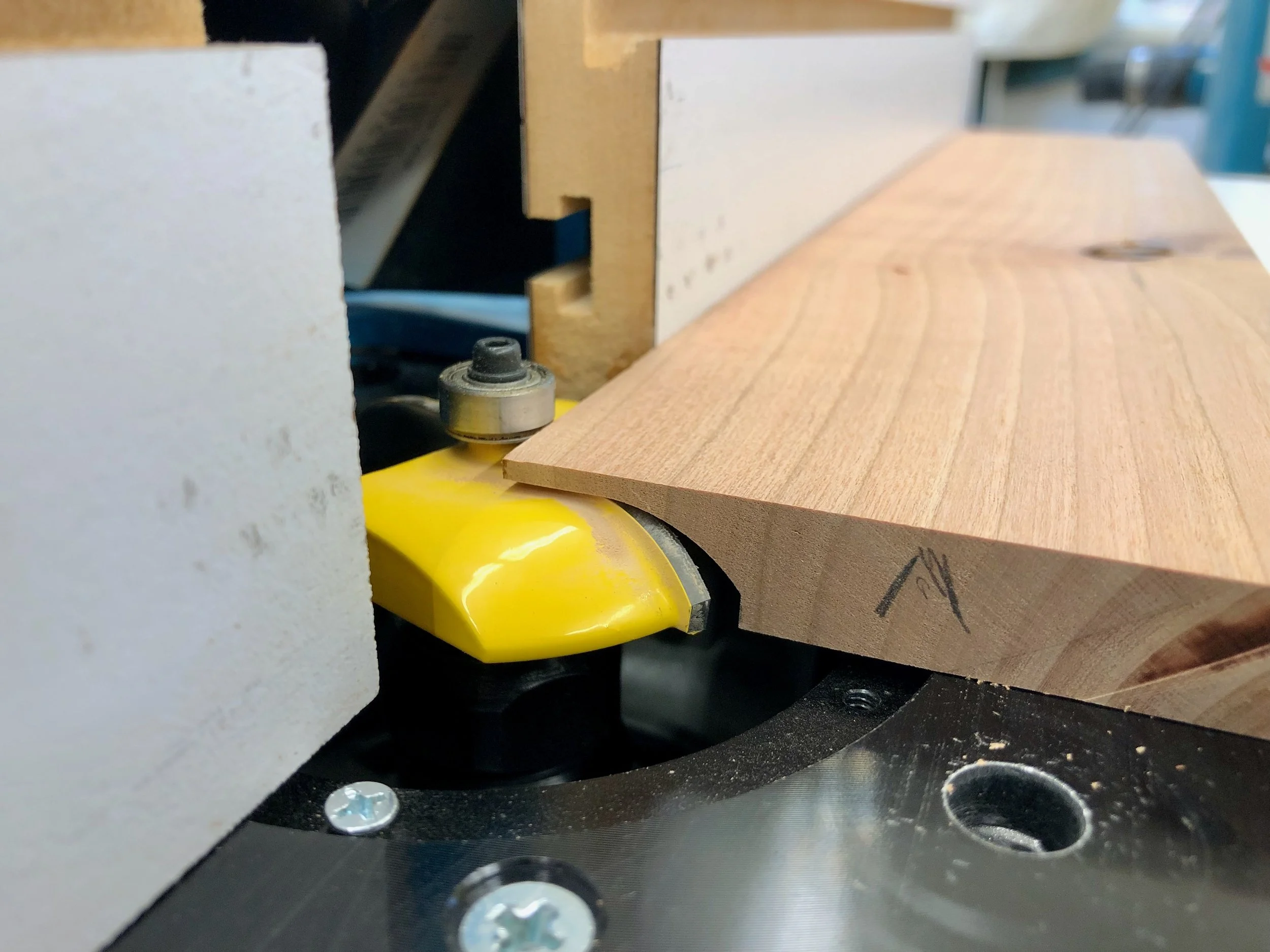
Molding profile finished at the router table
Finally, the top was fashioned as an exact replica of the marble original using a 1/2 in. cherry board. The curves along the front edge were roughly cut at the band saw and then finished with a rasp and card scraper.
Assembly
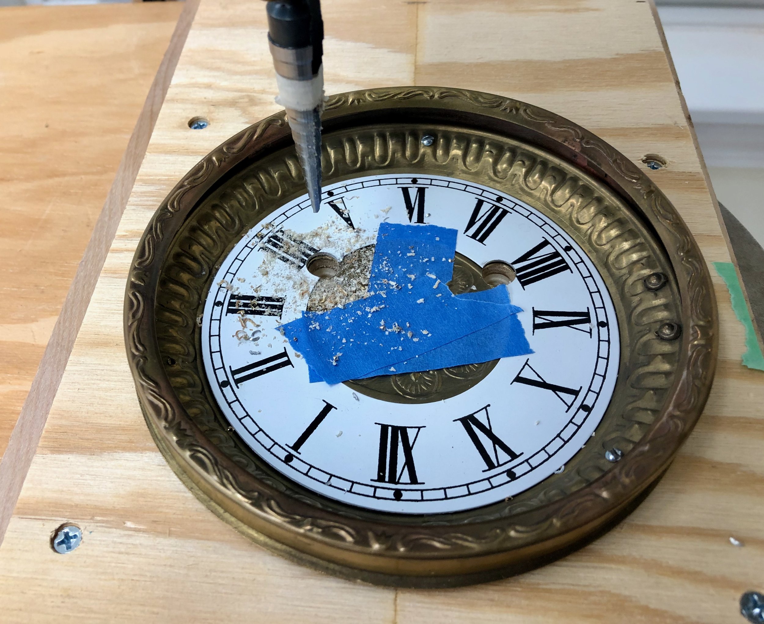
Time to put the clock together. The first step was modifying the dial pan to accommodate the winding arbors, and this involved accurately drilling two 3/8 in. holes into the metallic pan and number ring. Following some compass and ruler work to fix these coordinates on paper, I then used this paper template and a thumb tack to dimple the hole positions onto the metal dial. The “dots” were then widened to 1/8 in. on the drill press, and these entry holes now allowed for perfect alignment of a Unibit (a step drill bit) which was used to create the wider openings. Grommets were placed within the holes to finish the look.
Drilling the arbor holes with a Unibit
It was now time to assemble the case body. After a final sanding and some edge rounding the base was completed by sequentially gluing the thick veneers about the plywood core. Next, the tower box was constructed by fitting the sides to the ‘false’ top and bottom. The two front layers were laminated together but I decided to leave this piece unattached from the case body, for now, to make it easier to mount the clock mechanism into place. The back of the case will attach with screws during the final assembly step. I glued a couple of cherry “braces” along the bottom seams of the box joint to ensure stability and then the tower was mated with the base by affixing these with screws onto similar wooden braces mounted out-of-sight within the base cavity. Next the dial was attached to the front board using 3 steel screws, eventually to be replaced by brass. I’ve learned to always pilot brass screws with their steel lookalikes to avoid the heartbreak of shear that can otherwise ensue.
Clock tower and base with front panel.
It was now time to test-mount the clock works to the case. The trick here is to center the winding arbors and center wheel shaft within their respective holes while also making sure that the shaft protrudes far enough beyond the dial to accommodate the hands, but not so far as to touch the glass. To get the spacing right for this one I ordered flat mounting brackets and attached these to an extra 1/4 in. spacer board inserted behind the front panel. (It’s reasonable to assume that factory produced clocks had every component sized to perfection prior to assembly, whereas, amateur clockmakers like myself must collect the parts we can find and then figure things out from there. Victor Frankenstein worked under similar conditions.) With the arbors all centered the 6 mounting screw positions were marked in pencil, the clock removed, the holes drilled and then the clock reinserted and fastened into place. Finally, the pendulum was attached, and with a gentle flick the wound clock sprung to life. That’s a nice feeling.

Clock works mounted to front board (clamped in place)
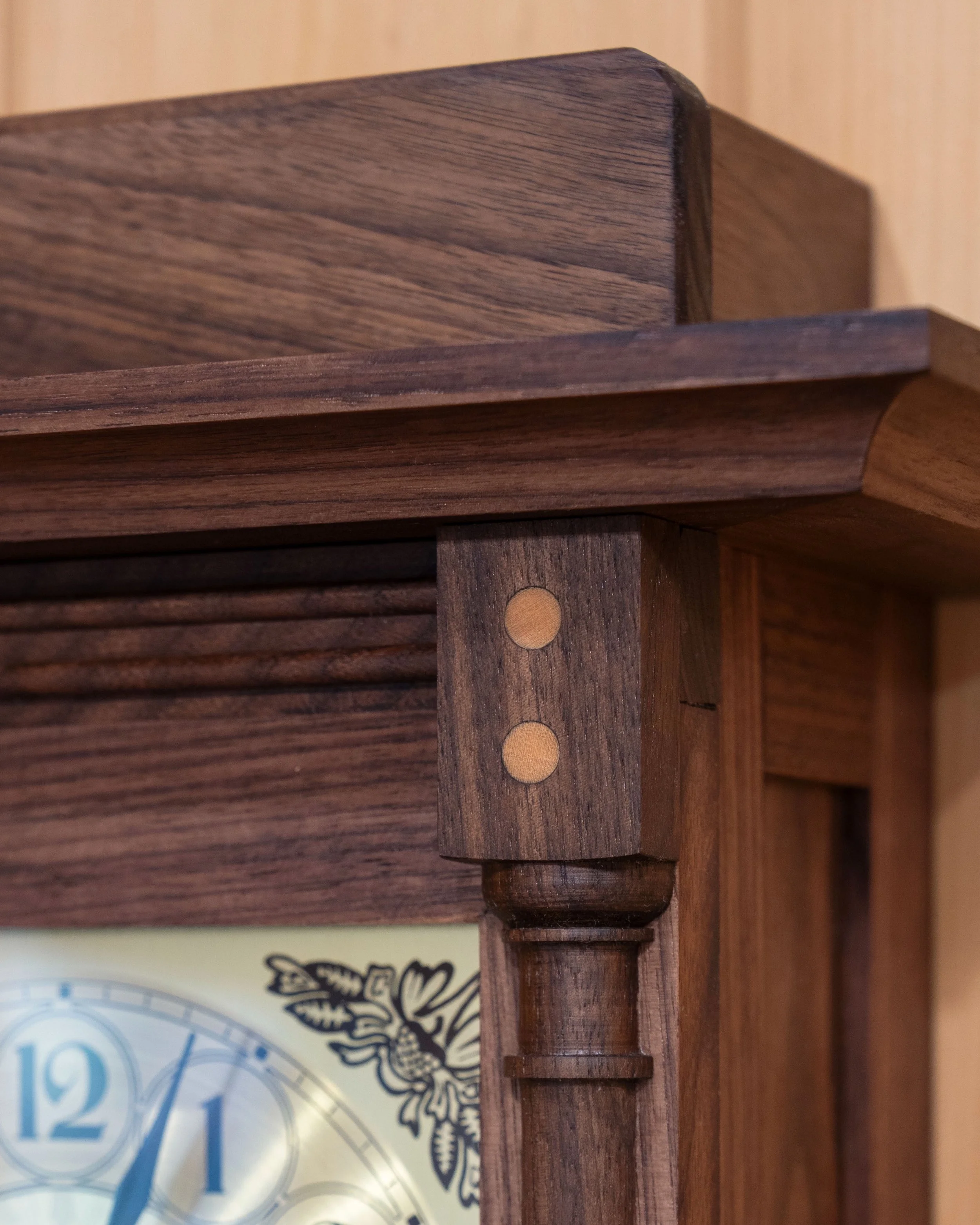
Once assured everything would fit properly during final assembly the clock works and dial pan were removed. The cherry top was then affixed to the tower with glue and some pan head screws, followed by the front panel. Since there is only a narrow glue surface along the edges to support this critical section a wooden support was also installed along the inside top for extra stability.
The final step to complete the cherry clock was to trim the base with cove molding. In this step, five unique molding segments would need to be cut and joined with mitered seams. The tool chosen to cut these parts was my 12 inch sliding miter saw. This is a nice saw but over-powered for the job, and a bit rowdy for cutting the two smaller pieces. Still, using double stick tape to hold the molding in place on the platen I was able to make it work. I spent a day playing around with scrap wood, and another day on an abortive attempt using the real stuff, all in an attempt to get the lengths and angles right. To mate properly with the front edge protrusions a 47° angle was needed for the central two miter joints, a 43° angle for the adjoining piece and 47° again at the corners - or thereabouts. Now, I had earlier prepared an angular shooting board specifically to assist in this operation. These handy jigs allow you to use a hand plane to shave the ends of miter joint components to make the mating surfaces square and accurate. However, forgetting about the front protrusions, I naively fashioned my jig at a 45° angle. To make things work for this Project, I rebuilt the shooting board’s stops at a 43° angle and then used a pie-shaped spacer to compensate during the 47° shaves. It worked!
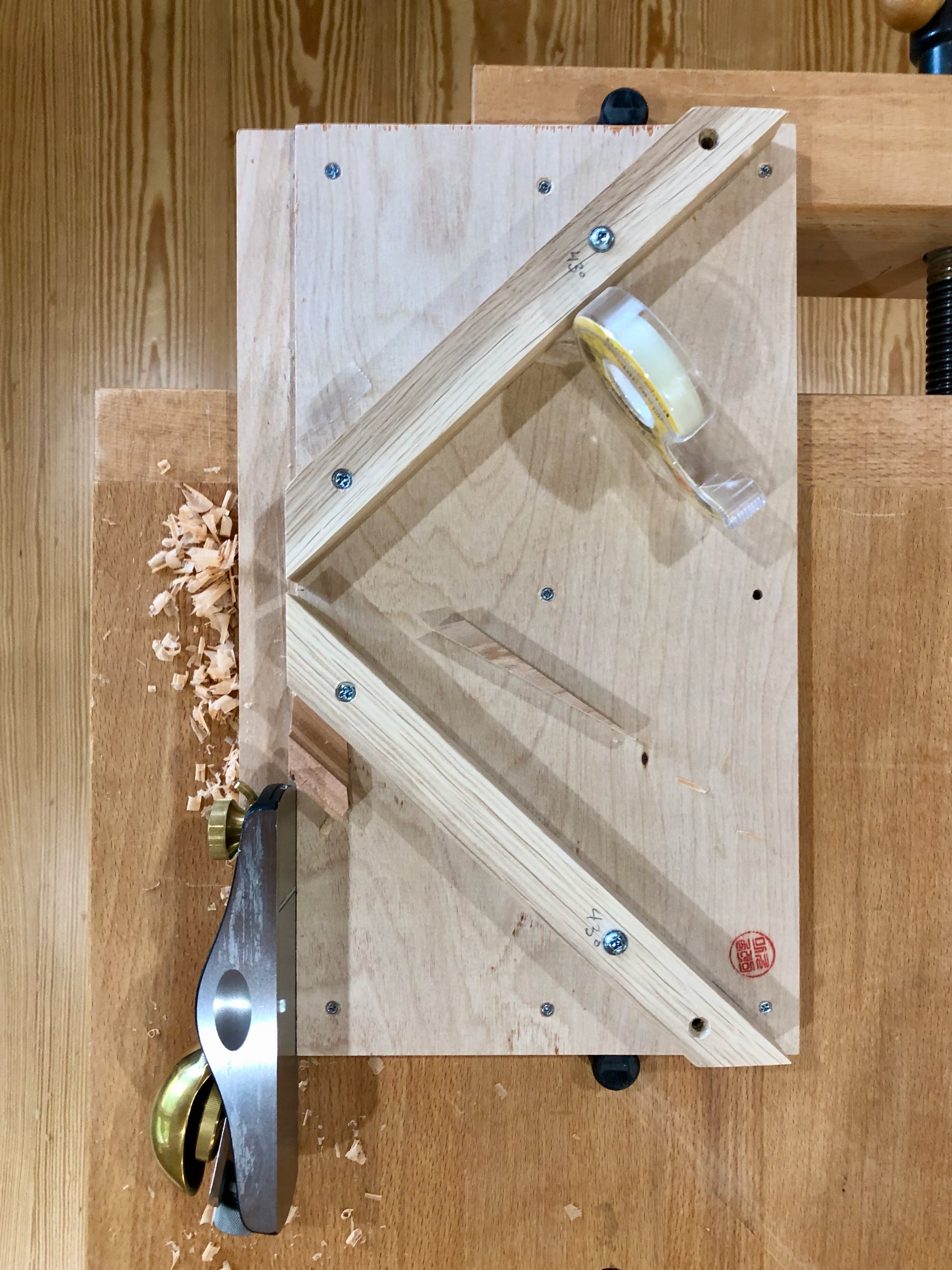
Shooting the 43° angle on a molding piece, tape and wedge accessories at hand
Everything came together fairly well on the second try; not perfect, but possessing a pleasing handmade look. And with that, the woodworking portion of this assembly was complete. The whole case was then sanded extra smooth (to 320 grit) in preparation for the finish.
Unfinished cherry case
Finish
As I have described in the past, gel polyurethane is my preferred finish for cherry items. If one desires a smooth, hard finish with minimal blotching this product cannot be beat. I used two coats of the satin sheen version on this clock, smoothing with a gray Scotch-Brite pad in between applications. Looks great!
Time to put the clock back together. I started by screwing the mechanism into the backside of the case and then testing that everything ticked, tocked and pinged as it should. Next, the dial pan and bezel were fastened to the front with those brass screws. I now needed to mount the glass into the bezel. In lieu of any actual instructions, the bezel came with four soft metal tabs soldered along the inside rim and the cheeky presumption that nobody purchases these things unless they also know how the assembly goes. Playing their game, I dropped the glass into place and then began bending the tabs inward. I guess the trick is to get the tabs to hold the glass in place while also keeping them out of sight when viewing the dial. I have this same bezel on a couple of my antiques but the tabs are much shorter on these and so visibility is not an issue. I thought maybe mine needed to be cut off, but that does not seem possible with any of the tools in my possession and so they remain lurking almost out of view. My bigger problem was that, held in this manner, the glass is still too loose and it jiggles when opening the hinged bezel. Closer inspection of my antiques reveal each to contain a tiny wad of paper between one or more of the tabs and the glass in order to achieve a secure fit ... paper?!! Paper would certainly work for me, too, but instead I decided to use a couple thin pieces of cherry which I superglued to the inside of two tabs. (I can just picture the scene when, 150 years from now, some clock collector will inspect this piece and mutter, “Hunh! I wonder why they didn’t just use paper here?” It’s fun to mess with “the future” whenever you get the chance.)

Cherry “filler” inserted between glass and tab
Lastly, I mounted the clock hands and then worked to assure that the bell strikes exactly on the hour/half-hour. This is an iterative adjustment of the small bushing located within the minute hand, itself. Once satisfied with the bell stuff, I let the clock run for a few days to see how things went. During this period I occasionally fiddled with the nut at the bottom of the pendulum bob until I was convinced that all parts were conspiring to keep the minute wheel spinning at exactly twenty-four times the earth’s rotational velocity. (Ha!) To finish up, the metal back plate was affixed to the case’s back board which was then screwed into place. Finally, a layer of protective felt was glued to the case’s underside to complete the Cherry Clock.

The Cherry Clock (Amer.)
Congratulations Jill and Sam! Time to enjoy a wedding.

win back art
William Morris (1834-1896)
British poet, author, designer, textile maker, social activist, printer … genius
The well-read might recognize this little gem: “win back art”; first penned by William Morris in 1884, but it’s pretty obscure. The rest of us will have had to look it up, and that’s okay, too. Personally, I enjoy the pursuit. That is, uncovering a good quote and then tracking the creator’s contemporaneous intent before the airbrushers of history have applied their gloss. But be advised, the source and even the existence of many favorite quotes turn out to be apocryphal. Keeps the game interesting! Here’s what I found for this one.
Background
During the late Victorian era, William Morris was a highly influential thinker, artist and craftsman. While admired today as a founder of the Arts & Crafts movement, in his own time he was once branded by a British nobleman as the “poet upholsterer”. Seems there were some that could not abide art being associated with craft. But, 150 years later, the world continues to revere Morris’s work in design, furniture and bookmaking while nobody, not even the internet, can locate that nobleman who probably wishes he was titled Lord Apocryphal.
I came across this quote while reading an article from The Craftsman, Gustav Stickley’s periodical published from 1901-1916 to promote American handicraft and his Craftsman ethos. The Craftsman was a wonderful magazine. You can still find fragile issues in library collections or at used book sales but I read my article in The Craftsman: An Anthology, a book of collected articles edited by Barry Sanders and published in 1978. For the benefit of humankind, the University of Wisconsin has recently digitized a complete collection of The Craftsman and provide it in a searchable format free of charge. The article mentioned comes from the November 1902 issue and is titled The New Industrialism, by Oscar Lovell Triggs, a University of Chicago English professor. We’ll skip his outsider’s thoughts on “industrial betterment” for this post but let his article serve as testament to the continuing impact of Morris, then recently deceased, on social movements of the early twentieth century.
The quote
In his 1902 article, published later that year in book form and co-authored by Frank Lloyd Wright, Triggs refers to Morris’s “win back art” as one of three tenets supporting his (Triggs) “new industrialism”. I was intrigued by this monosyllabic triad, and since Triggs neglected to provide a source, I dug deeper to find their origin. It turns out that phrase first appeared nearly a quarter century earlier in a self-published pamphlet by Morris, titled Art and Socialism. I do not know how successfully that pithy call to action was used in its day, but I propose it could help us, today.
First things first, I am not now, nor will I ever advocate Socialism as a political system. Although never abandoning his cause, Morris, himself, had toned down his fervor in that direction by 1890. Win(ning) back art was sought as a means to restore fulfillment to workmen during their daily labor - that’s all. You see, a social crisis had ignited in the early nineteenth century as new materials and methods appeared with ferocious rapidity (think: steam power, coal, canals/railroads, mechanization, task specialization) and this assault had a most demoralizing effect on the working class in Britain, site of first adoption. Recall your history lessons and you will have a sense for how everything resolved here, but fast-forward to the present where we are reaping the benefits of another onslaught (robots, the internet, instant communication, (coming soon!) artificial intelligence) and you can worry that what has since been termed “hyper-novelty” has, once again, far outstripped our culture’s ability to adapt - to say nothing of Homo sapiens’ adaptability as a species. The rising scourge of substance abuse, violence, suicide and perhaps even the rampant tribalism experienced in the US today have to be connected here, although I have not sought scientific confirmation. Regardless, it is easy to draw parallels between both the origins and cultural sequelae of the Industrial Revolution and the Computer Age.
Action
So, what to do? I believe an aspiration to “win back art” might provide real benefits today. And you might, too, if I ever get around to revealing the significance of that phrase, so let’s get on with things.
Early in his Art and Socialism pamphlet Morris convincingly equates a state of “pleasure” with both “labour” and “life”, itself. He then uses Medieval architecture, thus his reference to “three centuries” ago, as evidence for the impressive handicraft of humans before the era of powered machines, “when men had pleasure in their daily work”. The actual phrase “win back art” was used only twice, mid-sentence and without fanfare, half-way into the work. Importantly, this sentence also serves to define “art” as the pleasure of life. Here is that sentence with the titled quote in context.

“For, though all is not well, I know that men's natures are not so changed in three centuries that we can say to all the thousands of years which went before them; You were wrong to cherish art, and now we have found out that all men need is food and raiment and shelter, with a smattering of knowledge of the material fashion of the universe. Creation is no longer a need of man's soul, his right hand may forget its cunning, and he be none the worse for it.
Three hundred years, a day in the lapse of ages, has not changed man's nature thus utterly, be sure of that: one day we shall win back art, that is to say the pleasure of life; win back art again to our daily labour.”
William Morris, Art and Socialism (1884)
In these elegant paragraphs, Morris implores us to first recognize the inbred need to create that exists in all humans. To labor in the satisfaction of that need is to make “art” by his definition. He then calls on us to reclaim, for our benefit, the pleasure of labor which we are in danger of losing to the callous demands of productivity. Or, put more inspiringly, to “win back art”. I’ll leave you with that interpretation and ask, not rhetorically, what can we do to win back art for the sake of our lives.


Tickin’ Francese

An Ansonia Clock Co. advertisement (c. 1900)
Get it? Tickin’ Francese? Oh, but I do crack myself up! Which is a good thing too, for sometimes I’d swear I am the only person who appreciates my Dad puns (heh, heh … wait …). Anyway, this post is about the Americanization of a classic French entrée clock.
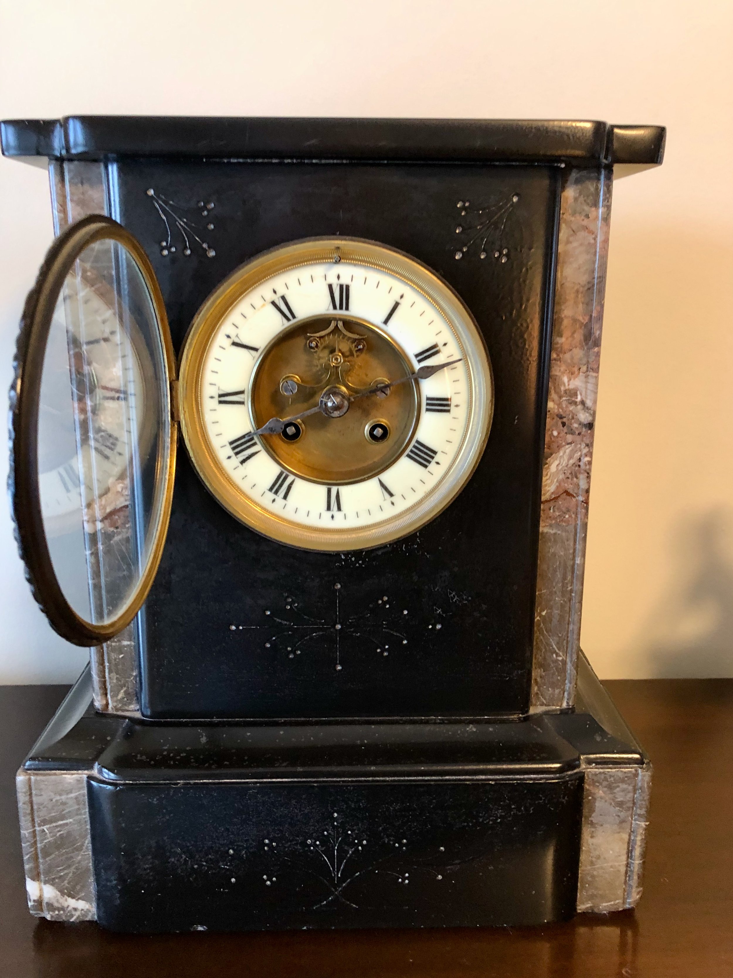
In addition to the dozen or so clocks scattered about the house and workshop that tell time I also have a small collection of antique clocks that tell stories. These wonderful objects, five in total, were collected over the past quarter century as my interest in clocks developed. Four of the five are operational and while they all have special meaning for me, no clock in my collection would be particularly valuable to anyone other than me. My favorite, a late nineteenth century French marble clock, has been keeping our living room on time for the past 18 years. I recently did some digging into the history of that French clock and, like most research efforts, this revealed some unexpected insights.
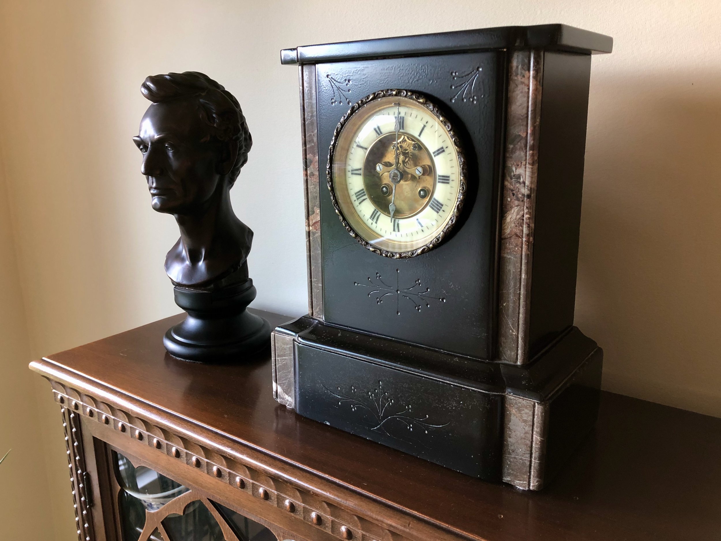
French marble clock with Abraham Lincoln, a contemporary.
While it is easy (and fun) to study the general subject of “time keeping”, researching clock devices in any depth is more of a challenge. Books on clocks tend to be either pictorial encyclopedias, manufacturer’s sales catalogs or repair manuals. A few general histories are out there, and I found Eric Bruton’s The History of Clocks and Watches to be a delightfully informative reference. But to dig deep into any particular clock the internet is probably the best option; spade that turf long enough and one can accumulate a good pile of consistent-ish information. There are also a few clock repair gurus on YouTube who share their knowledge of these once indispensable, now venerable relics with loving zeal (kinda like that high school Latin teacher) and I invite you to check out Time4clocks as an example. Those are my sources for the following tale.
The plot line is a comparison of clock cases, but the story begins with a desire to understand the history of my particular French marble clock, and for that we need to examine the clock works. That is where the maker and date can be established. Of the many clockmakers producing the distinctive pendule de Paris (clock of Paris) movements in nineteenth century France, mine was made by the most prolific: Japy Frères et Cie (Japy Brothers & Co.). According to this source, in 1806 the Japy brothers, three sons of the industrial pioneer and clock making giant Édouard Louis Frédéric Japy (1749-1812), inherited a first of its kind, single site manufacturing operation for clocks and all of their parts. This firm dominated Europe’s clockmaking world for decades before their over-diversification into products such as typewriters and bicycle parts nearly drove them into the ground. During their heyday, however, Japy Frères made a wide variety of strikingly beautiful timepieces, and among these are the family of so-called black marble clocks. Googling that descriptor gives you an idea of the diversity of production for just this one style.
As far as I can tell, my particular specimen dates to the 1890s. This was determined by inspecting the backside of the movement, ignoring those serial number-like red herrings stamped all about, and interpreting the logo that changed over time depending on which new clockmaking award the brothers chose to plug.

‘Clock of Paris’ movement backside (bell and pendulum removed)
Though certain features, such as the Brocot escapement and exposed count wheel, are characteristic of an earlier era the logo on my movement, declaring the “Gde Med. D'Honneur" (Gold Medal of Honor), was apparently used from 1888-1900. However, given the tenuousness of this dating method, my personal language barrier and the general hazards associated with internet sleuthing, it would not surprise me if it is a decade or two older than that.
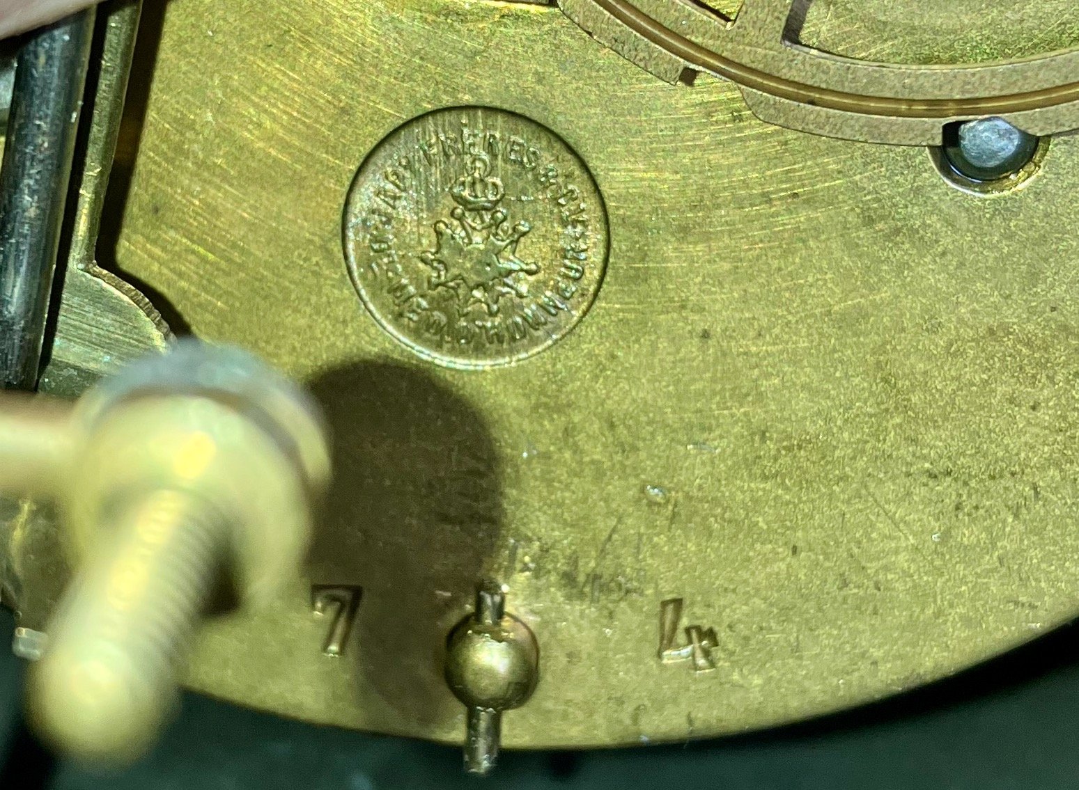
Logo close up
Black marble clocks were wildly popular in Europe and Great Britain. And as a nation of immigrants with a fondness for Old World tastes, they were sought after in the U.S., too. Somehow my clock made it across the Atlantic and, ultimately, to a clock shop in Hightstown, NJ where I purchased it in 2005. However, most nineteenth century Americans had to make do with the local fare. The so-called black mantle clocks, presumably a welcome diversion from the prevailing brown wooden cases, were top sellers and all of the big U.S. companies had their line-ups (e.g., Ansonia, W.L. Gilbert, Ingraham, New Haven, Sessions, Seth Thomas, Waterbury). And while some companies imported marble for these, most cases were made from substitute materials. To mimic the French stained marble (largely quarried in Belgium, as it turns out) those crafty Americans used a process called “japanning” to put a black enamel coating on either a wood or metal clock case. Seth Thomas also employed an early type of celluloid plastic, called “adamantine”, to veneer a flat black or even a fake, so-called “marbleized” finish to wooden cases. Resourceful!
After learning about my French clock and its influence on contemporaneous American designs it dawned on me that two of my other antique clocks fell into this same family. The first is a stout Ansonia metal clock, also acquired in New Jersey, that graced the mantle of our lake house there for many years. Purchased in 1998, it dates from the 1880s and was one of the many many black mantle clock designs produced by that firm, founded in 1850 by Anson G. Phelps. I had the 100-year old movement cleaned and oiled at that time and it is still running strong. The dial and hands have been replaced over the years, but that is not uncommon for heavily used clocks. On first glance it bears little resemblance to my bone fide marble clock but it does possess the characteristic brass rimmed, flat glass bezel, the telltale botanical engravings and it was, of course, black.
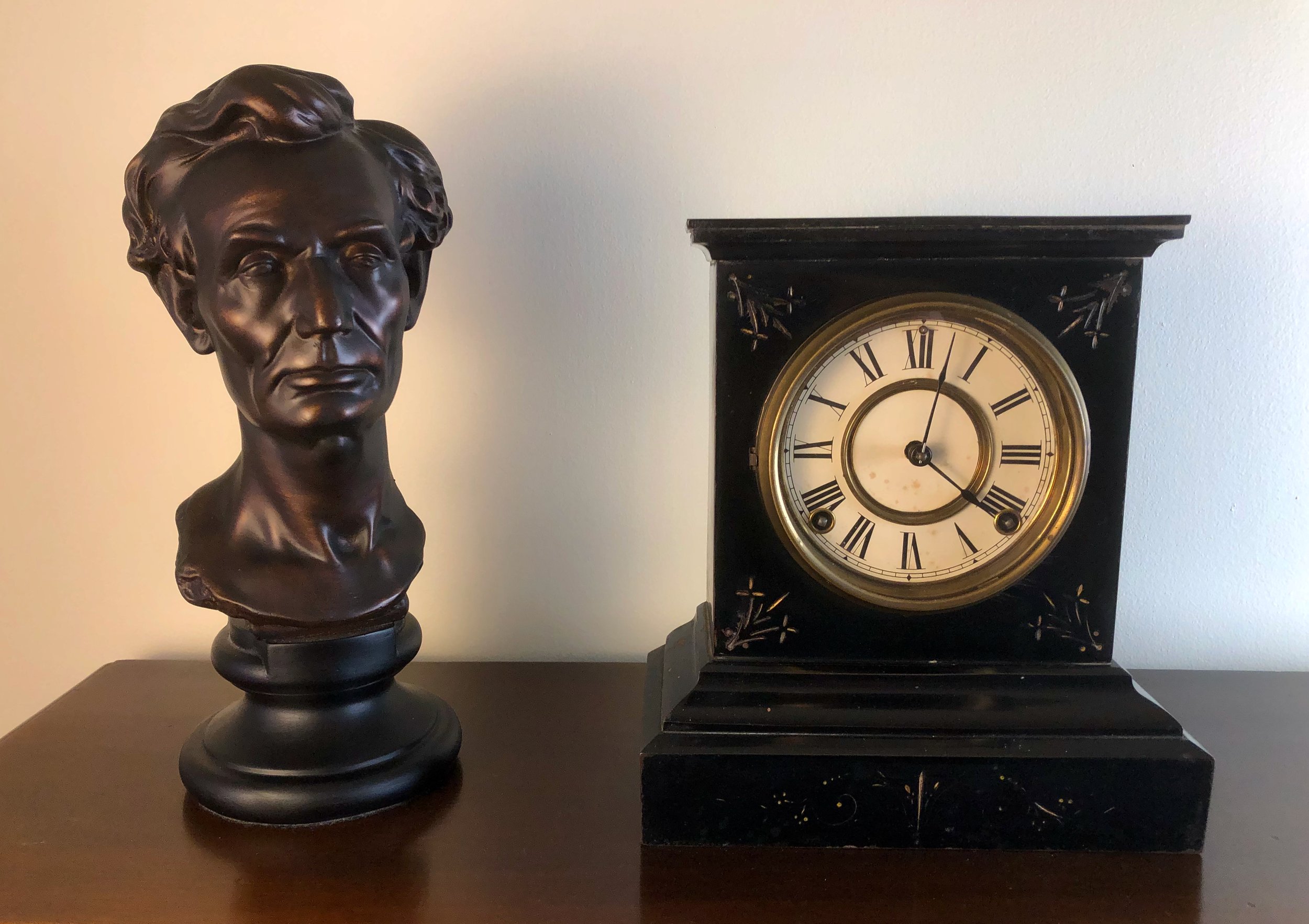
My Ansonia black mantle clock c. 1885
The movement is visible from the backside beneath the circular cover. Like all American varieties the works are less space-efficient than the pendule de Paris, but sturdy.
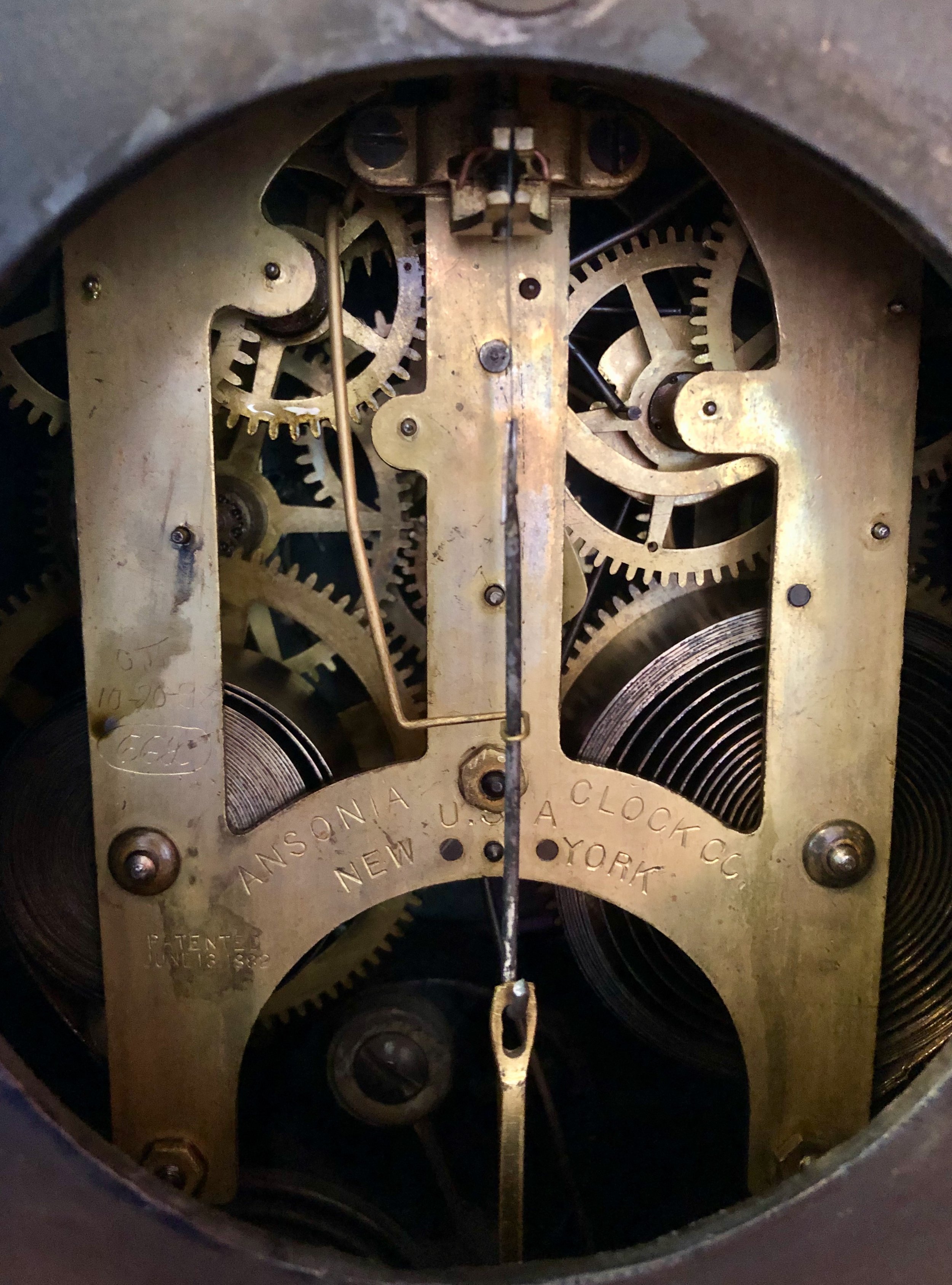
Ansonia movement, patented June 13, 1882.
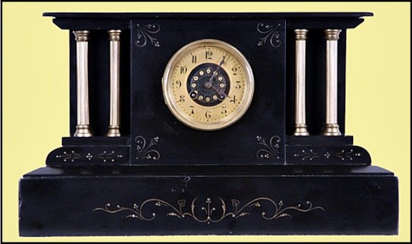
For marketing purposes, many clocks were given names and this one, ironically, was called “Unique”. The case turned out to be a close copy of another one of Japy’s marble clocks. In fact, if you invert the top it is a dead ringer - in enameled iron.
Japy clock c. 1860
(reproduced from liveauctioneers.com website)
The second American black mantle clock in my collection comes via Michigan and my departed Uncle Chuck’s estate. I wish I knew more of its provenance and whether he may have inherited it from an earlier family member but all I can uncover is its horological history. The tattered label identifies it as a clock made by the Sessions Clock Co. This Connecticut company was formerly the E.N. Welch Manufacturing Co., which lost so many assets during a series of factory fires that they eventually had to sell to a smaller firm and was renamed “Sessions” after the new head, William E. Sessions. Perusing the history of various clockmakers it seems that fire was a major “selection event” driving their evolution, worldwide. Apparently, Frédéric Japy’s successful legacy of co-localizing all operations to enhance productivity/affordability also made clockmakers more susceptible to sudden catastrophe.
Back to our story, this early Sessions clock has a black enameled wooden case that possesses fine engravings and an exquisitely ornate dial housed within a brass (or brass-like), flat glass bezel. As with similar clocks from that era, the case is loaded with other metallic gimcrackery. Some of this was meant to imitate bronze features gracing their French counterparts, but the rest appear to be an American fling with rococco-ism that probably merits further research to determine exactly what they were attempting to accomplish. Still, it is a stately looking object on my shelf with a dear familial connection and, unfortunately, a sprung mainspring.

My Sessions black mantle clock, c. 1905
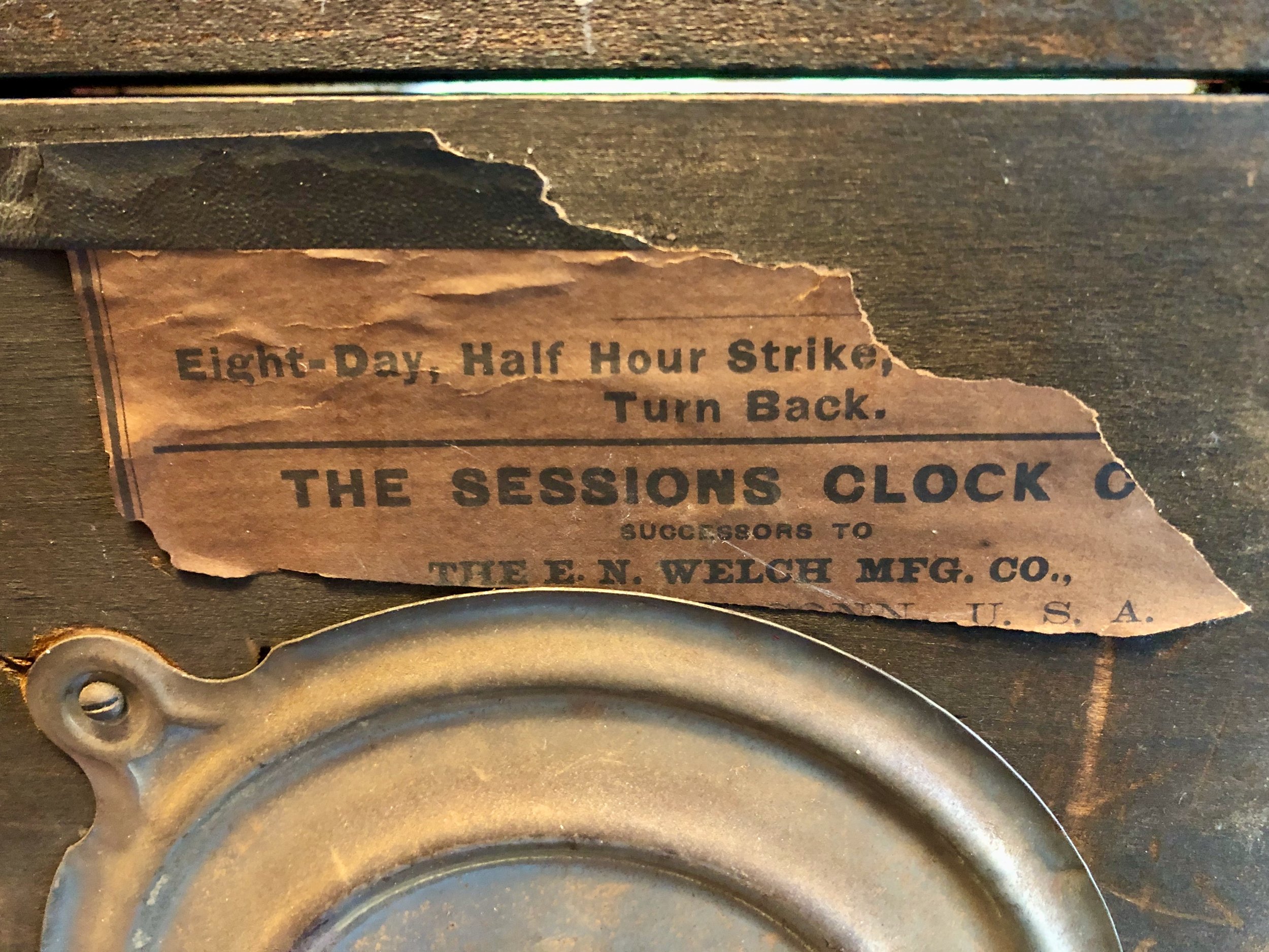
Remnants of the original label
Since the label still references the E.N. Welch heritage, I date the clock to near the corporate sale of 1903. A cursory Google search, once again, turned up its marble doppelgänger of a slightly earlier period.
Japy clock c. 1880
(reproduced from harpgallery.com website)
So that is the story of three black mantle clocks of common pedigree. Variously produced some 120-150 years ago in France, New York and Connecticut, and after some traveling about they now all reside in my Massachusetts home. That’s quite a testament to influence if you think about it. The design of this French clock was so powerful that it was copied across the globe, spawning a multitude of facsimiles wrought from local materials and produced by the millions to be traded even more widely, yet all striving to be the black marble clock. Individually, these clocks are now treasured as heirlooms. Much like a beloved family recipe, they were selected to satisfy a long ago taste, enjoyed in their time, transported across international and state boundaries, and handed down for succeeding generations to partake. Bon appétit!


Clock No. 1

I have been fantasizing about clocks a lot lately. They are fun to dream of while working on heavier things. I keep a list of the ones I’d like to build some day that continually shuffle in their mental order of construction, mostly early American classics. Of course, the desire to make a clock completely of my own design is there too, and recently I decided to convert some doodles into a drawn plan. I was looking to make a shelf clock that could serve as a housewarming gift for good friends of ours, and what I was trying to create was a timepiece that could be used in any room. This small clock required a simple case design and one that, although made of wood, would not look “old-fashioned”. It should also be a case that is easily constructed in the event I ever choose to duplicate for sale. Mission and Shaker styles both satisfy these criteria and I was hoping I might create something original that could fit within these canons. I call this design Clock No. 1.
Design
I favor elemental shapes in my wooden objects, things like right angles and arcs. These are disciplined features that, in concert with the material’s “untrained” texture, can achieve a satisfying harmony. Seductively curved mouldings and scrollwork have their place, but they too often compete with the natural character of wood. Circles, with some rectangular joinery will be the theme of this clock. Semicircles will define the bottom edges of the case and thereby create the feet. A box joint will form the connection between the top and sides, and I will do my best to hide the other seams so as not to distract. The clock’s back would be accessed via a door (hinged or sliding, TBD). And in place of numerals I could use dowel pegs made from the same wood as the case; the dark end grain should provide a pleasing contrast.

Clock No. 1 rough sketch
Materials
When building a clock the first decision to be made concerns the movement: mechanical or quartz? To wind or not to wind, that is the question, for clock case dimensions are affected by a mechanical movement’s bulk and pendulum swing. All else being equal, I prefer mechanicals for the life that these clocks bring to a home. But the current Project is for a vacation home and that changes things. I know from experience the sorry scene of opening the door to your retreat and being met by a “dead” clock on the mantle. Admittedly, it is an easy task for the clockwinder to resuscitate and then march the live timepiece through the gong sequence until it, once again, reaches its own meridian. However, this task begins to feel Sisyphean and grows old over time … quartz it is. Battery-operated quartz clock movements are easy to find and I picked one up at a new source for me, the Norkro Clock Co.
I can imagine that this clock would look nice in a variety of woods but, given that it is a lightweight clock with thin walls, I decided to use quarter sawn lumber to reduce the propensity for warp. That decision pretty much limits the choice to those woods commonly milled in this orientation, namely: oak, ash or cherry. I chose cherry.
Clock materials
Dimensioning
To begin, the 3/4 in. thick cherry board would need to be sliced into two thinner boards of 1/4 inch depth. This was accomplished by re-sawing in half at the bandsaw and then reducing these boards further (while flattening) to the exact dimension on a thickness planer. Next, the mill marks were removed using a card scraper and the grain patterns inspected carefully in order to assign stock-to-parts as artfully as possible (i.e., which portions of wood to use for the front, sides, top, bottom and back). Once labelled with tape, including interior vs exterior, the parts were trimmed to their proper widths at the table saw. During this operation both edges of the front and one edge of each side were cut at a 45 degree angle. During assembly these would all come together in mitered joints which, if executed properly, would leave an invisible seam.
After cross-cutting the front and sides to [proper height + 1/2 inch] it was time to cut the semicircular bottom edges. There are 3 common ways to cut circles using power tools and these involve either the router, drill press or band saw. I needed to make semi-circles of two different radii on small boards and for these reasons cutting at the band saw was chosen as the proper method. Way back during construction of the Stationery Chest I made a circle-cutting jig for my small bandsaw that has served me well ever since. Onto this jig, the boards were mounted individually at the circle centers with a bolt inserted at the exact height of the finished front or side piece (this is where the extra 1/2 inch comes in), the jig was slid into place on the band saw table and the board was then rotated in one smooth operation to slice out a perfect semicircle. Slick.

Cutting out the front board in a “clockwise” spin
Once the semicircles were cut, and the bottom 1/2 inch trimmed away, the next step was to fashion the box joint along the top and side pieces. I decided to use the table saw for this operation and this required that I first construct a new jig for the task. The “fingers” of this joint are small rectangles, 3/8 in. wide x 1/4 in. tall, which become the critical dimensions defining the new jig made along the lines of a larger version that I have described previously. This jig, used with a dado stack on the table saw, worked well to reproducibly cut the cavities at fixed distances along the joint edge. Taped together, both side parts were cut at the same time to ensure perfect alignment.

Cutting the box joint fingers
After the sides were complete, the fingers for one half of the top were cut-out. The sides and front were then dry fit and the top was dropped into place to mark its exact width, prior to sizing and then cutting the other half of the box joint. Next, the front edge of the top was trimmed back by the width of the front board so that everything would fit together properly. This happened to also be the width dimension for the interior shelf and so that was cut to size using the same fence setting at the table saw. The shelf, or bottom, is a structural element and would be supported by a shallow groove, easily cut into the side boards at the table saw using the cross-cut sled. The last part to fashion was the door which was cut from the remaining stock to fit the cavity of the dry-fit case. Since the door would have no structural support, I chose to rip the board in half and then glue it back together along the centerline. This corrected a slight bow and should help to ward-off future warp.
Clock case parts
The final operation prior to assembly was to make the clock face. Holes drilled in a 4 inch circle surrounding a central opening would form the dial. These holes would then be filled with shop-made cherry dowels to take the place of numerals. Rather than draw on the face board, I first made a template of the dial on hdf material and then used this to guide a hand drill to make the production cuts. The dowels were fashioned with a dowel plate and hammer using cherry scraps.
Dowel-making with face template in background
With assistance from the template, the dial was created by drilling the 12-hole circle into the case front and then tapping a short dowel into each opening. A small dab of glue was applied to the back of each peg to secure these in place. The protruding ends were then removed with a Japanese flush cutting saw and the face sanded smooth to 220 grit. A center hole for the clock stem was then drilled to complete the clock face.
Clock face (bare wood)
Assembly & Finish
After sanding all of the parts smooth it was time to glue them together. The first step was to assemble the finger-jointed top and sides. These were put together as tightly as possible by hand and then the shelf board was slid into place and the whole carcass squared-up and cinched with clamps. Lying on its back, the structure could then receive the mitered front board which was aligned and clamped firmly into position. It is always difficult to snap a good picture during glue-up, the awkward disposition of clamps and devices evoke a scene in the dentist’s chair during an expensive procedure, but I tried my best in the below.
Case undergoing assembly
Unclamped, the case held together nicely but still required some grooming. The protruding box joint fingers were trimmed flush with a block plane, while the mitered edges were crimped to invisibility using a burnisher. I also trimmed the interior of the 1/4 in. thick sides (down near the bottom) so as not to interfere with the dainty statement of the 1/8 inch wide feet. A few joint gaps were beautified using thin cherry scraps and the whole carcass was then sanded down to 220 grit.
I chose to use hinges for mounting the door at the back of the case. Ultimately, the door will be attached following the finishing steps, but it is best to align and drill the screw holes at this point. I used the smallest pair of brass butt hinges I could find. As a handle I decided to simply drill a 3/4 in. circular finger pull. Clean.

Door mounted on the backside
Finally, I mounted a small rare earth magnet within the cavity that could mate with a hack-sawn screw to serve as the door catch. On to the finish.
I find the character of this wood to be fascinating and so I took some time to experiment with finishes, specifically comparing gel polyurethane with an oil-based wiping varnish (also polyurethane). I wanted to highlight the color variations in the wood, including the patches of punch card-like ray flecks, without inducing the blotching for which cherry is prone. I also wanted to maximize the contrast of the dowel end grain with the surface wood to make the face pop. Working on test pieces, I found that the gel polyurethane imparted a brighter, more orange, color to the wood, whereas the oil varnish gave a greener tint when compared side-by-side. The final surface was also smoother with the gel product (build-up filling the tiny valleys, perhaps?) and so this finish was applied to the clock case and door in three coats.
After the finish had dried, I attached the door hinges and then mounted the clockworks. The final design decision for Clock No. 1 was the choice of hands. The gold colored hands originally purchased for this clock turned out to be too bright, with not enough contrast against the wooden face. I liked the style, but not the finish and so I procured a similar set of hands in black. These did the trick!
Clock No. 1 face
I like this prototype clock and think it has some staying power. That little nine inch timepiece has a presence. The cherry wood provides intricate grain on a scale that does not overwhelm a small item, although oak would also be nice and I now think mahogany would be a rich material to try, as well. I have some ideas for making the joints appear “cleaner” and to also simplify the door mechanics, too. Lots to explore! - next time.


Mission Line Mirror

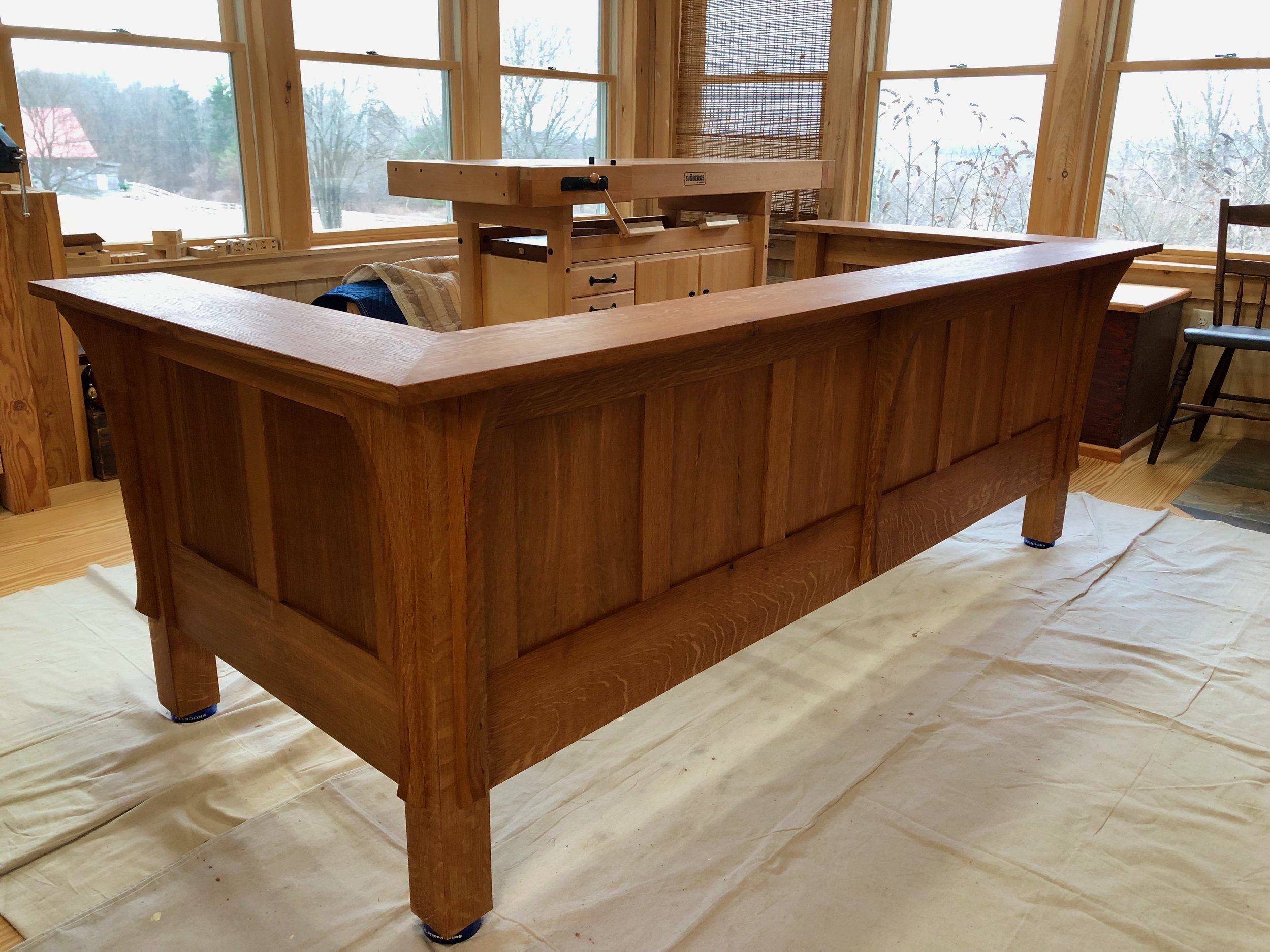
Let’s reflect for a moment on moving house. Mathematically speaking, moving is a binary equation. One night you are sleeping at your old address, and the next you and your belongings are someplace new. Moving-in is more of an asymptotic function; at least it always has been for us. Prior to occupying our mid-century ranch in late 2019 we took the opportunity to repaint all of the walls and give a fresh start to the decor. The “moving-in” proceeded along its usual course: put the essentials in place and install the remainders g r a d u a l l y over time. It has been our experience that the last things to move-in are always the wall hangings. This time, low ceilings and plenty of windows served to minimize the available wall space, which in some ways made it easier to live without, but also heightened the impact of every hanging decision. That sets the scene for the latest Project, a new dining room mirror.
Like many households, we have always had a mirror in our dining room. I think its purpose is to make the space appear larger, but it also adds vitality to the setting and comes in handy for that occasional self-check. A previous renovation had opened up our current dining “room”, yet the space still called for a mirror. However, real estate on the lone remaining wall was too limiting for anything we had in stock and so this potential hanging took its place with the others along that asymptote to infinity. And then I noticed an example of a Craftsman style mirror while reading a book on the Stickley’s. This L. & J.G. Stickley mirror had exactly what was needed: substantial width and narrow height. It also appeared alluringly proper. At the time (1905), Leopold and John George declared that their “furniture was neither Arts & Crafts nor Mission, but ‘simple furniture on mission lines’.”* While clumsy, that expression, likely an attempt to re-characterize the Craftsman™ designs they had blatantly copied from their older brother Gustav’s catalog, still resonated with me.
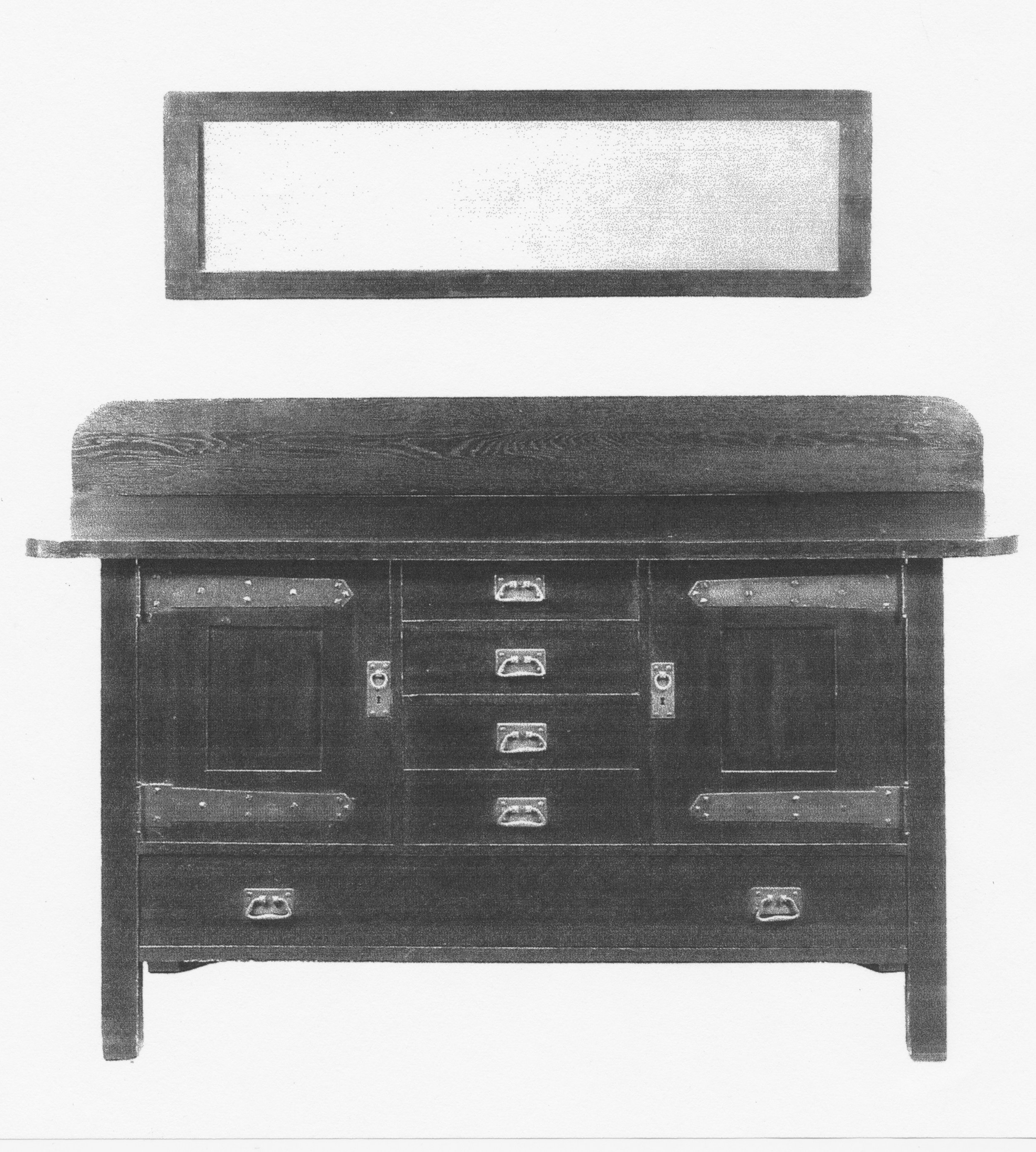
simple, “mission line” mirror
reproduced from: * Clark, M.; Thomas-Clark, J. The Stickley Brothers; Gibbs Smith: Utah, 2002; p. 135.
Design & Materials
There is nothing special about the design of this mirror, except that prior to discovering it I don’t think I would ever have thought to make one so long and narrow, which I guess does make it courageous in a way. I could not find any measurements for the original but did my best to keep the proportions of frame to mirror (calipered from the photograph) while accommodating the wall’s constraints: approximately 45 in. long and 16 3/4 in. high. The frame would be 2 3/8 in. wide on all sides. As to construction, the joints of the original were most likely mortice and tenoned, but a half lap joint would also work and that’s how I decided to put the 4 frame members together. That’s everything. With the dimensions and joint type settled there was no need for a paper plan. Three board feet of 4/4 quarter sawn white oak, some picture hanging hardware and, of course, the mirror glass were all of the materials required. Simple.
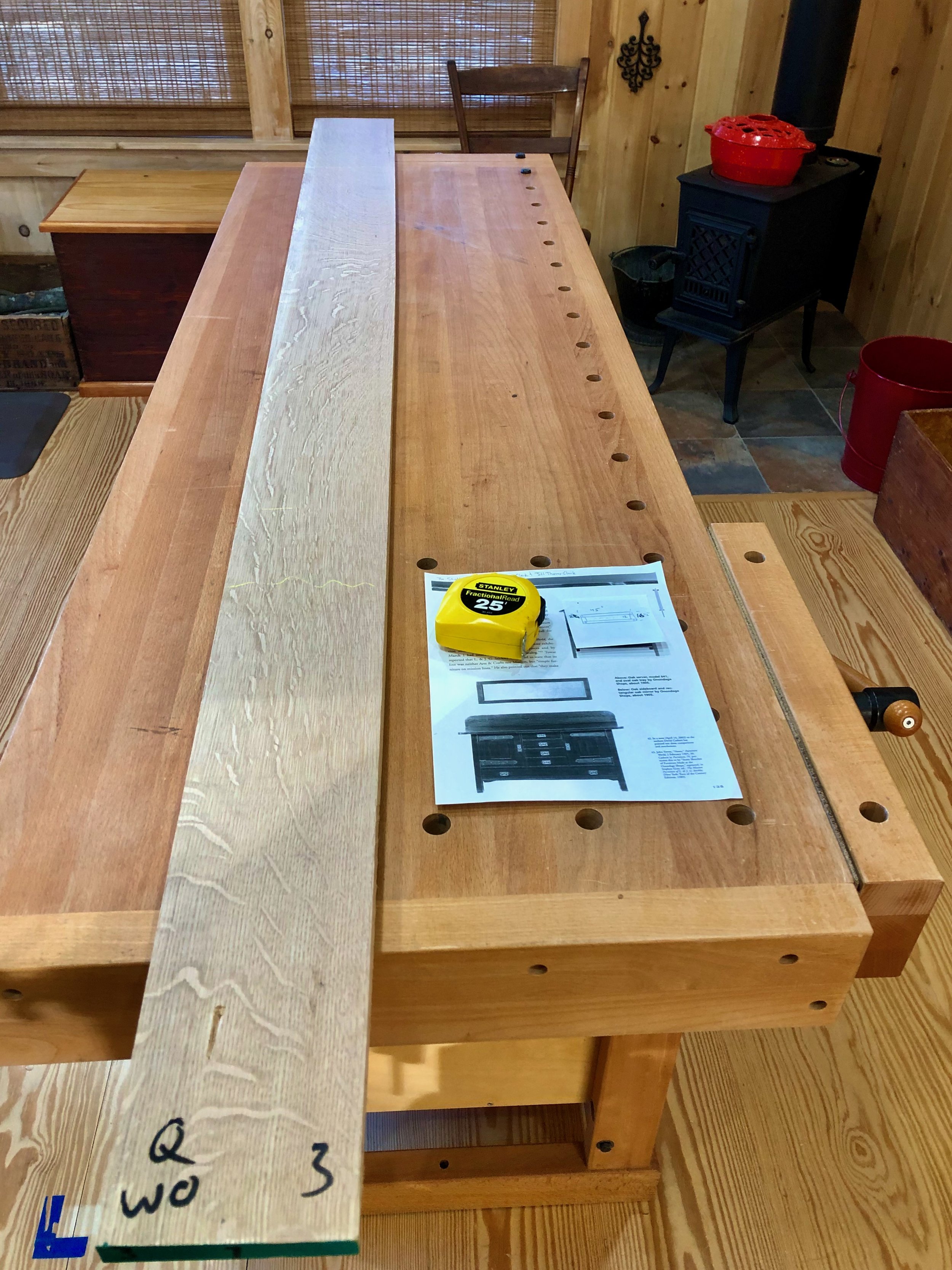
Mirror material
Dimensioning & Assembly
The dimensioning step was pretty simple, too. First, the board was cut crosswise into three sections from which the 2 3/8 in. wide frame pieces were ripped at the table saw. These were then jointed square and thickness planed to uniformity. The four pieces were then chopped to the final lengths and half laps cut on all ends using a dado blade and cross-cut sled. A rabbet for holding the mirror glass was ripped along an interior side of both of the long members and, finally, a couple 1/2 in. diameter oak dowels were prepared by hammering scraps through a dowel plate. These would be used to eventually peg the joints.

Mirror parts
All surfaces were card scraped to remove mill marks and then assigned their positions. Glue-up was easy; simply a matter of clamping all the seams together and double-checking that everything remained square.
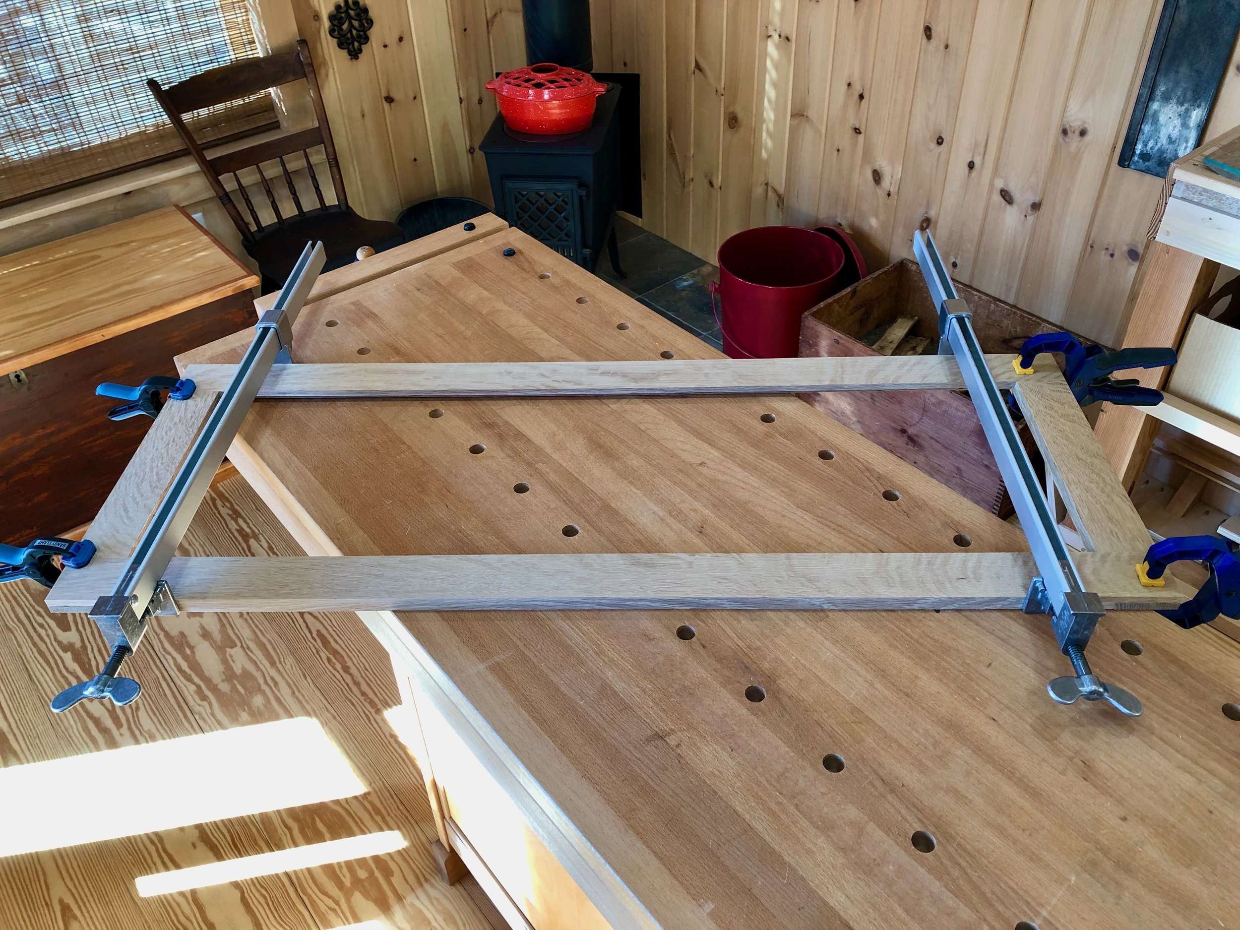
Mirror frame assembled.
Just a few steps to go. I wanted to peg the half lap joints squarely in their center and so a simple jig was constructed from scrap wood to reproducibly mark that spot at all four corners. Once drilled, gluey dowels were tapped into the holes and then sawn flush upon drying. The dowel end-grain was further shaved level with a block plane and then the entire frame was sanded smooth using an orbital sander.
The end grain portion of the half lap joints protruded slightly at all corners and so these were shaved flat with a block plane. To give the frame an inviting look, all of the sharp edges were then “knocked-down” using a spokeshave and sandpaper while the corners rounded slightly with a rasp. Then the entire piece was hand sanded using 180 SandNet.
Finally, I needed to make two short rabbets along the backside of the vertical members to complete the housing for the mirror glass. This was done carefully with a router and chisel so as not to ruin the nearly completed piece. I also chose to install the mounting hardware at this stage and then “test hang” the empty, unfinished frame on the wall. This allowed me to get everything straight without having to handle a heavy mirror in the process.
Finish
To fit with the existing furnishings I wanted the oak frame to be darker than the typical, ammonia fumed Craftsman finish. Indeed, all of the Stickley companies employed a range of finishes that they would use to suit the individual buyer or decorating trends of the time. I was aiming for something akin to their “Centennial” finish and followed the 4-step Jewitt process: dye (dark mission brown)/seal/glaze with gel stain (Java)/varnish.
With my part complete, I sought the services of a local glass shop, Northeast Glass Works, to supply and mount the mirror glass into the frame. They did a great job and we now have a mission line mirror to complete our wall.

Mirror on the wall

No. 220: the finish!

In the fifth installment we (at last!) find ourselves approaching the finish line for the No. 220 Prairie Settle, a version of L. & J.G. Stickley’s 1912 home furnishing masterpiece. Only three jobs remained: some carpentry to create the seat; upholstery for comfort; and finishing to complete the “look”. Aspects of these jobs were conducted throughout the build but are summarized now in this final post.
Job 1: Carpentry
Carpentry on this Project is used in support of the upholstered seats, so let’s begin there. Both cushioned seats (as in the catalog original) and inset seats (like many of the other settles from that time) have been used by modern builders and restorers of the No. 220. This posed the first of many choices to be made. Inset seats give a “cleaner” look but cushions are said to be more comfortable, and since we intended to use this piece every day cushions were selected. That decision then determines the type of underlying frame to be used by the upholsterers. The cushions would rest on a platform that, itself, would rest on a hardwood cleat built around the inside of the frame - all out of sight, in the end. After consultation with the upholsterer (more on him later) the dimensions for the cleat and frame were decided and good old fashioned carpentry was used for their construction. The cleats were made of hard maple (1 x 1 1/2 in.) and attached to the rails, at the proper height, with glue and screws. A center brace of the same dimension was also incorporated using a half-lap joint to tie it all together. Solid.
Maple cleats affixed
Next, a platform frame was constructed of 3 x 3/4 in. poplar boards. This ”figure 8” frame would rest on the cleats and sit 1/2 inch below the top of the rails; the two open areas would be filled with stretched webbing by the upholsterer. I used pocket screw joinery to make the frame. Prior to assembly, the corners were notched to accommodate the settle’s legs and, afterwards, all of the edges were chamfered lightly using a spokeshave.
Poplar frame in place
(what’s wrong* with this picture?)
*(In the interest of full disclosure … about a month after the above picture was taken, after surrendering the platform to the upholstery shop, and after attaching the overhanging arms to the frame I realized that I would now no longer be able to drop this platform into position. To remedy this situation, the webbed frame was reclaimed from the upholsterer, one edge was trimmed back to allow for fit, and then the platform was returned to the upholstery shop so that it could be completed. An extra cleat was “sistered” onto the existing frame structure to support the shortened platform and all was well again. Somewhere Henry Ford is chuckling.)
Job 2: Upholstery
Never having attempted the craft of upholstery I was not about to try it here. Instead, I found a local shop, Marcoux Upholstery, with an excellent reputation that was upheld by my every interaction with them on the No. 220 - mighty fine folk. Leather was selected as the covering material which comes with a whole host of decisions to be made concerning source, grade, embossing and color. Most of these choices are based on personal taste & pocketbook, but the surrounding decor and frame wood influence the color decision. So before we could select a leather color we needed to lock-in a frame color. The brown/wine leather sofa we are replacing goes well with the underlying rug and remaining furniture pieces, and so a leather of this general hue was considered a safe choice. That hue required a complementary wood color. Knowing that there is not a single “correct” color for the wood, I chose not to create too many choices. I also planned to use the Jeff Jewitt process to finish quarter sawn oak that employs modern day materials to match the look of aged, ammonia fumed finishes used in the day. Many color variations are possible with Jewitt’s method, depending on the dye and accenting stain used. To create my spectrum of choices I sampled both a “blank” and three different TransTint dye colors on scrap boards: reddish brown; medium brown; brown mahogany.

Dyed white oak scraps + blank
Following this I conducted the rest of the sequence using antique walnut gel stain on them all. In my mind, every one of the dyes samples could work but, to be critical, perhaps the red was too red and the brown too brown for this piece. The brown mahogany-based finish was the winner for us (but I repeated this one on a larger board, just to be sure).

The chosen finish (far right)
That was easy compared to selecting the leather. I won’t go into all of the details but there are a lot of leather options out there. Again, I’m sure that many of these would work just fine for us, and so following a single elimination beauty contest we hoped that “walnut” in the “reagent” embossed pattern would be one of them.
The winning leather
The rest of this job was in the hands’ of Marcoux. They came with their van to pick-up the unfinished, armless frame and took it back to their shop for measurements. A week later they brought the frame back so that I could work on the arms and finish, and then a couple weeks following that the cushions and webbed platform were delivered. I cannot tell you how pleased I was with their craftsmanship - it all looked great.
Job 3: The Finish
At last the final job, finishing the wood. I took my time here, trying my best to make the wood look its finest. A piece this big will always have a few “trouble” spots, but in the whole I wanted the color to be uniform, the grain patterns to be noticeable and the rays to shine - but not too brightly. Here is how the job proceeded.
1. Raise the grain before a final sanding
Since I will be coloring the wood with a water-based dye I needed to first raise the grain with distilled water and then remove the resulting fuzzy nubs by sanding. I used a piece of 180 grit SandNet on a sanding block for the job. This preliminary step ensures a smoother surface and even coloration.
2. Dye the wood
The TranTint dye (brown mahogany) was mixed at a concentration of 3/4 tsp. per one cup of distilled water and a small cosmetic sponge wrapped in a T-shirt rag was used to wipe it on. An artist’s paint brush was employed to get dye into all of the internal crannies (looking at YOU, corbels). Once the first application was dry the wood was lightly smoothed using 320 grit sandpaper and then a second helping of dye was applied.
Brown Mahogany dye applied
3. Oil the wood
Treating with boiled linseed oil (BLO) is not a part of the conventional Jewitt finish, but I saw a woman post this modification online in describing some Mission-style cabinets she was making and they looked gorgeous. I’m not sure how much this will be noticed in the end, but I thought I would throw it in. Thus, BLO was applied liberally by rag and then the excess was wiped off after 10 minutes. The piece was left to cure for 2 days.
Boiled linseed oil applied
4. Seal the wood
Even with a coat of BLO I wanted to be sure the wood was sealed prior to the next staining step. For this I used a coat of General Finishes Seal-A-Cell product, applied by rag and cured for 24 hours before smoothing lightly with a maroon Scotch Brite pad (synthetic steel wool).
5. Stain the pores
The object of this step is to highlight the unique pore and grain structure of oak. It will also darken the entire surface a bit to produce the final color. This so-called “glazing” step is the signature component of Jewitt’s finishing method. I applied a dark brown, oil-based gel stain from General Finishes (antique walnut) with a rag, rubbing it into the cavities with a circular motion and then wiping away the excess in the direction of the grain. The stain was left to dry for 2 days before giving it a cloth rub-down. While not conveyed well by these photos, each step has served to color the wood, deepen the texture and highlight the contrasting grain patterns.

Seal and glaze applied
6. Finish with varnish
This final step both livens-up the color and provides some physical protection from stains and liquids, but this finish is meant to be invisible and so a non-gloss product is called for. I used General Finishes ArmRSeal wiping varnish, satin sheen. The finish was applied with a rag, lightly, in two coats over two days and with an intervening smoothing rub using a gray Scotch Brite pad. Once it was all dry the piece was wiped vigorously with a cloth diaper to even the sheen. Voila!
Complete at last, this latest version of the No. 220 was hauled (carefully) from the workshop to the living room, dressed with the leather cushions and put into service. An epic build for me and a nice heirloom for the family to enjoy.


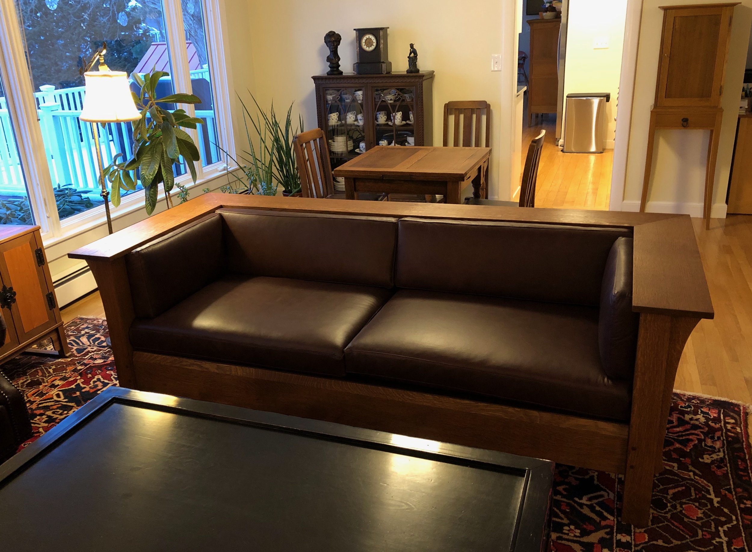


No. 220: the arms

Really? An entire post dedicated to the arms of a furniture piece? Yes. Remember, these are not just any arms.
The No. 220 Prairie Settle from L. & J.G. Stickley was a breakthrough design in 1912 largely because of its arms. On first sight, the size and elevation of No. 220’s wrap around arms command your response to the entire piece. The accompanying corbels and panels, the upholstery, the finish, they all do their part; but those unique arms are why we gasp. Here’s how they are made.
Materials
There are only two components here, both made from quarter sawn white oak. The supporting corbels will be made from the same 4/4 boards as the stiles and rails of the frame. The arms were to be the same thickness, but their 7 3/4 in. width was larger in that dimension than any of the 4/4 boards available at the lumber yard. It would not do to create this span by piecing together two smaller boards and so I sorted through the wider members of their 4/4 S3S (surfaced 3 sides) stock. These are nice boards, pre-planed and so you know the exact grain and ray pattern as you make your selections. Many were 8+ inches in width, however, their 3/4 inch depth meant that they were 1/16 of an inch too thin for what the plans called for, and that’s before I did any final smoothing in the shop. I ended up selecting these. It’s not the end of the world - structure and function will be fine - just a slight alteration to the intended look that I convinced myself would not be noticed by anyone but me (and now, you).
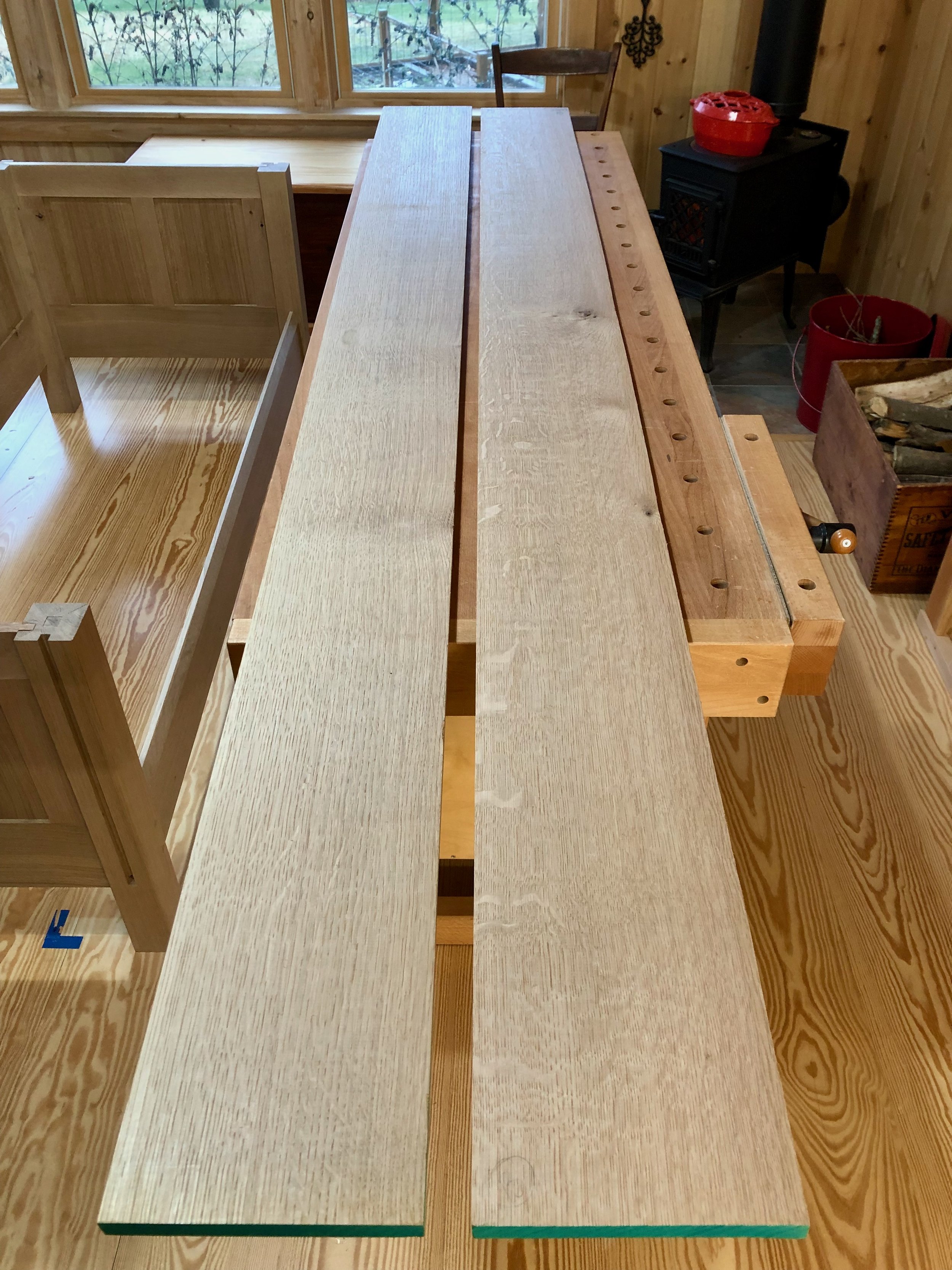
Arm boards
Job 1: Corbels
Corbel is an architectural term describing any projection that juts from a wall to support the weight of an element above it. The arms of No. 220 are supported by the settle’s frame with assistance from seven such corbels spread along the perimeter. Though eye-appealing, these members serve an important function or else they would not belong on a Craftsman design. The plan calls for six corbels of identical dimensions and a seventh, slightly larger one, placed along the center of the paneled back side. I sketched the designs free-hand on card paper after examining pictures of authentic examples (which, again, differed somewhat from the published plans).
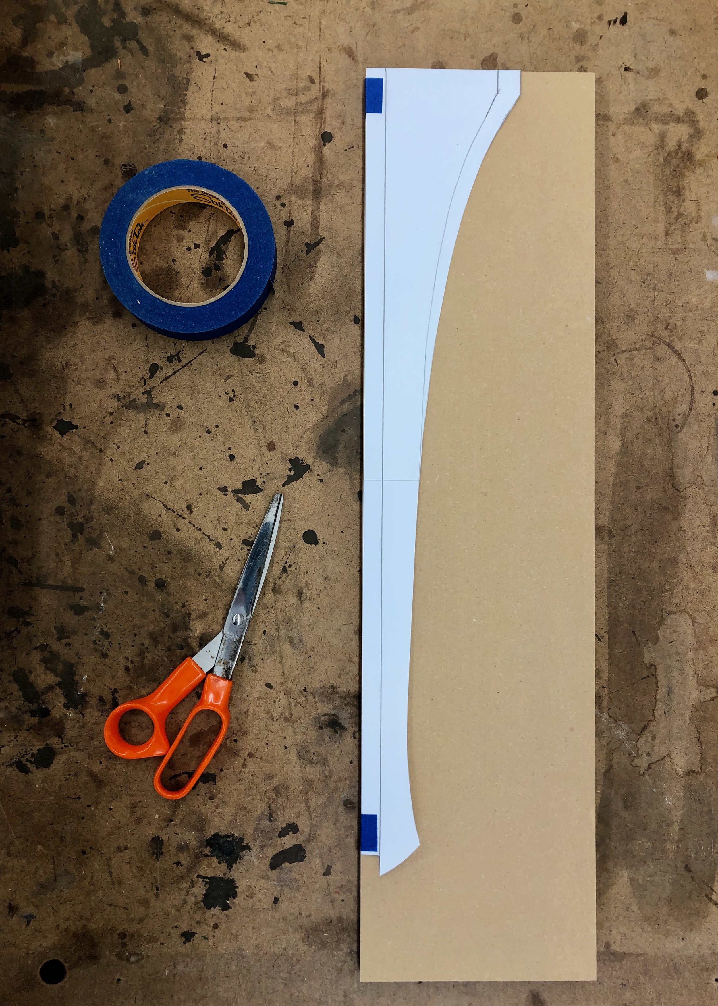
Corbel profiles sketched on paper
The larger template was traced onto 1/2 inch mdf board stock and the paper was then trimmed back to the smaller template which was also traced. Next, the mdf template versions were cut-out at the bandsaw and the curves shaped smooth “to the line” using a drum sanding bit on the drill press. These two new “patterns” were then used to trace their shapes (1 large, 6 small) onto prepped white oak boards and the shapes were cut-out at the bandsaw as before. I tried to stay about 1/16th of an inch outside the lines during these cuts.
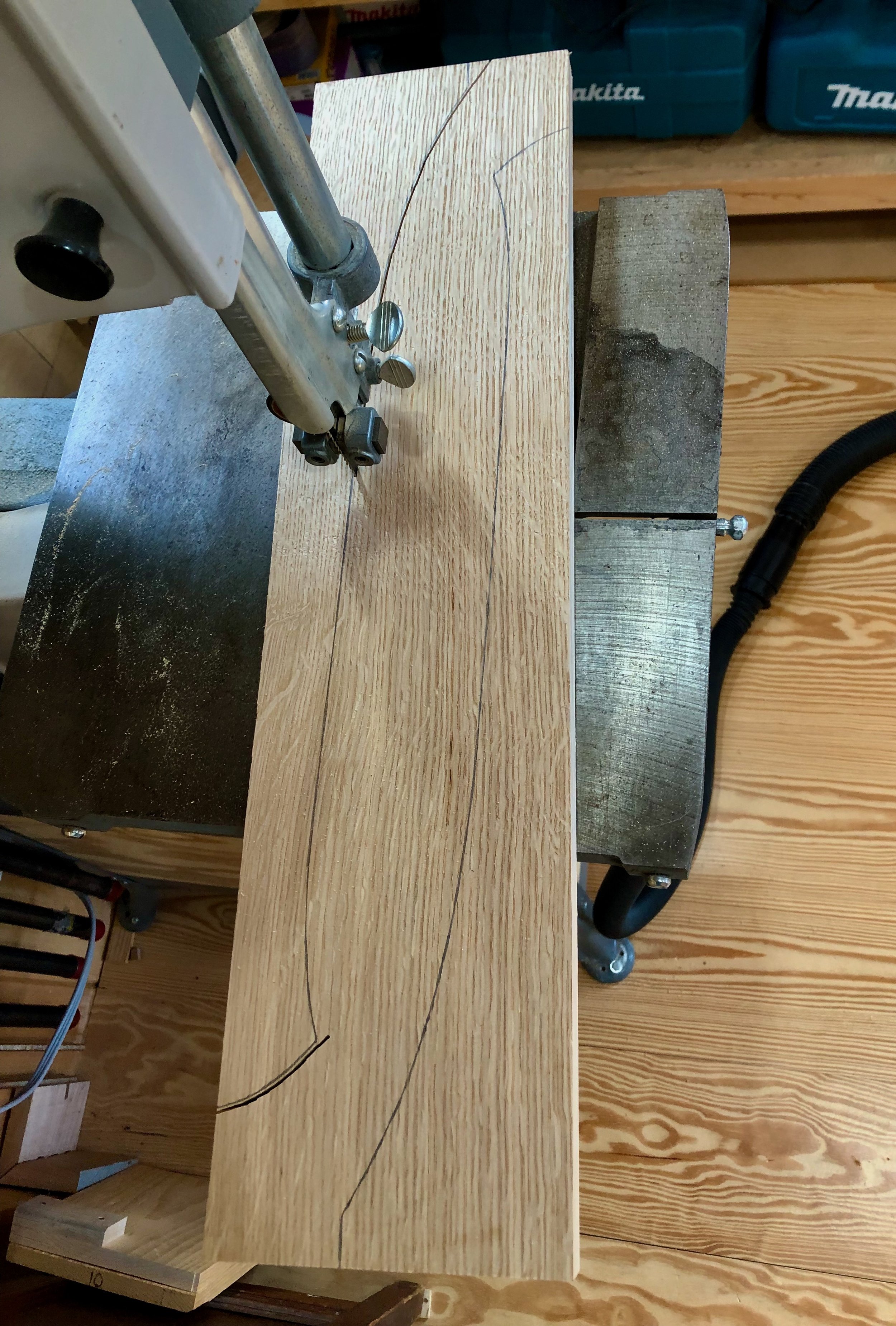
Cutting out the corbels, two per board
Next, the wood needed to be cleaned-up. A card scraper and 150 grit sandpaper were used to smooth the flat surfaces, whereas, the “cut” edges would be shaved to the line using a flush trimming bit at the router table. In this operation, the mdf patterns made earlier would serve as guides for the roller bearing to ensure that all curves ended up exactly matching the originals. I glued a couple of lips to the mdf patterns that allowed these to be temporarily affixed with screws to the corbel about to be shaped. Worked out well … except that on a couple occasions that little flare near the bottom was, unfortunately, clipped-off in the process. Tear-out like this is sometimes hard to avoid, and the quarter sawn grain orientation only made things easier to rip away. No problem, I just penciled a shallower “upturn” on these two defectives and then drum sanded to the line on the drill press. They say much of woodworking is actually “correcting mistakes”. These’ll look just fine.
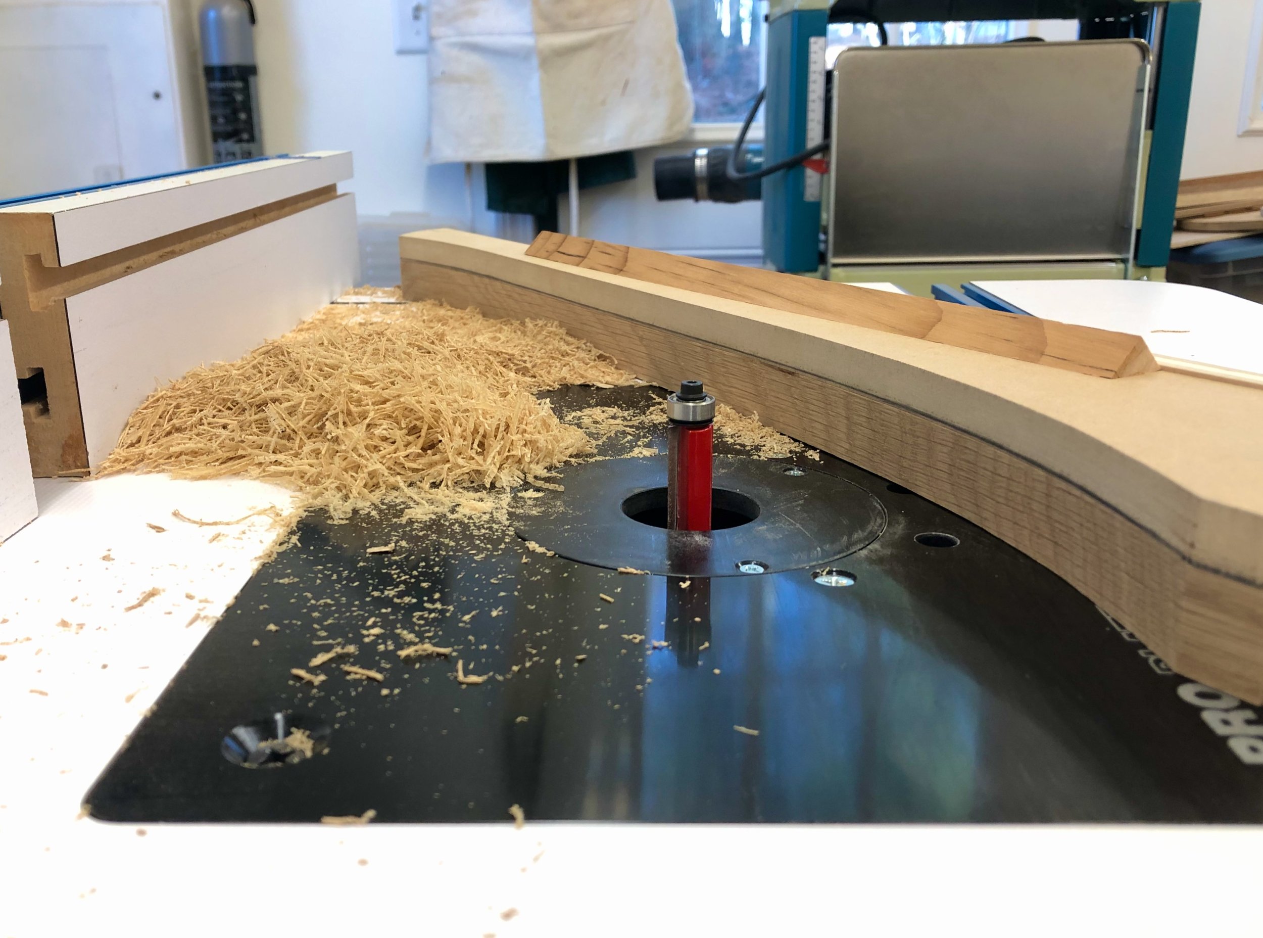
Shaping the corbels to pattern with a flush trimming router bit.
All that remained was to create tongues along the back edges for these parts to mount within the previously grooved legs and central stile. This was done using the dado blade on the table saw. Following a final trimming for fit, the corbels were ready for assembly.

No. 220 corbels
Job 2: Arms
These should be easy. The final dimensions are all in hand: the arm lengths are determined by the as-built frame dimensions; and the 7 3/4 inch arm widths were prescribed by the plan. It all comes down to the order of operations and execution of tactics; in short, properly sawing the four 45 degree angle miter cuts. The goal here is to have a uniform looking seam, and one that is as tight as possible. My strategy was to cut one end of the back, say the “right-hand” side, and the corresponding right arm and try to get that joint “correct” before tackling the other side. That way, if a recut is needed, I would still have length to play with along the back. Should everything go as intended each of the corner angles sum to 90, but any deviation from 45 degrees in this first cut would need to be compensated for in the second if both the 90 degree angle and a tight & true seam are to be formed. I’m not sure why this situation bothered me so much before any cutting occurred, maybe its just the scale of things (an 11 inch hypotenuse!). Anyway, because of that scale I decided that the sliding miter saw was the machine to use for making the cuts.
To get started, the board stock was ripped to the correct width and the edges jointed square. Things are too cramped in the workshop to wield a 7 foot board at the jointer and so an antique No. 7 Stanley jointer plane, once belonging to my great-grandfather, was used to square the edges. Andrew restored this beauty a few years ago and it provides smooth & faithful service whenever called upon.

100+ year-old Stanley No. 7 plane and arm board
Time to do some cutting. The first miter was sawn on the back arm and then things got hairy. Not only was it not the perfect 45 degree angle set at the sliding miter saw, the cut, itself, was a bit “hollowed-out” in the center. What’s going on here?!
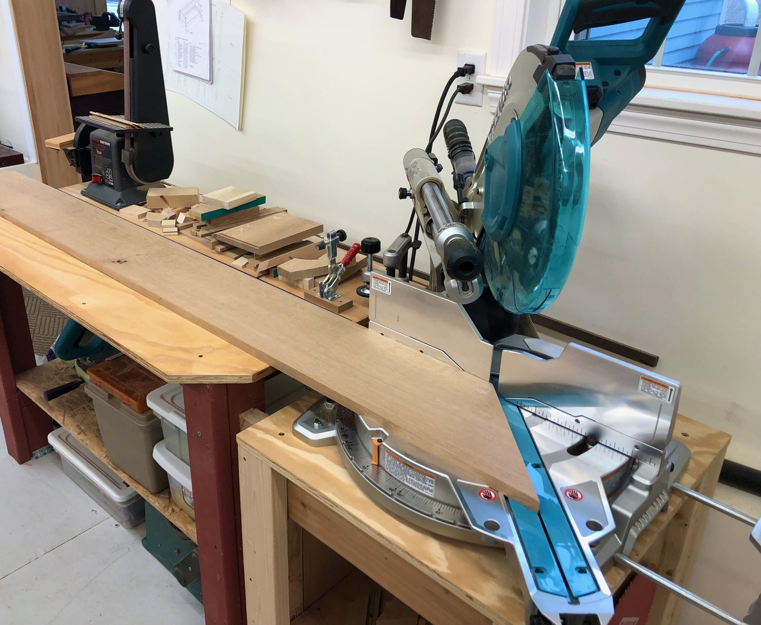
Cutting the back arm miter
I cut the second board and, again, things were just not right. While these were not fatal imperfections they would need to be fixed before joining. Maybe I should have paused at this point and just switched to using a track saw, but instead I took the route of fashioning a shooting board to correct the situation. Shooting boards are handy shop jigs that are easy to construct. They are used to guide a hand plane tilted on edge to cut along end-grain wood and I always thought I might need one to smooth the sawn edges before joining - only now it was required to also rescue the integrity of the angle, itself. Most 45 degree angled shooting boards are rather small, used primarily to shave the ends of picture frame stock. The challenge in this case was making a shooting board that could accommodate an 11 inch “shave” at the end of a 7 foot board. The typical design was a non-starter for this scale, but the key mechanical features could be preserved in a temporary set-up constructed from a few oak boards, screwed together and then clamped to the surface of my workbench (see below).

Shooting “board” set-up, in use
This “jig” worked surprisingly well. With a re-sharpened plane iron and some patience the skewed quarter sawn end grain was brought back to a flat 45. Not knowing the cause of the original error, I proceeded as planned: cutting at the sliding saw and beautifying that result as best I could at the shooting board until both of the corner joints passed inspection. I have since discovered a mechanical mis-alignment between the saw’s blade and the sliding arm. The machine is currently undergoing rehabilitation at the local Makita service center. I know, ‘it’s a poor carpenter that blames his tools’ - but they should, at least, meet you halfway!
Assembly
One final modification prior to assembly: biscuit slots. “Biscuits”, mentioned in earlier Projects, are football-shaped wooden wafers that assist glue joinery in two ways: 1. by providing a mechanical alignment between two pieces; and 2. by furnishing face-grain mating surfaces, which is particularly valuable when, as in this case, the joint involves end-grain wood - a notoriously poor glue bonding surface. I cut two biscuit slots into each of the angled ends with my handy biscuit joiner. Glue applied into these slots and unto the faces of the biscuit wafers will furnish a strong bond “within” the joined arm sections. I also cut three such slots into the upper rail and back arm board to ensure proper register here during assembly.
Final assembly of the arms would occur on top of the frame. The main object here was to attach the three arm pieces together, paying particular attention to the mitered seams, and since I needed a flat area to do this, it was either the frame or the floor. Also, since the assembled “U”-shaped arm structure would be rather fragile and unwieldy to handle afterwards, I decided to glue the arms to the frame at the same time. This necessitated mounting the supporting corbels in place too and so the whole thing was glued in a single session with assistance from my son, Ben. It went pretty well. I clamped and glued the long back arm section and its corbels to the frame first. After a 45 minute cure this gave a stable base for attachment of the remaining pieces, and it also allowed me to liberate and re-purpose some clamps - always a limiting resource. Next, the remaining corbels and side arms were glued into place. No drama (whew!).

All parts glued securely in place
The clamps were removed the following day and everything looked as it should. To complete the arms, the surface was sanded lightly with an orbital sander and then all of the sharp edges surrounding the arms were broken using a sanding block. A final hand-sanding over all surfaces (150 grit) made everything smooth and ready for finishing.


Branching Out

Another year under the Red Top and time to reflect on that newly formed ring.
Incremental mass
First, the facts. Along with a few accessories for our home and some items crafted for family & friends, 8 capital “P” Projects were completed during the year (plus, the No. 220 is well on its way). Not a bad year. I’d say the Ledger chest was my favorite piece, followed closely by all the rest. Included in these are a garden structure and a “winged animal” house, the construction of which are now becoming annual traditions.
Those are the quantitative metrics, easily compared year over year. Qualitative metrics also count, and these come from the new techniques and lessons picked-up along the way. For instance, when the year began I had yet to construct my first drawer and now I have made nine. Sliding doors (2), a sliding lid (1), panel edged boards (11) and finger jointed corners (4) were also fashioned for the first time in 2022. Learning new skills is the most rewarding part of the workshop experience for me; that, and capturing the thrill of it all in this forum. Upon reflection, I probably last acquired manual skills during my graduate research days, and then spent the subsequent “working” years applying those in and around the chemistry laboratory. It feels good to again be in a realm where there is room to grow.
New Growth
The Red Top Workshop sits in Harvard, Massachusetts but its roots emanate from the opposite hemisphere. “Asian Inspired Furniture” is the tag line on the website and East Asian furniture design was the inspiration for nearly everything built during my first few years as a woodworker. This theme was continued in 2022 with completion of the Ledger chest (Japan) and Stationery chest (Korea), but a new style has gained my interest based on the Arts and Crafts movement of the late nineteenth and early twentieth centuries. English Arts and Crafts furniture design, and its American cousins, “mission” and “Craftsman”, produced beautiful furniture that relied on simple construction, meaningful features and robust materials as their raison d'être. Conceived as a response to the overly ornate Victorian styles, Arts and Crafts furniture also happens to share many characteristics with the simple, straight-forward works of Korea and Japan. Previously, I have commented on the genius of Gustav Stickley and the influence of his Craftsman designs on American furniture, and will likely have more to say on the Arts and Crafts pioneers as I continue my research. The aesthetic is so compelling to me that it is sure to populate future work.
In fact, I may need to re-brand so as to include this broader interest into the identity of The Red Top Workshop. That, too, is a satisfying aspect of furniture making; the ability to respond to developing interests by applying previously acquired skills to the creation of new motifs. If you think about it, that’s how a tree shapes itself over time, developing branches where the light is best. And thriving in the process.
Happy New Year!

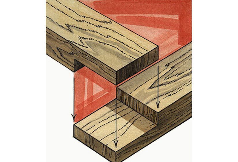