

Under the Red Top
making the best of life & wood


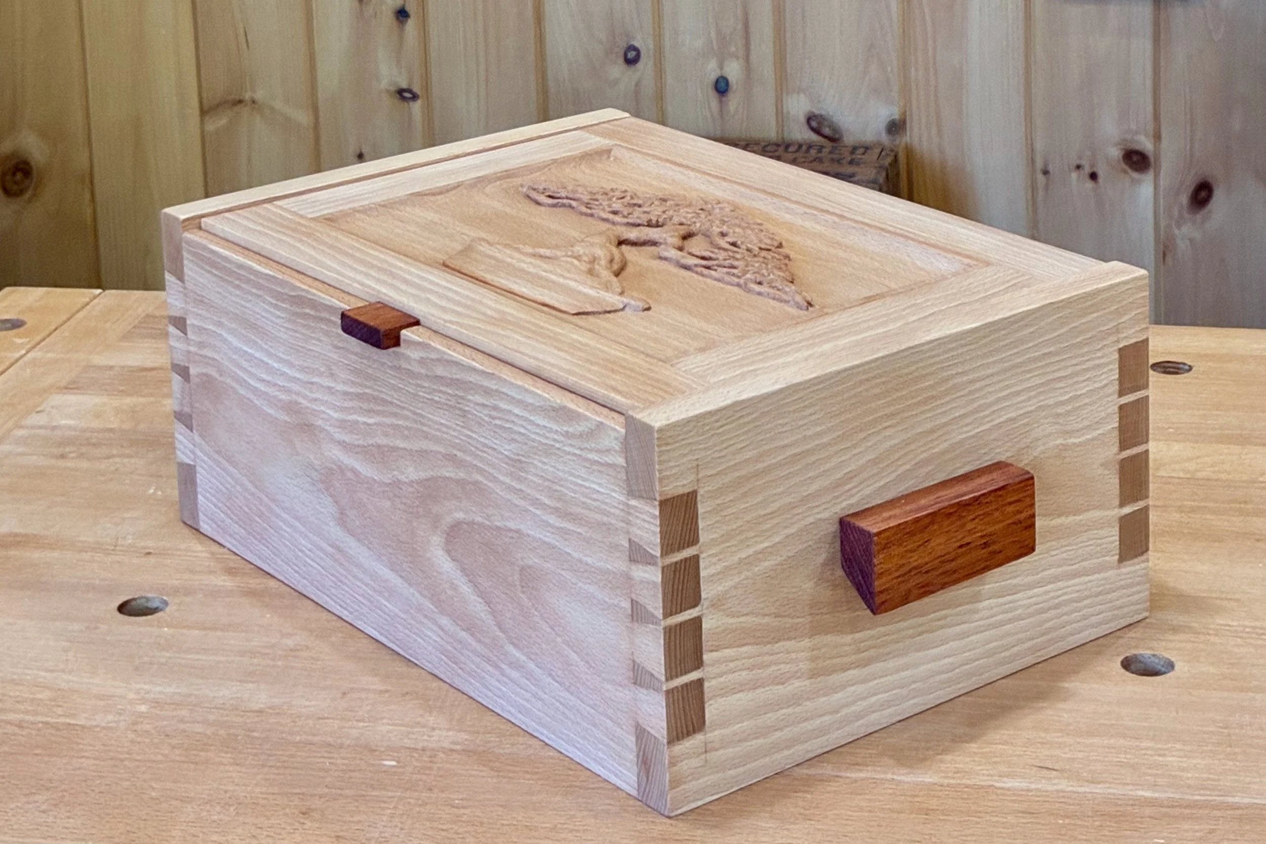
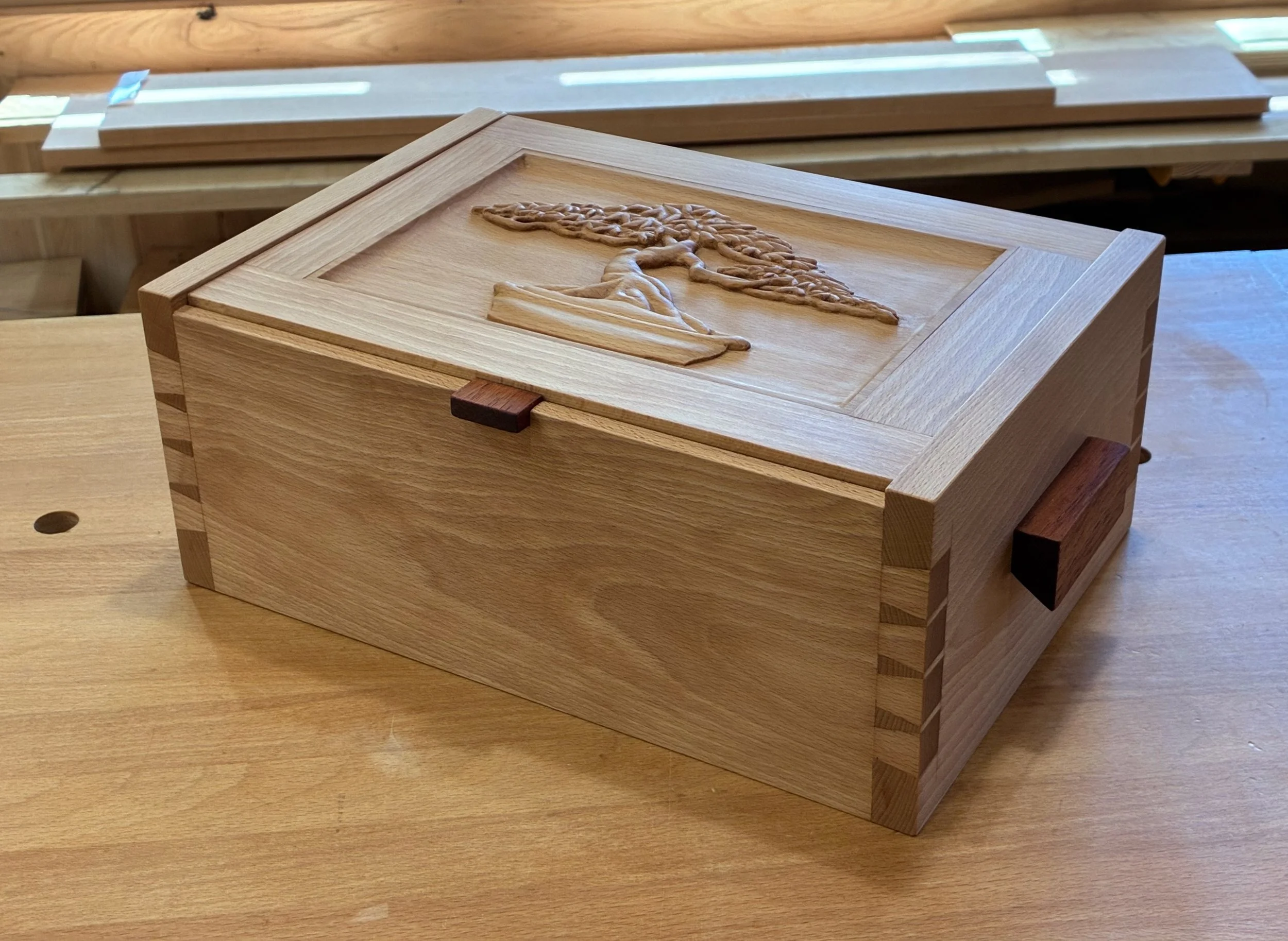
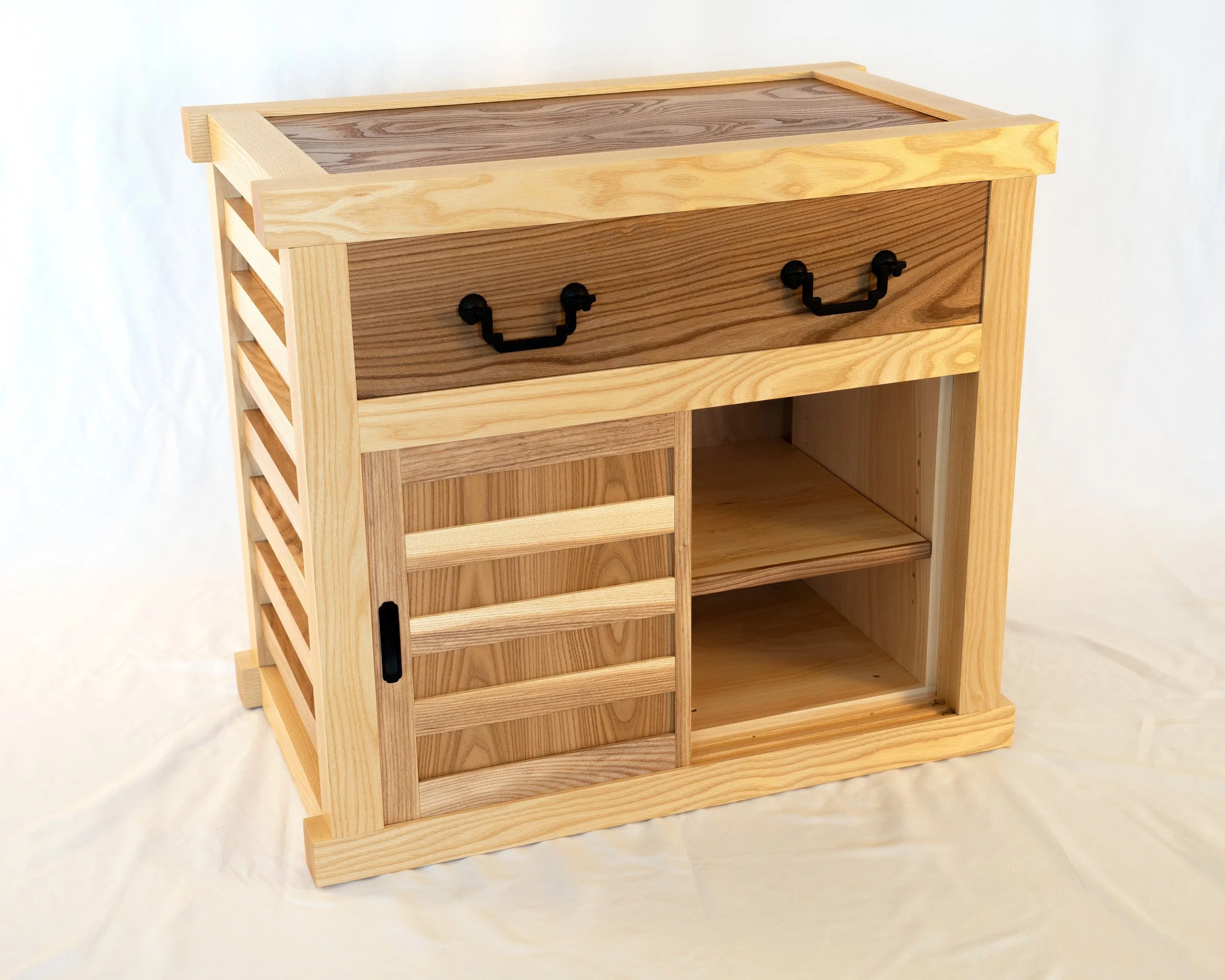
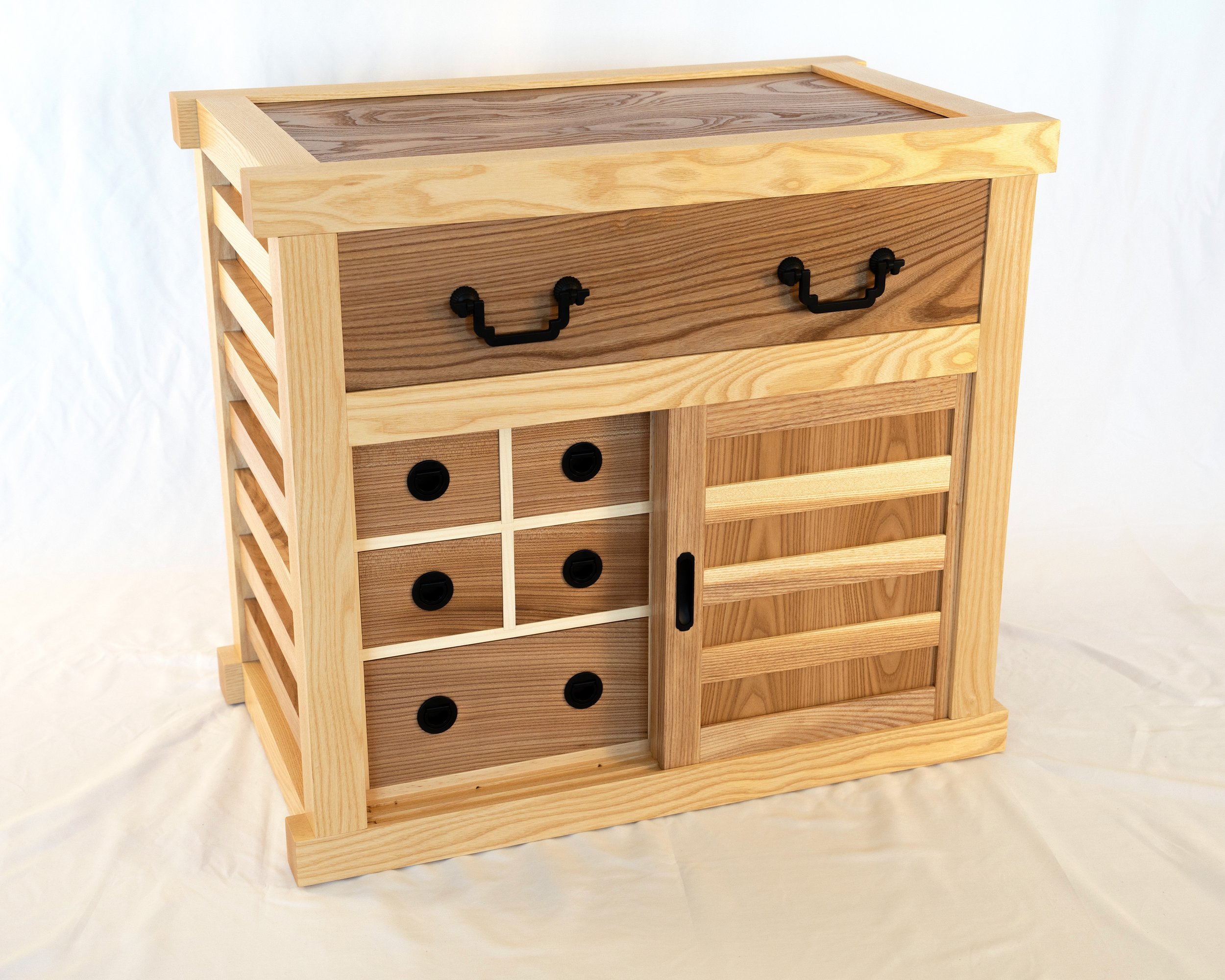
Bonsai Toolbox
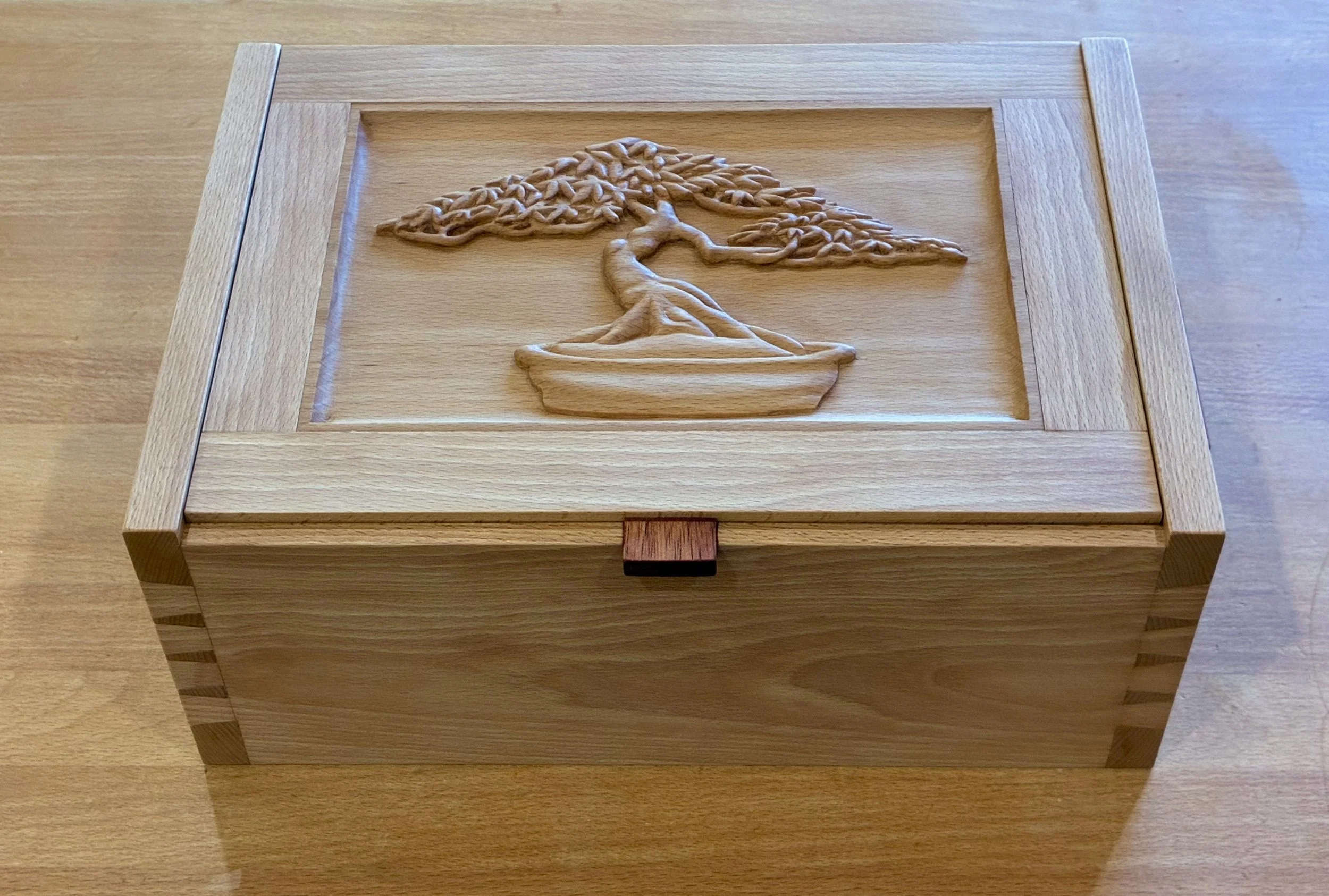
Here’s another bonsai build; not for trees but for tools!
Much like woodworking, the bonsai “gardening art” relies on a special set of tools to clip, shape and otherwise maintain small trees. Those tools, beautiful objects themselves, are a joy to use but they also require maintenance. One important responsibility is to keep them stored where you can find them and out of harm’s way when not in use. There, the analogy to woodworking also applies, but I have yet to encounter a purpose-built bonsai “toolbox”. That seemed like a miss, and one that I intended to rectify while my tools were still in mint condition.
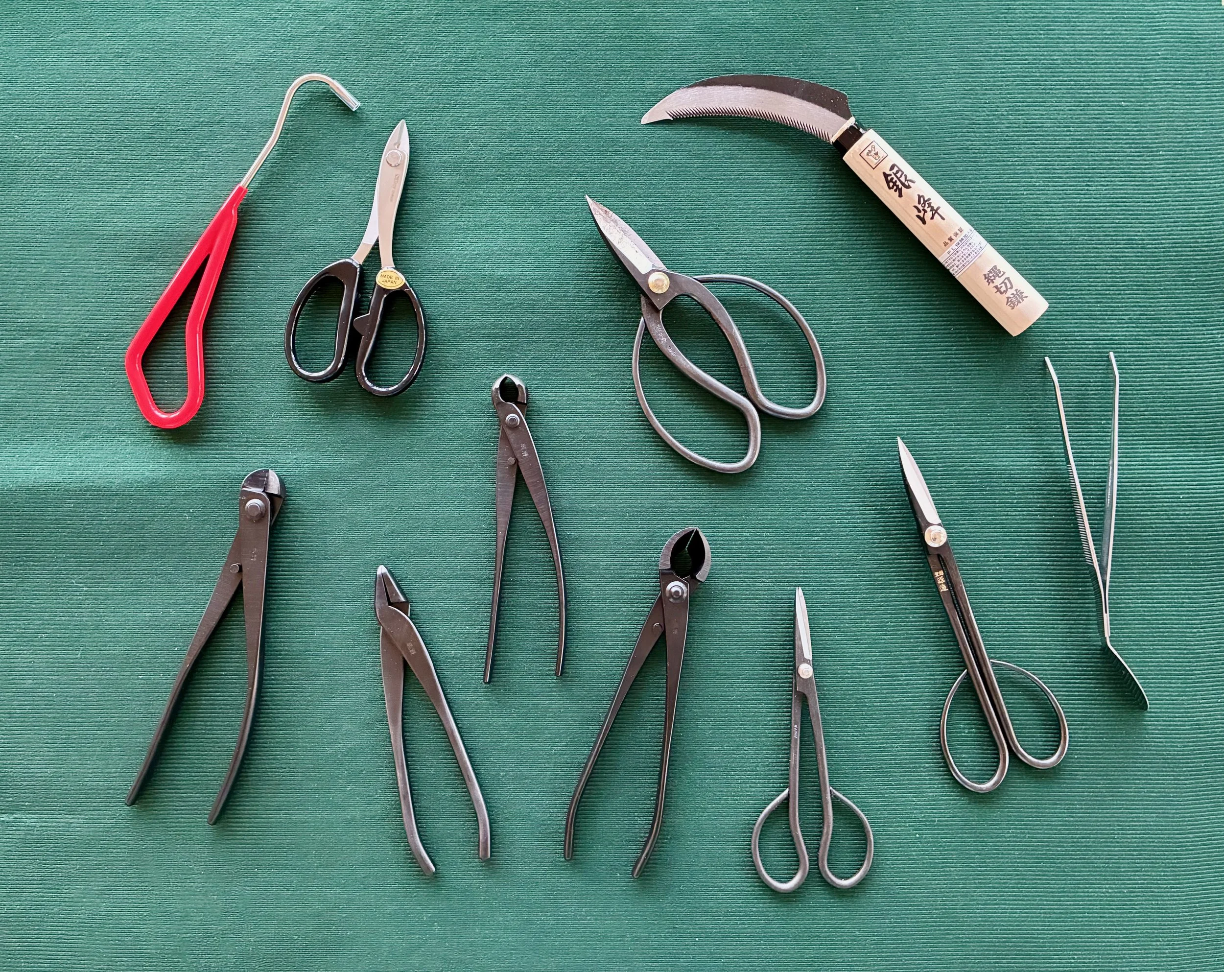
My bonsai tools
Design
Thinking historically, I found a canonical Japanese carpentry toolbox, made of wood with traditional joinery, that was my first design idea. However, intended to store saws and hand planes, it is a much larger box than I require. I spent some time scaling the dimensions back, but, on paper anyway, this no longer appealed. Too utilitarian, somehow.
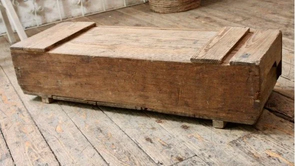
Example Japanese tool box
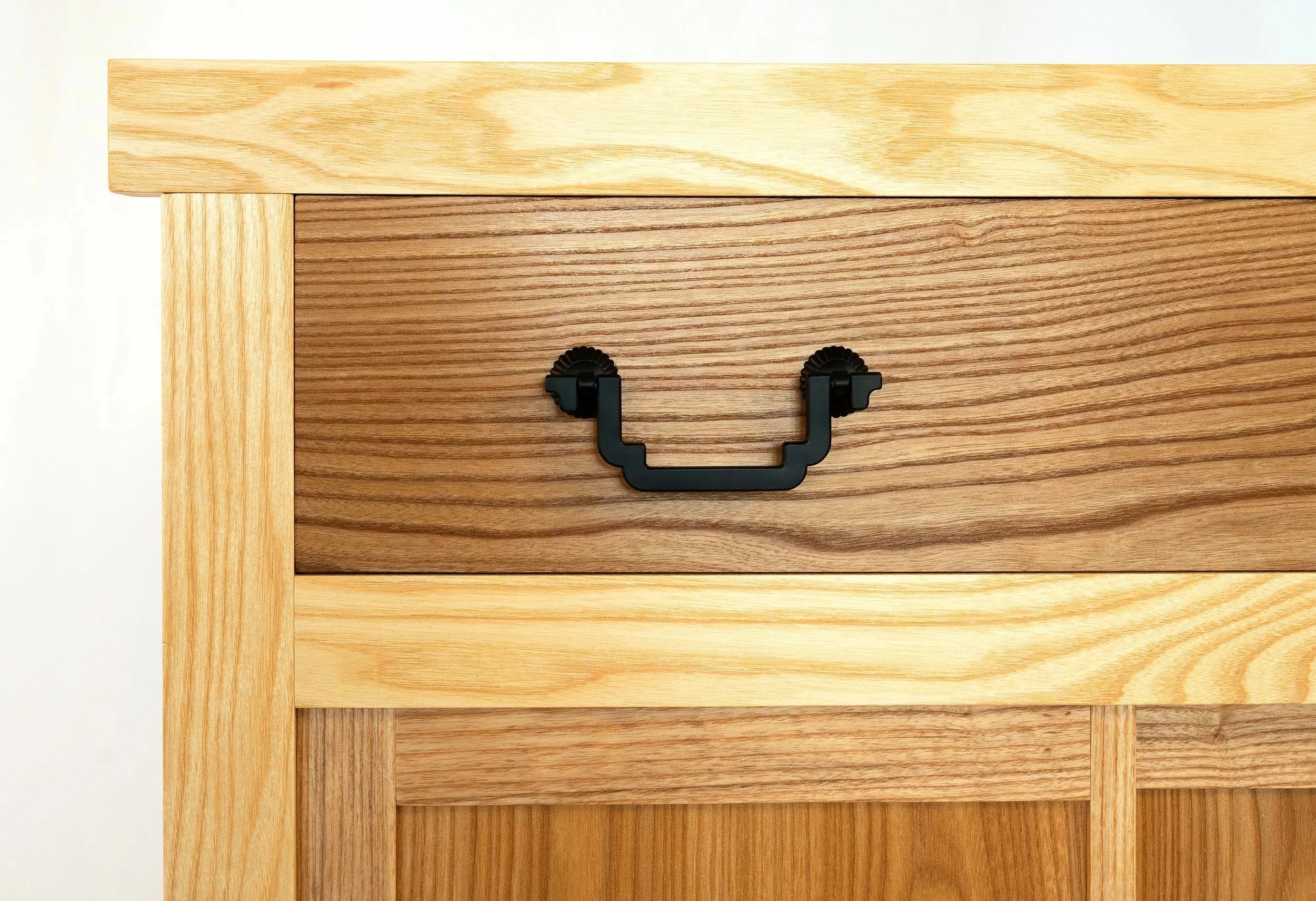
It was about this time that I received the Oct/Nov 2025 issue of Fine Woodworking. The featured project for this issue was a beautifully crafted jewelry chest that one could imagine might also serve as a box for bonsai tools. Inspiration arrives through the mail.
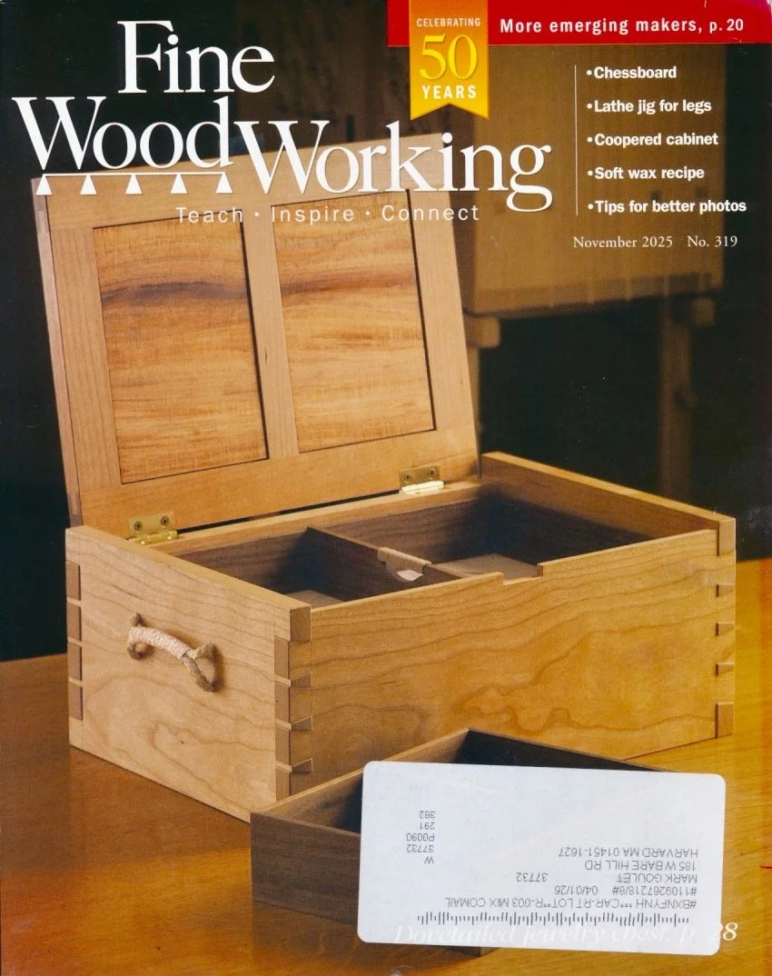
Timely issue: Fine Woodworking, No. 319, Nov. 2025.
This chest, made and described by Michael Pekovich, looked more appealing to me and, while I had some modifications in mind, the overall dimensions seemed perfect. Thus, the beautifully rendered plans, created by John Hartman, were photocopied and taken out to the shop.
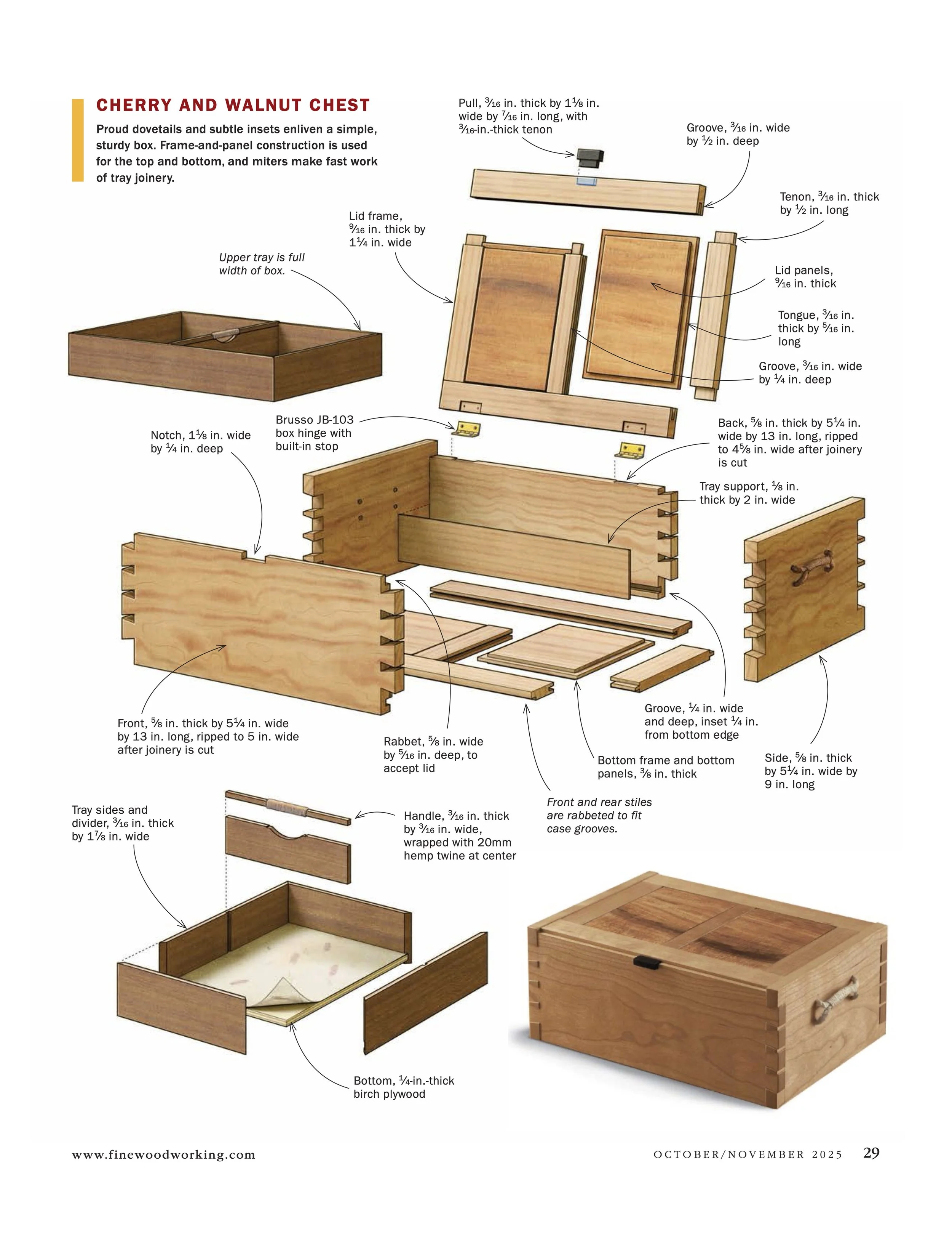
Exquisite and detailed plans help a lot!
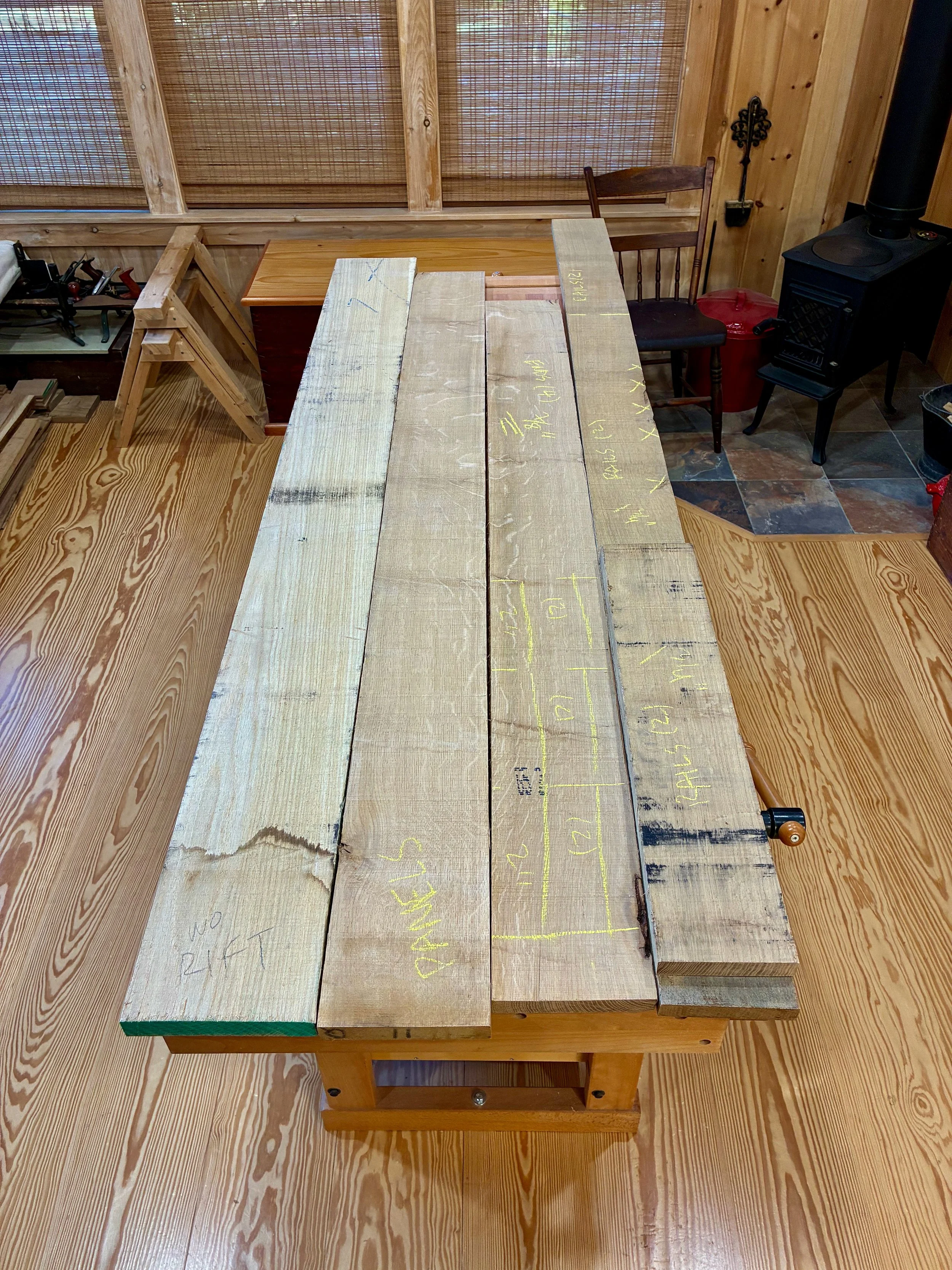
Materials
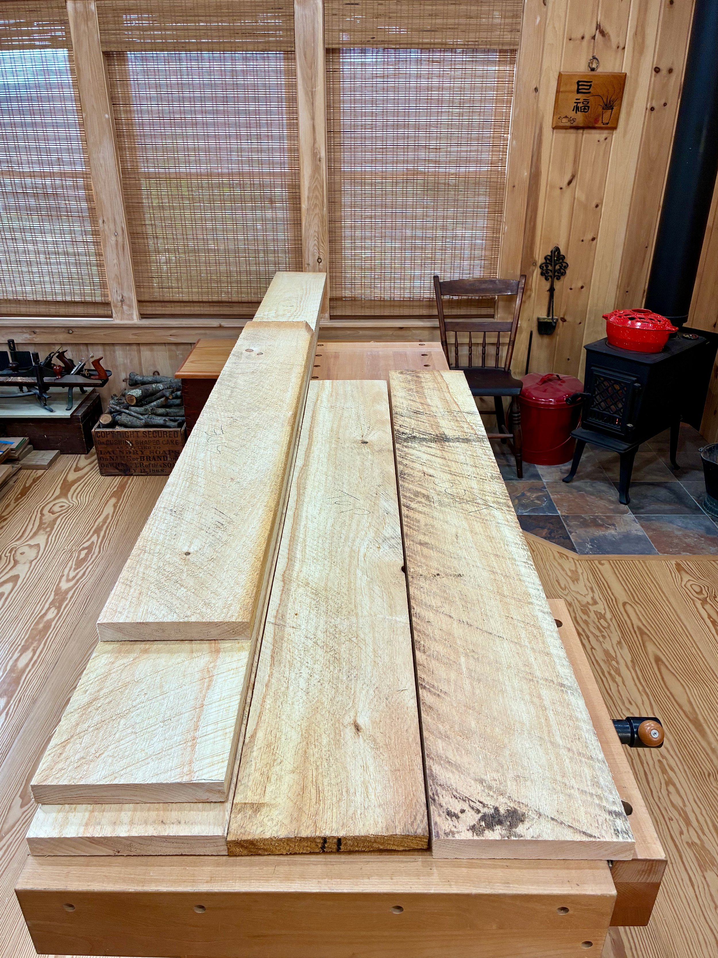
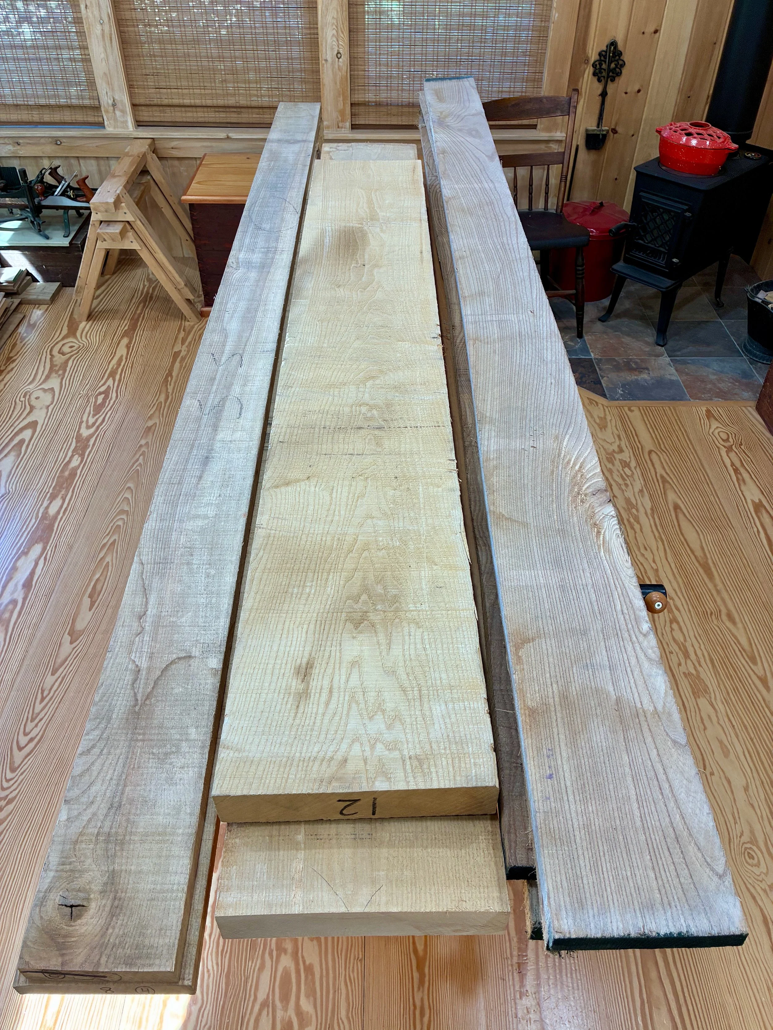
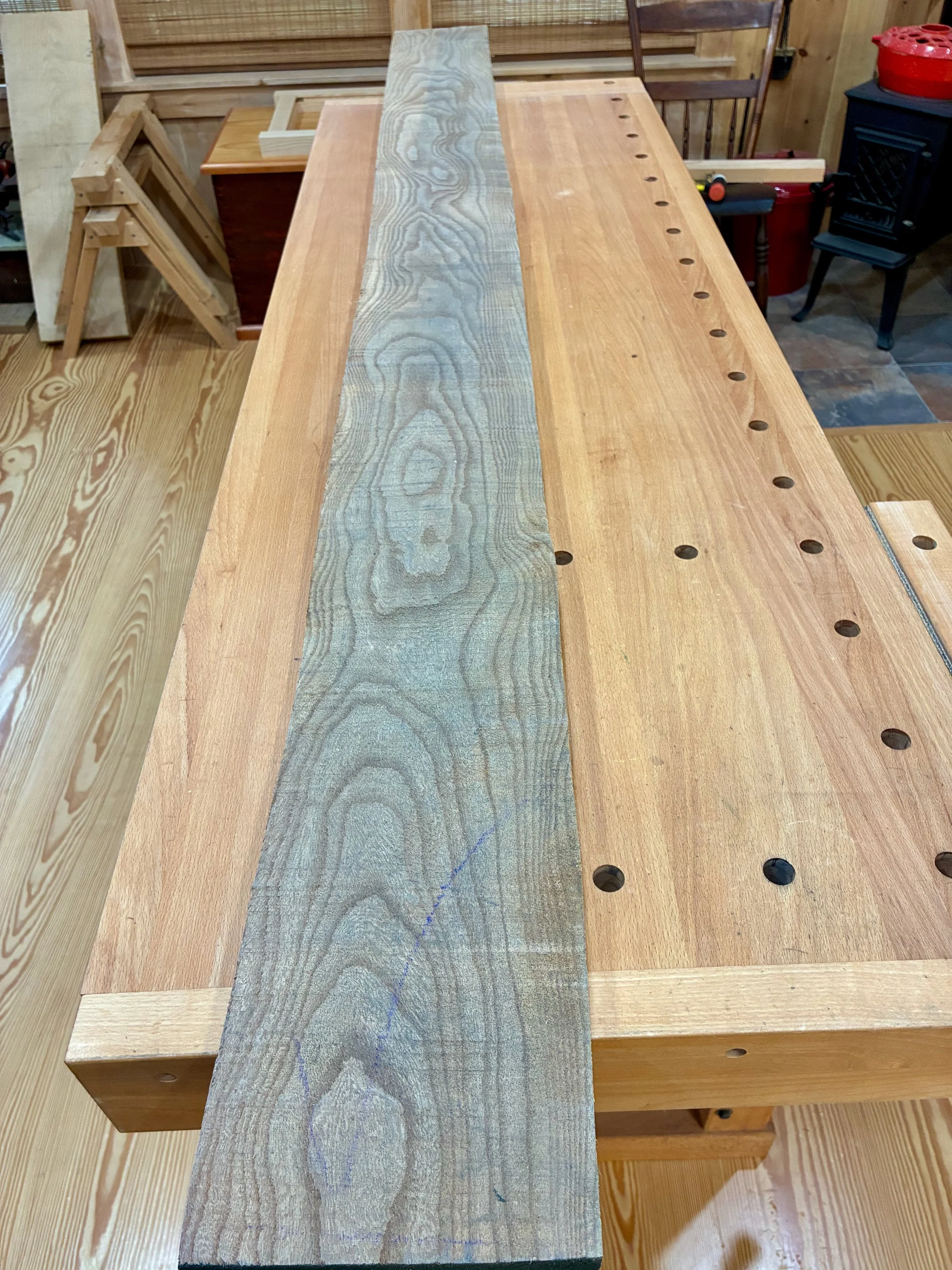
The FWW jewelry chest was made of cherry and walnut but I chose European beech as the wood for my box. Tools call for workaday wood. I already had a plank on my rack that would serve for the frame parts and planned to pick up a wider board when it came time to make the lid.
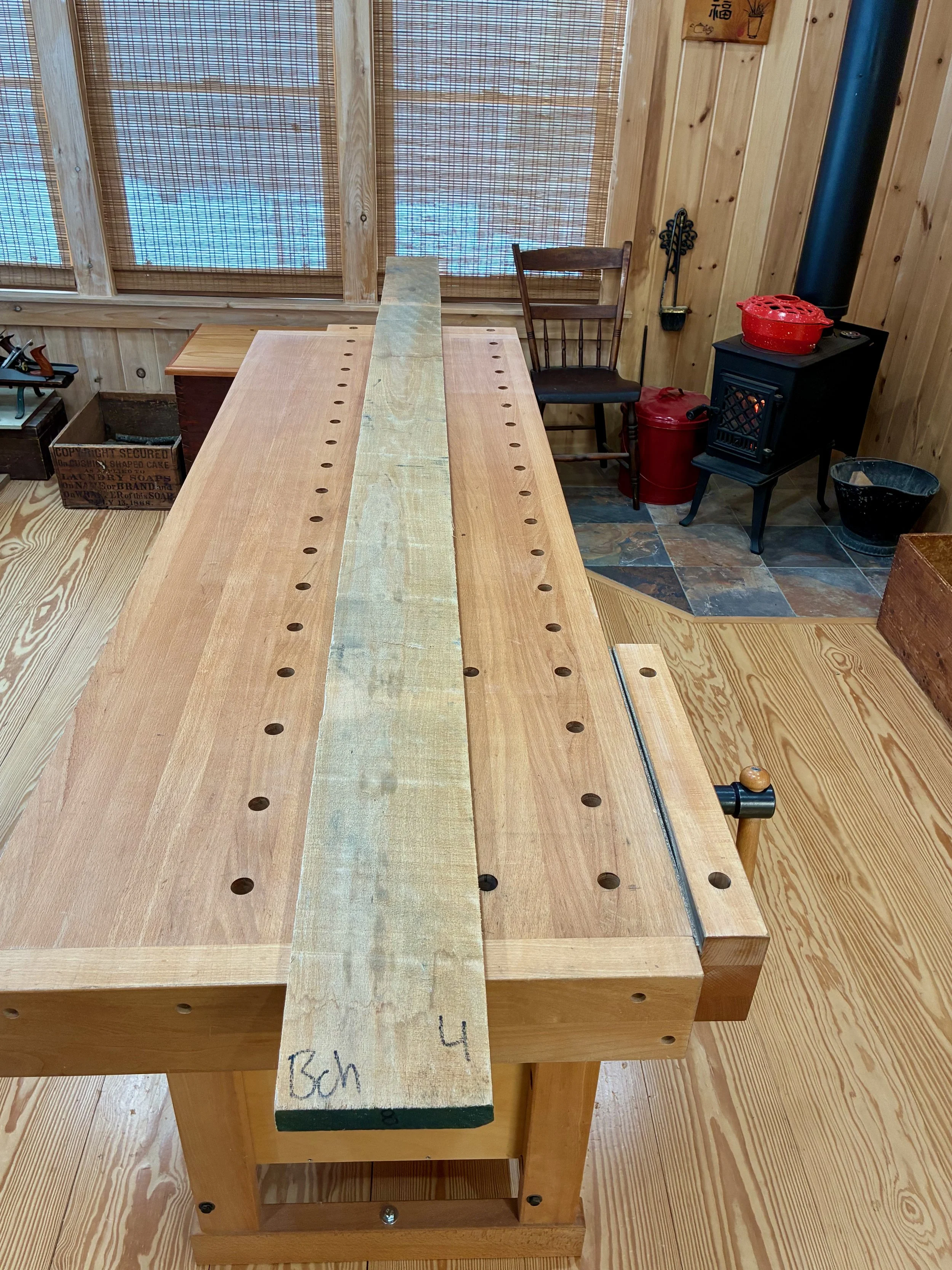
4/4 European beech
Dimensioning
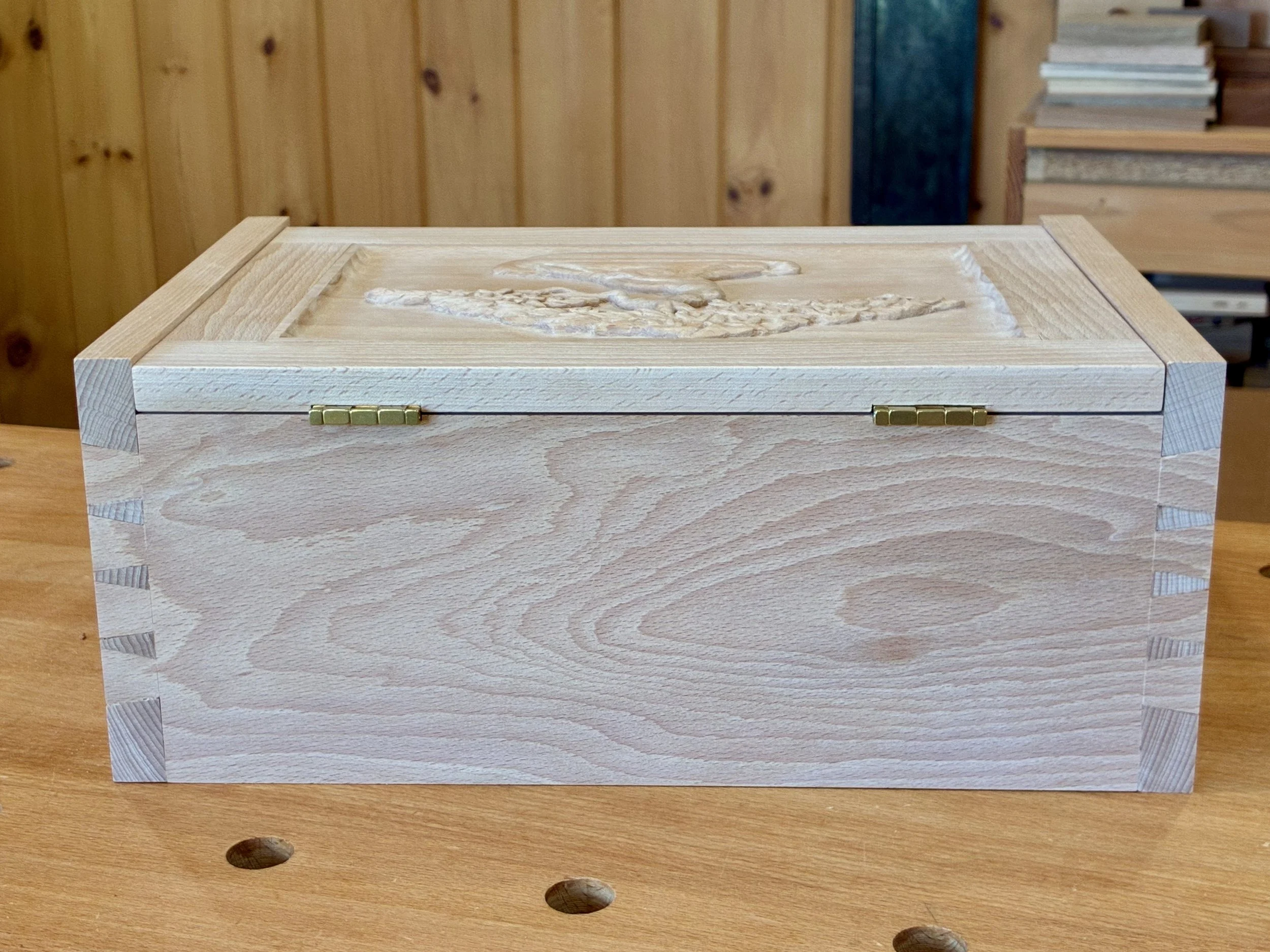
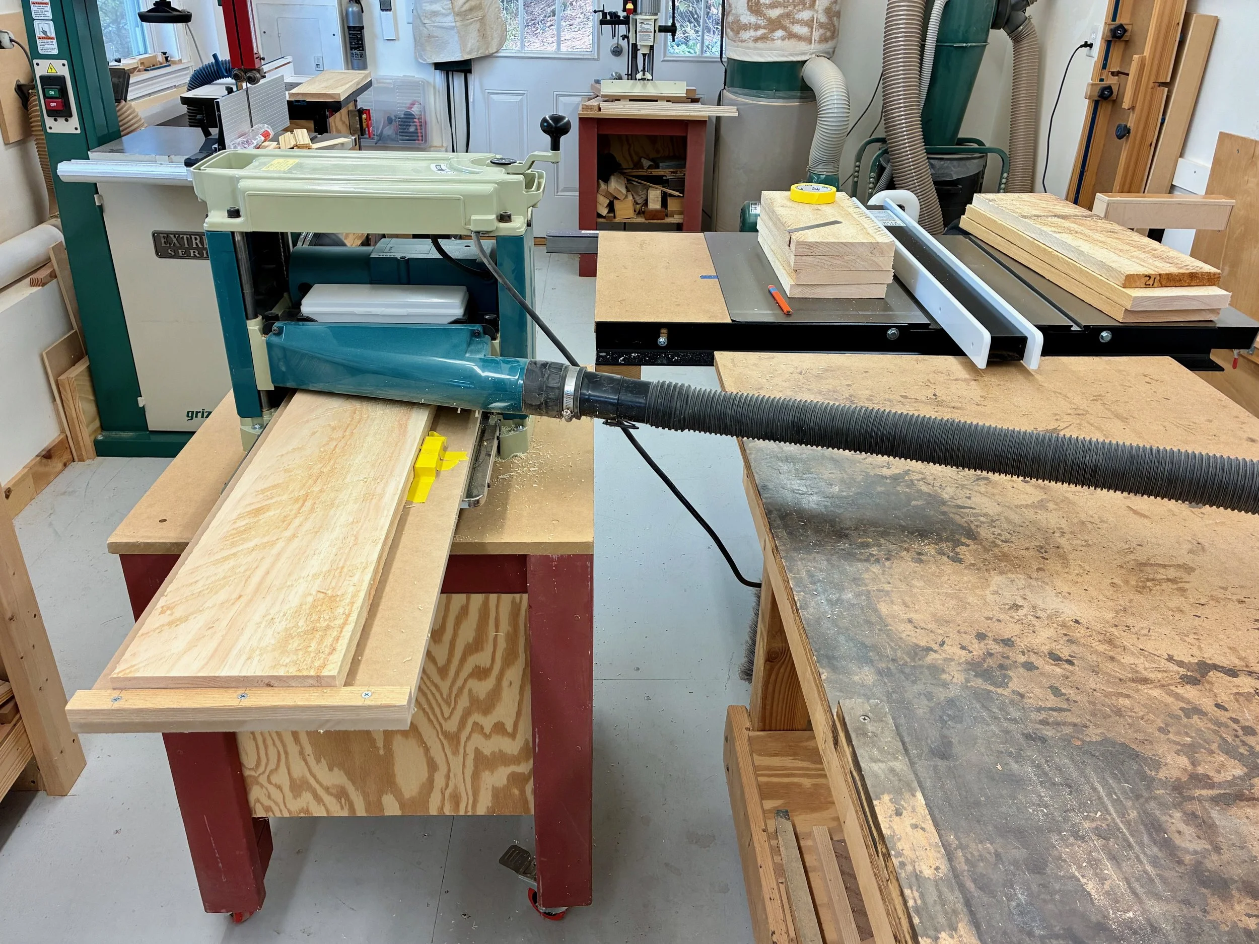
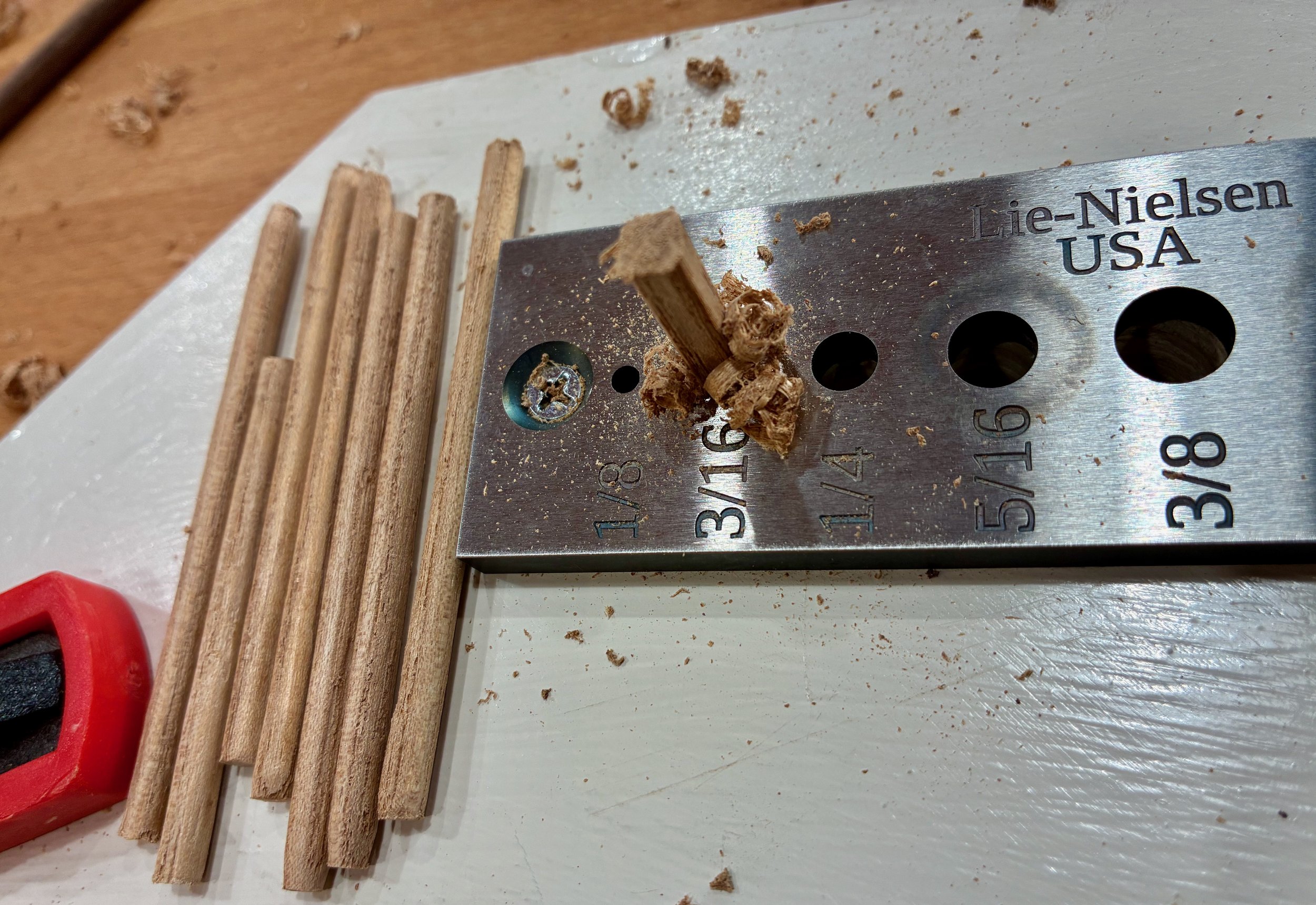
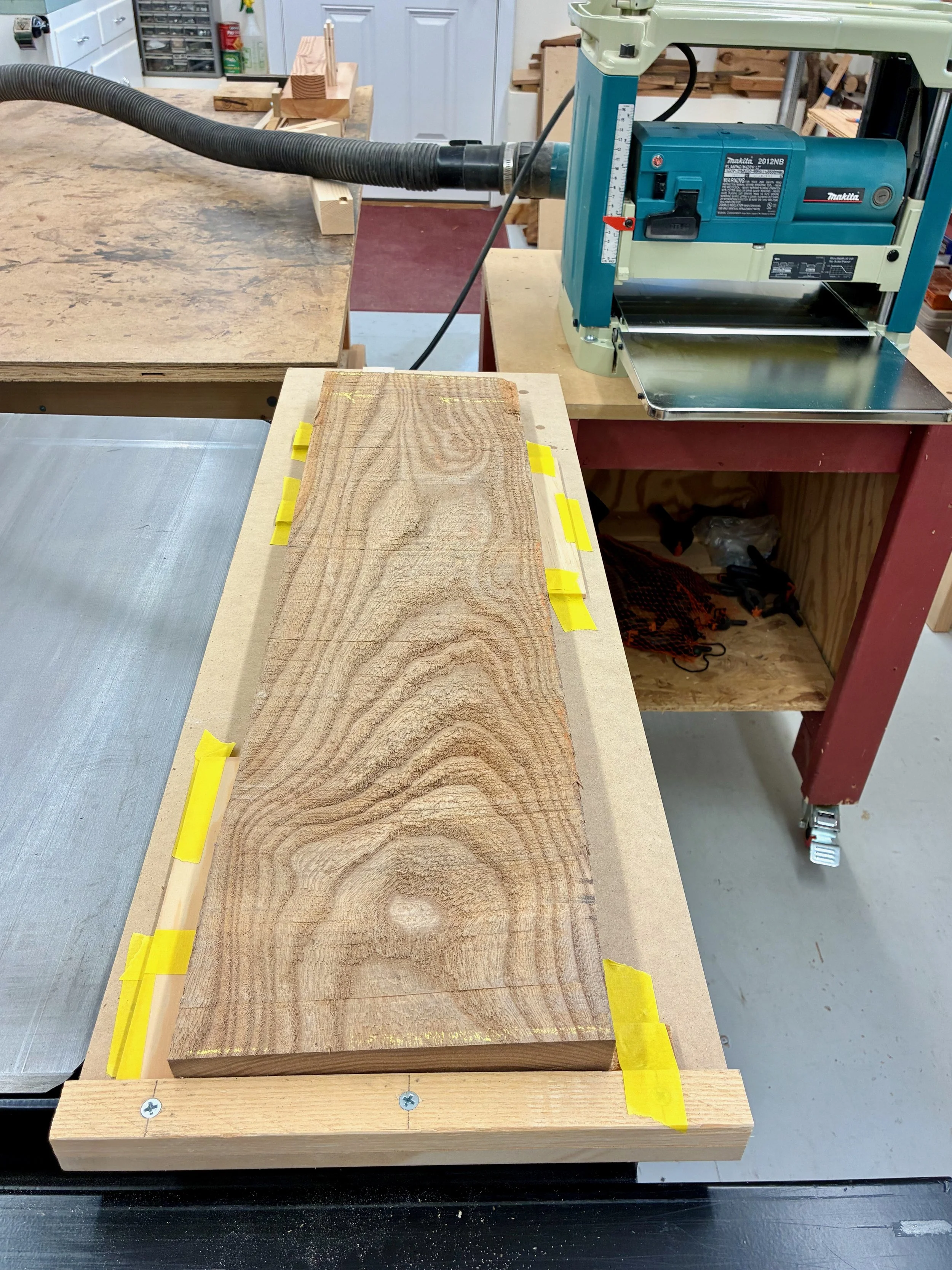
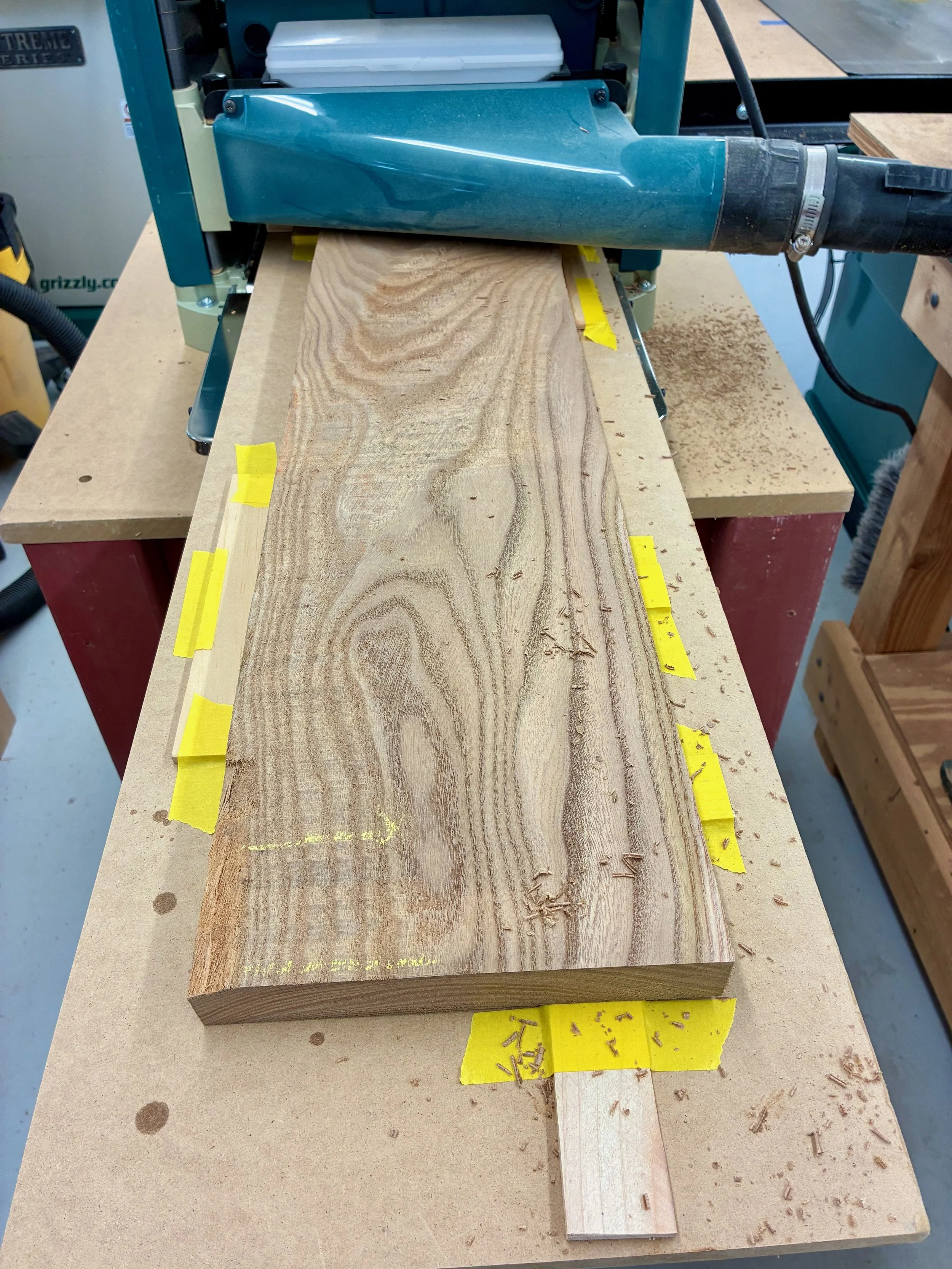
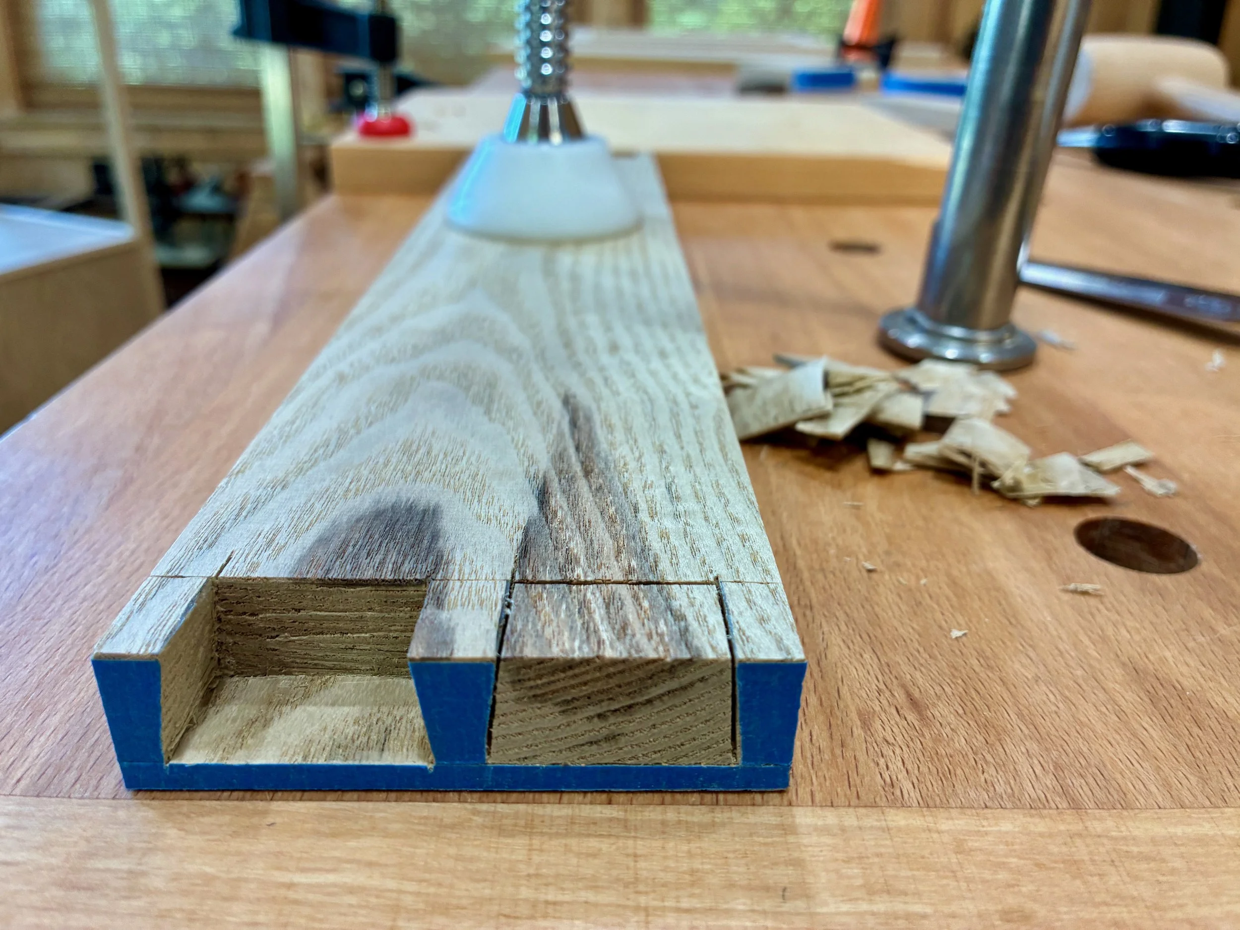
That rough plank was readily chopped up, jointed flat & square, thickness planed to 5/8 in. and then trimmed to final dimensions in preparation for dovetail work.
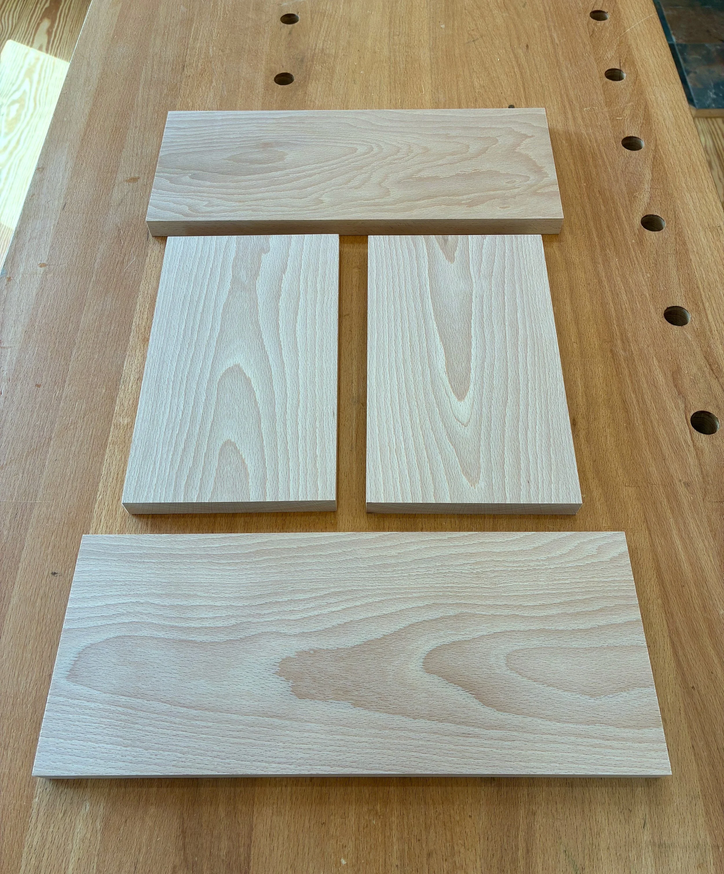
Box side material
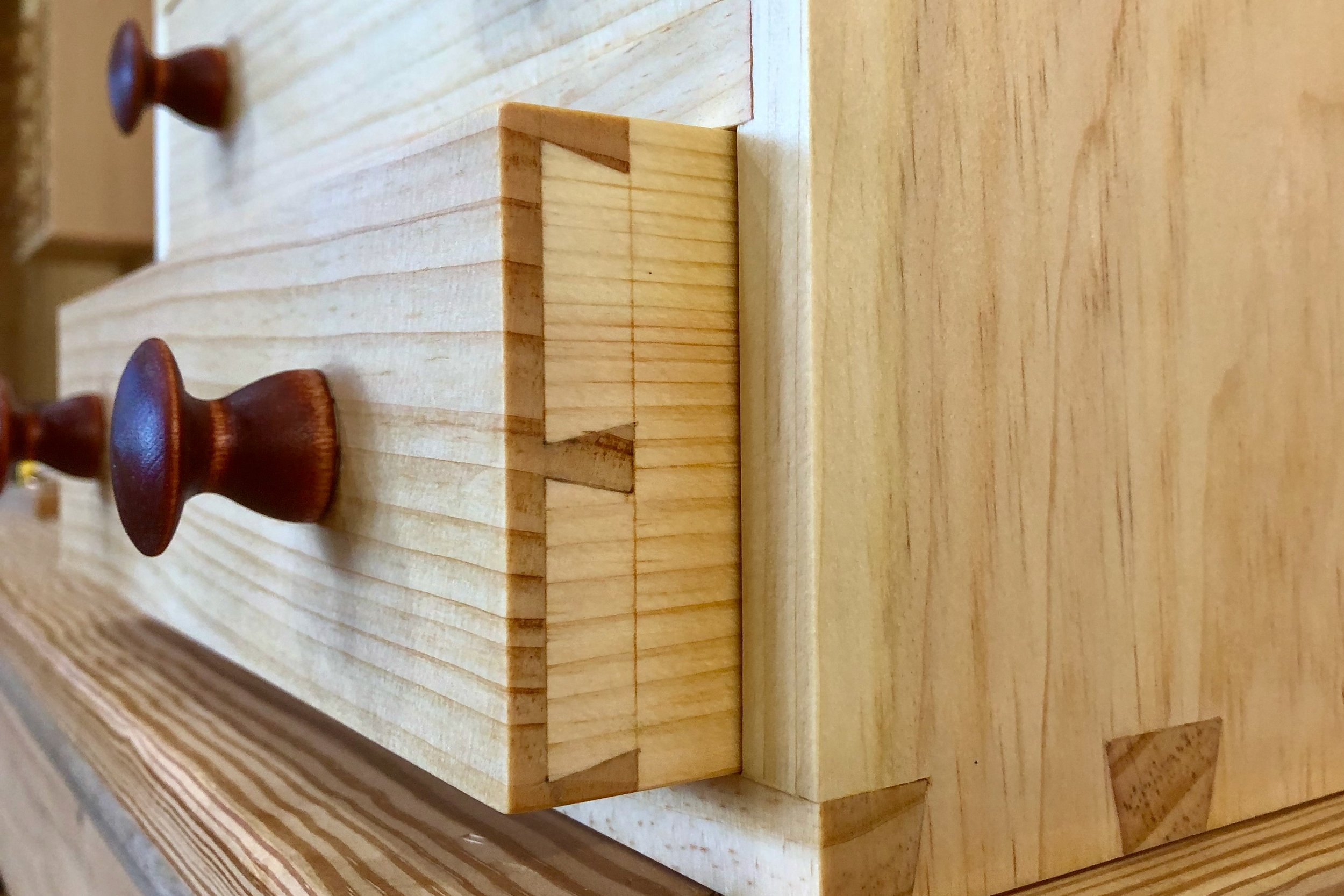
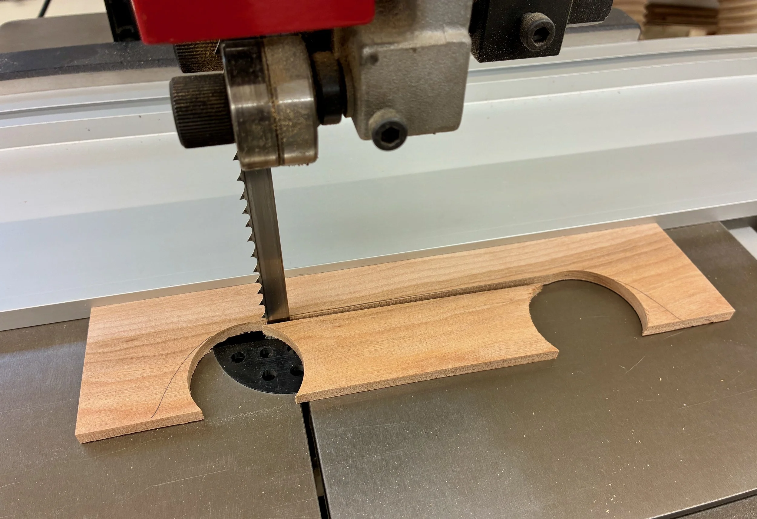
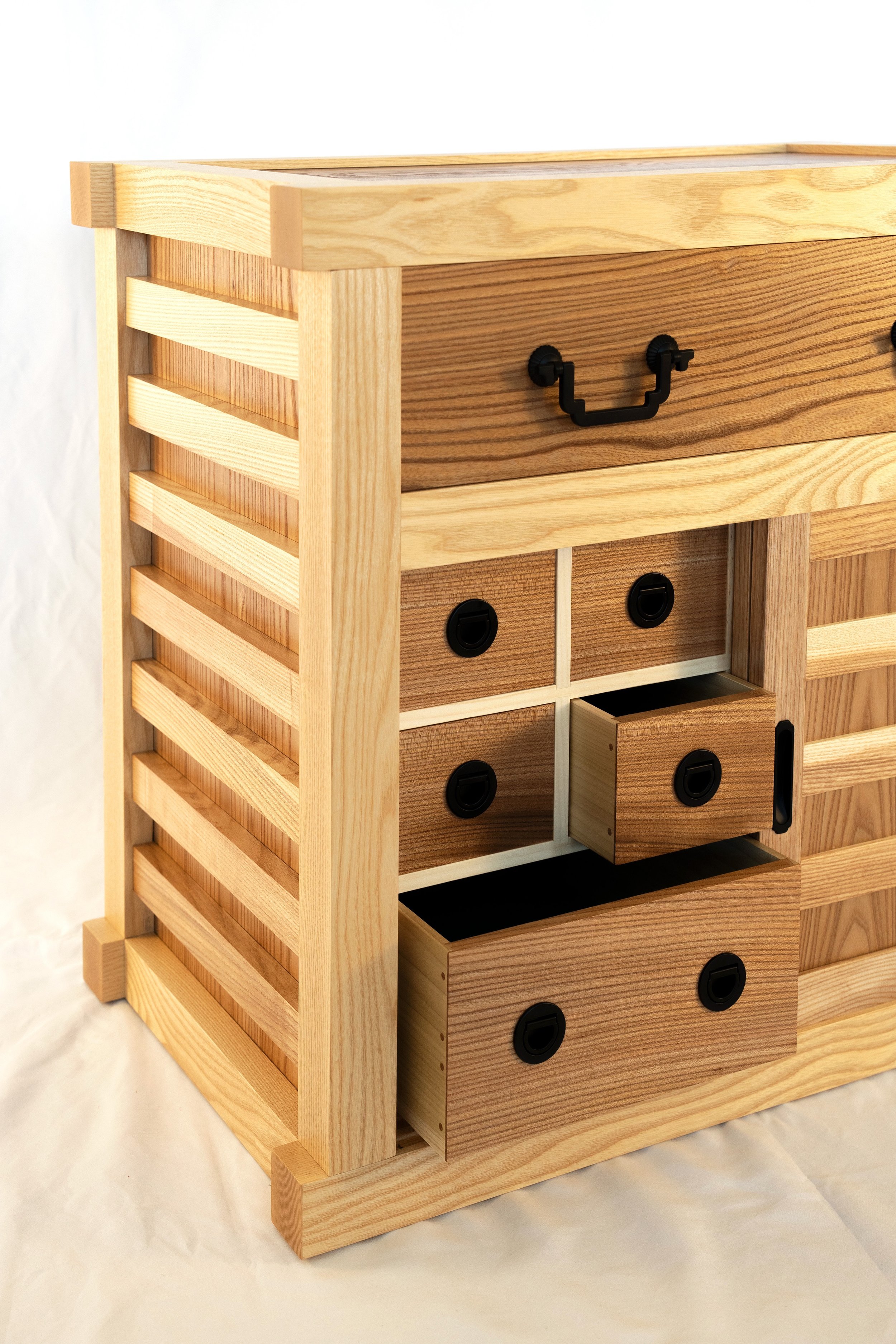
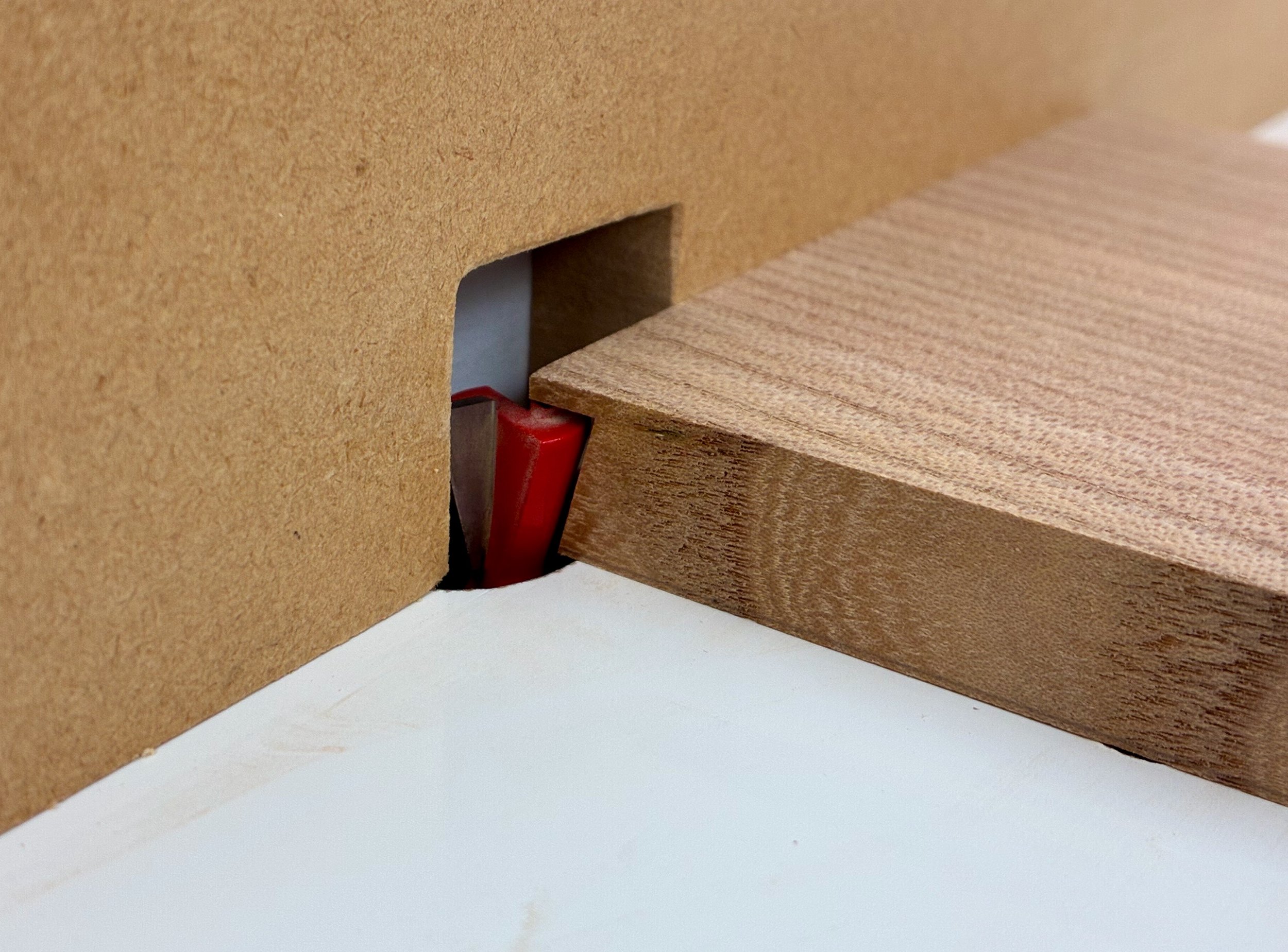
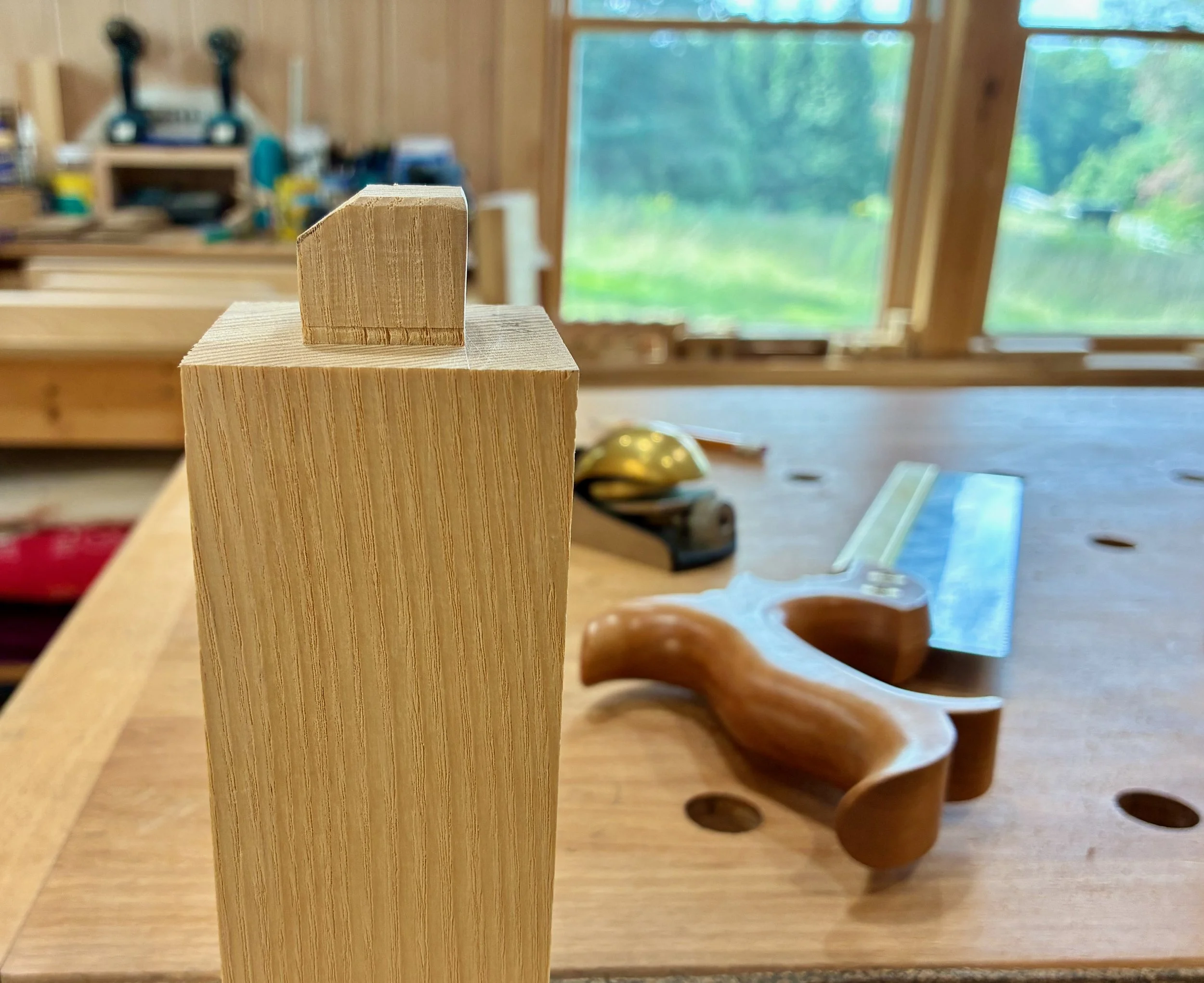
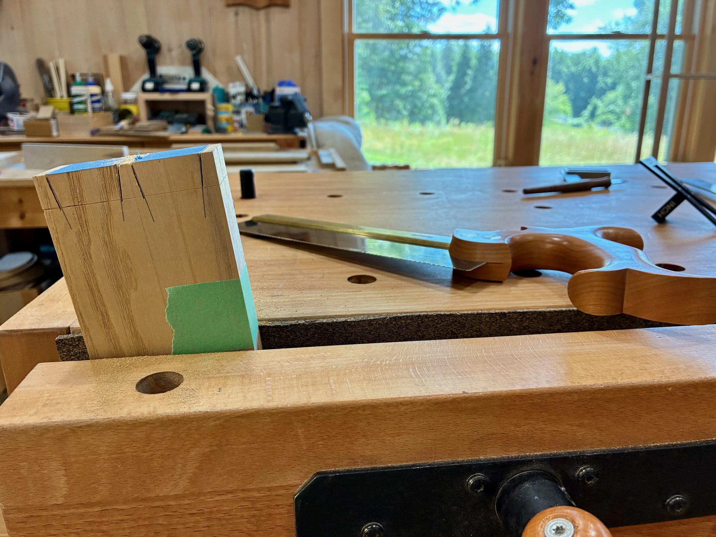
Making the dovetail joints came next. The plans called for creating proud dovetails as a means of adding dimensional character to the chest. They would look lovely on this small piece, but I decided to go with conventional dovetails so as not to distract from an idea I had for highlighting the lid. As such, the parts were marked for a “tails first” approach and then sawn and chiseled to fruition. I show a couple pictures of the process, below.
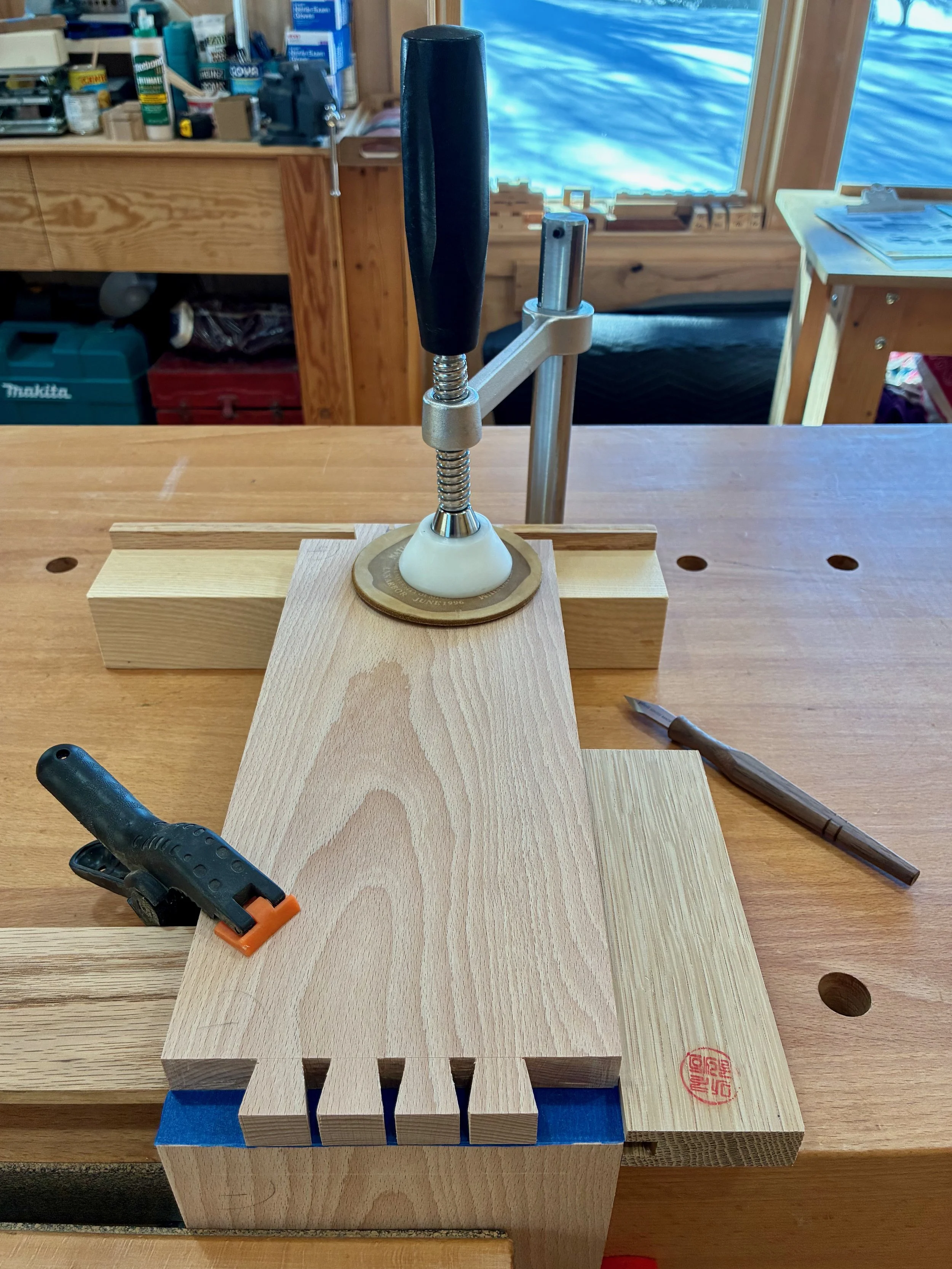
Once the tails are sawn and chopped-out, the pin shapes are scored onto painter’s tape with a knife
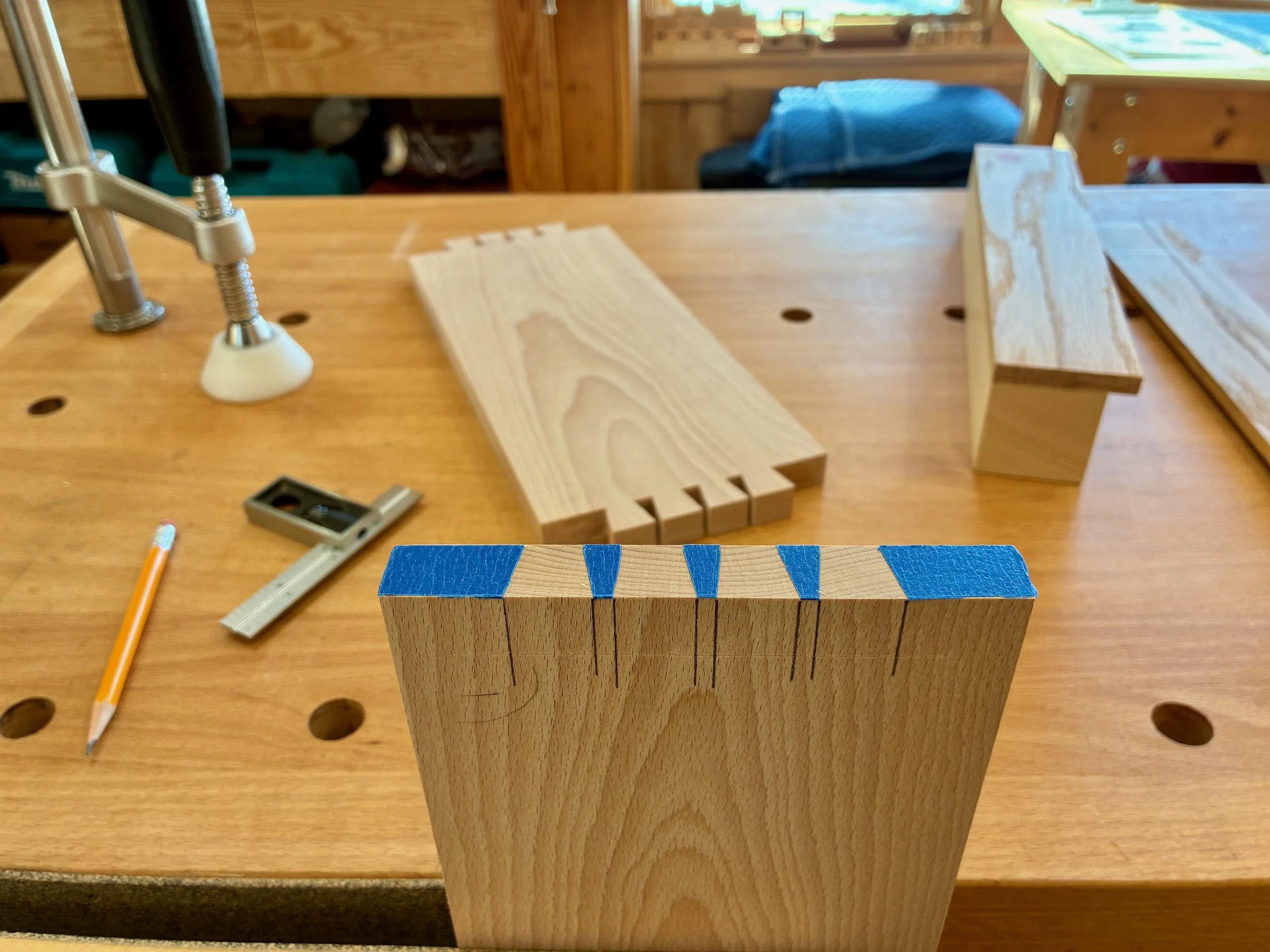
Removal of the tape sections and penciling the verticals define the next cuts
Following the saw cuts, waste is removed with a chisel to reveal the pins
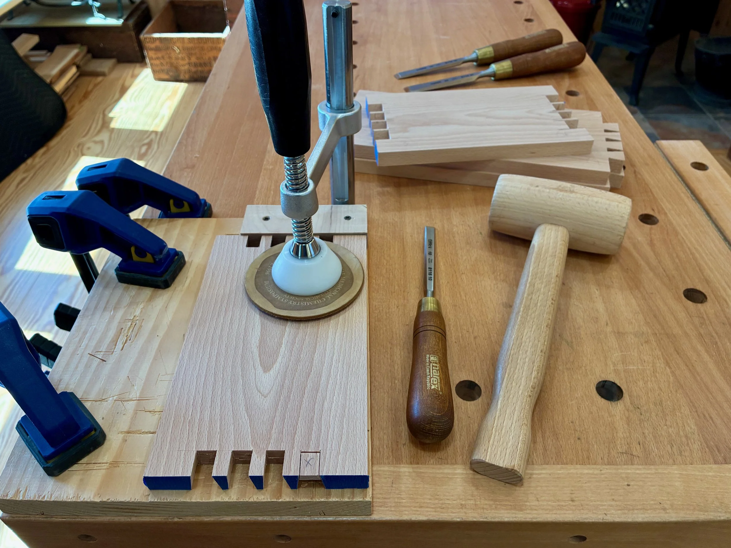
One needn’t be a lover of wabi-sabi, that Japanese admiration for the imperfect, to appreciate my dovetails, but it might help. It took me a long time to trim and pare the pins on this one so that they could actually fit within the tails and, in the process, gaps developed. Beech is stiff, but I blame it on a poor job cutting the tails. More practice required.
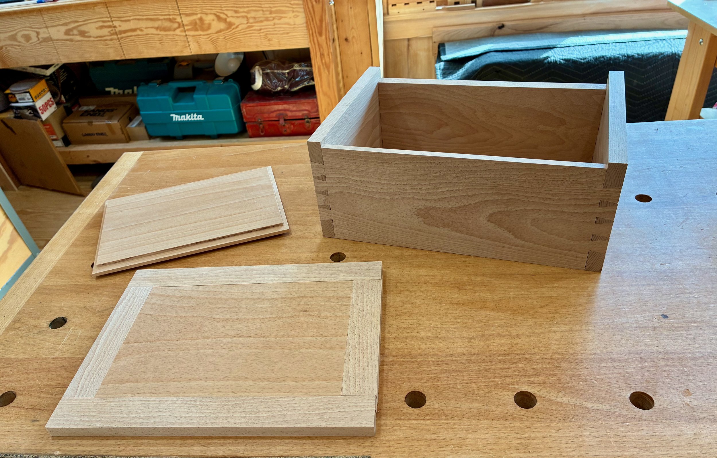
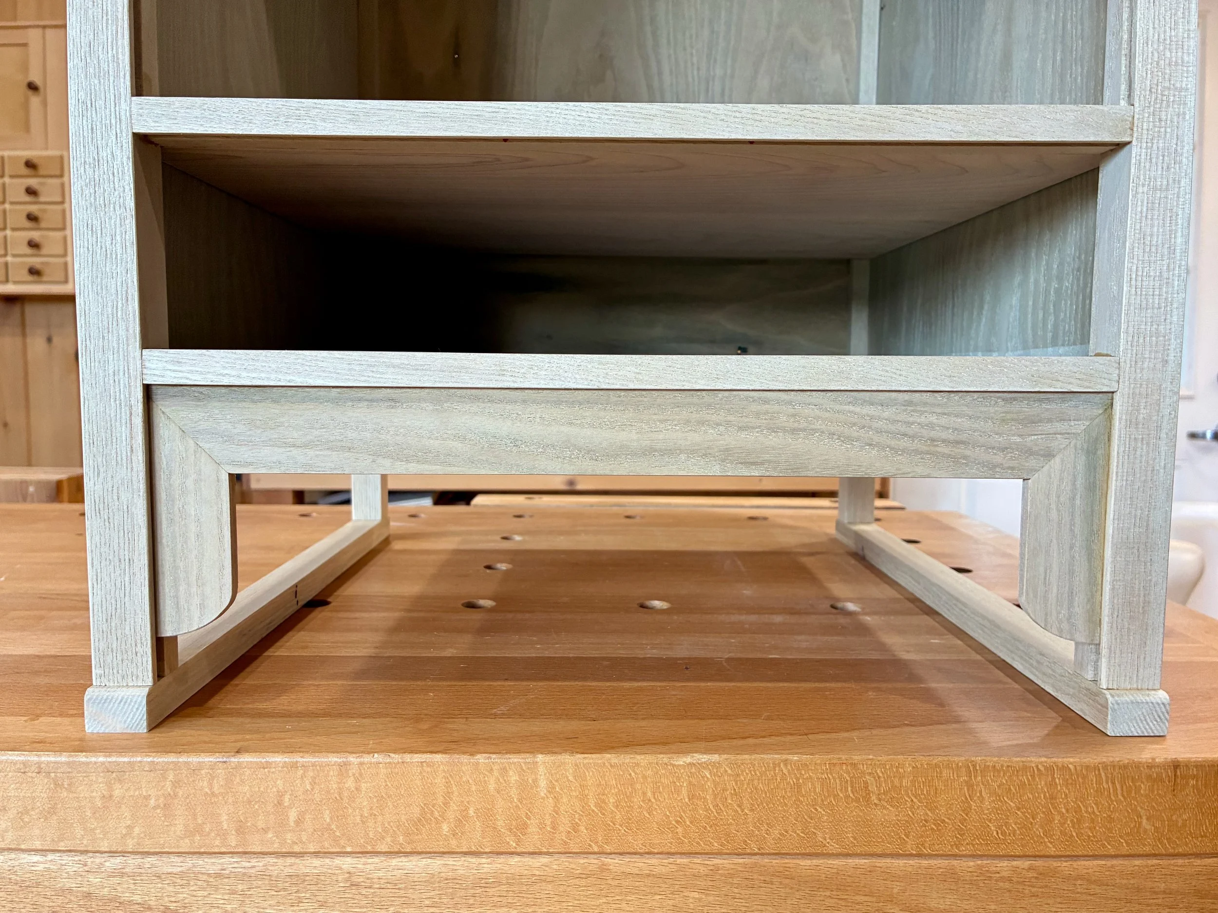
Dry-fit box
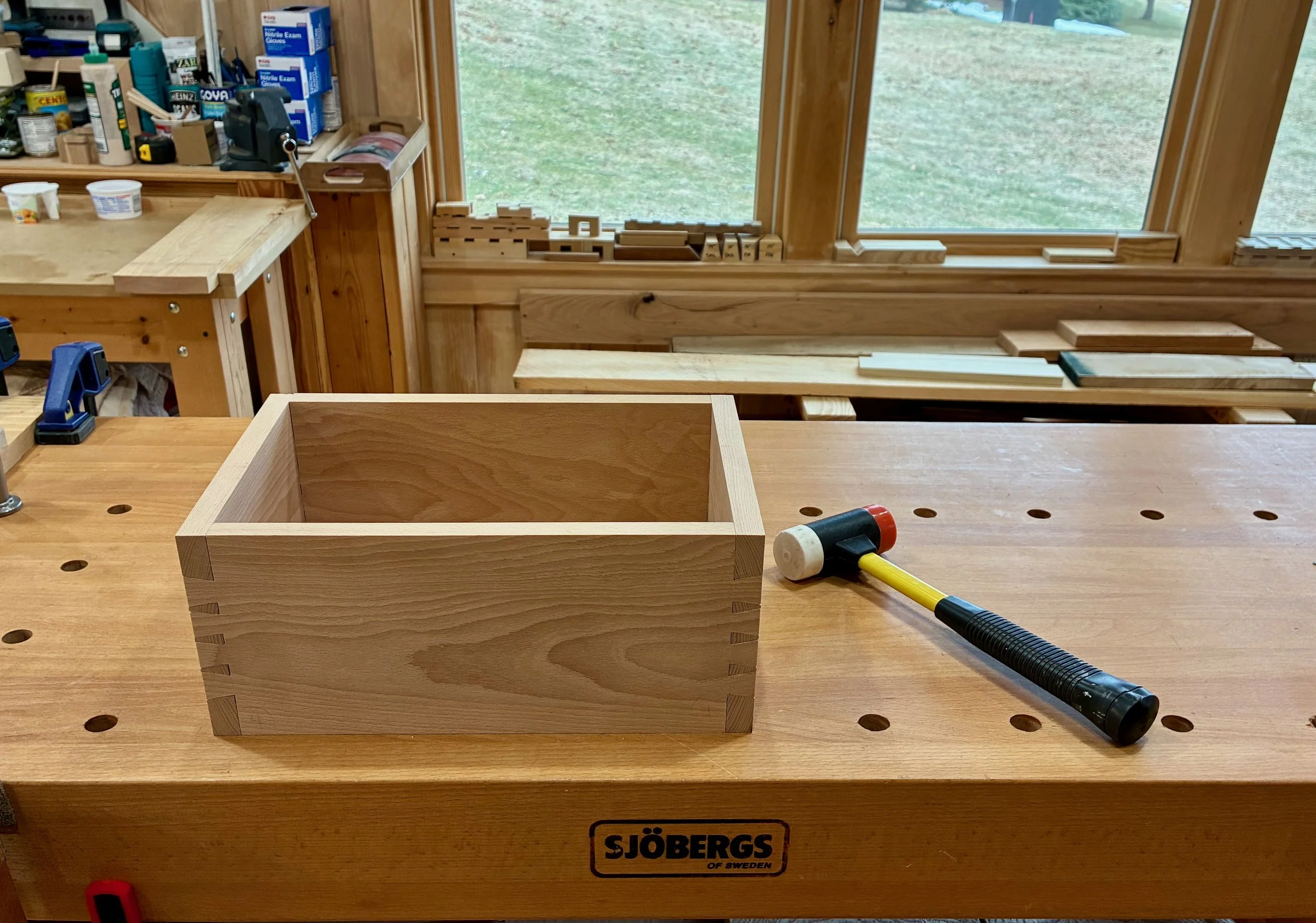
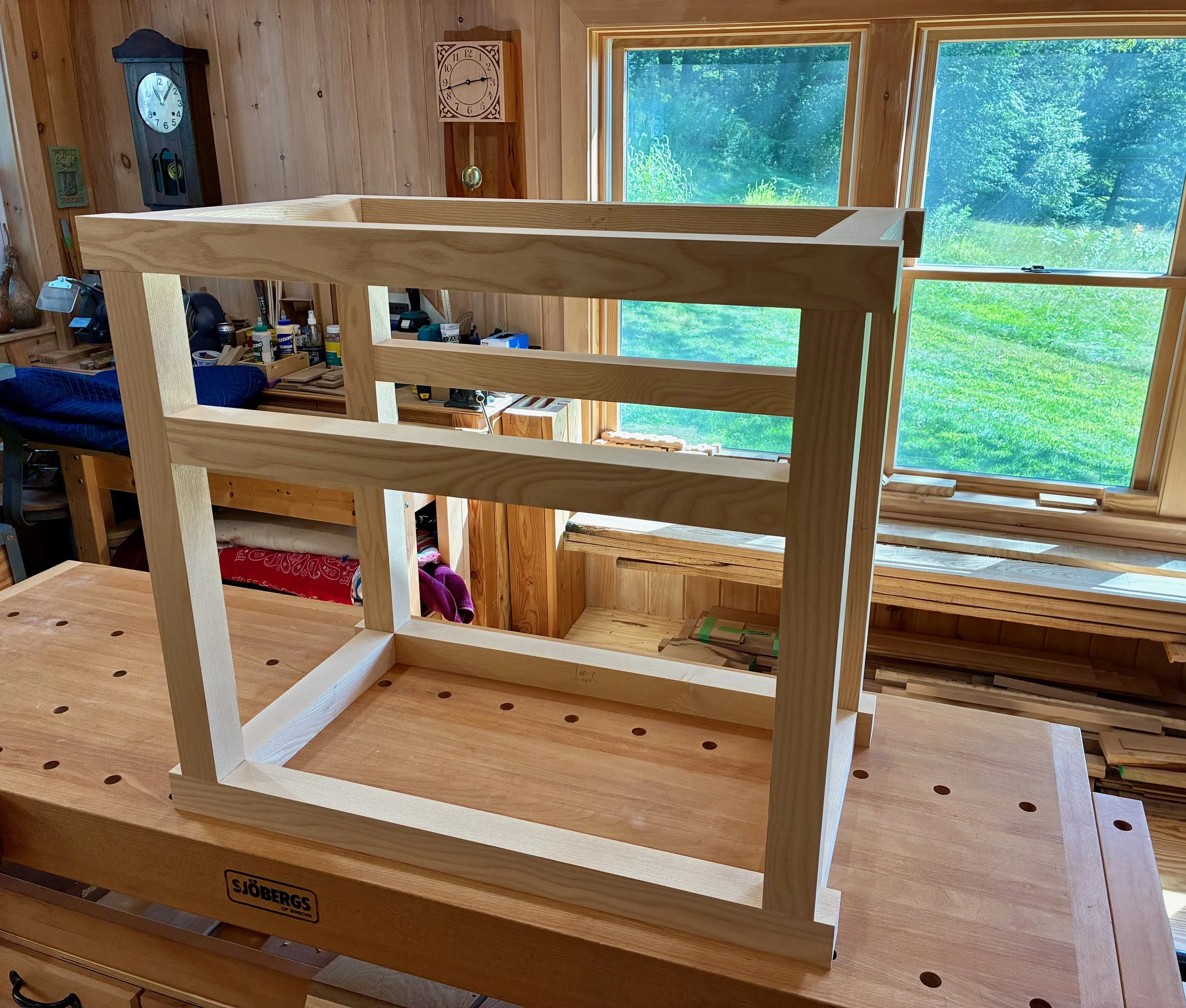
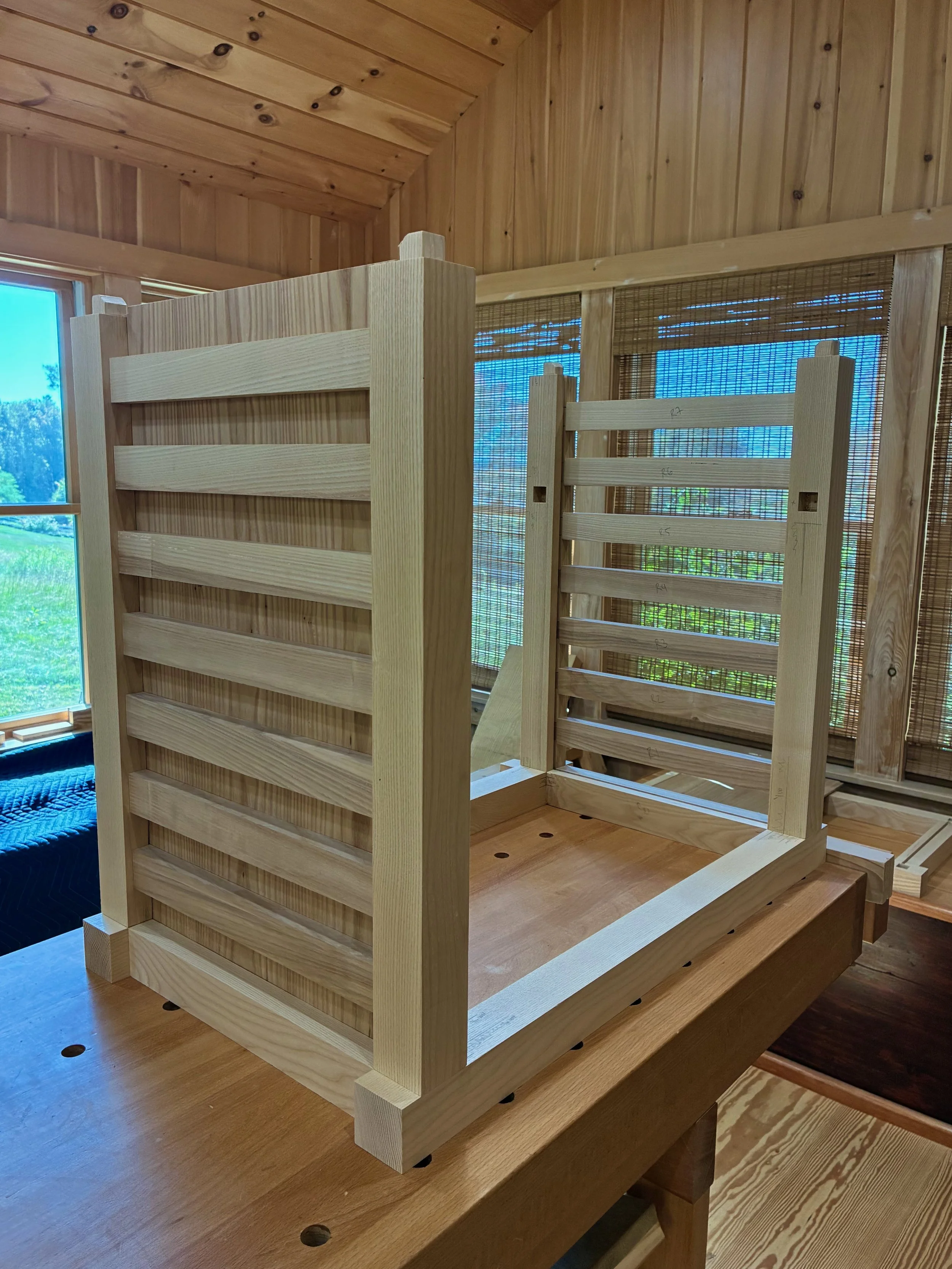
Anyway, with the box joints completed I could now dado and trim the side parts, as called for, at the table saw. Upon disassembly, a groove for the floor was cut near the bottoms of the long box sides. These sides were then trimmed and rabbeted as specified in the plan before pounding things back together again, dry.
Modified box
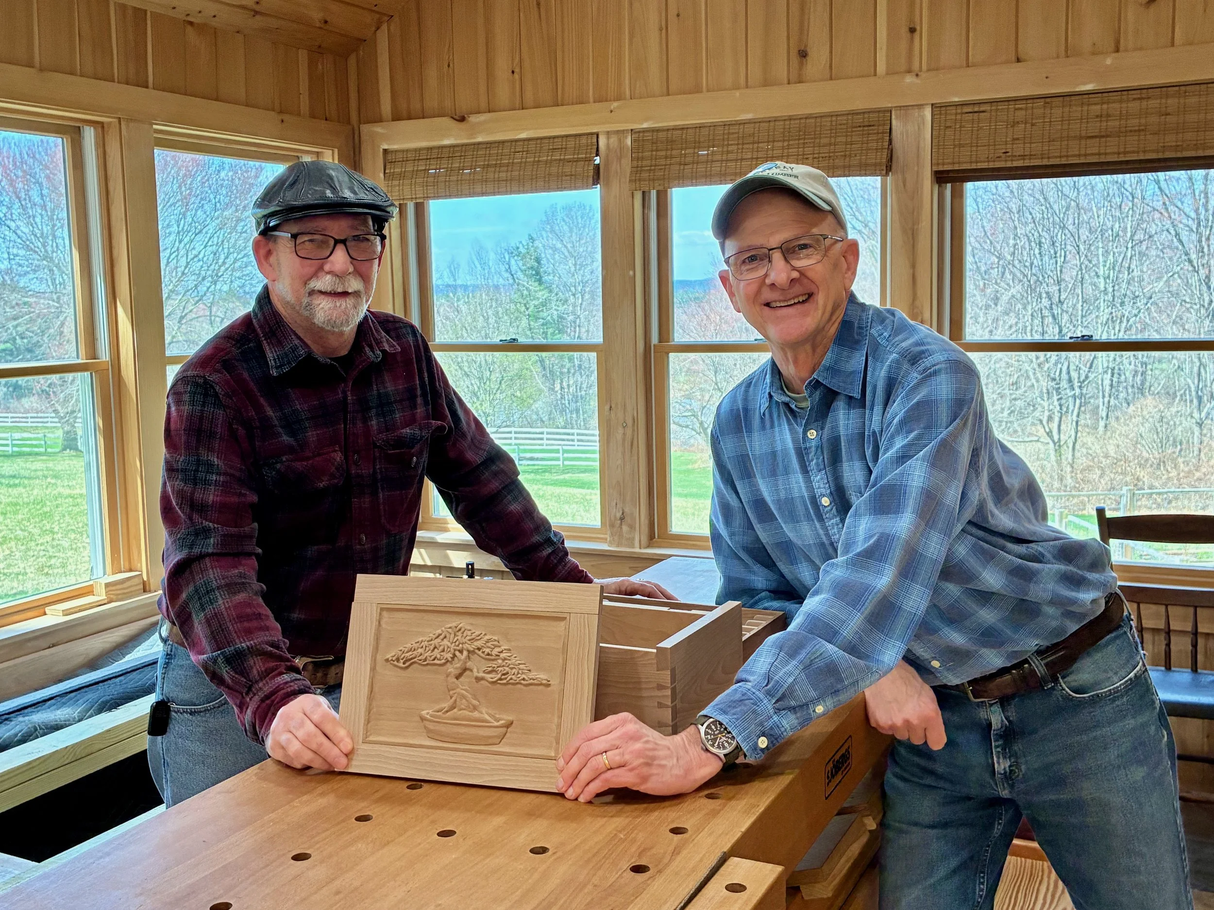
Next, the box lid was prepared and it was here that I chose to deviate from the plans. I had an idea to enhance the top by carving the image of a bonsai tree into the surface. Now, I do not carve. But I do, on occasion, leave the workshop to communicate with people on the outside, and it was through on of these excursions that I got connected with a highly skilled woodcarver in central Massachusetts named Don Chartier. Like me, Don has retired from his initial calling to pursue passion work full-time. He is a trained wood carver and a self taught painter who does amazing work. We struck up a pen pal relationship and, before ever meeting in-person, concocted a plan whereby I would lend him a bare piece of beech and he would return it, beautified, with the image of a bonsai carved into the surface. What a deal! First I needed to prepare the lid.
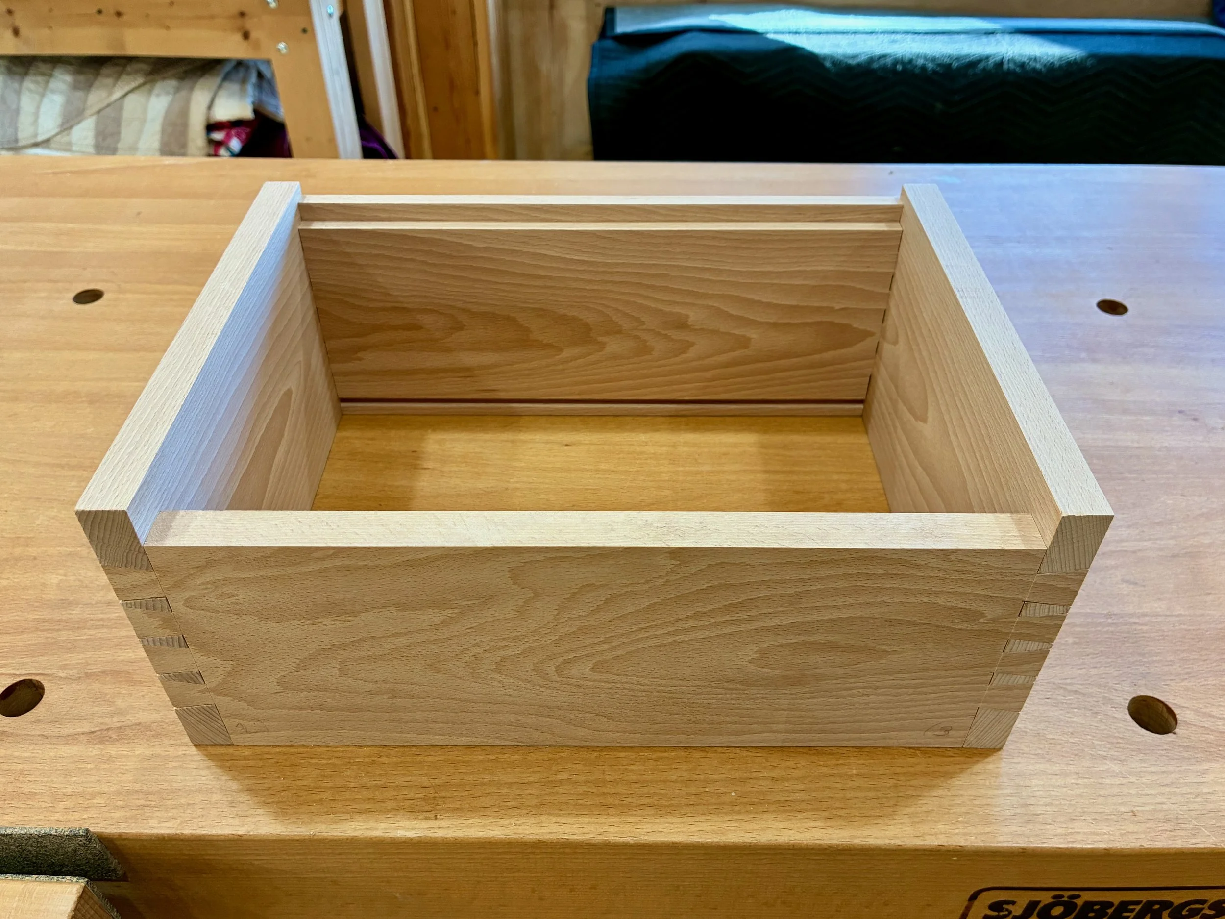
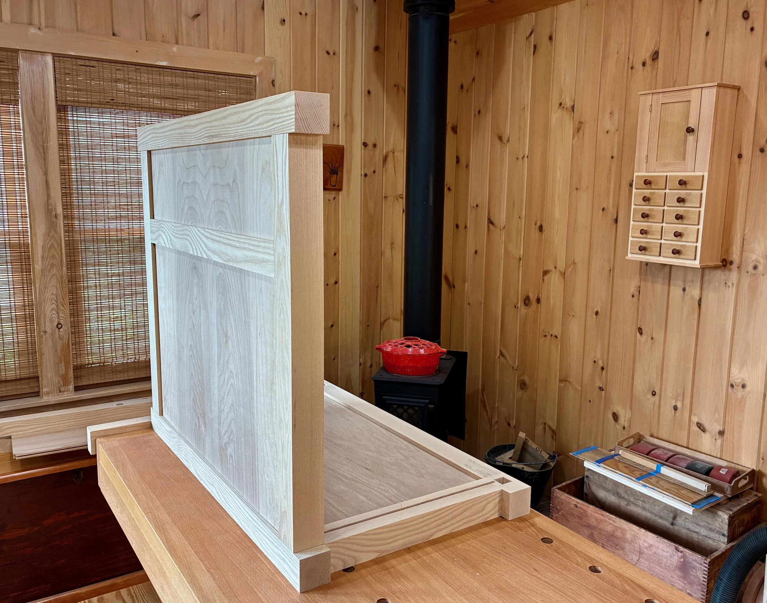
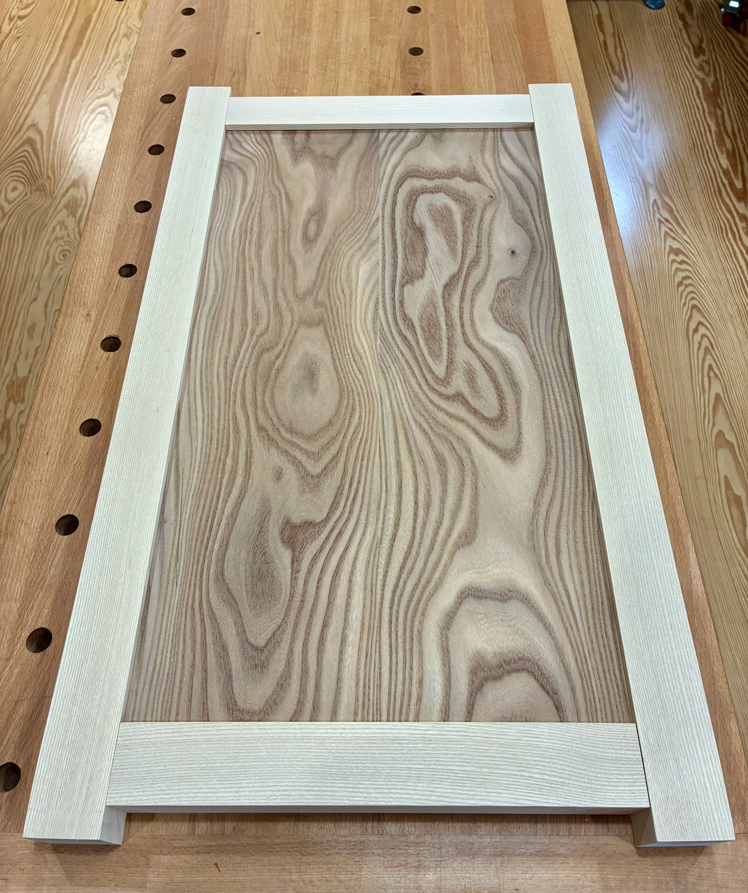
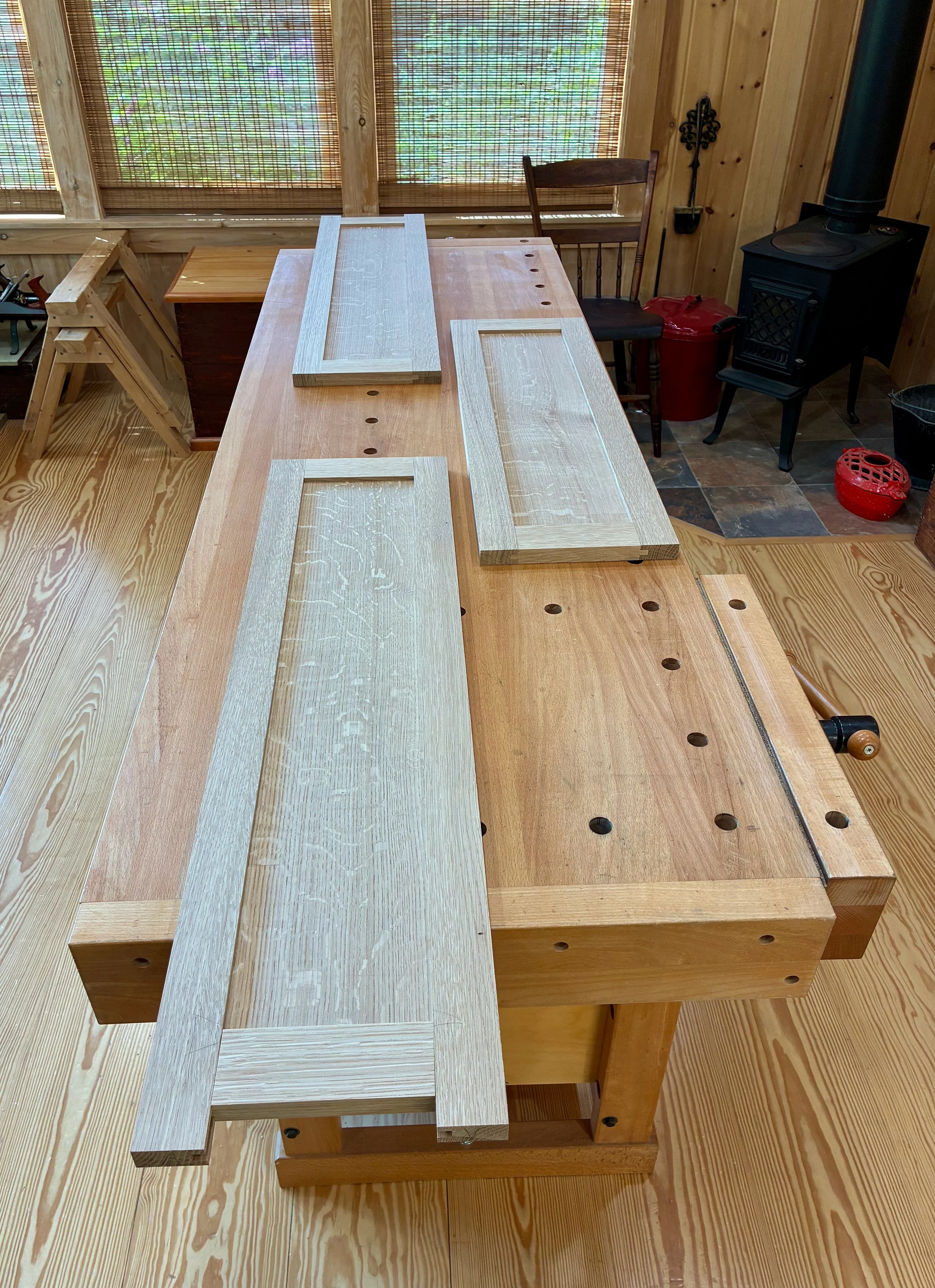
I used remnants of the beech stock to create the stile and rail lid parts. The 1¼ in. wide members were ripped from a prepped board, grooved along one edge at the table saw and then chopped to length. Next, tenons were formed at the rail ends. Finally, a wider European beech board was prepared for use as a single panel. Once flattened and smoothed, a tongue was rabbeted along all four edges to mate with the frame parts. The dry-fit construct was then sanded smoothed to level the joints.
Dry fit lid and spare
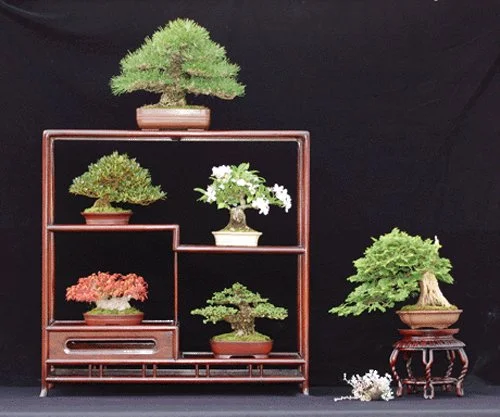
Before beginning the carving we needed to settle on a subject tree. I have no mature bonsais, at present, and so I downloaded images from the internet and fired them away in emails for consideration by Don, the artist. We settled on the informal upright maple tree (below) as the subject. It has the right dimensions and features for a carved image to inspire a budding bonsaiist.

Model maple
Carving
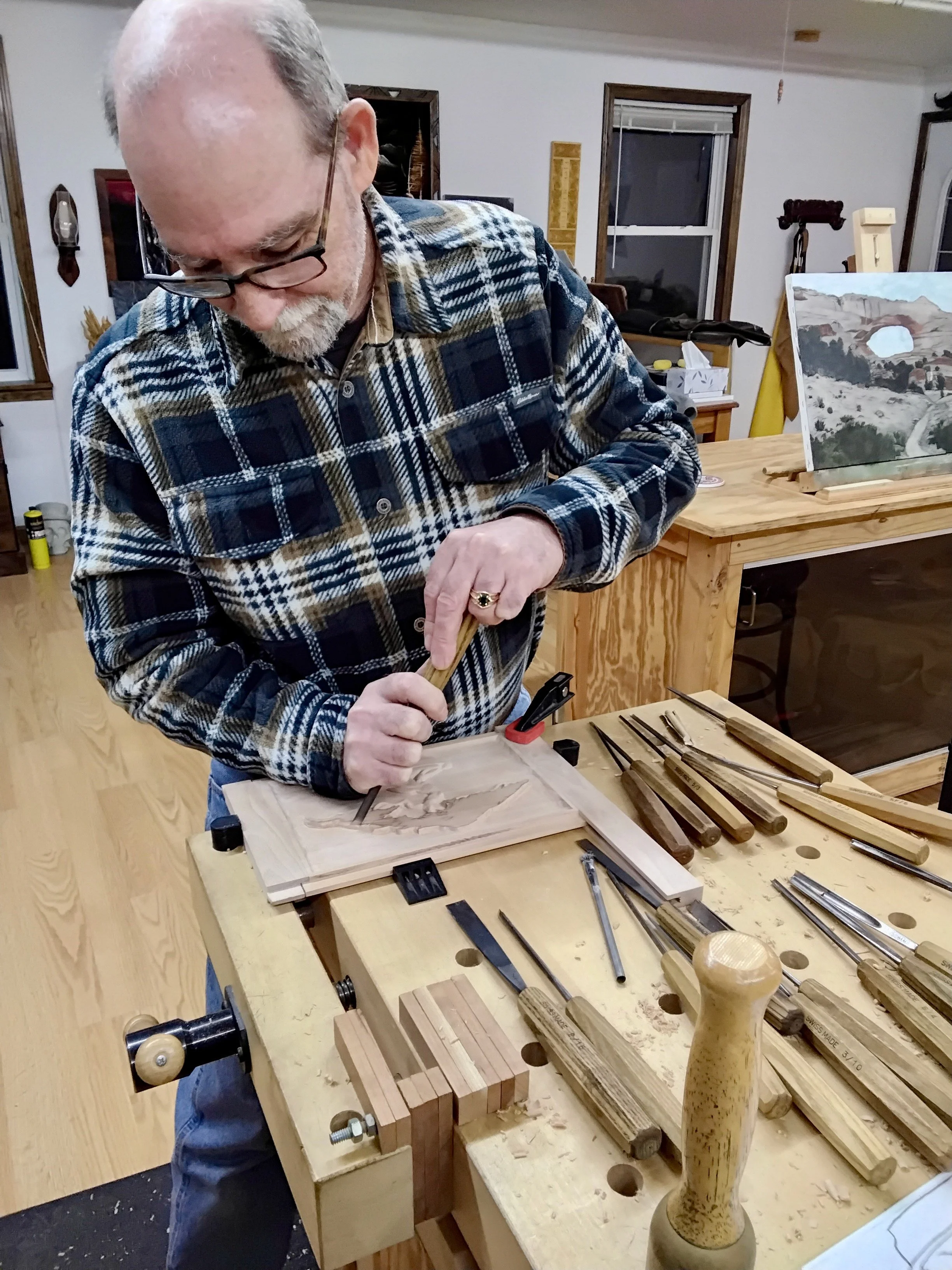
I asked Don if he might take us through the carving process and he graciously provided the description and pictures, below.
Don Chartier: I will start with a quick explanation of the carving tools. The chisels are numbered from 1 to 12. A number 1 chisel is perfectly straight. The number 2 chisel is slightly curved and so on up to the number 11 chisel which is a u-shaped chisel. The number 12 is a V-shaped chisel.
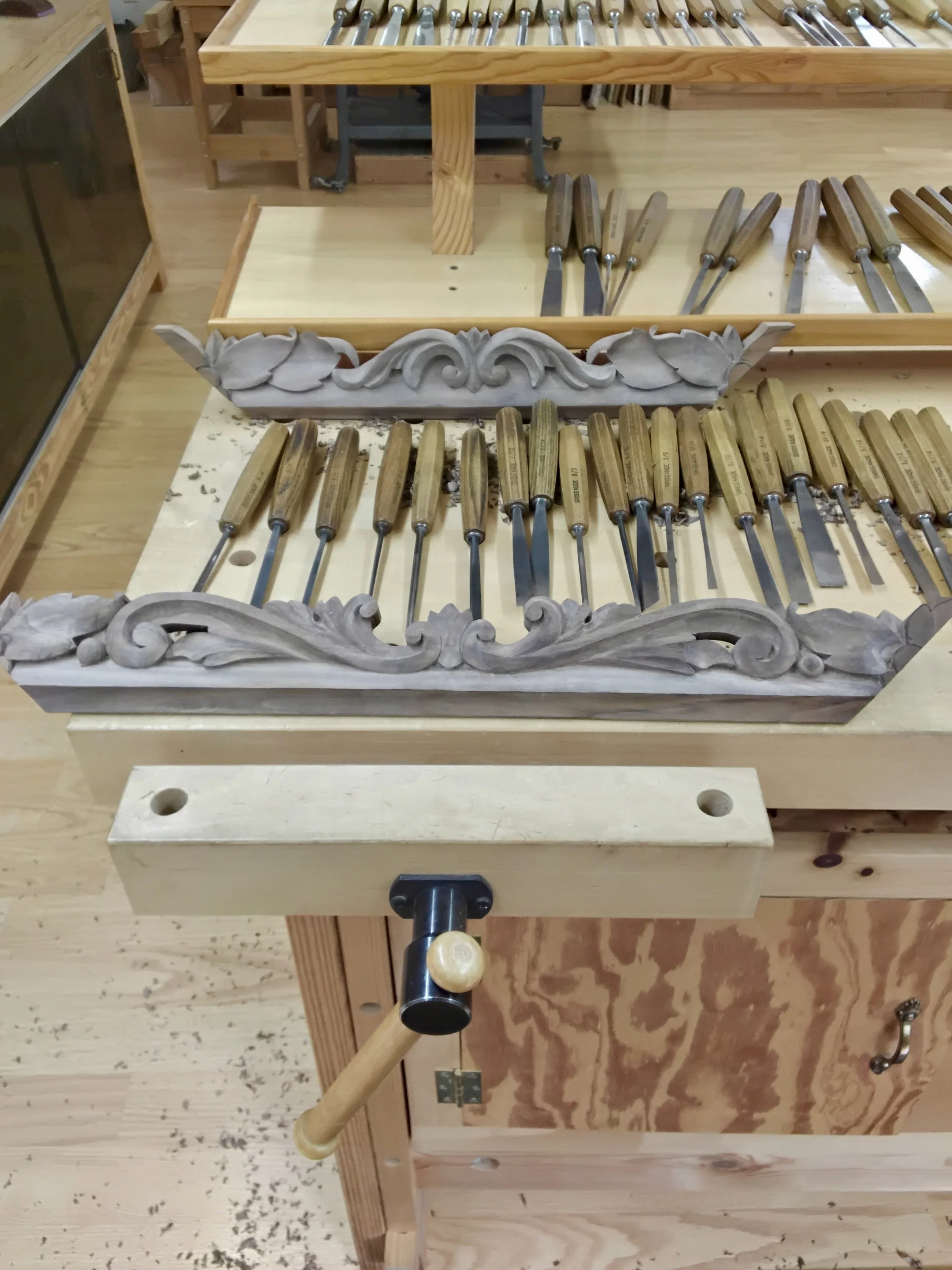
A selection of Don’s chisels and a walnut picture frame in-progress
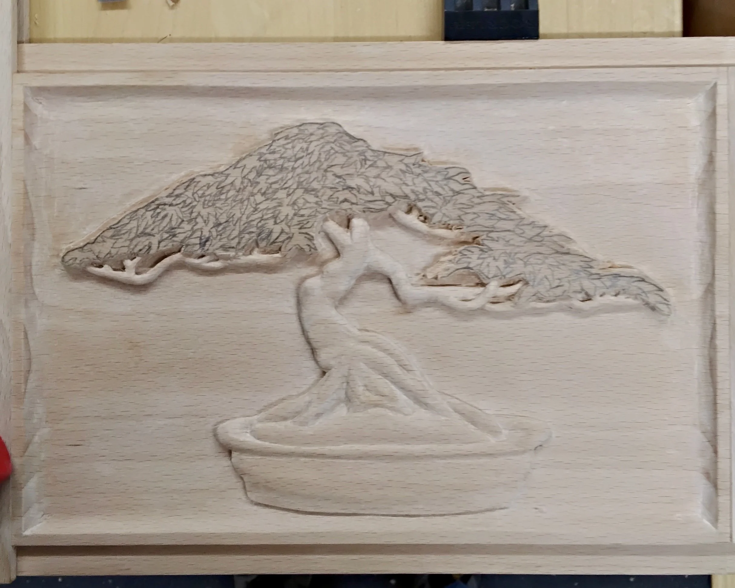
To begin a carving I start with a drawing and transfer that to the wood using carbon paper.
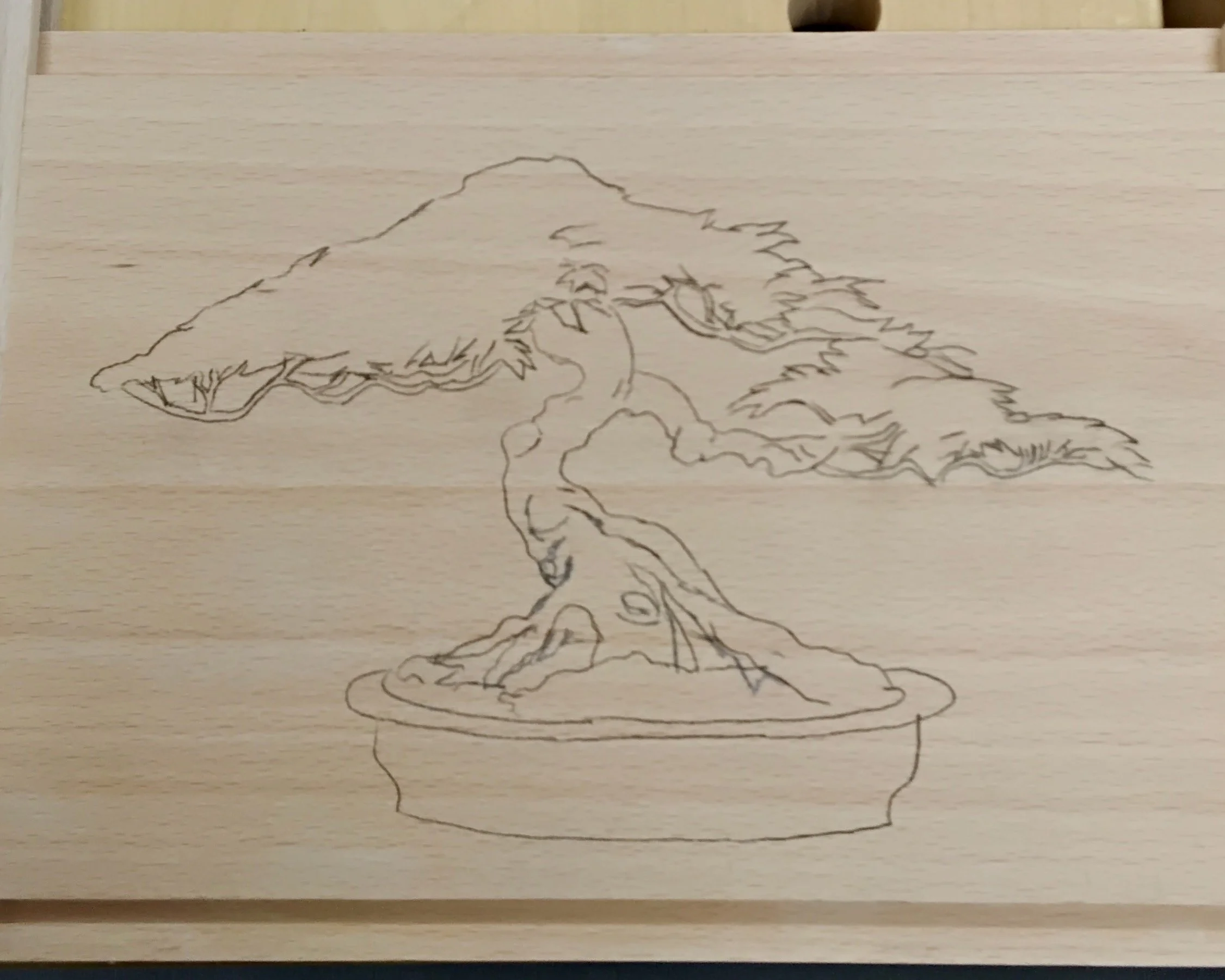
Bonsai figure rendered on the beech panel
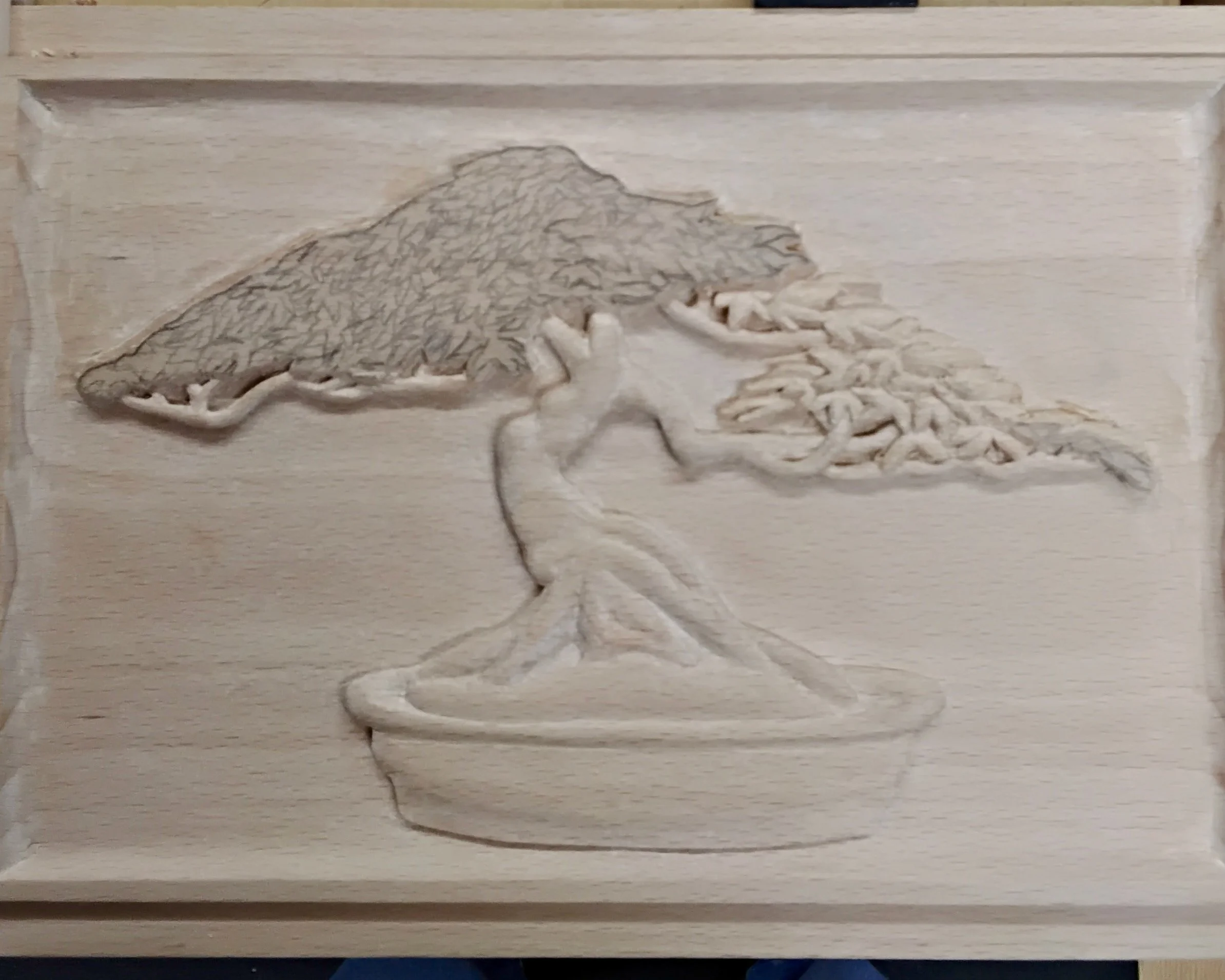
The next step is to use a v-chisel. For this carving I used a 6 millimeter because it is approximately the same depth as the background will be. With the v-chisel and mallet I cut around the outline of the stencil. I stay about a 16th of an inch away from the stencil for now and will refine it later. I also cut a groove around the edge but stay approximately 3/8ths of an inch away because the edge will be a cove and not a straight edge. Next I used a 6 millimeter number 7 chisel to cut the cove around the edge. The next step is to remove the background. For this I used a few different widths of a number 2 chisels ranging from 16 millimeters to 2 millimeters depending on how wide or narrow an area I am removing. As with the groove I cut around the pattern, staying slightly above where the finished depth will be. With the background now removed, I will now square up the edges around the pattern using a variety of different chisels carefully matching the chisels with the curves of the pattern. Once this is completed I will begin shaping the tree trunk and pot, again using a variety of different chisels.
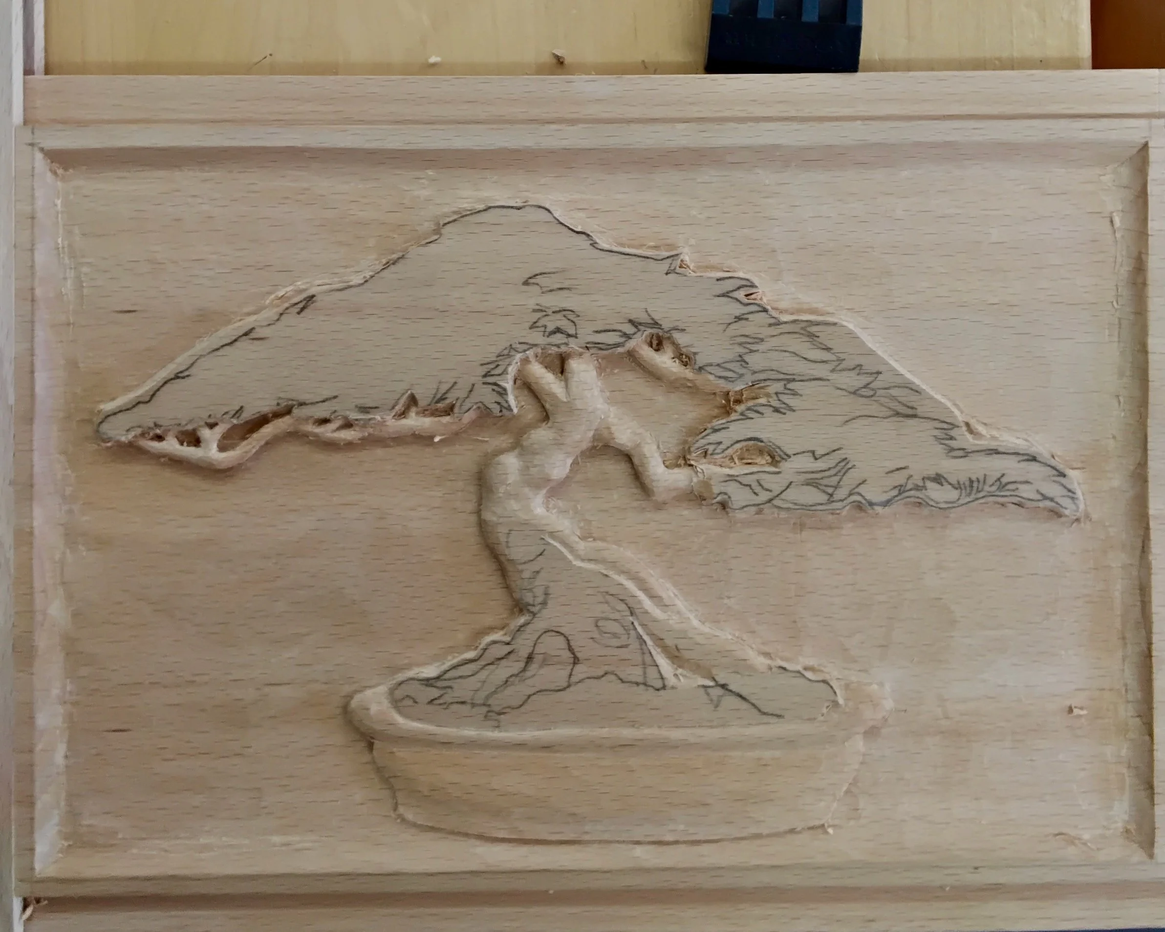
Edges defined, pot and trunk taking shape
As I complete this section I will now carve all the way down to the finished depth. I next turn to the leaves. I begin by hand drawing in the leaves. I didn't transfer this section with the carbon paper because it is easier for me to draw them in.
Leaf patterns added by hand
The leaves are the most intricate part of this carving requiring many different chisels.
Preparing for the leaf work
(also, note Don’s latest painting in the background of his studio)
Canopy taking shape
With the majority of the carving done, I will now do the final carving to clean up all the edges and rough spots.
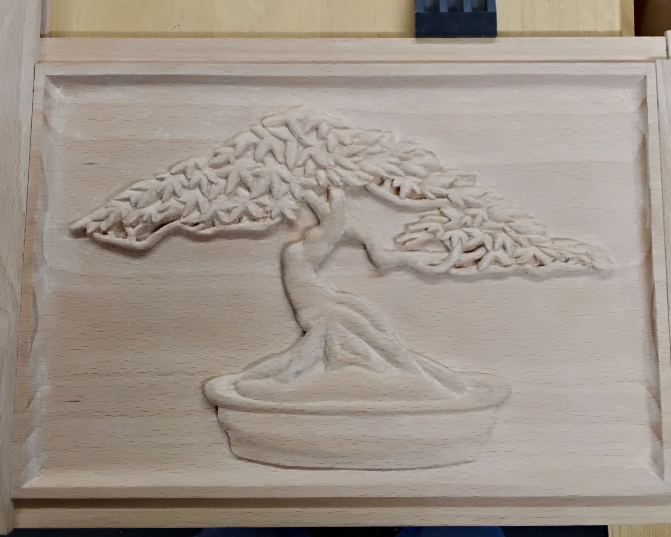
Ready for the final touch-ups
The very final step is to lightly sand the entire carving with 220 sandpaper.
Taking delivery of the finished work
Needless to say I was blown away by the craftsmanship (and beauty) contained in that 6 × 9 inch panel. Thank you Don!
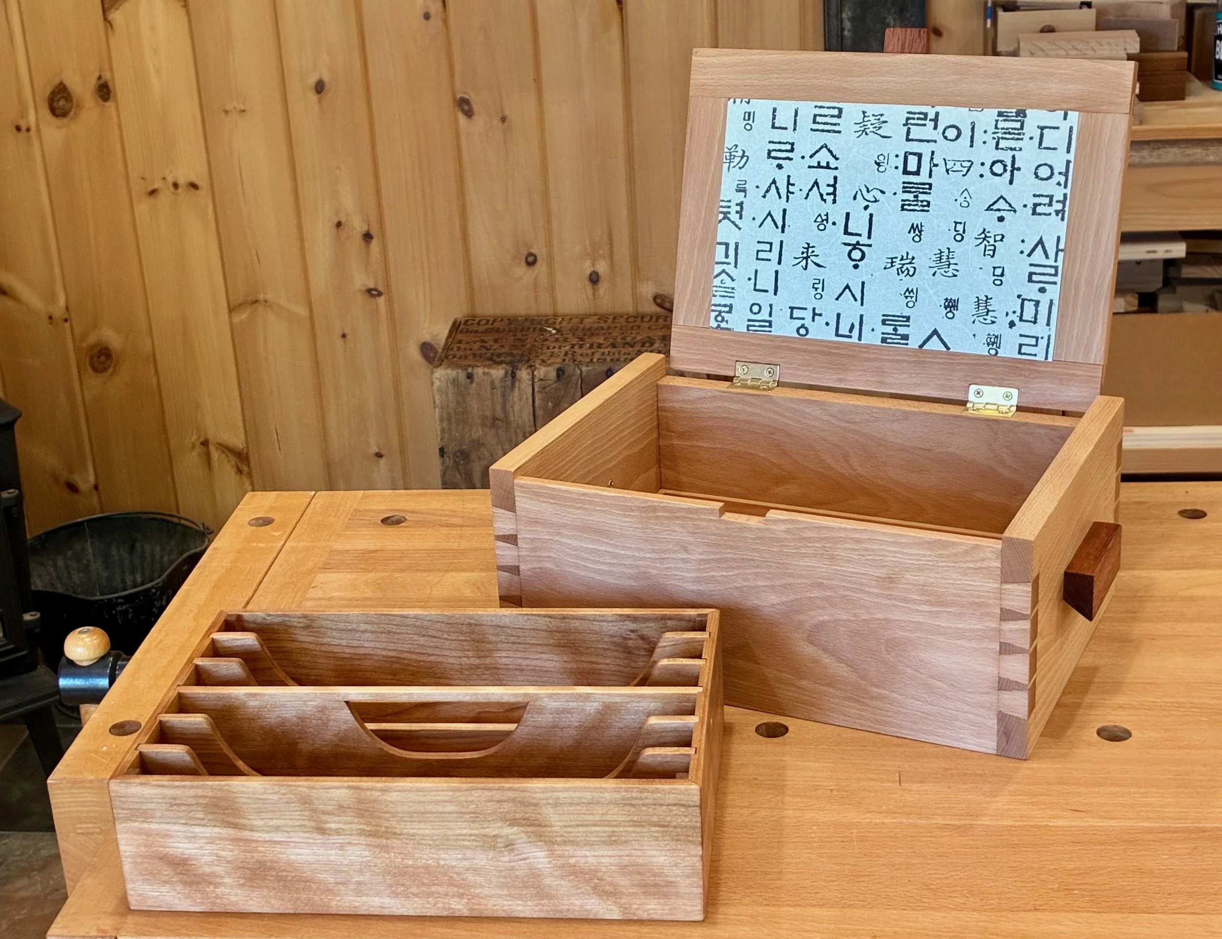
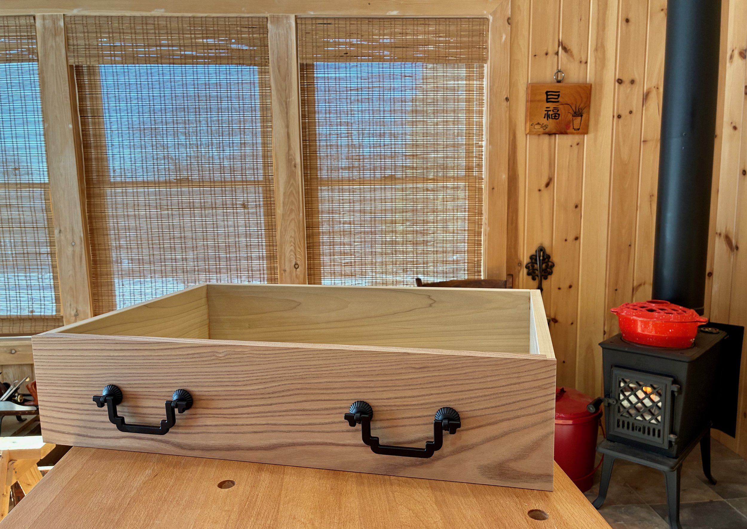
Back in the land of mundane, I had a few things to finish off while the carving proceeded. To begin, the box floor was fashioned from a single beech panel composed of two 3/8 in. thick boards edge glued together, a much simpler version of the original plan. The floor panel was then rabbeted on the long edges to fit snugly within the ¼ in. grooves of the box sides. Following this, the box was knocked apart and two mortises chiseled into the back to house the brass stop hinges for the lid. Finally, a notch was cut into the front side to house the latch.
Tool tray
The original box had a removable top tray, an element common to both jewelry chests and toolboxes. I would keep this feature, with appropriate modifications: mine would be deeper, and divided longitudinally to segregate the tools. I constructed the tray in a manner consistent with the plans using some leftover yellow birch as material. Prior to assembly, the short sides were dadoed to house 5 partition boards, the center one being modified to also serve as a handle.
Cutting out the belly of a partition, roughly shaped beforehand at the drill press
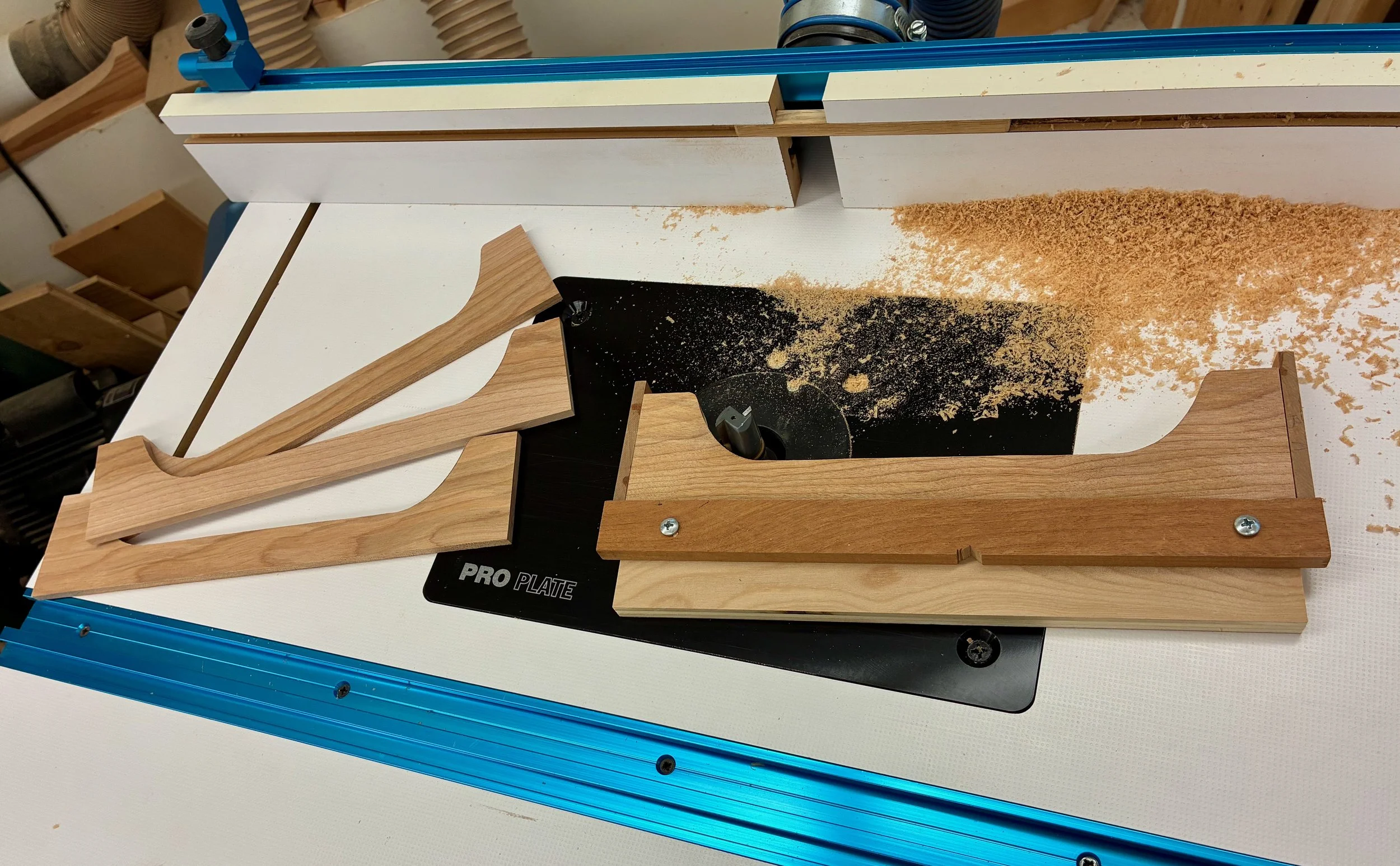
Using a template jig to smooth the partion edges at the router table
Assembly & Finish
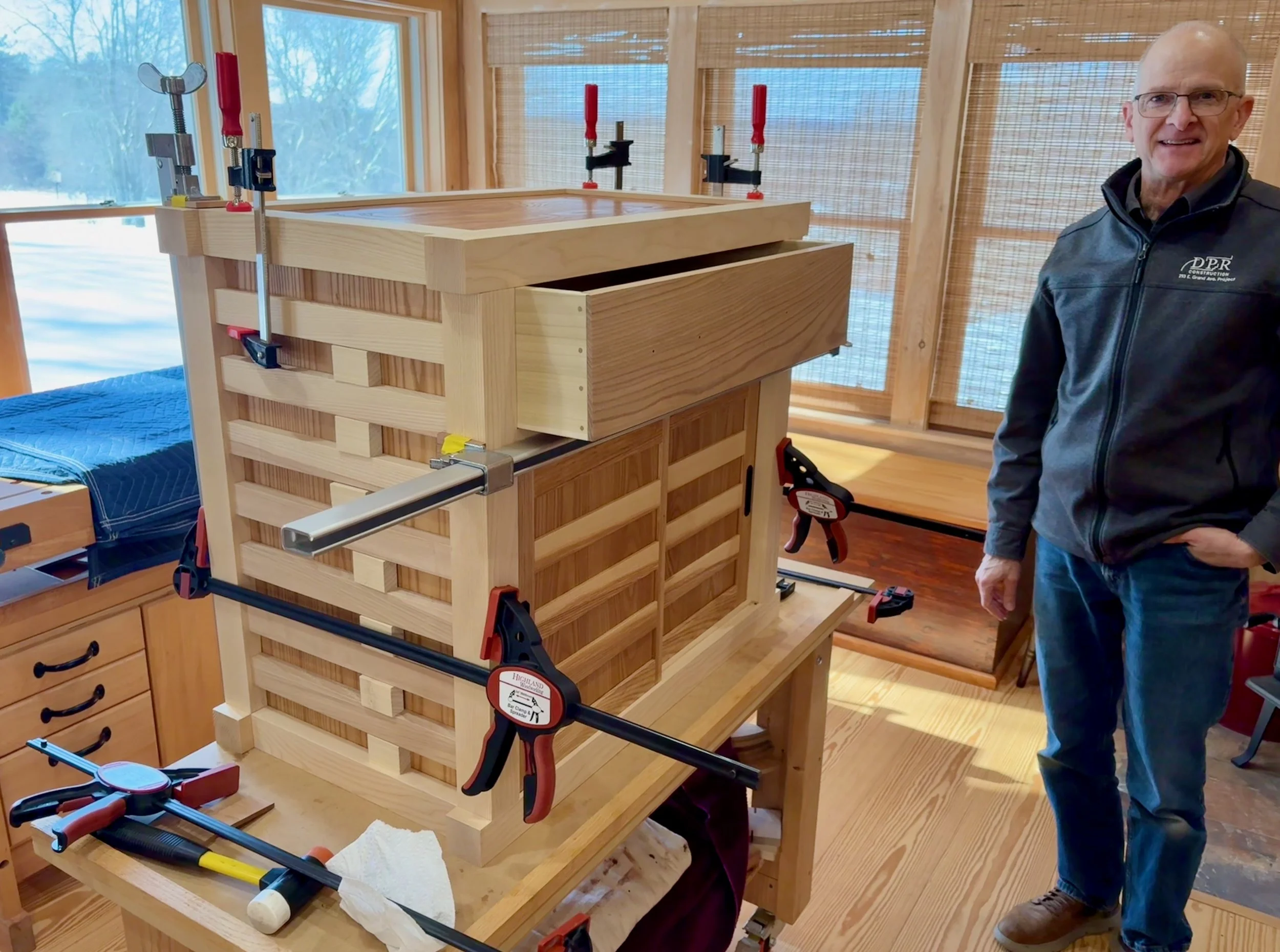
Following a final sanding of the parts it was time to put things together. Those dovetail joints were such a tight rub during the several dry-fits and disassemblies that, being afraid to apply glue and swell the wood even more, I popped the thing together dry and cinched the joints firm with clamps and cauls. It creaked as the clamps were tightened, giving some confidence that it’s not going anywhere. The tray was next glued-up, “clamped” along the mitered edges using tape, and then nestled into the box to assure a square assembly that “fits”.
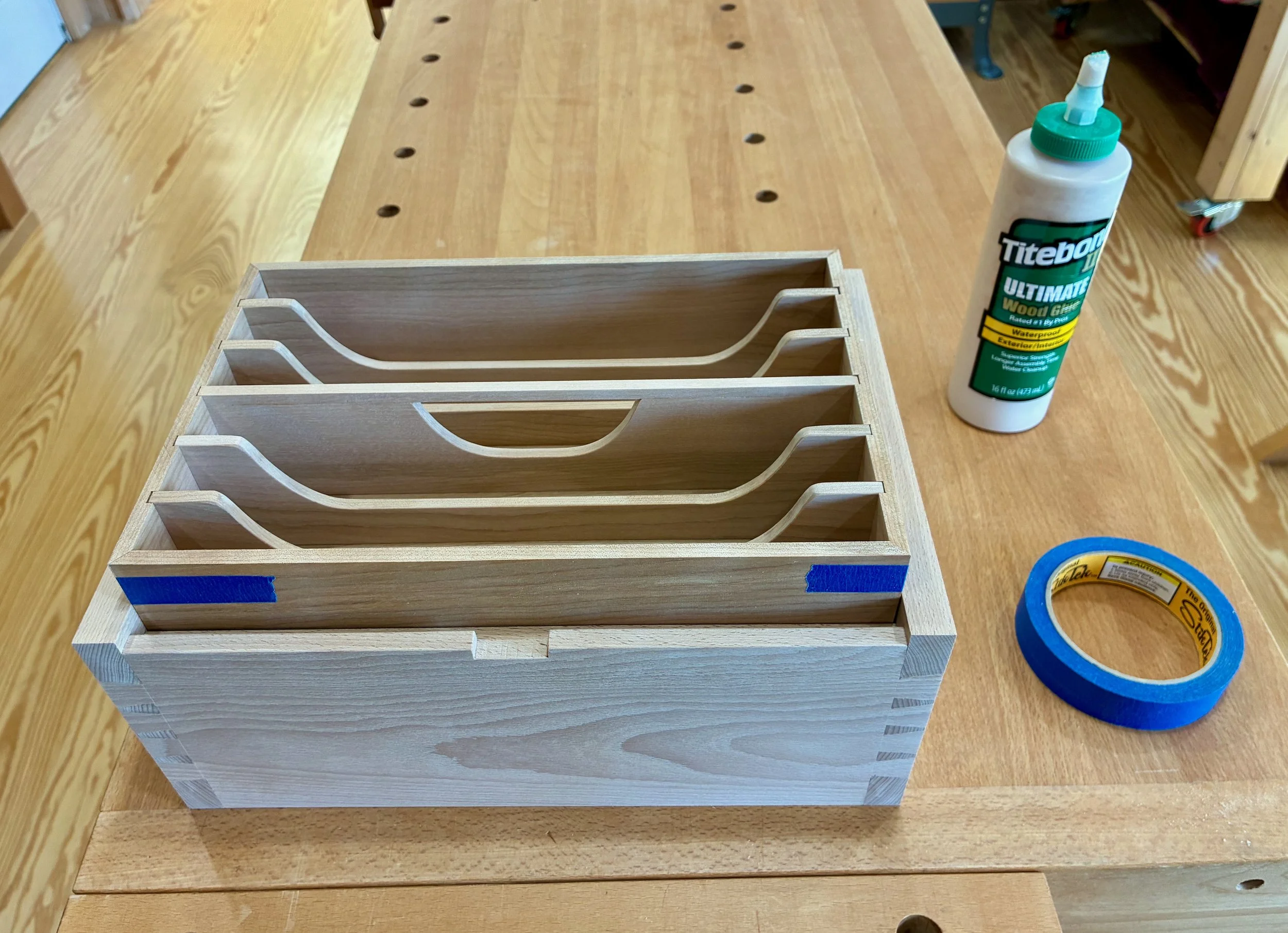
Tray sitting on a block within the box
With the tray complete, I glued the center partition to the bottom but left the others to float freely within their channels. Should my tool mix change over time they can be readily replaced with customized dividers. And, as tools are heavier than jewels, I decided to reinforce the corner mitered joints with beech blocks while also adding a couple brass screws to secure the center partition. Along the bottom interior of the box I added a 1 inch ledger board for the tray to rest on, creating a cavity beneath for extra storage.
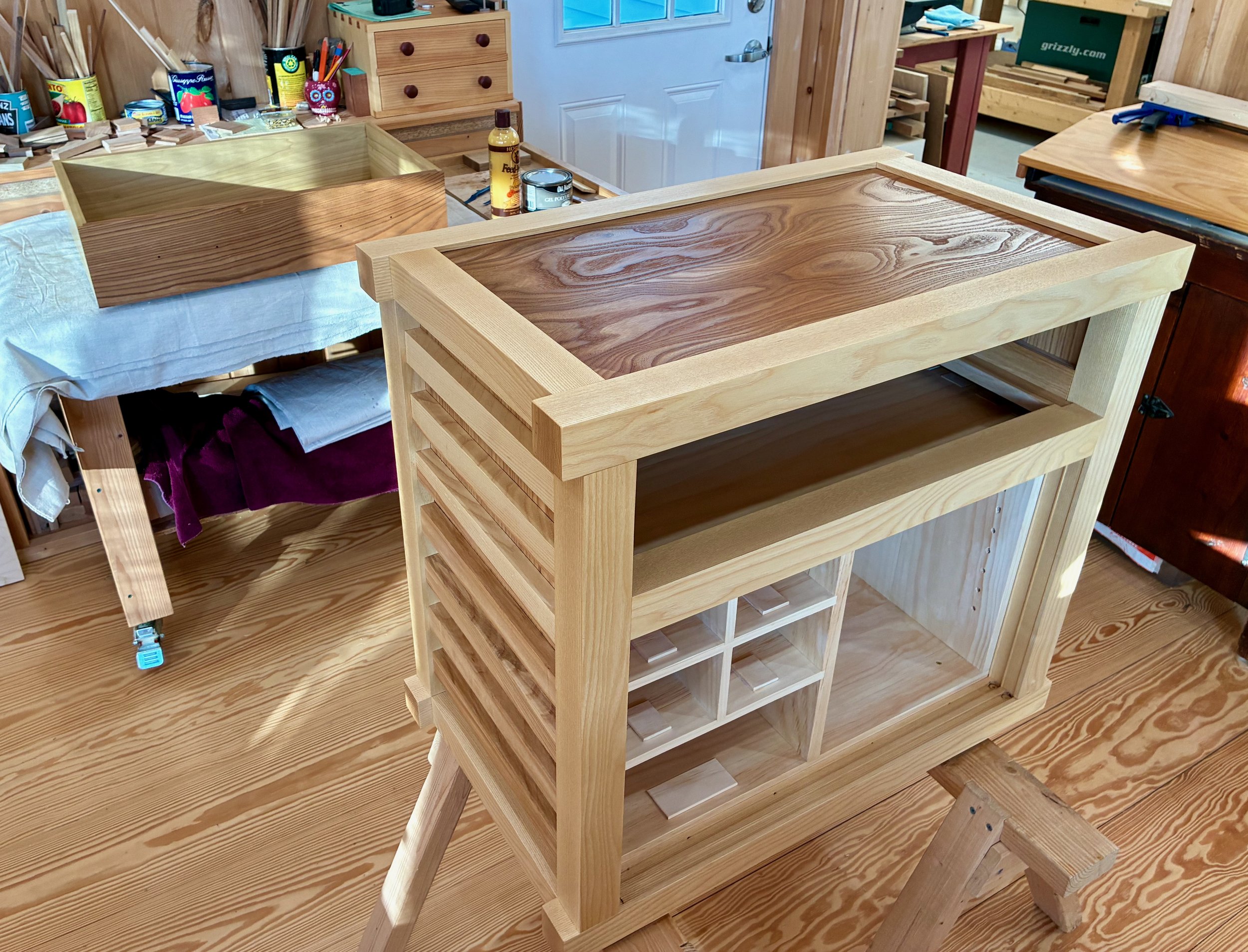
Now, the lid. I started by glueing the frame parts around the carved panel to make a lid that was slightly wider than the opening at the top of the box. The ends were then shaved to fit using the table saw and a hand plane. Taking extra precautions to protect the carving, I marked the back rail and then morticed two slots for the hinges there.
Hinged lid
The last parts to fashion were the latch tab and handles. The original used a dark piece of wood for the latch and rope for the handles. I decided to use a contrasting wood, Spanish cedar, for both. The latch tab was dimensioned appropriately and then fastened to the lid using dowels. For handles I made 5/8 in. thick rectangles, relieved slightly on the underside at the table saw. I have an aversion to glueing different woods together and so I mounted the cedar handles in position using double stick tape and then secured them to the beech with brass screws.
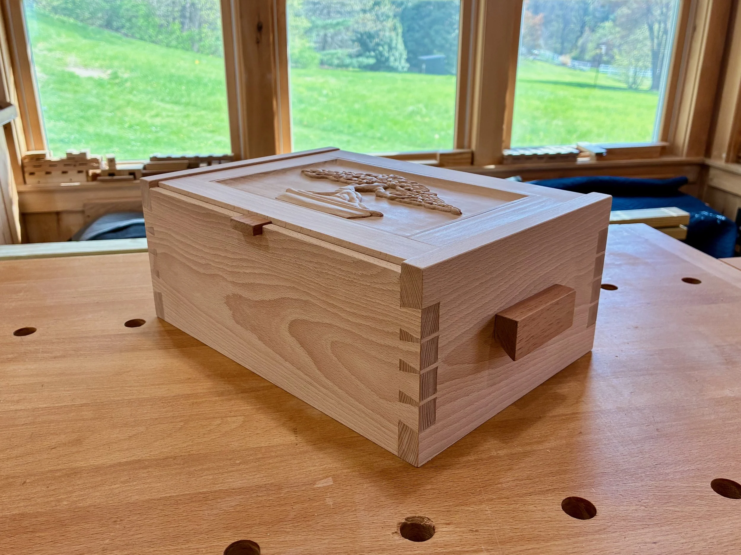
Latch and handles in place
On to the finish. After some experimentation I decided to keep things simple and let boiled linseed oil do most of the work. The grain character of European beech is subtle; the wood’s glory is in its color tones. I was getting used to the pale raw look but felt obligated to make those colors glow as rich as possible, while also providing some protection from dirt and water. All pieces received an application of BLO, with the tray parts getting two more of gel polyurethane for extra protection. These treatments were applied over the course of several days, and once everything was cured I gave the toolbox a rubdown with Howard’s Feed-N-Wax. The beech is surprisingly splotchy, now, but that should ease as things darken. One last modification of the lid was to cover the interior panel with some Korean wallpaper. This little surprise upon opening adds some Asian seasoning to the gumbo.
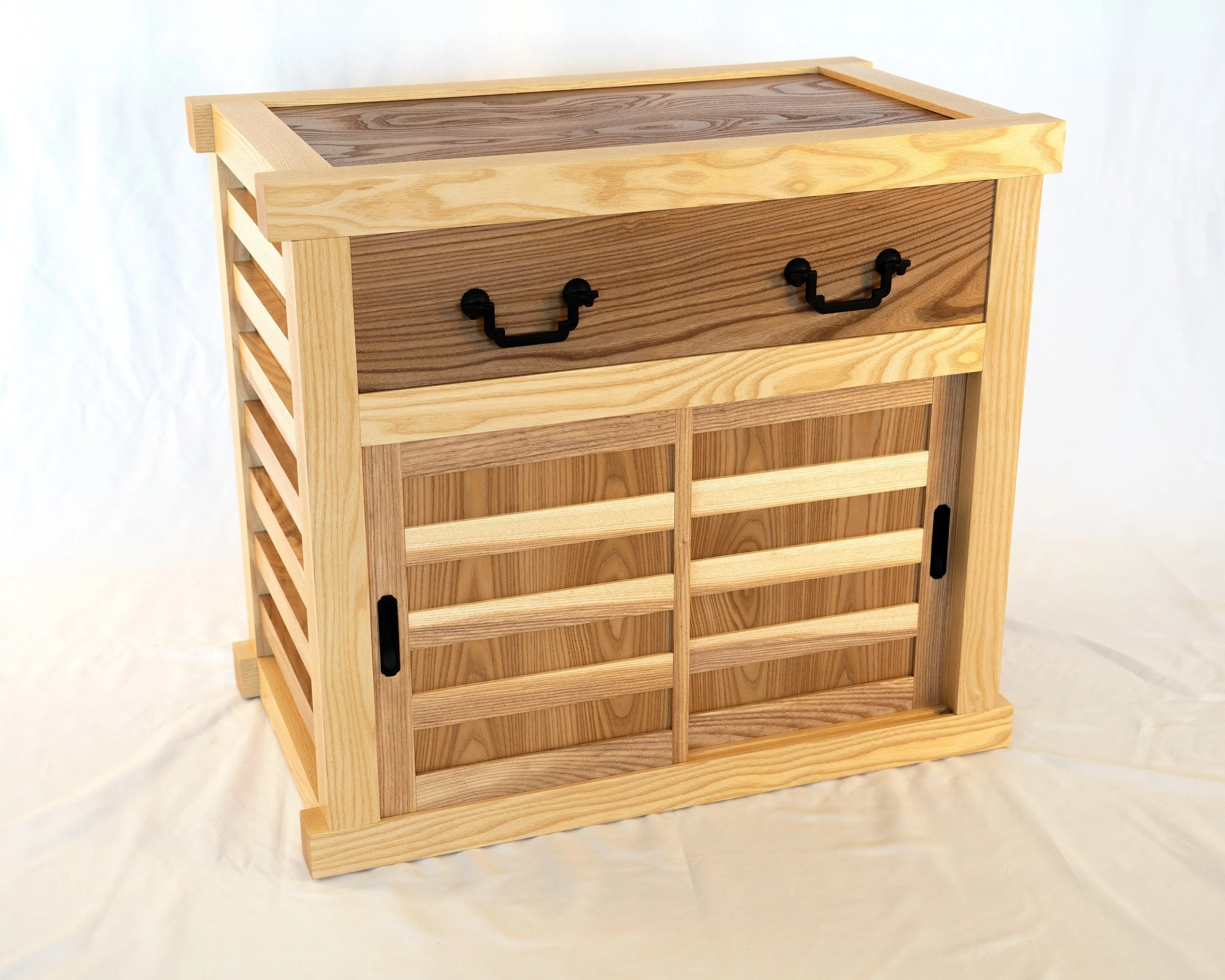
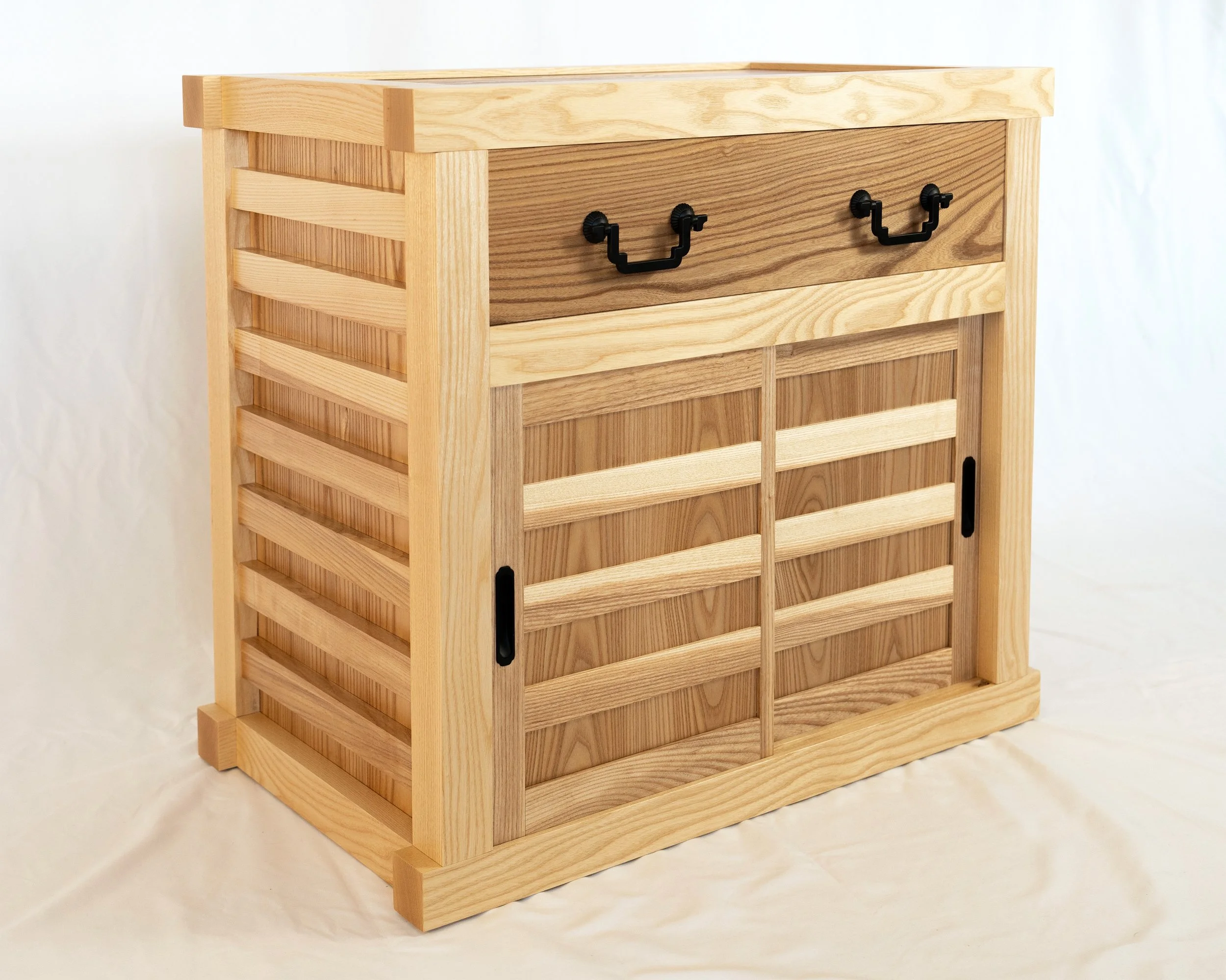
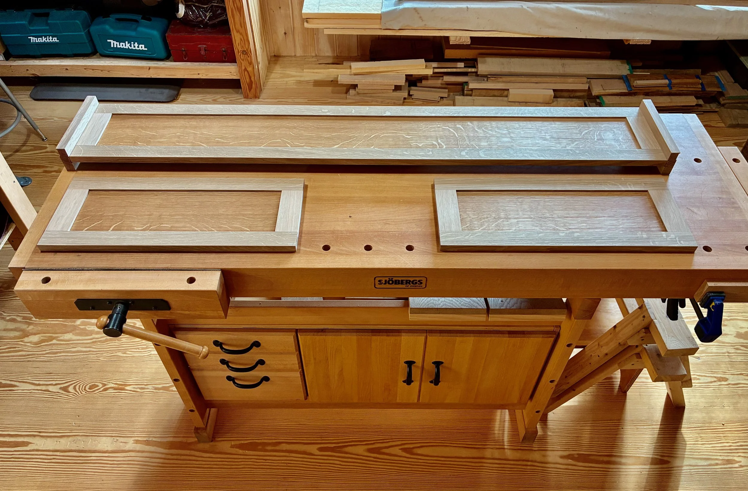
Finished toolbox
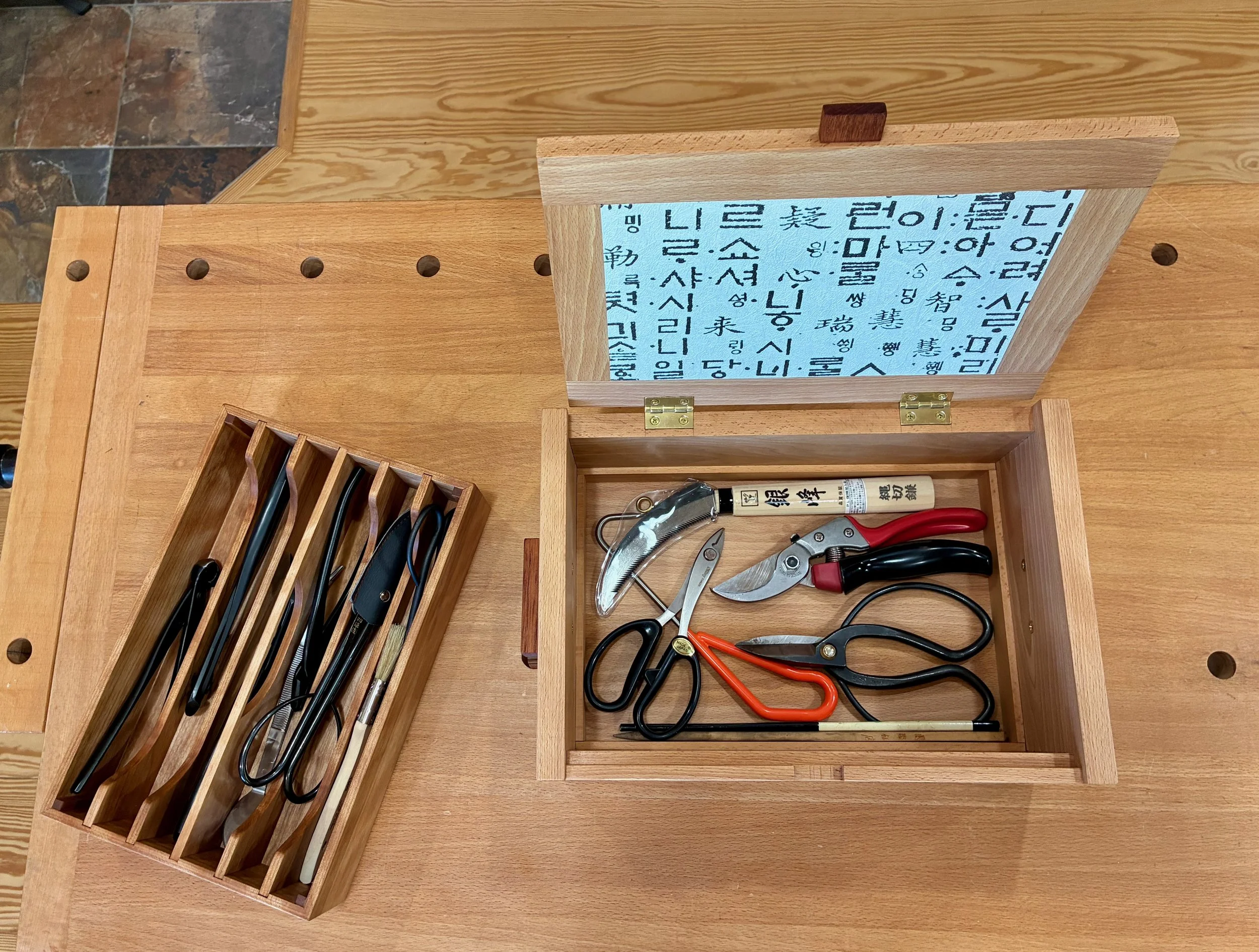
Tools protected
This little box is packed with features, which made it a very enjoyable build. Also, the opportunity to collaborate with Don on the lid took things to another level of satisfaction. And much like bonsais, this “masterpiece”, if cared for properly, should delight the owner for generations to come.
Bonsai Toolbox

Bonsai Benches

Early appreciation of bonsai in America as “remarkable Japanese plants”
This spring I am getting into the bonsai hobby with much excitement - it will be my second foray. Some thirty-five years ago I began accumulating a collection of trees that I enjoyed keeping on a bench in my New Jersey garden, although not all of them seemed as pleased. Fifteen years later I moved to New England, and my trees encountered that same existential impediment faced by the first European settlers here: winter. Consequently, spring of 2005 marked the end of my first bonsai adventure and, in hindsight, that was probably for the best. I had more worthy attention outlets as the family matured and professional obligations mounted. However, I now enjoy a woodworker’s retirement and reconnection with an old friend, Rich, who is both a skilled bonsai practitioner and generous soul (read: mentor). That feels like a winning hand.
While no doubt “remarkable”, bonsai trees are in fact the same as all other plants that have evolved on this earth. They are not necessarily “Japanese”, and rarely are they horticulturally special when compared to “normal” plants. Bonsai (literally: “planted in a tray”) are merely trees put in a container and maintained so as to grow a healthy, albeit stunted, existence there. What makes them remarkable are their features, carefully manicured over time, that evoke the illusion of age and the beauty of Nature.
To be appreciated, visually, bonsai should be displayed, and there are several ways to properly do this. Elaborate, furniture pieces (tables, shelves and stands) have been fashioned to support bonsai at their best during shows and competitions. I’d like to make one of these some day, but the current Project is for displaying my growing specimens out of doors.
Shohin bonsai on display
(photo from Bonsai Bark by Wayne Schoech)
Design
To display bonsai in a garden one simply needs a stable platform of convenient height; ideally, one that is impervious to the effects of heavy pots, wind and water. Common solutions employ makeshift wooden surfaces supported by cinder blocks. These provide versatile structures that are are easy to remodel as a collection grows or the seasons change. My particular benches are meant to sit permanently along a specific wall on the edge of my patio garden, and so purpose-built structures seemed best.
Bonsai garden space cleared of previous plantings
I played around by re-dimensioning some outdoor seating bench designs but ended up with a simple table plan. There will be two adjacent benches, and I chose to vary their heights so that they would not have to lie exactly even & level with each other to look good. There was a fair amount of site preparation required ahead of the final installation, which I will ignore here. The important part for design was the footprint. These benches will be situated in a trapazoidal area, and so to make better use of the space they will also vary in their width dimension.
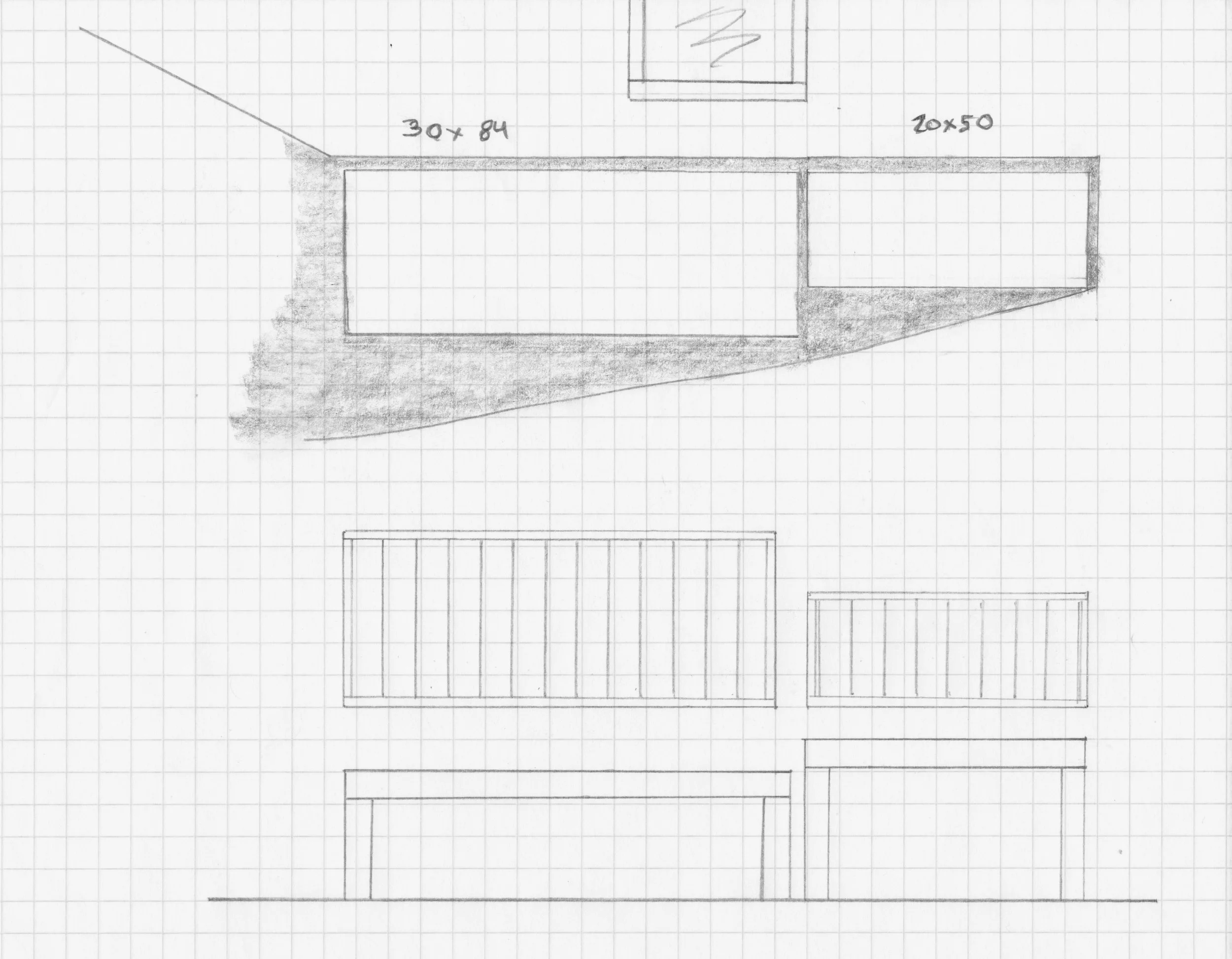
Rough plan
Materials
Pressure treated (PT) pine in 1 x 6, 2 × 4, 2 × 6 and 4 × 4 dimensions were procured from Home Depot. As I have commented previously, PT lumber is a remarkable material that resists rot and thereby saves trees otherwise required for the lumber to duplicate a shorter-lived, natural wood version.
Pressure treated pine and sliding miter saw
Dimensioning & Assembly
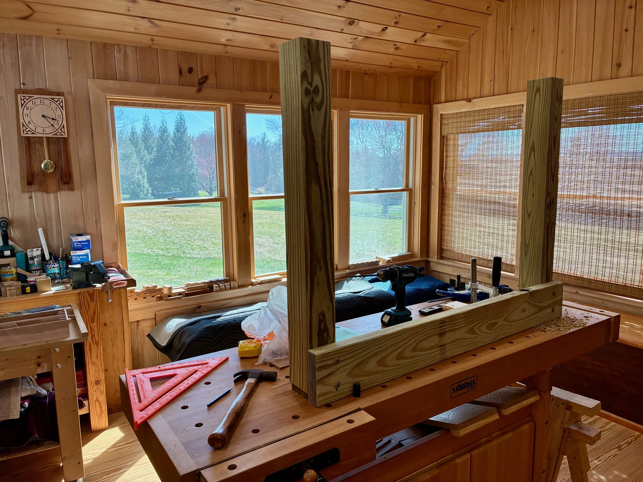
As a rule, I don’t like to use my workshop tools for PT lumber, but the sliding miter saw is so much easier to use than a hand held circular saw that I made an exception here. I followed the plan dimensions, exactly, so the sawing was simple: square-off the ends and cross cut to length. The wood was quite wet, but pretty straight and well-behaved, overall.
I began with the shorter bench and constructed it in the workshop. Galvanized, 5/16 in. carriage bolts were used to firmly join the rails to the legs, and a 2 × 4 “sister joist” (maybe that’s the term?) was run along the inside of the long rails to provide a nice surface on which to fasten the platform boards, spaced ¼ inch apart.
Attaching the legs to a side rail using carriage bolts
Laying the final board. A simple jig was used to keep the screw spacings uniform.
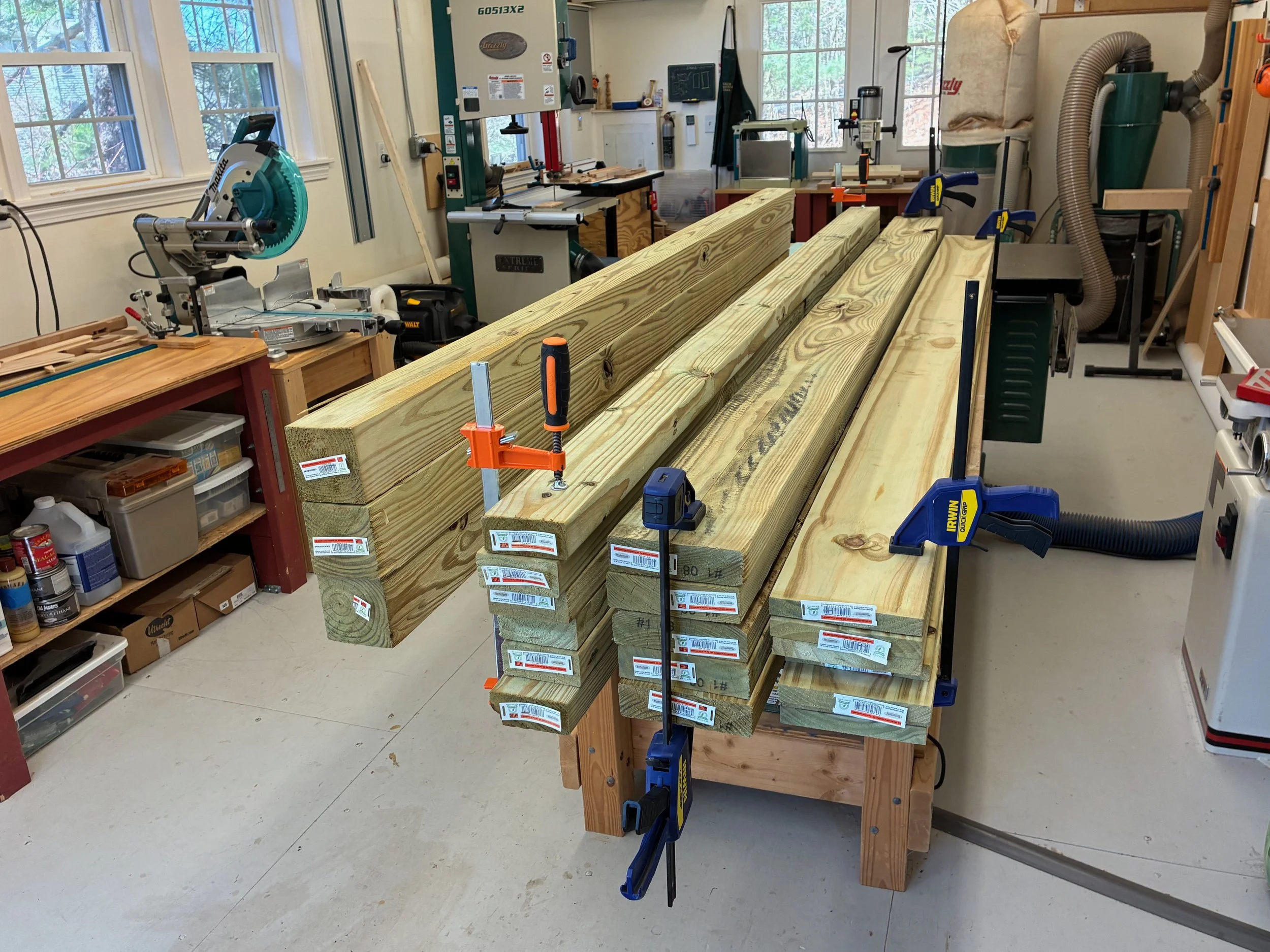
The larger bench was assembled on the garage floor from boards cut to length under the Red Top.
Tools and pre-cut lumber at the job site
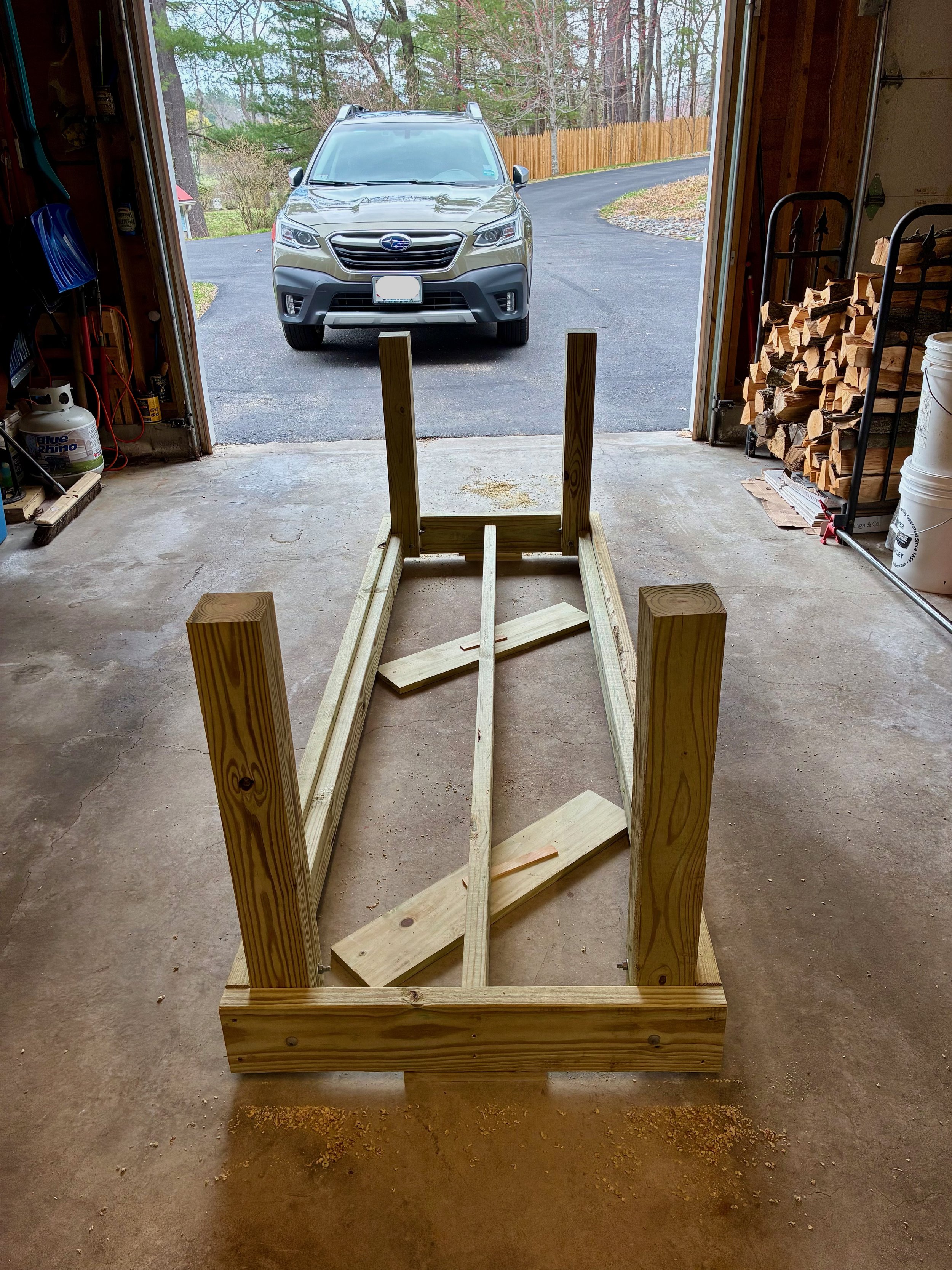
Completed frame
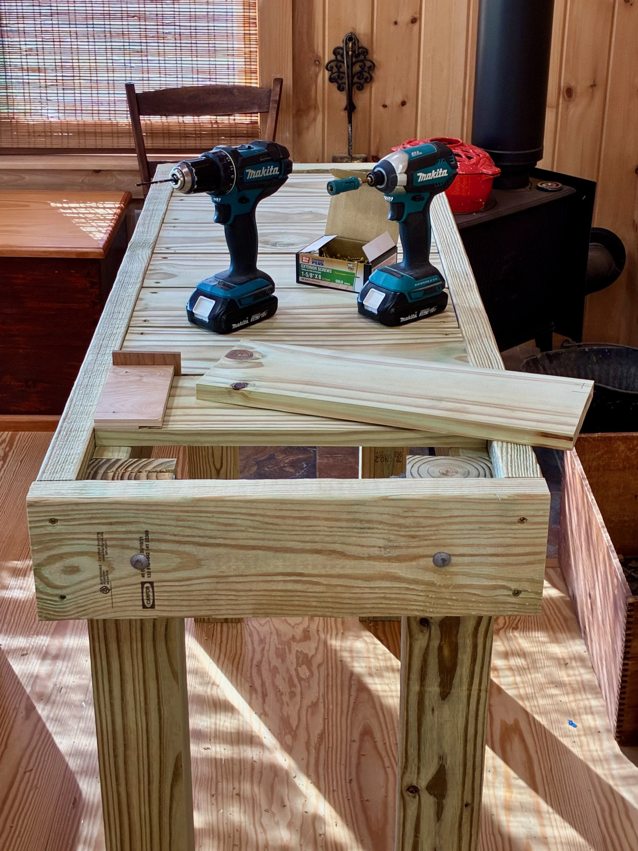
Except for flipping things over and moving the benches to site, this is an easy, one-person job. Rich helped me move the frame outdoors and the decking was completed there.
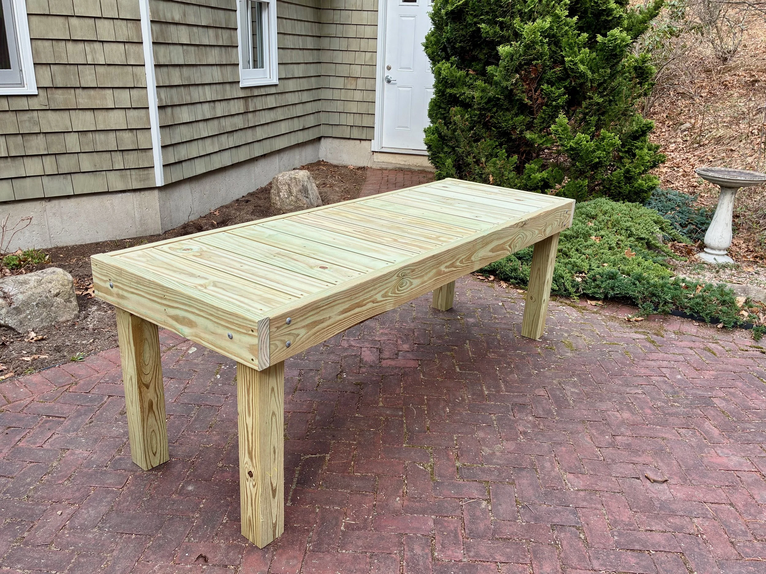
Bench done
Following some landscape work the bonsai benches were moved into place to begin their new life in support of a new adventure.
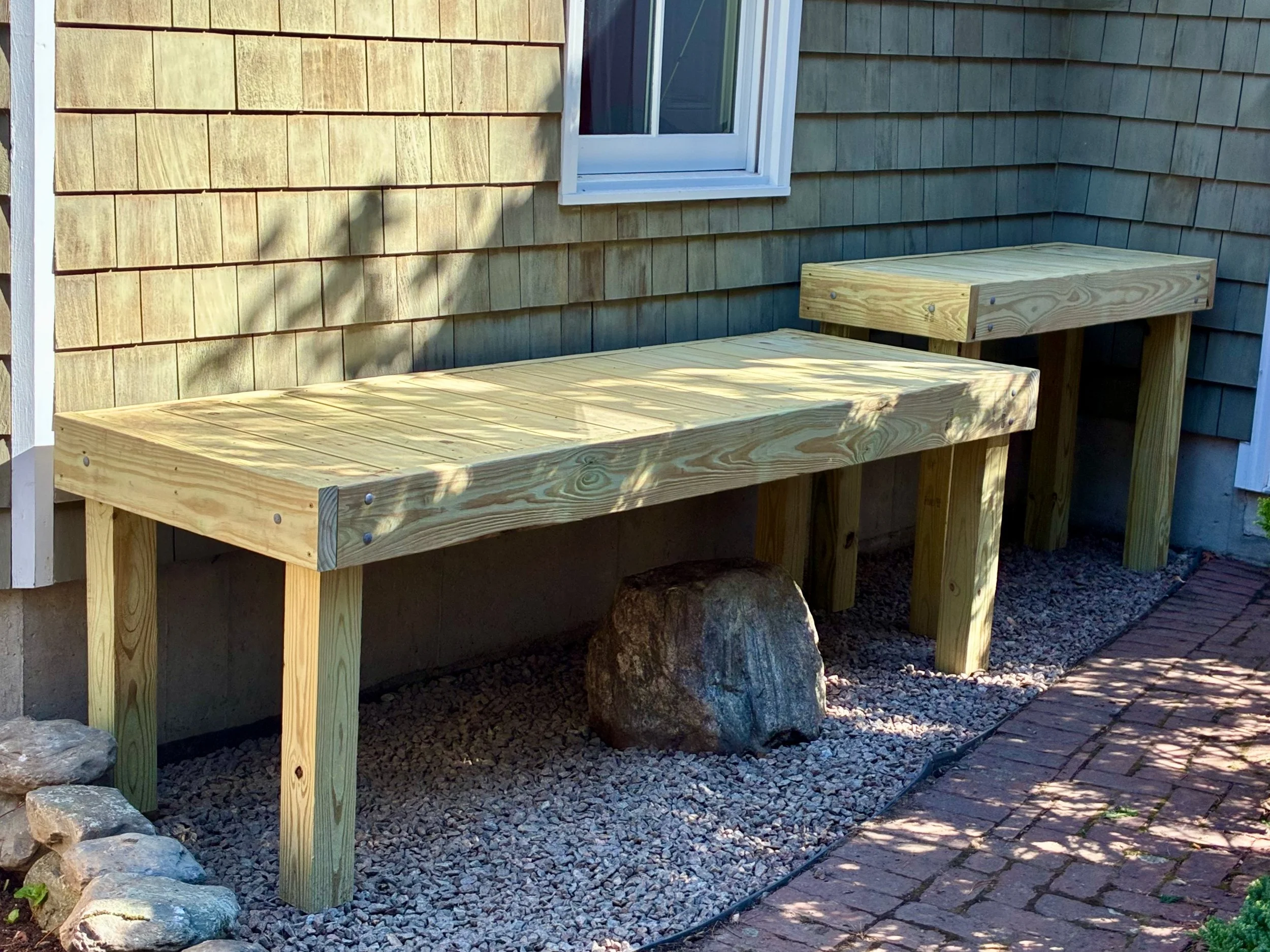
Benches in place
I collected some trees from the woods on my property to get started. They’ll spend a year or two acclimating to pot life and begin bonsai training, thereafter. Stay tuned.
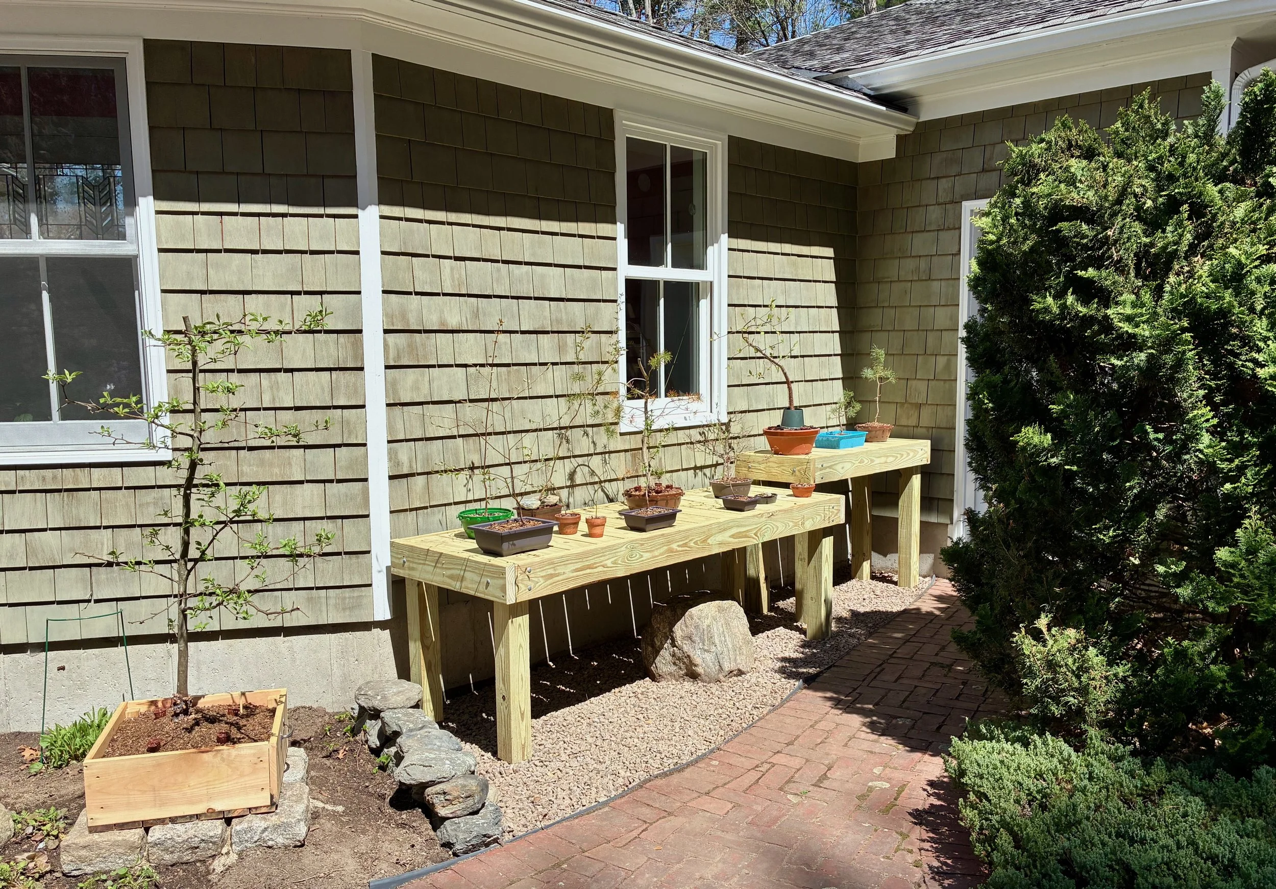
My remarkable plants
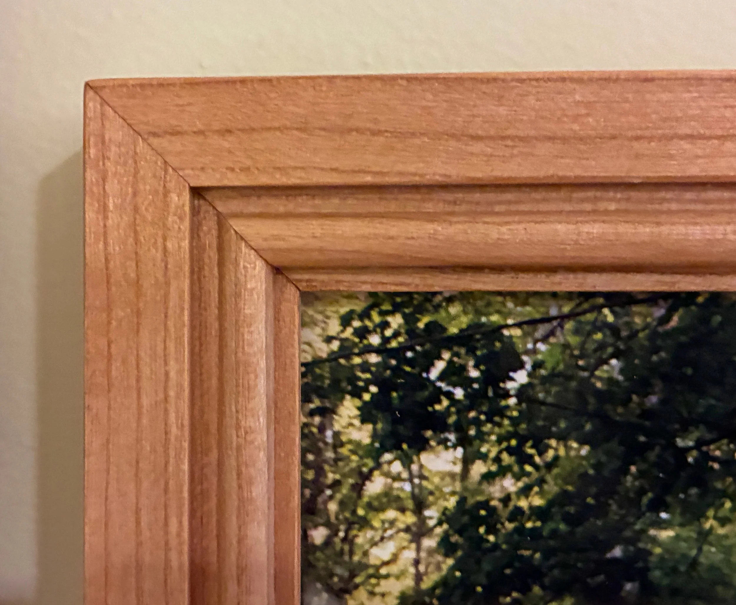
Framed

We turn out 5-10 picture frames a year at the Red Top Workshop. Some are for our home, most are requested by family members and the rest given as gifts. I’ve never written about these but decided it was time to give them a turn.
Making frames is much easier than one would expect, given the prices at a frame shop. In terms of material investment, the wooden frame structure costs very little - glass is the culprit. Fancy moulding work adds value, but unless you are hand-carving your wood, milling with industrial shapers (or a router) is quite economical. The work consists of shaping & rabbeting the wooden members, cutting these parts to exact lengths and then joining things together. From there it is a simple process of finishing the wood and mounting the art behind glass. You’ll find the final product always looks better than expected and, having taken part in its creation, that frame keeps your attention long after you’ve become blind to the picture it confines. Try it!
Design
For this Project I am framing two 8x10 in. family photographs, taken a few years’ back during the wedding of my oldest son. They are similar in composition, so two identical frames were in order. And since these were photographs, the frame did not need to do much other than look nice, and stay out of the way while doing so. It was decided that mitered corner frames made from narrow stock with a simple bead along the inner edge would do the trick.
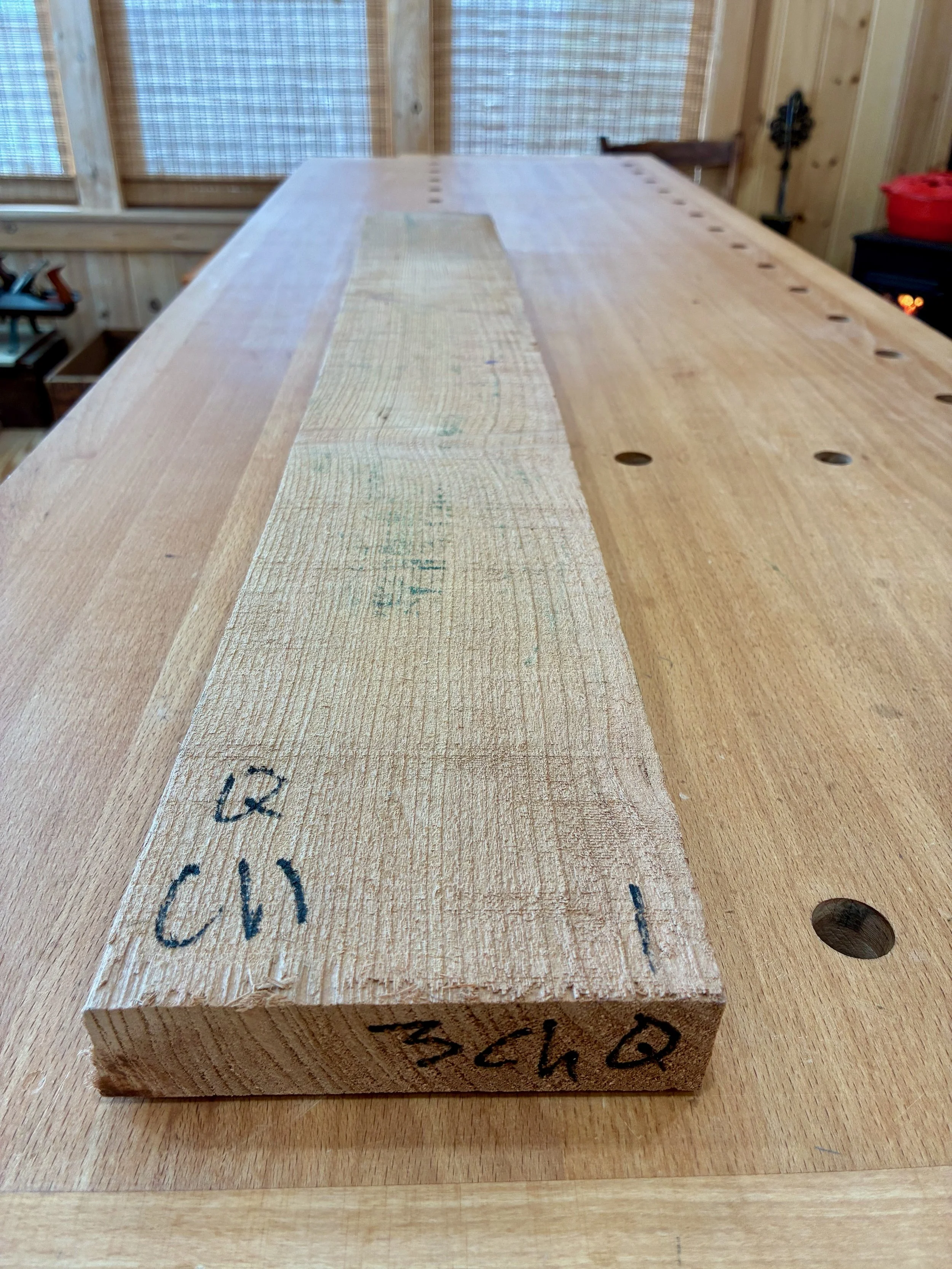
Materials
I like cherry and its been a while since I’ve worked this wood. A nice quarter sawn cherry off-cut (called “shorts” at Highland Hardwoods) was selected that should be perfect for the job.
Making a “short” appear long
Dimensioning
To prepare the stock, that 3 ft. long board was first cut in half. Next, both pieces were flattened and squared at the jointer and then resawn to 3/4 in. depth at the band saw. (Removing the bulk here gives my thickness planer a break.) Lastly, the boards were reduced at the thickness planer to a uniform 5/8 in. depth and smoothed with a card scraper and sandpaper.
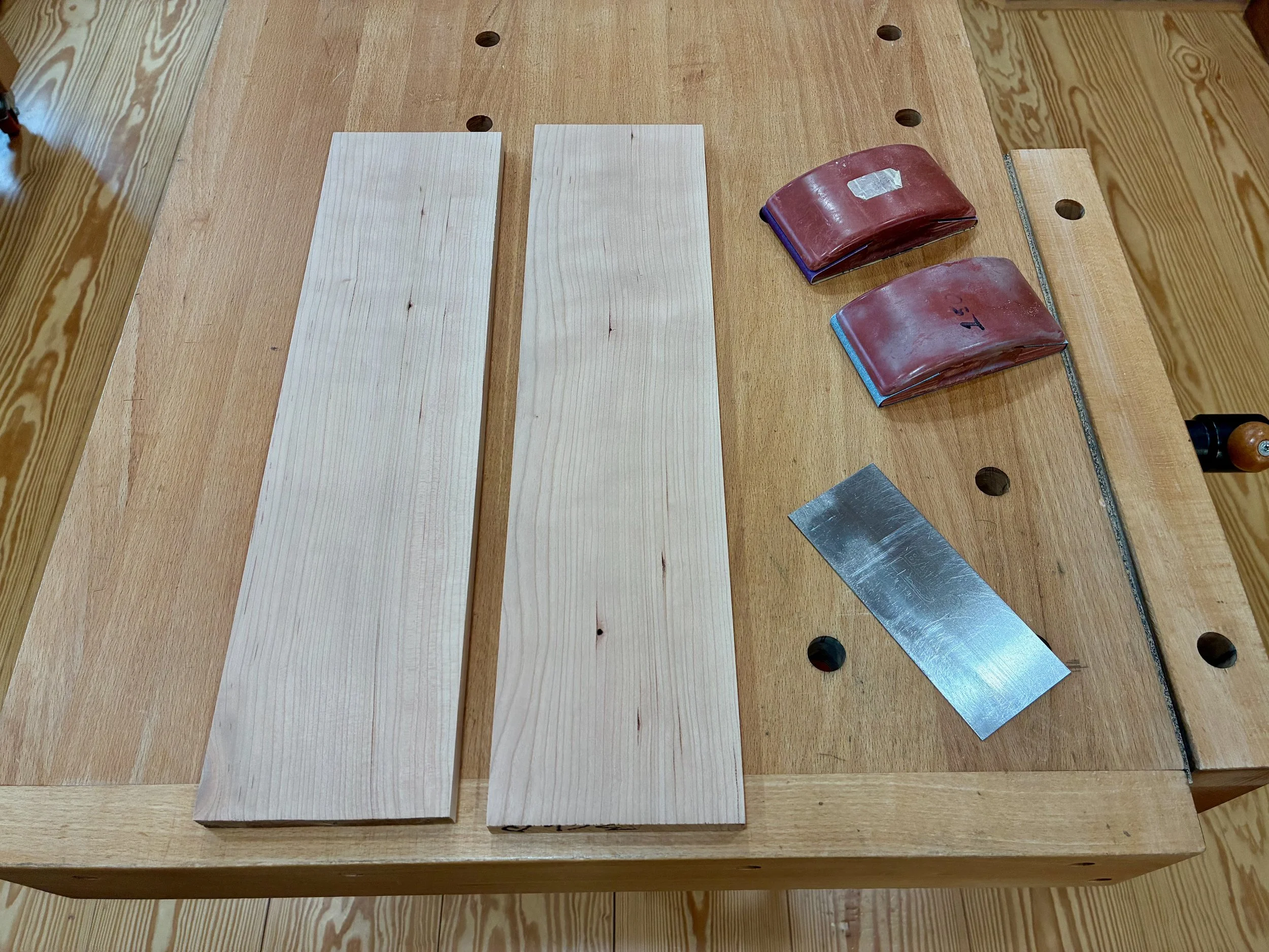
Prepped stock
In the next operation, the boards were trimmed to equivalent widths at the table saw and then ripped again to form four parts. I find it easier to shape and rabbet wide boards and so both edges of all four boards would be modified before again splitting these in two. A beading bit at the router table was used to decorate the edges.
Routing a bead feature
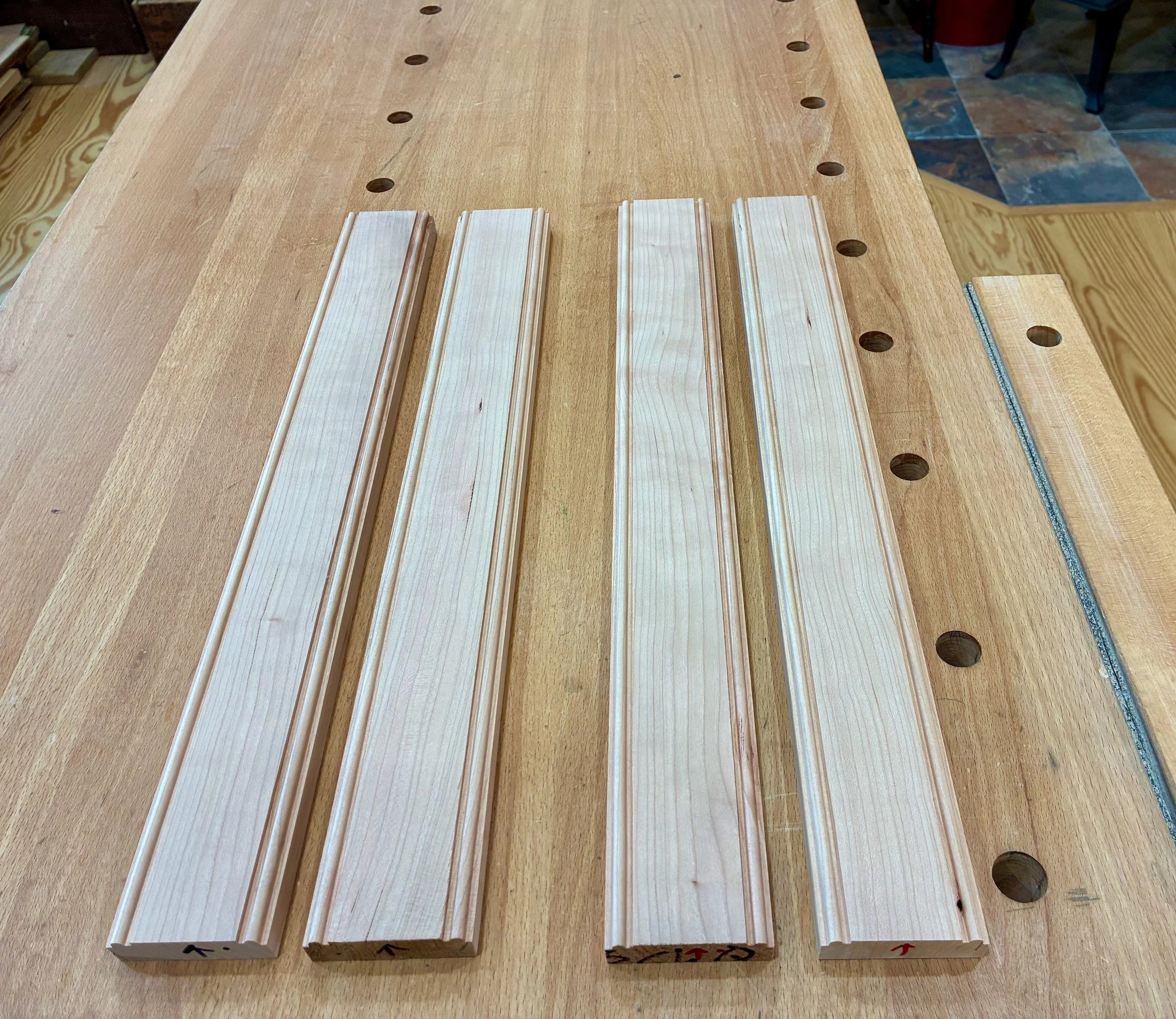
Beaded boards
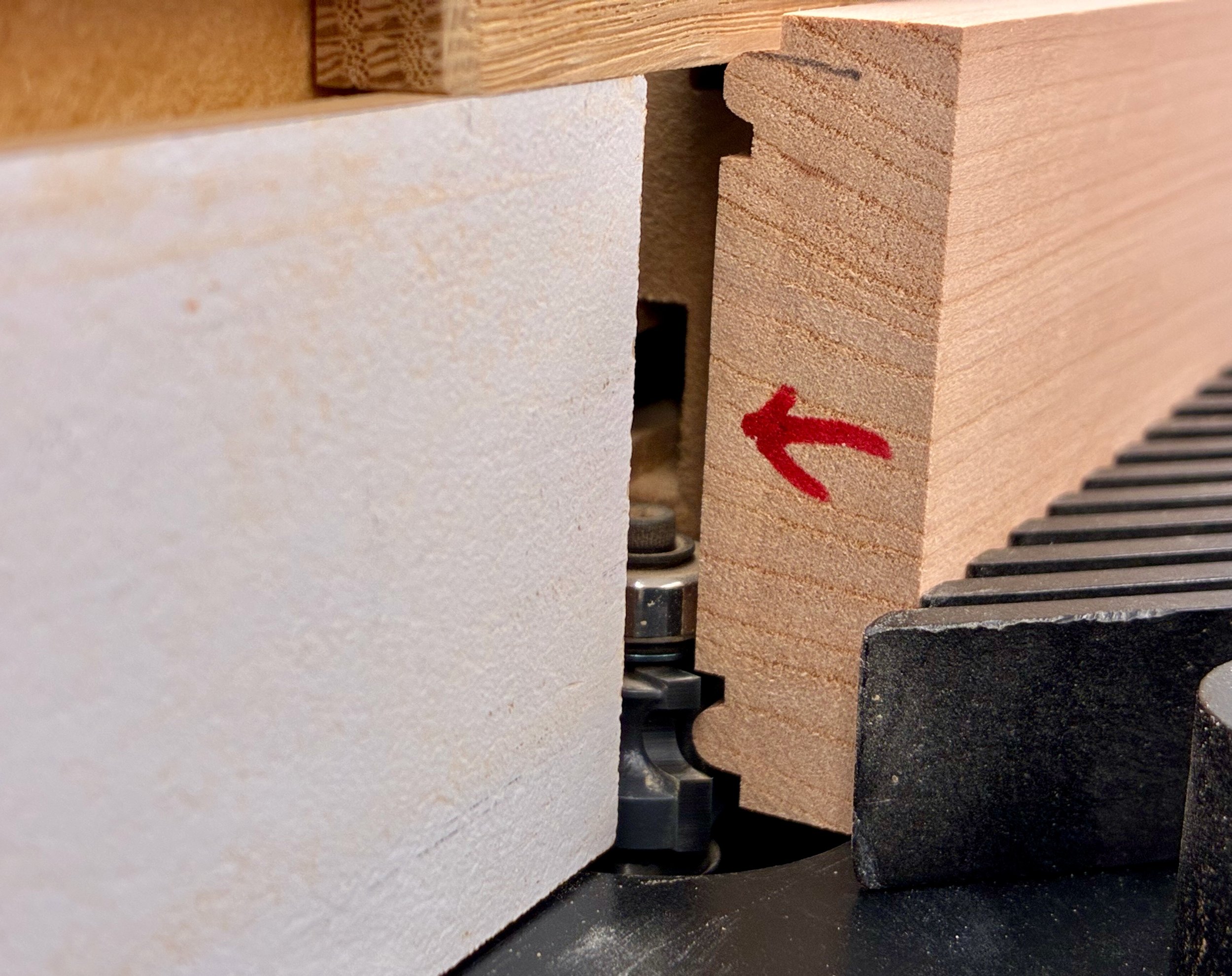
Next, rabbets were created on the undersides by the action of two sequential cuts at the table saw.
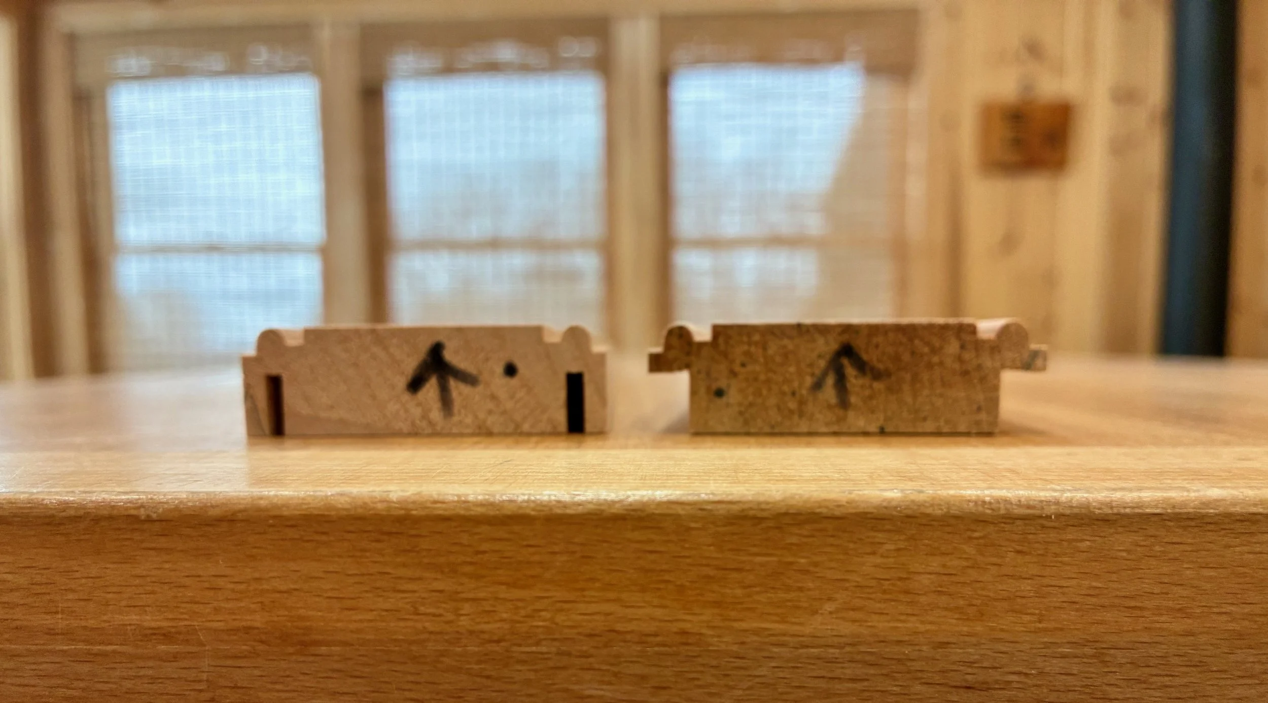
Left: Initial cuts define the frame depth
Right: Second cuts define the overlap
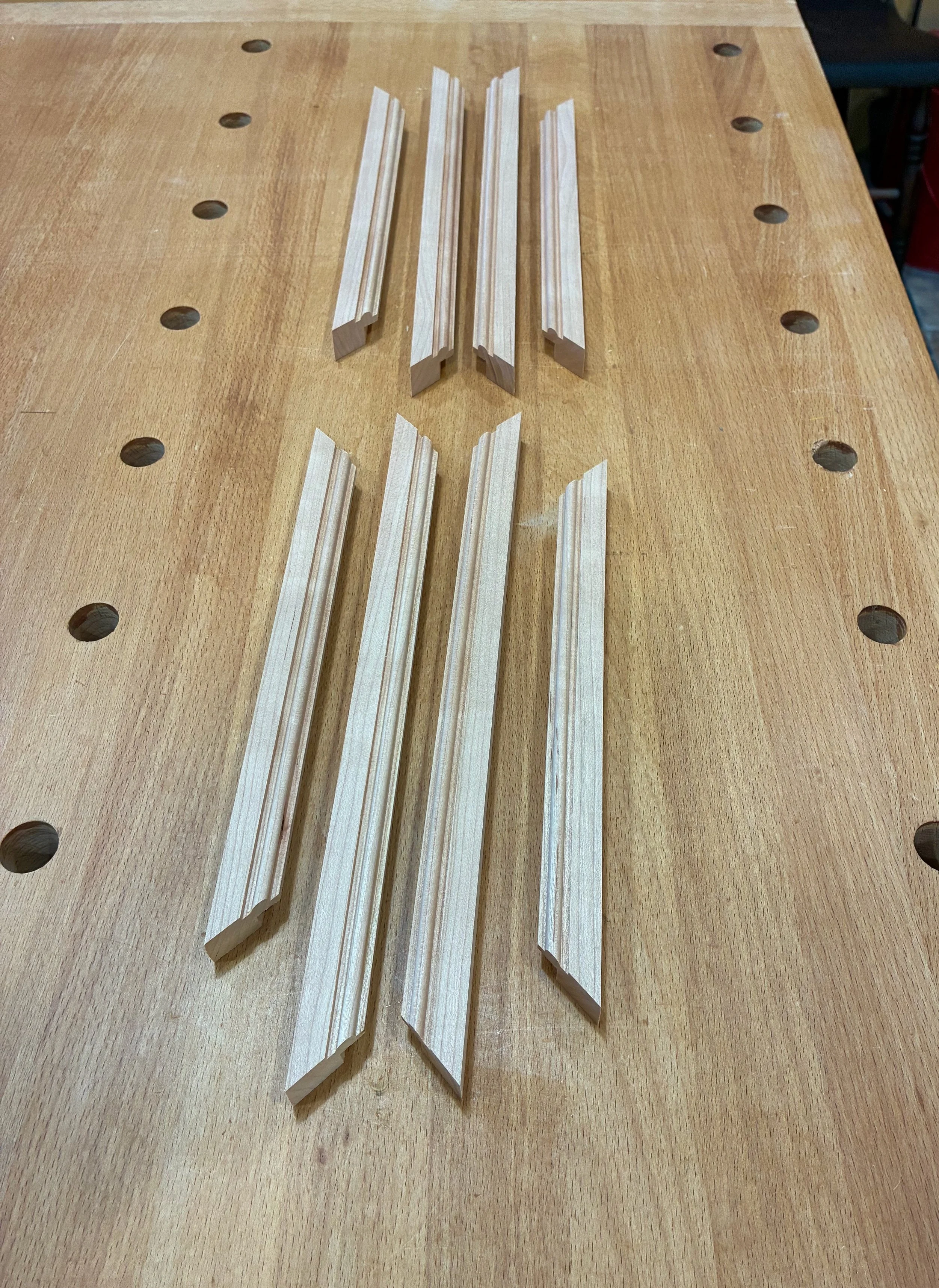
Finally, the boards were ripped at the table saw to yield eight, 3/4 in. wide frame parts. The freshly-cut edges were smoothed using a card scraper.
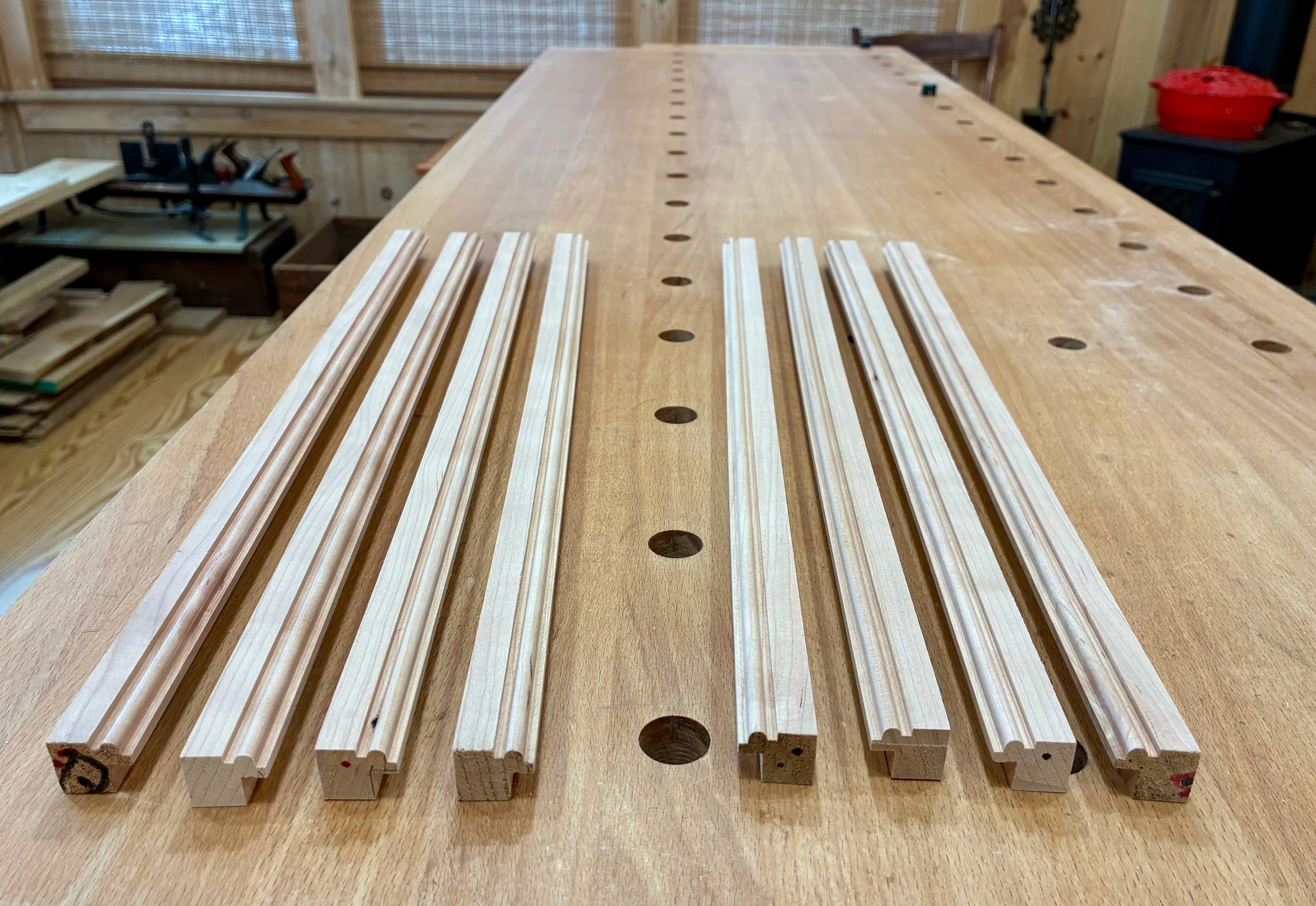
Frame stock
It was now time to cut these parts, accurately, to their final length on a 45° miter. In prior posts, you’ve seen me use my son, Andrew’s, nifty frame cutting jig at the table saw. I love that jig but, for some reason, it’s base is beginning to warp and the miters were not as clean as they should be. Fortunately, there is always another tool that can step-in to do the job; in this case, the sliding miter saw. This tool specializes in making accurate angle cuts. With a backing board, there is zero tear-out, and a stop block can be used to ensure all parts are cut to identical lengths. (Also, by flipping the frame part over after the initial cut, one can use the same angle position of the miter saw to make both cuts for each part.) Getting the length “right” is the only challenge with this set-up. You see, an 8 x 10 inch frame needs to match those dimensions at the rabbet. The outer frame edges will be longer than and the inner edges shorter than either 8 or 10 inches. To get the lengths right, all parts were first cut once on a 45° angle. For the short sides, a ruler was used to measure 8 + 1/32 inches along the “back” of the rabbet and this was marked in pencil. I lined up the pencil mark with the laser sight on my saw and then set a 45° angled stop block to hold this part, and all subsequent parts, in that position prior to making the second cut. Examine the picture and you’ll see what I mean.
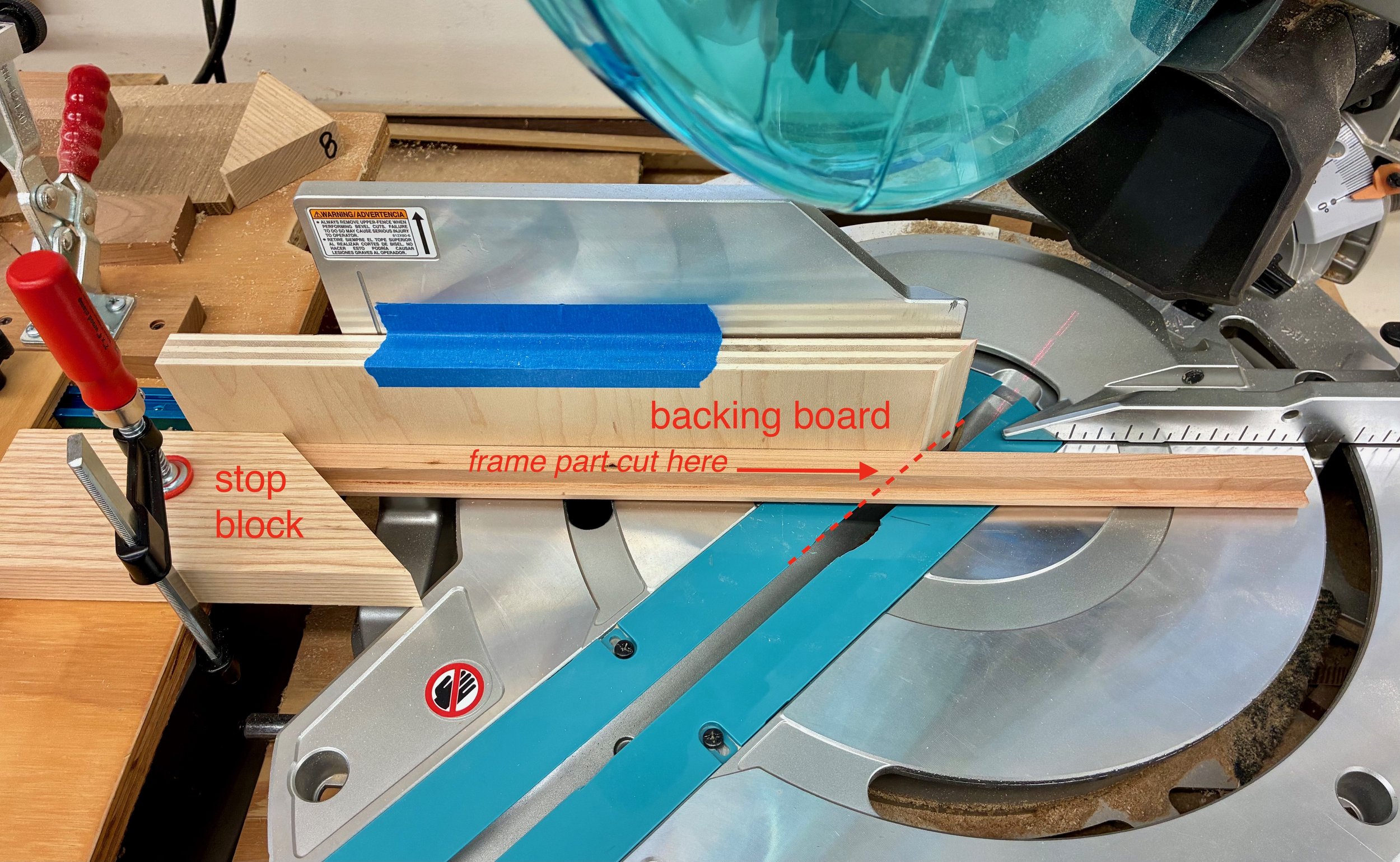
Making the second cut on a frame part
That’s more difficult to describe than to accomplish. Anyway, after 4 such chops for the short sides, followed by 4 more after resetting the stop block for the long sides, the frame parts were completed.
Frame sides completed
Assembly & Finish
Frame glue-ups are a cinch - if you have the right clamp. There are several framing vises available, and I own a few, but my advice is to invest in a band clamp and never look back. Band clamps are foolproof and fun to use. Just dab some glue on the miters, roughly match the parts together and then wrap & tighten the band clamp snugly around the frame. Voilà!
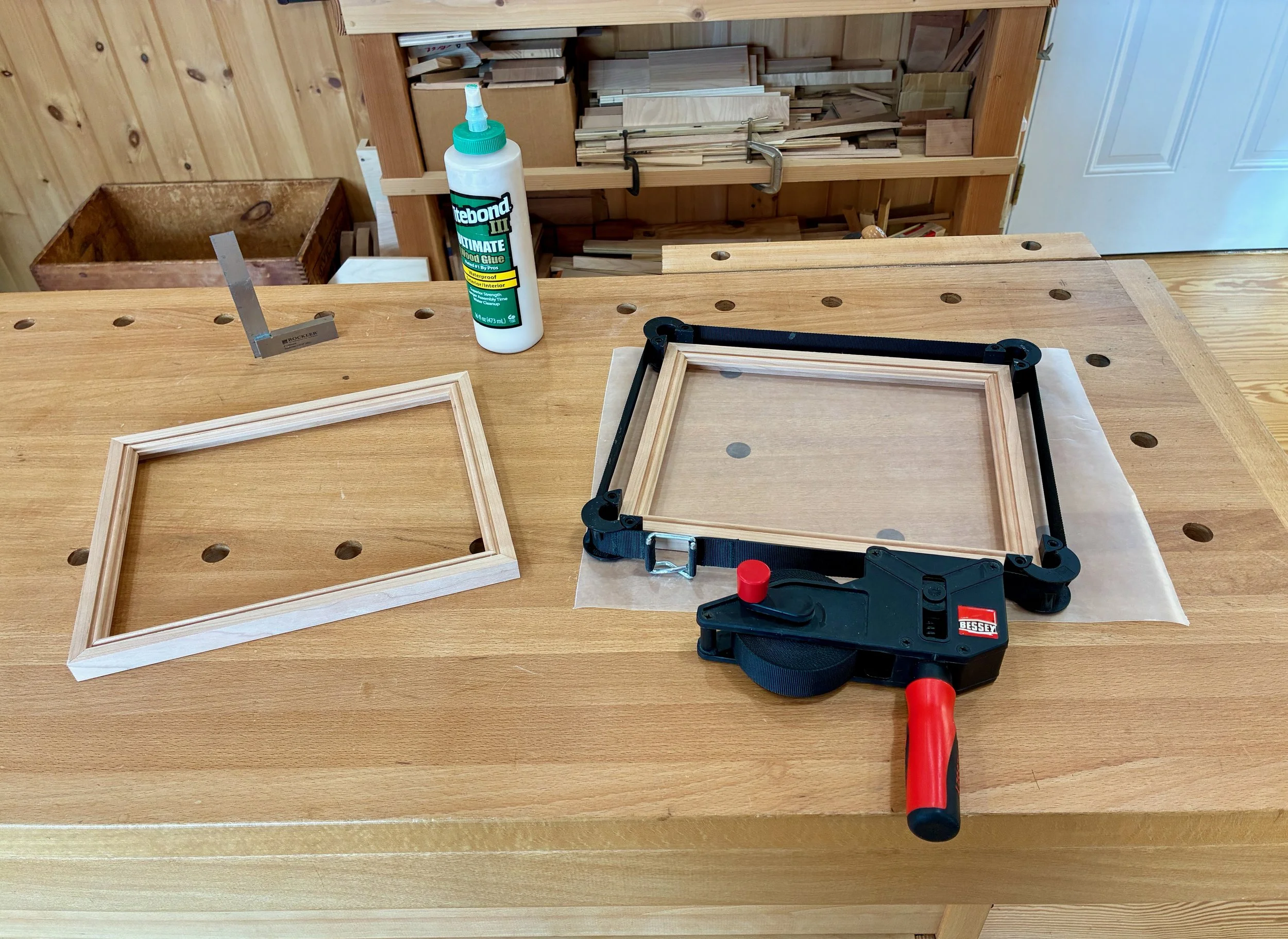
Frame glue-up
Once the glue had dried, the seams were evened-up with a brief touch of the random orbital sander followed by hand sanding to ease the edges and corners. I finished the wood with a single coat of gel polyurethane - no gloss, just warmth.
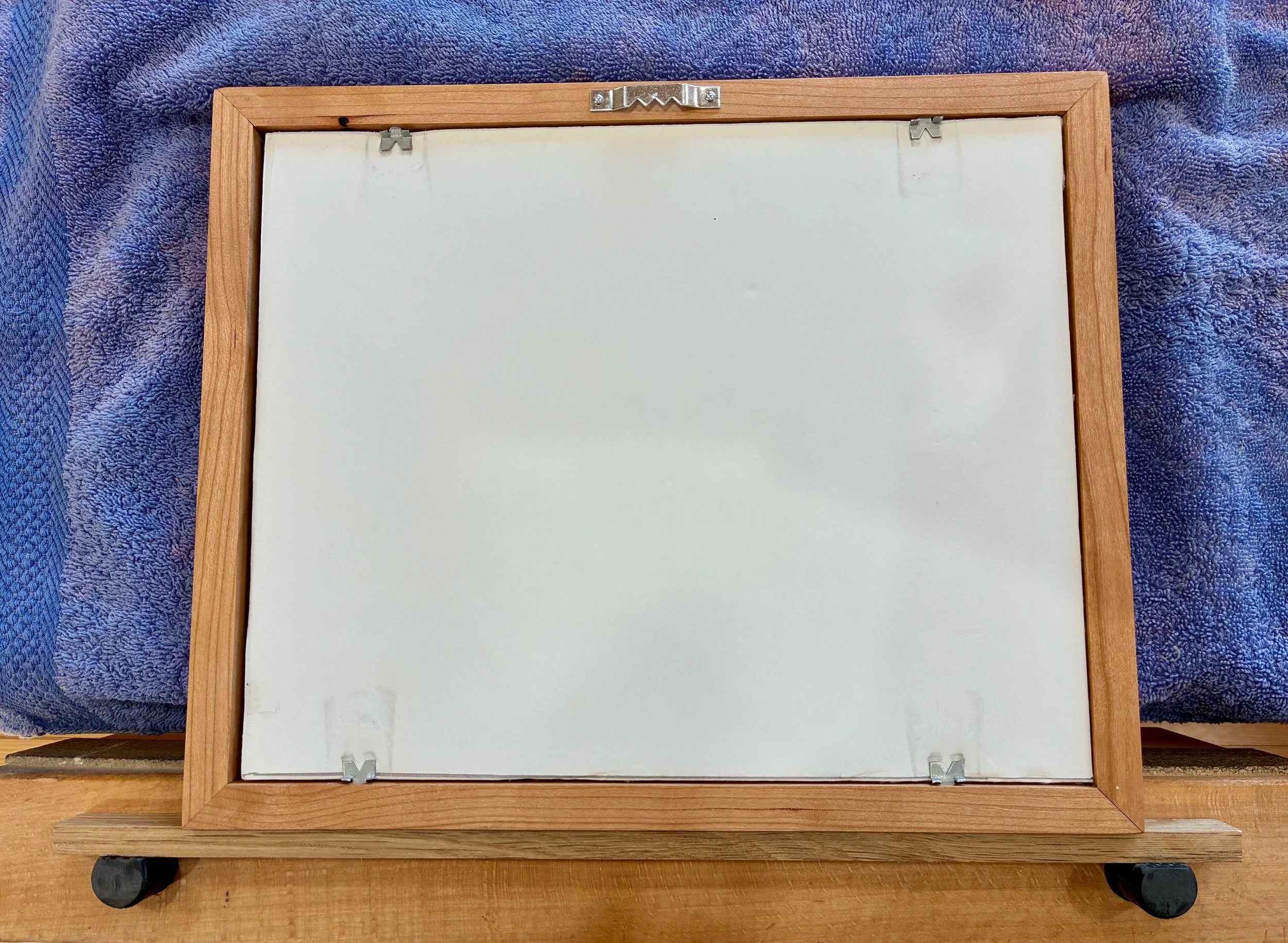
It is easy to order pre-cut frame glass online if you are after conventional dimensions such as 8 x 10, otherwise a stop at the local frame shop for some custom cut glass is required. For mounting things up I held the glass/picture/backing foam core board assembly in place with some glazier’s points. A saw tooth hanger was used for the wall mount, although I’d suggest wire for anything heavier than this one.
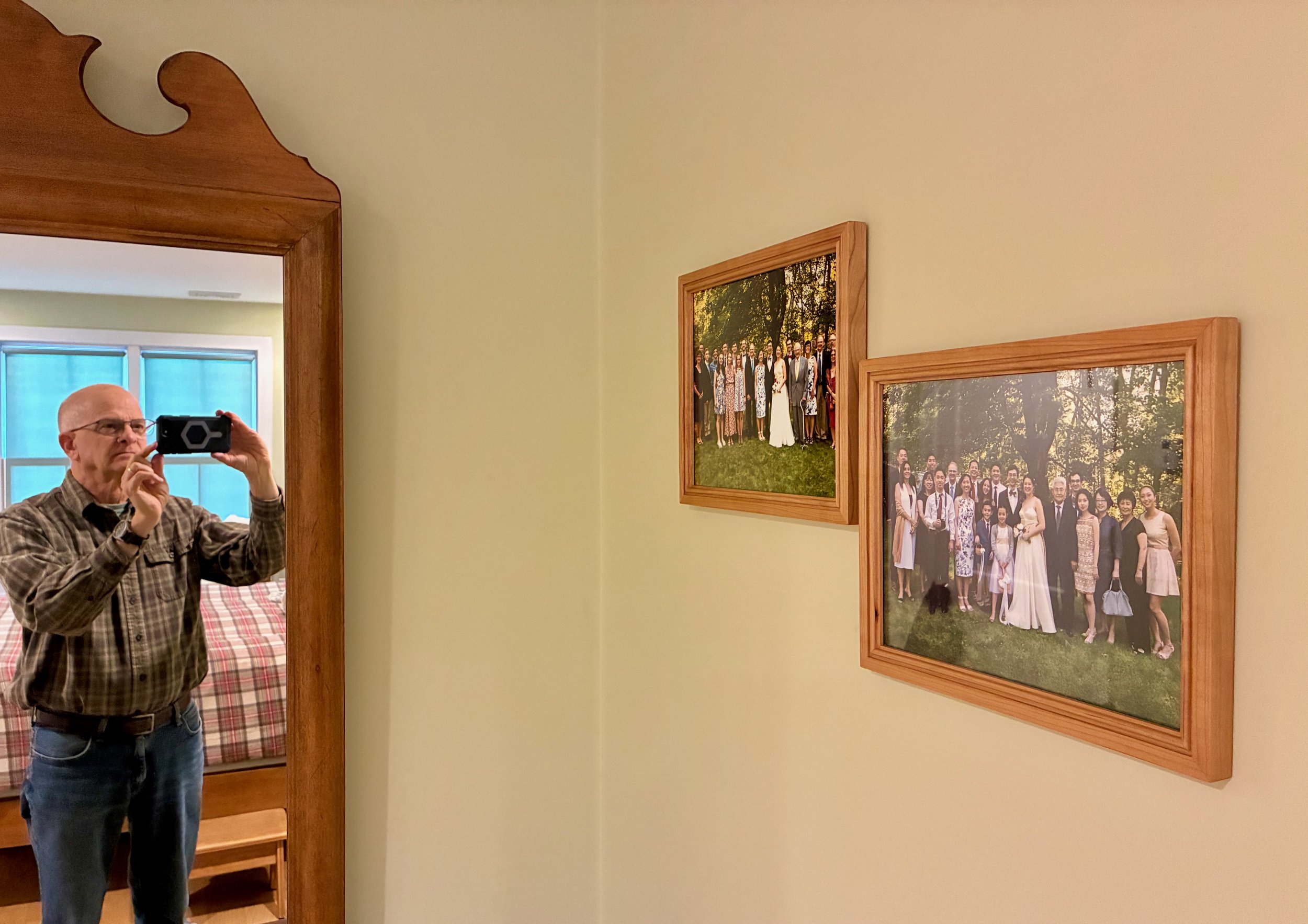
Framed print
And that does it. An unassuming board, a few tools and a little effort makes a worthy frame to display your memories forever. Pretty nice!
Picture perfect
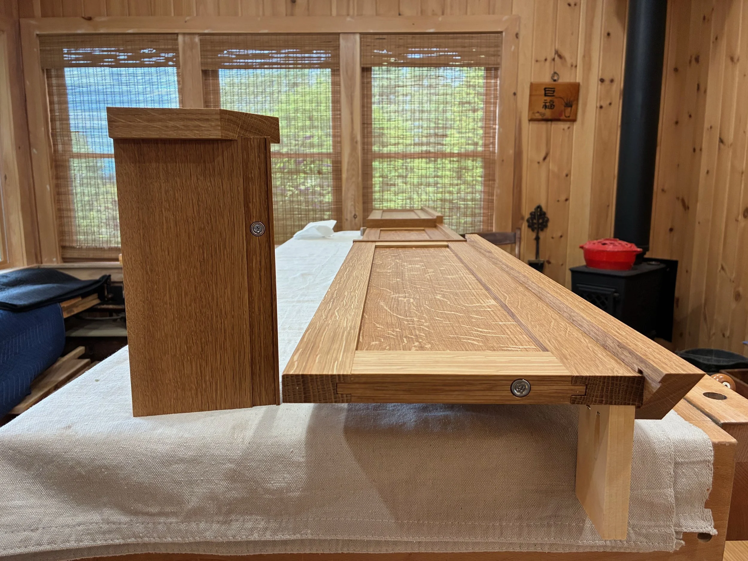
Coin Chest ep. 2
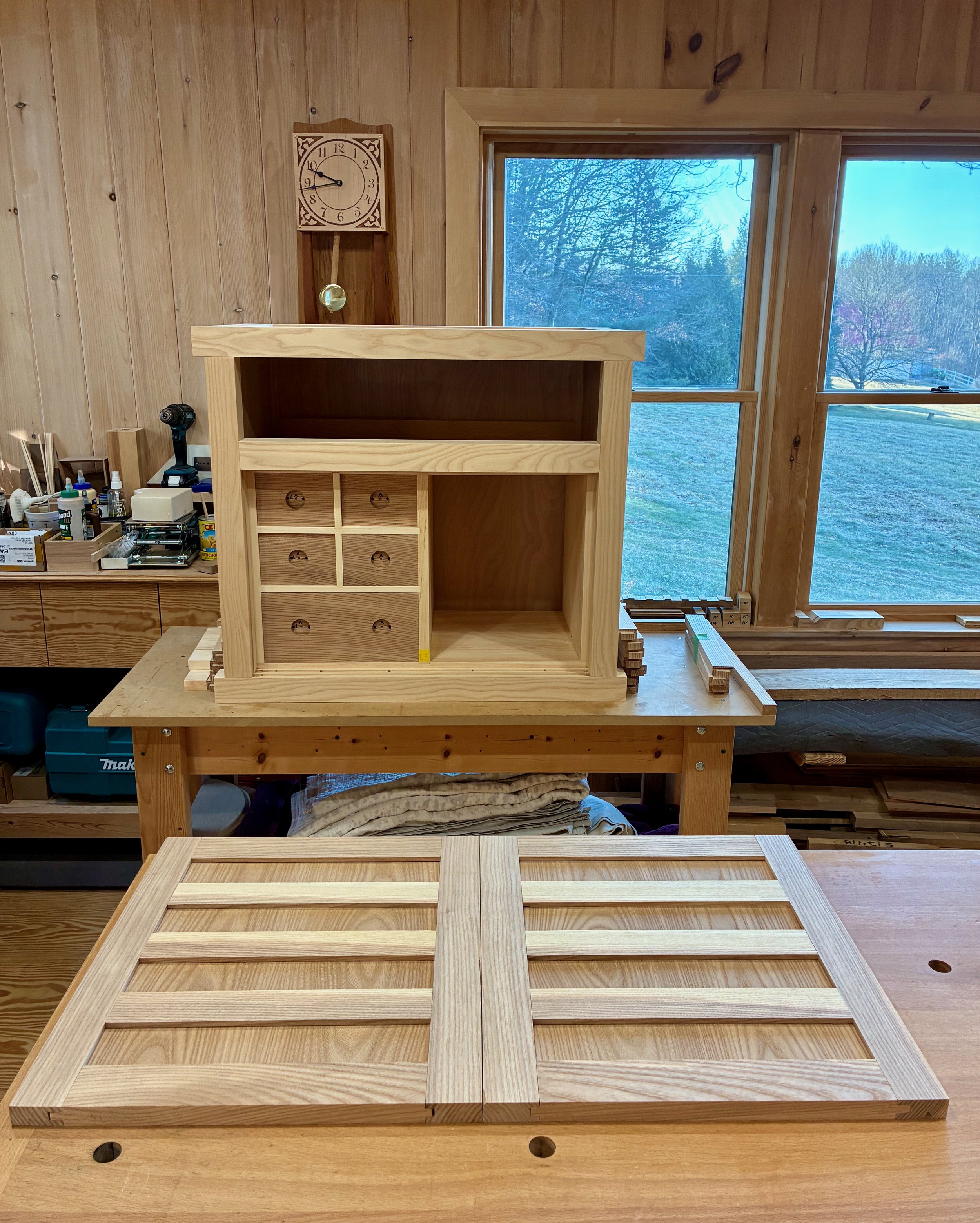
Picking up on the Coin Chest Project we shift our focus from casework to case components; specifically, six drawers and a pair of doors. Let’s get at it!
Design
Back in October 2025 we left the Coin Chest in a state of arrested development, where all of the chest’s framework parts were complete and assembled, just not glued permanently in place. This was to permit the construction and insertion of a box to house the interior drawers. That box would rest just behind the Chest’s sliding doors, creating an inner chamber common to many tansu of the merchant chest type. The plan was to build a box to fill the cavity, disassemble the surrounding framework, apply glue to the tenons, and then re-assemble the frame with the box enclosed. This may not be the method used 150 years ago in Japan, but it seemed like it would work, today, under the Red Top.
With a construction strategy in place, the final design step was to configure the inner drawers. There is no “right” answer here (alas, there rarely is), but the guiding notion was to create smaller containers that could segregate parts of the collection while keeping things versatile. Only half of the cavity would be “drawered”, the other half would be shelved with the intention to house coin books, magazines and other pieces not fit for life in a drawer. Rough plans for a couple of versions were drawn out and discussed with Mike before landing on the one below. Its construction would involve dovetail joints and dadoed housings.
Coin Chest drawer box
Materials
I chose to make the drawer box out of eastern white pine, a stable, lightweight wood that is easy to dovetail. In the end, only a small portion will be visible. Like the other woods, this was picked out of the fine selection at Reader’s Hardwood Supply.
4/4 Eastern White Pine lumber
Drawer box
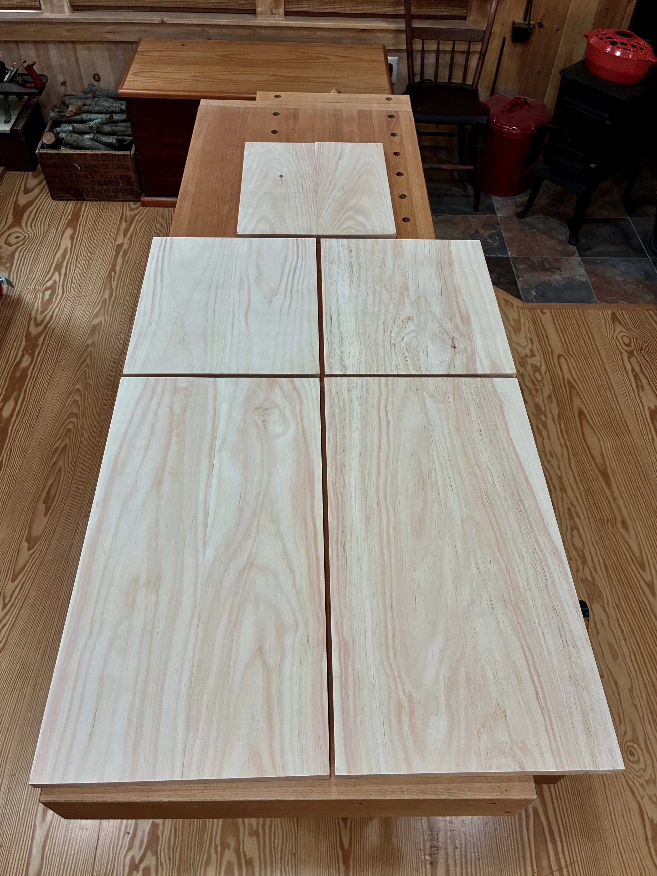
The box would be constructed of a top, bottom and two sides - no front or back. All parts would be 13 3/8 inches in width, a dimension most easily obtained by glueing two ~ 6 3/4 in. boards together. The only issue is that I have a 6 inch bed on my jointer and so, to catch that last 3/4 inch, I would need to use my new thickness planer jig to flatten the stock instead. This is an easy work-around that also serves to keep the jointer blades clean. With resinous woods like pine you learn to take the good with the bad: they are soft as a pancake to work, but all your tools get syruped.
Flattening boards on the thickness planer
After getting the boards milled to a uniform 3/4 in. thickness, one edge was squared-up at the jointer and then the boards were paired and glued together to make the rough box stock. Once sanded smooth, a track saw was used to square up one end of each board, and then the table saw employed to cut each piece to their final width and length.
Box stock: 4 sides and a central divider
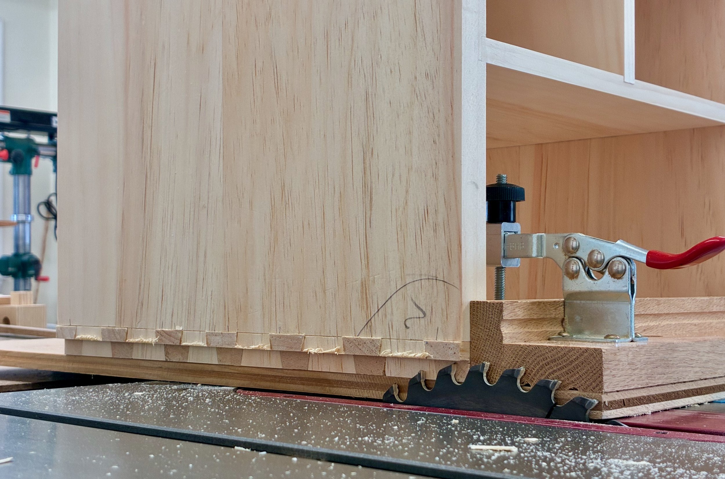
From here the boards were marked, sawn and chiseled in the typical through dovetail sequence. I still consider myself an amateur with this joint, but every bout makes me a better competitor. These turned out pretty nice (in spots). Pity they will be out of sight in the finished piece.
Dry-fit box
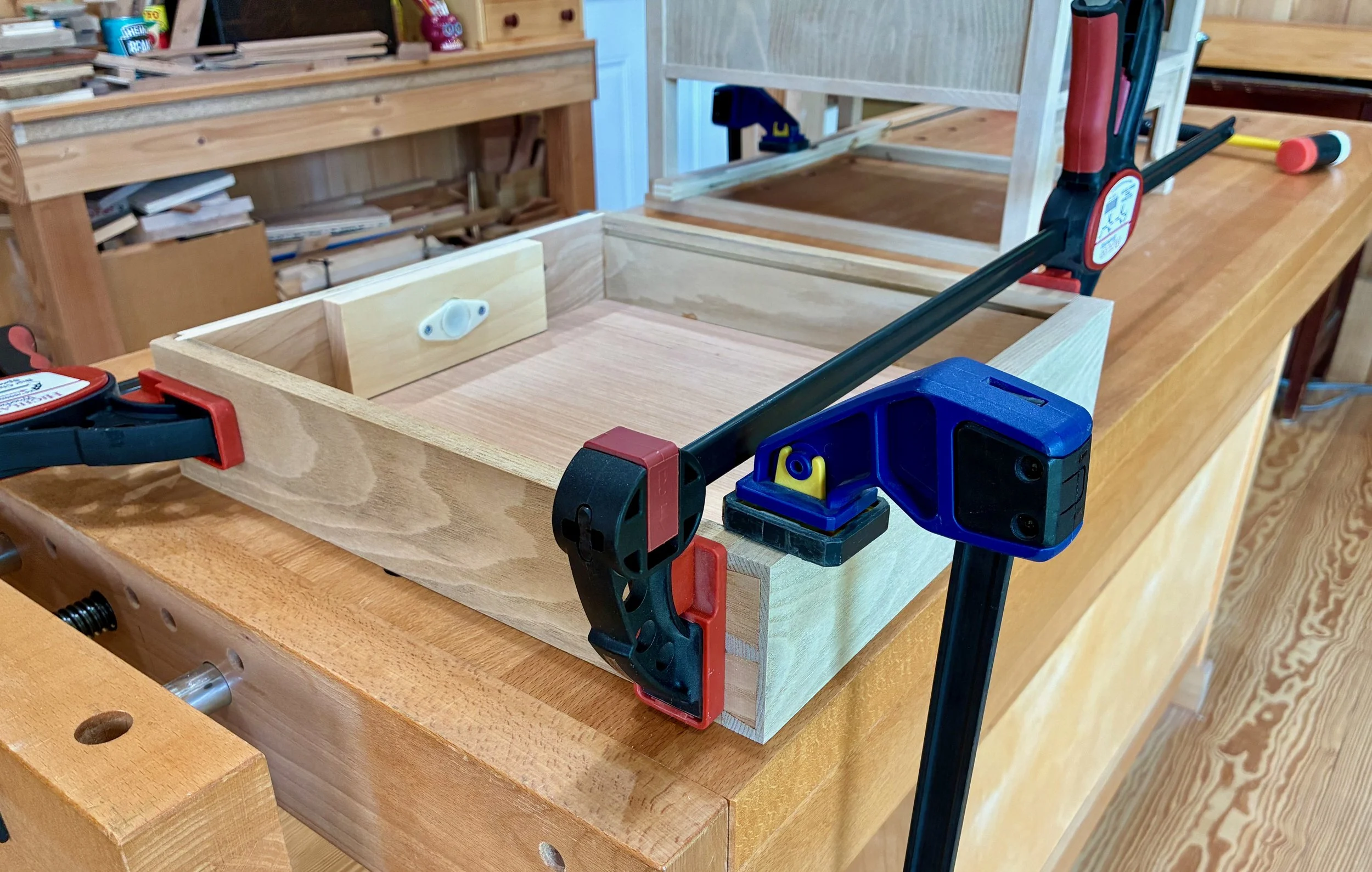
Box completed, I was now able to mark in pencil the position of the dadoed slots that will house the drawer dividers. These were cut at the table saw and then pine partitions were fashioned to fit within the grooves. Some of the partitions, themselves, required dadoes so this was an iterative affair: mark/cut/fit/repeat. Finally, a series of holes were drilled in a couple of the boards to hold the shelf support pegs. During glue-up, the divided box came together without issue.
Glueing-up the box
As designed, the box was still 1/2 inch too wide to fit within the case. You see, I made that box from 3/4 in. boards but, to match the drawer divider widths, I wanted only a 1/2 in. reveal around the edges once situated within the case. Also, tucking the box behind the case framework in this manner assures that no gaps would be seen. To achieve a fit, I therefore had to cut a rabbet along the bottom sides and around the entire back of the box. This was accomplished at the table saw.
Rabbeting the box bottom at the table saw using a zero-clearance sled.
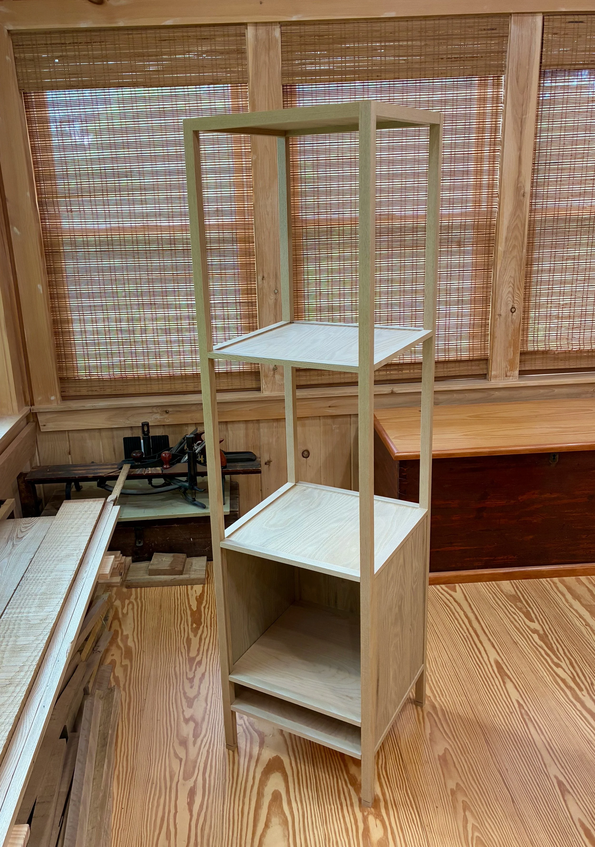
Once all of these modifications were complete, the box fit snug within the dry-fit case. Now, to fill up those cavities with drawers.
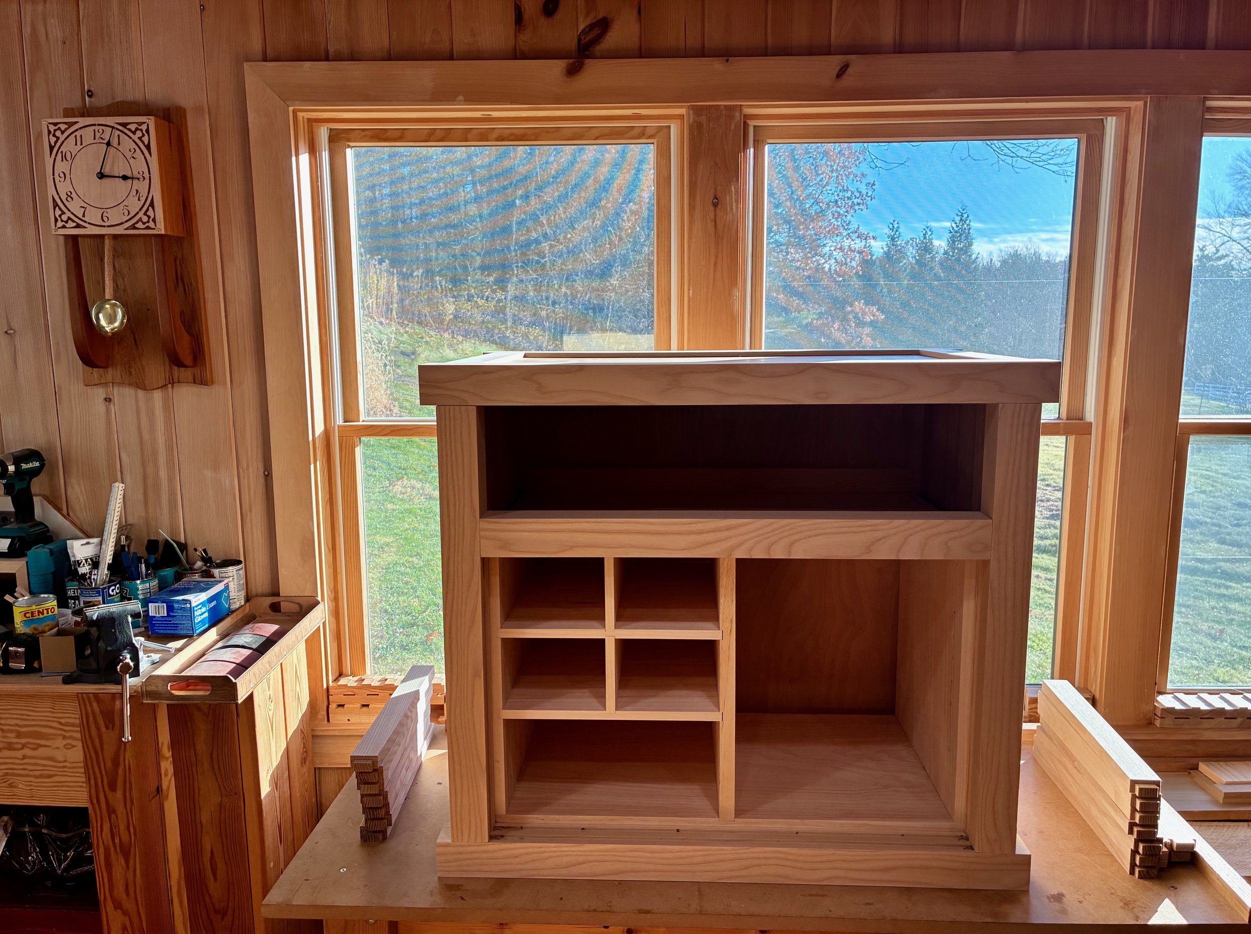
Box in a box
Interior Drawers
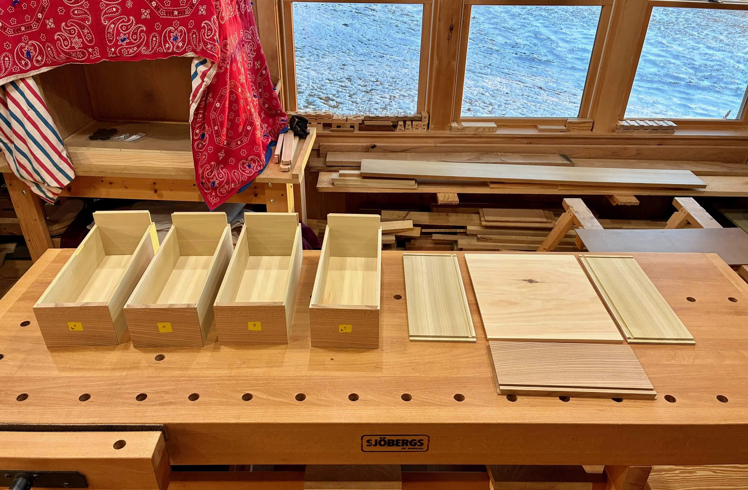
The five interior drawers came next, 4 small, 1 large. These would be made from three woods: red elm for the drawer fronts, poplar for the sides/back, and leftover pine for the drawer bottoms.
Drawer woods, L-R: pine (beneath the box); poplar; and elm
The design for these drawers would be inset, using rabbeted half-dovetail joints in the front and lock corner joints for the rear. But before going too far we had to decide on the drawer hardware. To permit the sliding door in front of the drawer bank to close, any protrusion of the drawer pull hardware would require that either the drawers be recessed into their chambers by that same amount, or the entire box, itself, be recessed within the case. Both of these solutions would make for an unsightly reveal upon opening the sliding door. Thus, flush pulls were chosen to bring both the box and drawers to the fore. Another consideration was color. We wanted the interior hardware to match the black iron tansu hardware planned for out front, and so black, flush drawer pulls were our quarry. This combination does not afford a wide selection but we found one that would work from an eBay vendor in China. I would need to have them in hand before dimensioning the drawer fronts so as to measure, and then accommodate, the drilled socket depth.
While waiting for the pulls to arrive, the drawer sides and backs were prepared. The ~1 in. poplar material was cut to rough width at the table saw, resawn down the spine at the band saw and then thickness planed to 5/16 in. for the sides. The backs were made at 1/2 in. thickness and the drawer fronts were prepped to rough dimensions. I also had time to re-paint a bathroom.
Interior drawer pulls and parts
It turns out that a socket depth of 5/16 in. was required for the pulls, thus the elm drawer fronts were milled “thicker” to 1/2 inch. I used a rift sawn plank for the fronts and kept the grain continuous along parallel drawers - it should flow together nicely. The drawer fronts were carefully dimensioned to their final width and height at the miter saw and table saw, respectively, and then that fence setting on the table saw was used to trim the corresponding drawer sides to a matching dimension.
After labelling all parts, the half-dovetail rabbet drawer front joinery was cut at the router table. This is an easy drawer construction method that is similar to (but a bit sturdier than) the pinned rabbeted drawers likely present on that original Tansu.
Cutting a half-dovetail rabbet into a drawer front at the router table
After making grooves for the drawer bottoms and backs at the table saw, the corresponding parts to fit those grooves were fashioned from pine and poplar.
Scene during drawer construction
Finally, 35 mm dia. sockets were sunk into the drawer fronts using a Forstner bit at the drill press. I then drilled the mounting screw holes, 2 per socket.
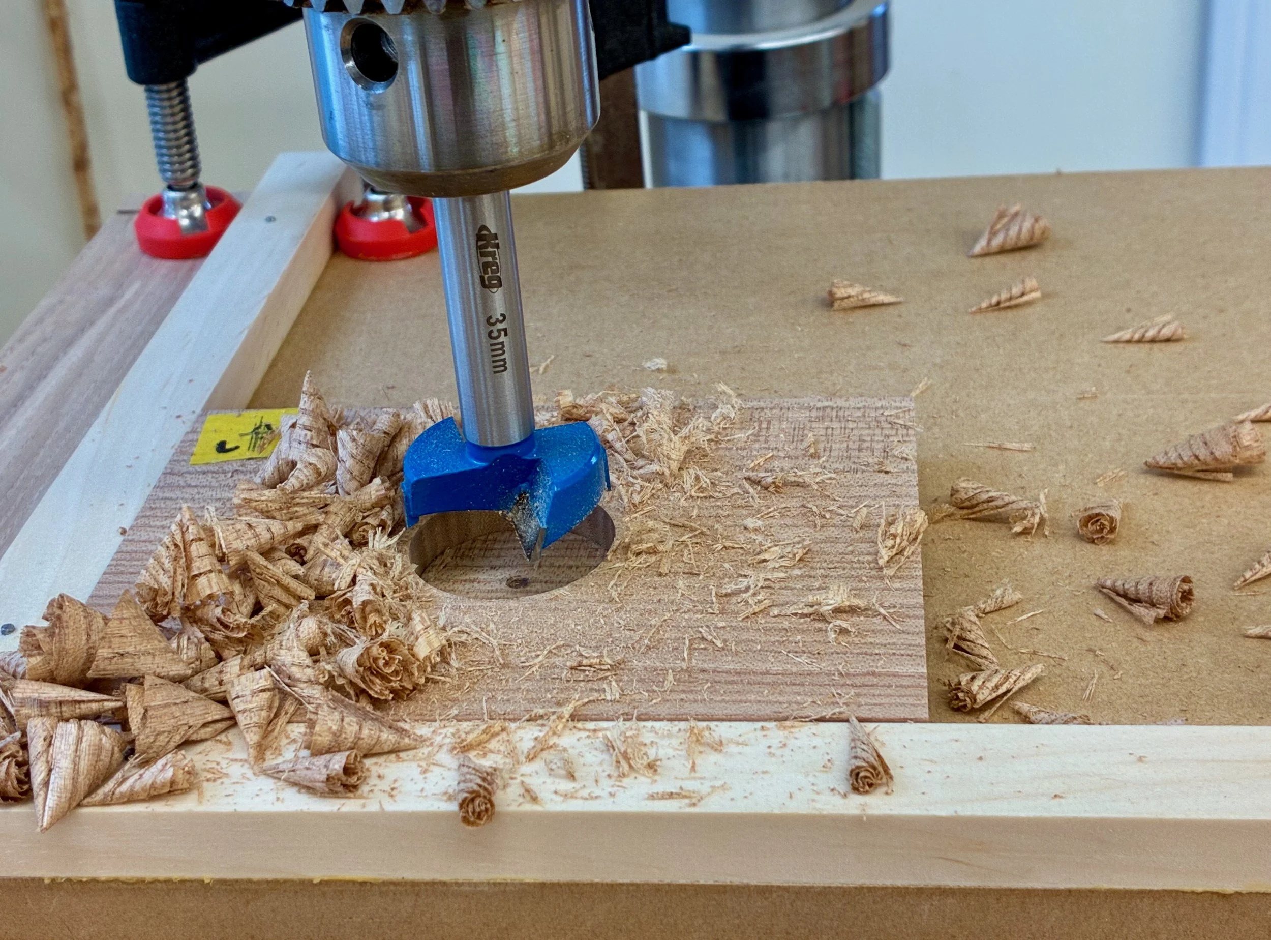
Drilling out for the pulls
Next, a coat of shellac was applied to the pine box followed by some furniture wax. When glueing drawers, I like to unclamp the squared-up constructs and then slide them into their cubbies to finish curing. This way I can double-check that the drawer sits properly in its home. The shellacking will keep the pine resin at bay, and the wax assures that an errant glue drip will not unintentionally cement the drawers in. With all 25 parts completed, the drawers were individually glued and tucked away.
5 drawers
The joints at the drawer fronts were then pinned with 3/16 in. diameter pegs hammered from scrap elm.
Pounding out the pegs
After sawing things flush, and some final sanding, the interior drawer construction was complete. Still deciding on a finishing scheme for these, I put off the hardware installation for now.
Drawers done
Sliding doors
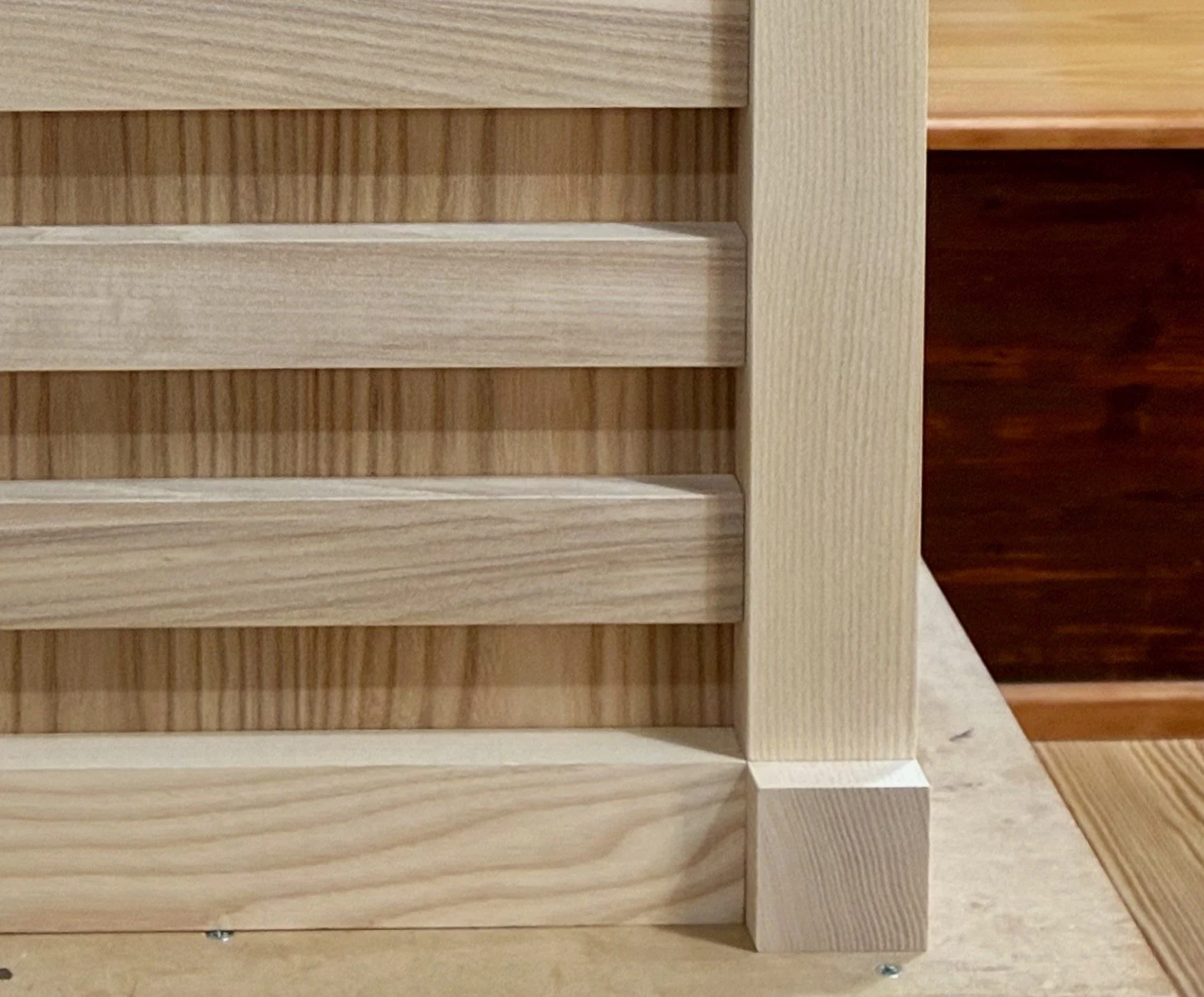
Next came the sliding doors. These would be constructed from quarter sawn ash and elm to match the tansu sides.
Elm and ash door stock
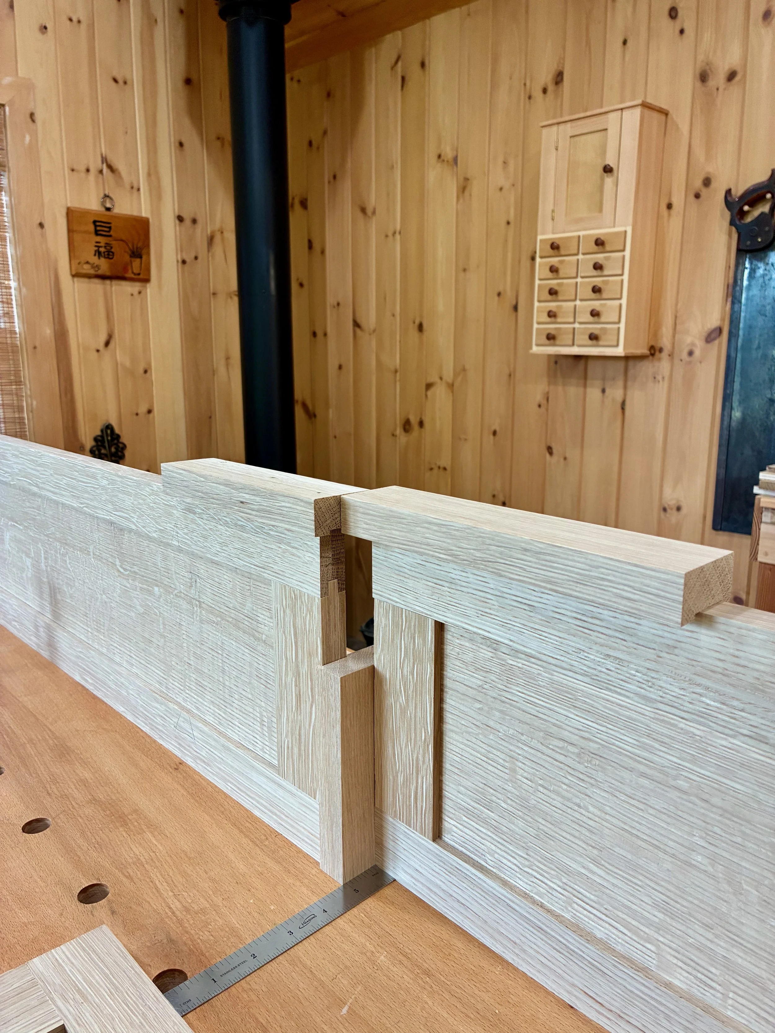
It was at this point that I realized the door design would need to be changed, for I had failed to account for sliding door overlap in the initial plan. You see, to achieve the intended look, I should have made the divider between the drawer and the shelf cavities wider - but that ship had sailed. It’s not really an issue with an open cavity, but with drawers hidden behind a symmetrically divided space, each door’s width needed to essentially conceal/reveal half of the entire opening. And since the center divider in the drawer box was 3/4 in. wide, that meant, to achieve the desired sliding door overlap, the interior stile of each door would need to be that dimension, at a maximum. The original plan called for double that width, but I think it will be okay. Lesson learned.
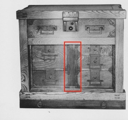
Picture of the exemplar tansu with doors removed. Note the extra wide central divider not included in my initial design.
from: Tansu: Traditional Japanese Cabinetry, by Ty and Kiyoko Heineken.
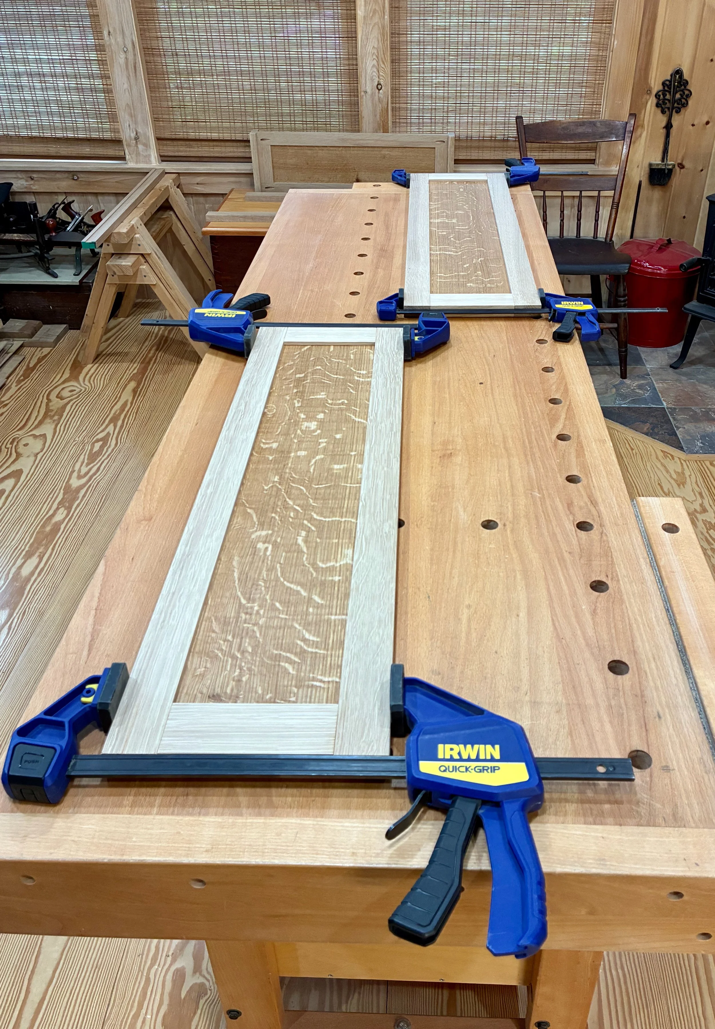
I used typical mortice and tenon joints for the door frames whose members were fashioned en masse at the table saw, jointer, thickness planer, miter saw and mortiser. A few hand tools were also employed - it’s fun to use all your stuff. The ash stiles and rails were grooved to accept 1/4 in. elm panels in between. These panels were prepared in the typical manner and, prior to assembly, they were chopped to size at the sliding miter saw, discarding a sacrificial 1 in. wide slice after each cut to keep the grain flowing naturally along the assembled door fronts.
Dry-fit, un-trimmed doors
Prior to glue-up, the 8 door panels were treated with a coat of gel polyurethane. I also trimmed 3/16 of an inch off of each panel’s width to accommodate 1/4 in. foam rubber “plugs” along one side that, by compression, would ensure the panels fit tightly within their slots and still allow for humidity expansion. The doors were then assembled with glue.
To fit the doors in their channels, I needed to rabbet the backsides of the tops and bottoms. This was done at the table saw. Now sliding within their tracks, I could mark the interior stiles and cut the doors to their final width dimension at the table saw.
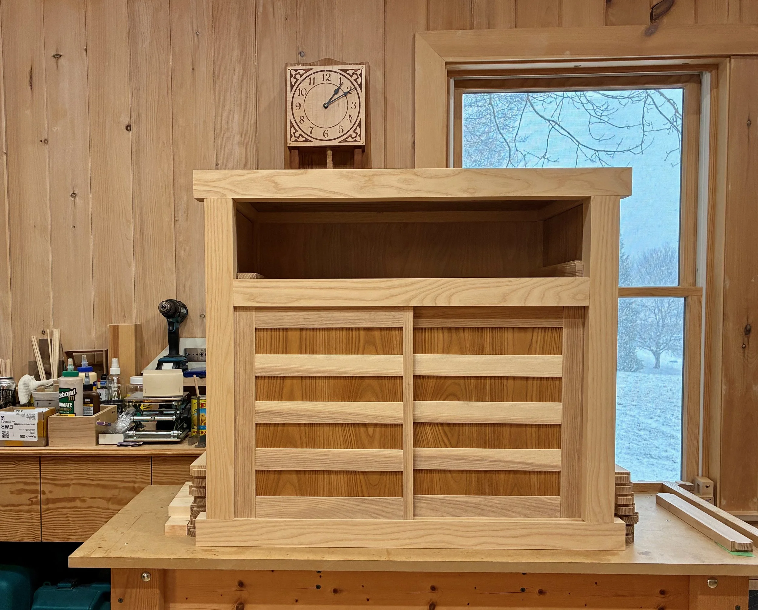
Doors in place
Before leaving the doors I created the sockets that would house the pulls. These pulls, along with the big drawer handles were procured from Japan via the internet and a nice tansu hardware store called Morikuni. A 5/8 in. wide by 5/16 in. deep cut-out was needed here, and for this I used my small plunge router and a 5/8 in. diameter bit. To keep the socket parallel with the door edge I also made a simple jig out of scrap wood to guide the cut. The round ends of the groove were squared off using a chisel and it all went well.
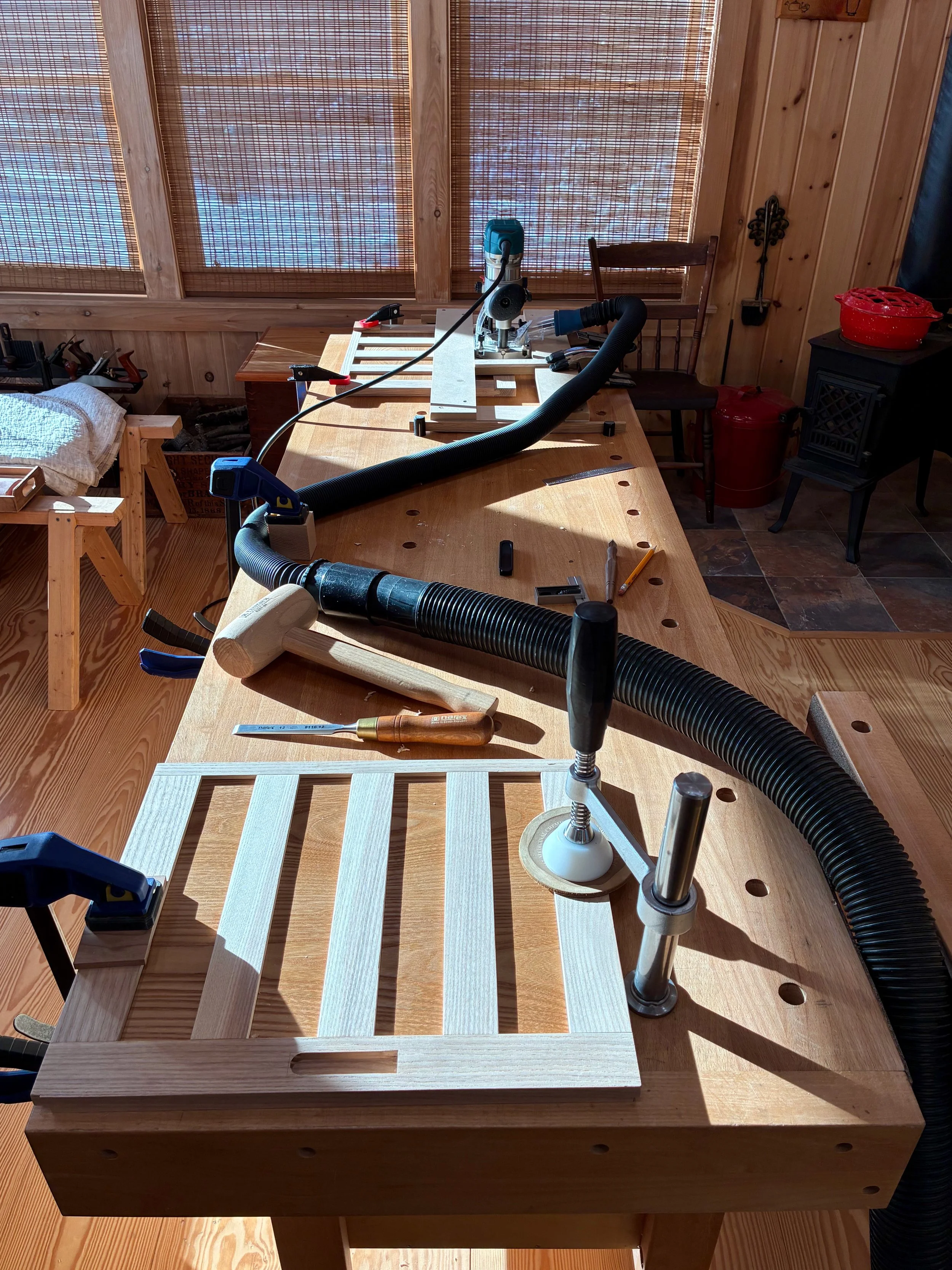
Far: plunge router cut guided by a simple jig
Near: squaring-off the cut with a chisel
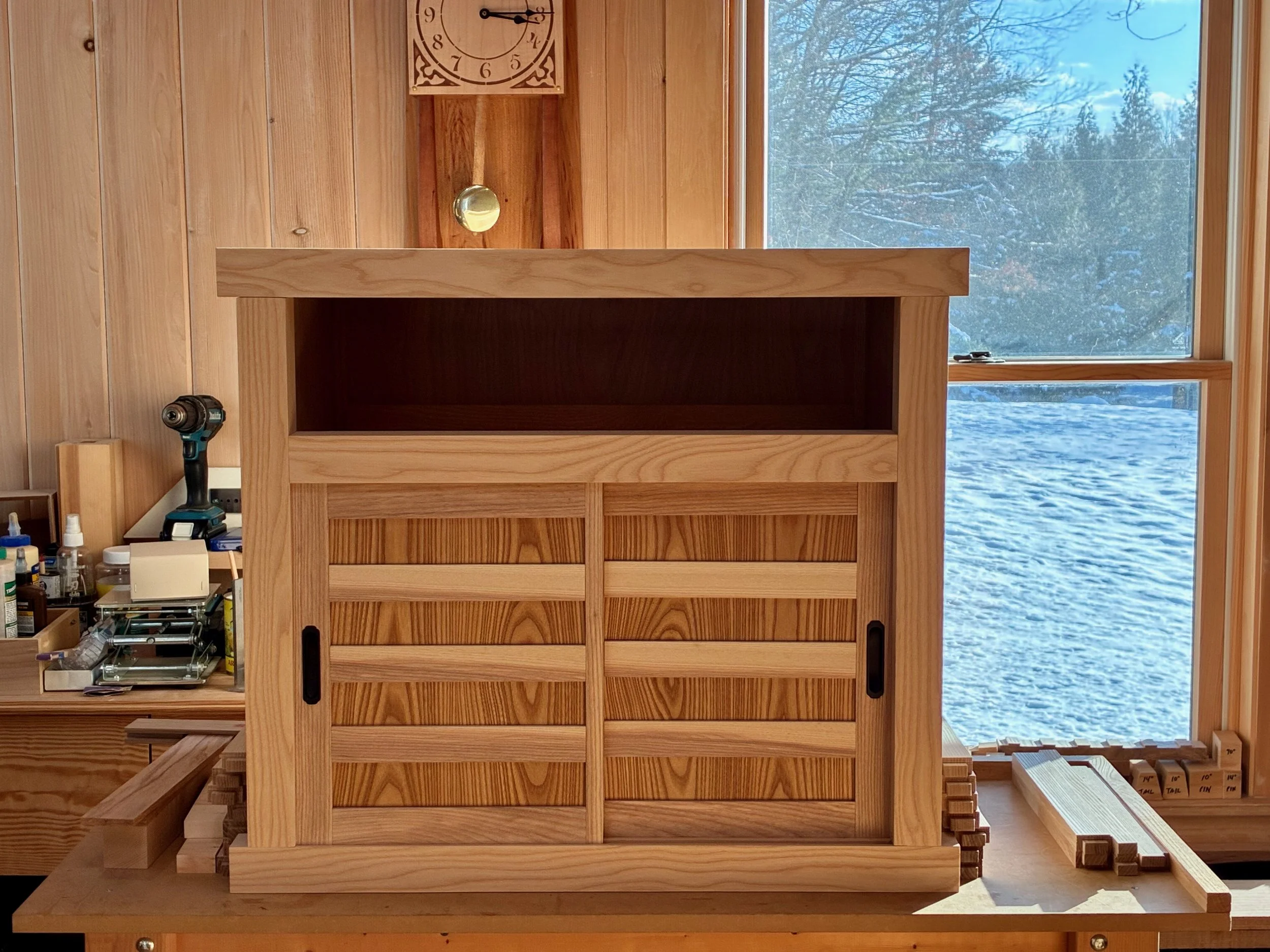
Pulls installed
Central Drawer
The final sub-assembly project was that large central drawer. This would be made from elm and poplar in a manner similar to those smaller drawers; just the front joints (double rabbet) and drawer bottom (birch plywood) would be changed. I selected a charming elm board for the drawer front and it all came together nicely.
Big drawer
Just a few details to take care of now. First, a shelf for the open cavity was prepared from 5/8 inch white pine, trimmed in elm. Next, six small ash boards were milled to serve as runners and kickers for the big drawer. These would be installed to the case interior during assembly, after which the final drawer fitting would take place. I also wanted to make stops for the interior drawers so that they would rest uniformly in their cubbies. These were fashioned from scrap pine and then glued into place. Lastly, the bottoms of those small drawers were lined with a blue felt.
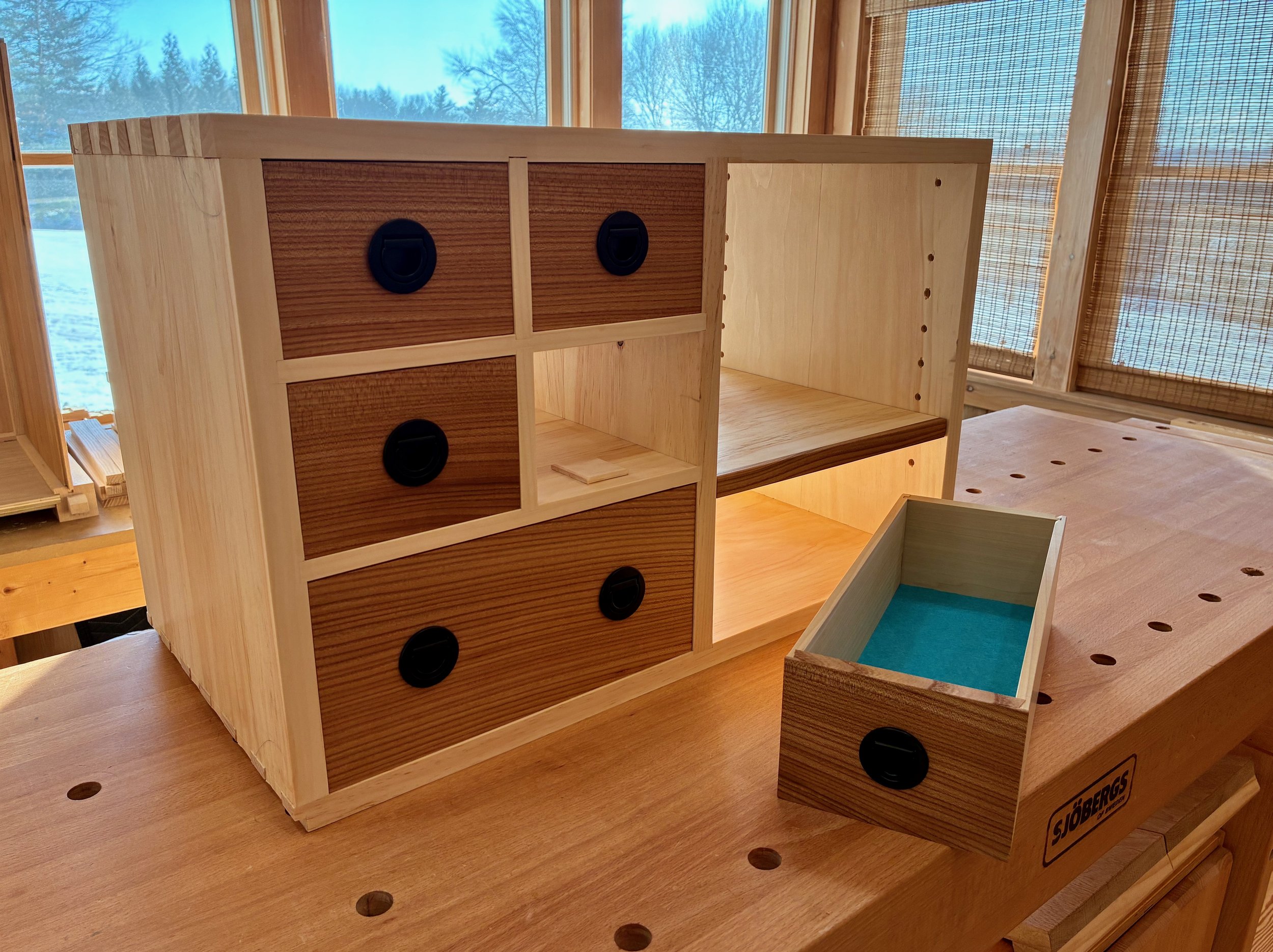
Drawer parts (pulls, stops and felts) and shelf in place
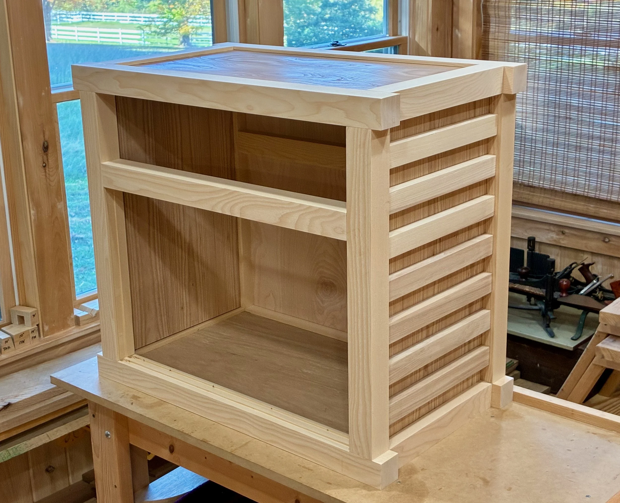
Final Assembly & Finish
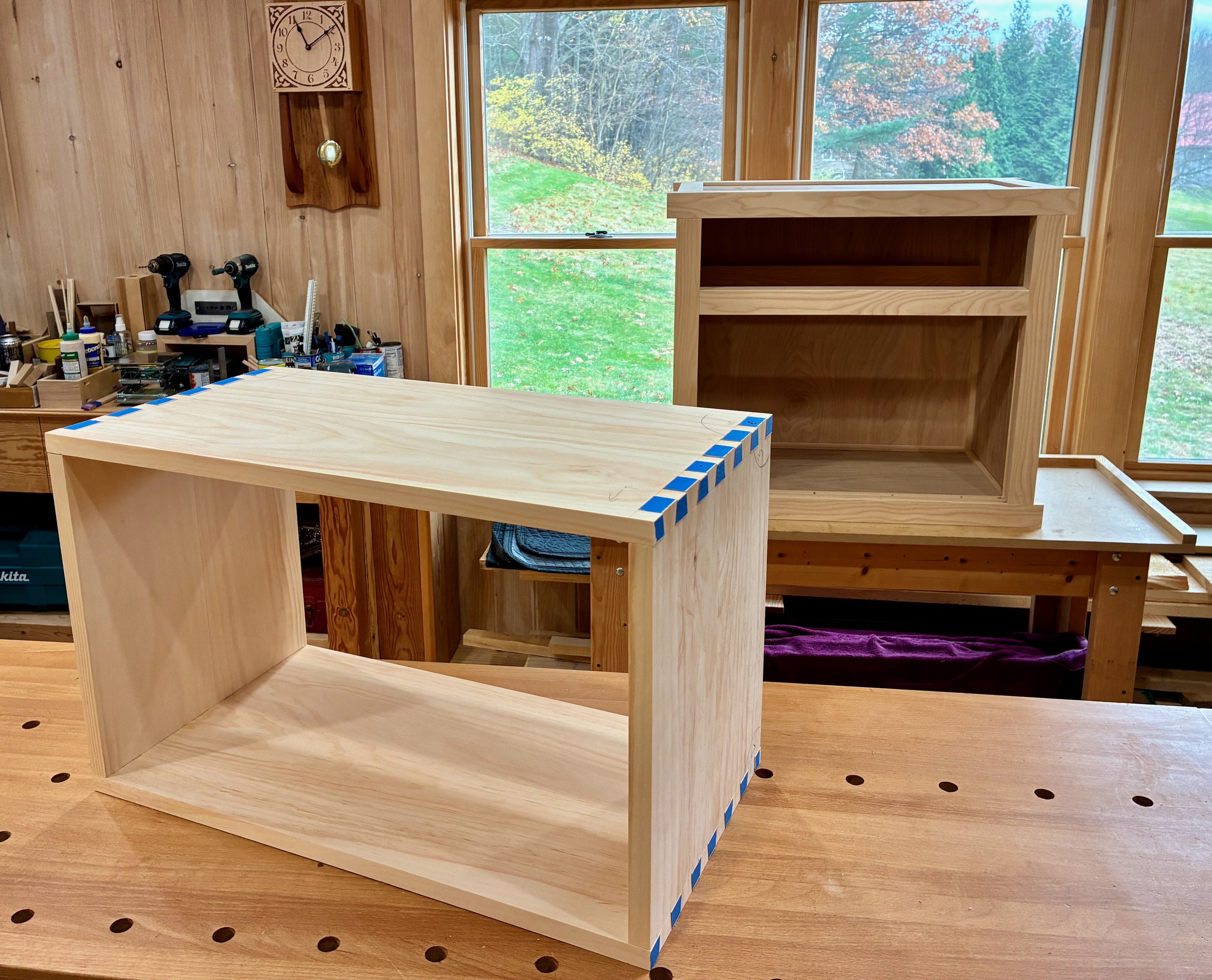
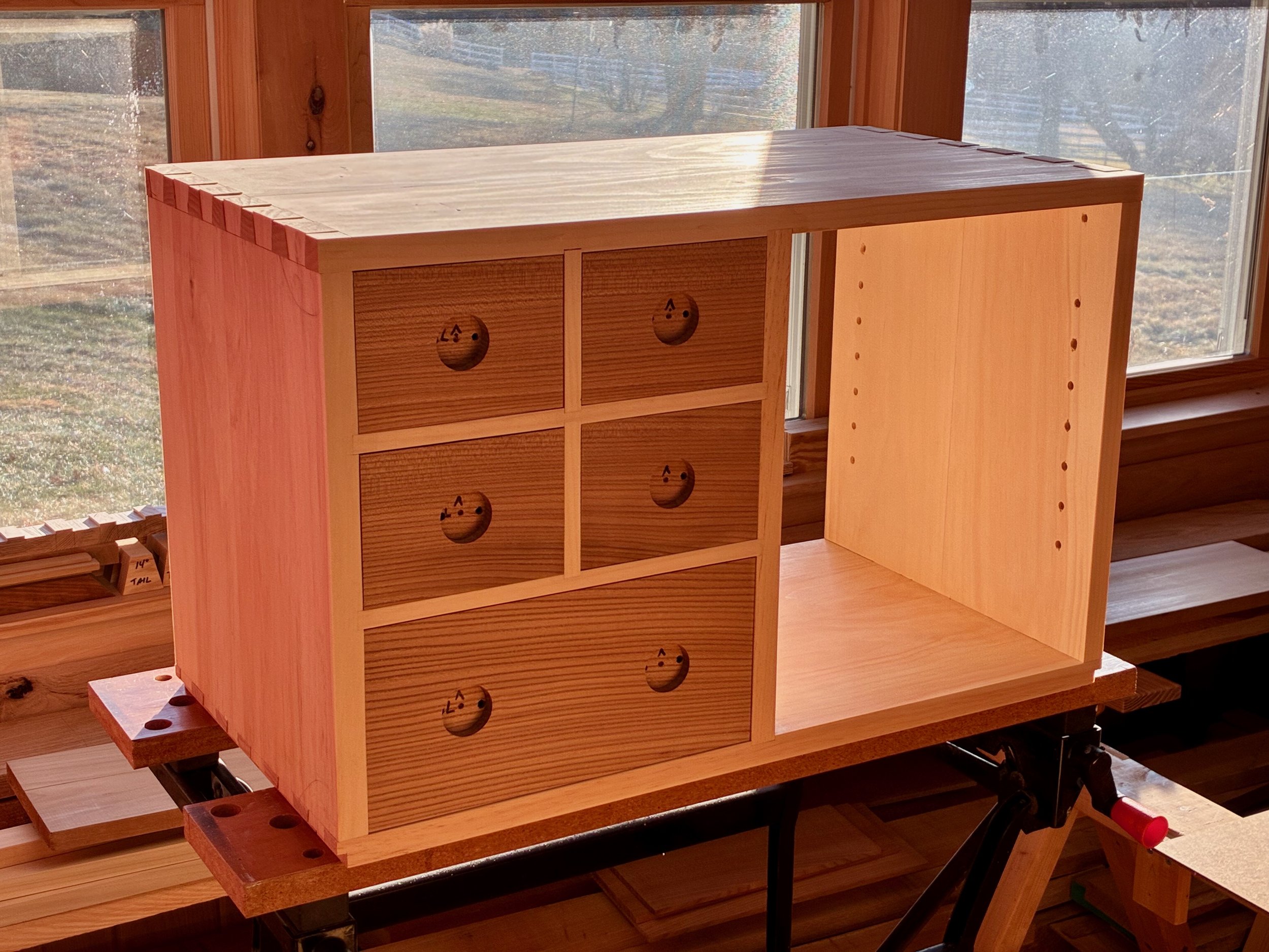
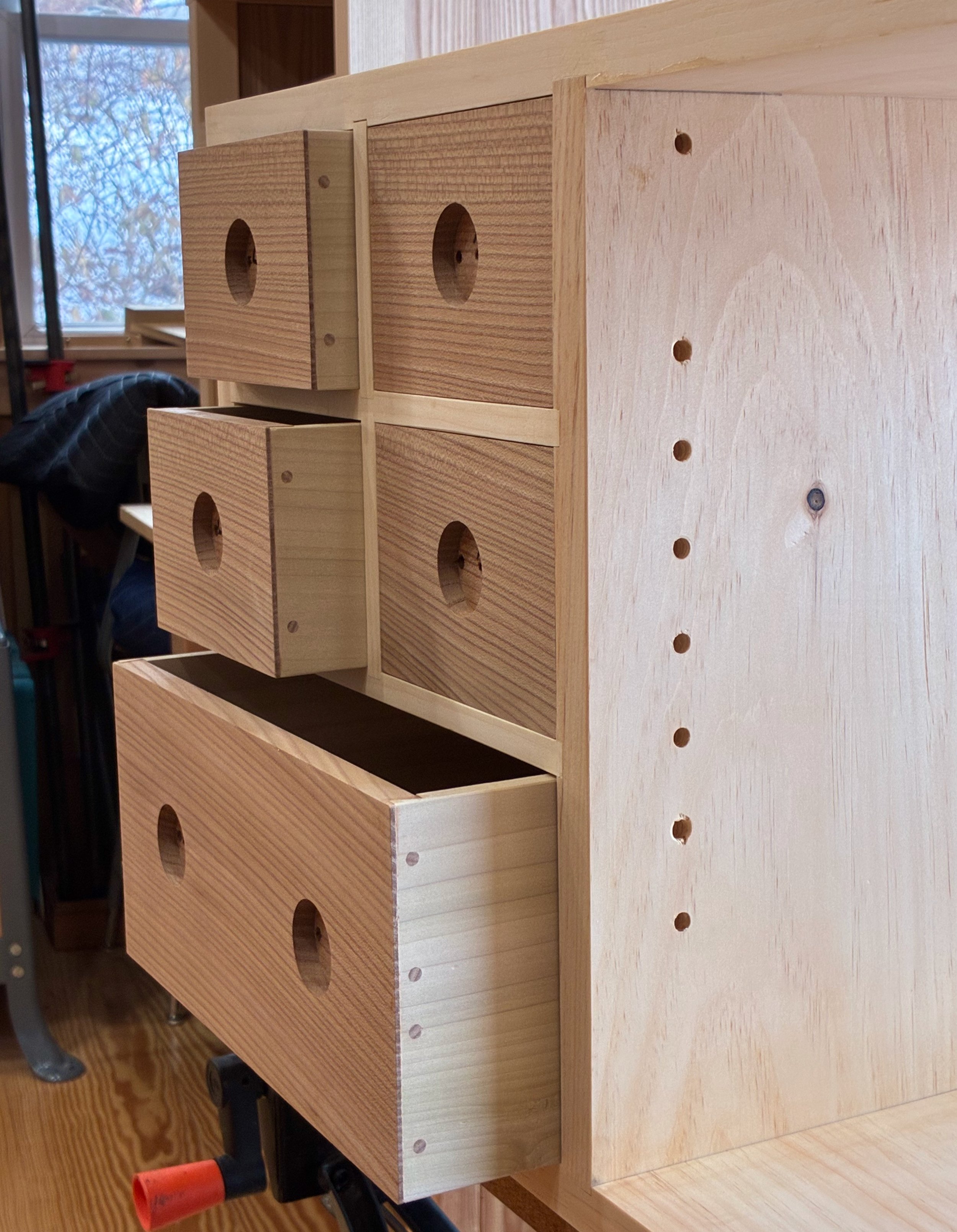
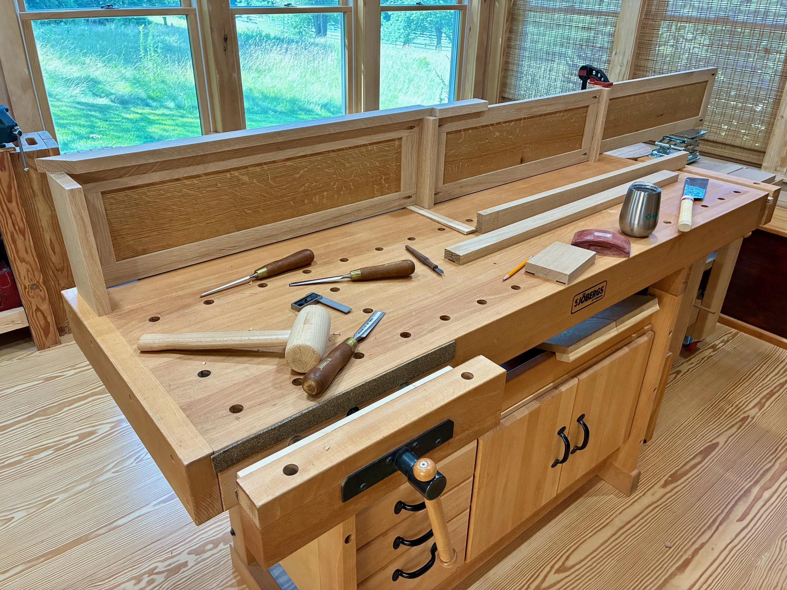
It was now time to take the dry-fit carcass apart and reassemble it with glue applied at the joints. For starters, the workbench was moved out of the way, the doors and drawers were set aside, and the remaining 42 parts arrayed in a manner to facilitate their orderly coupling.
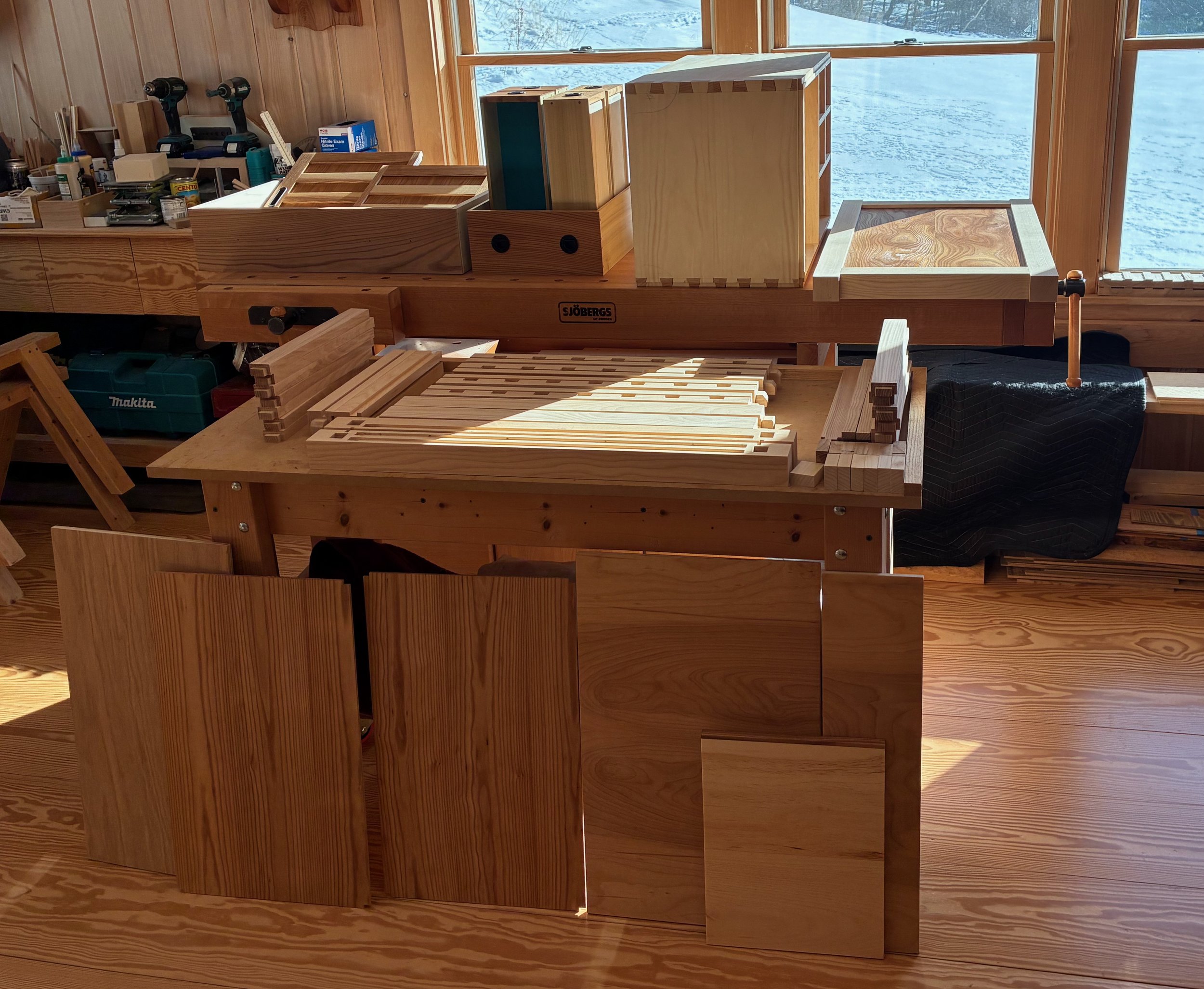
Pre-assembled state
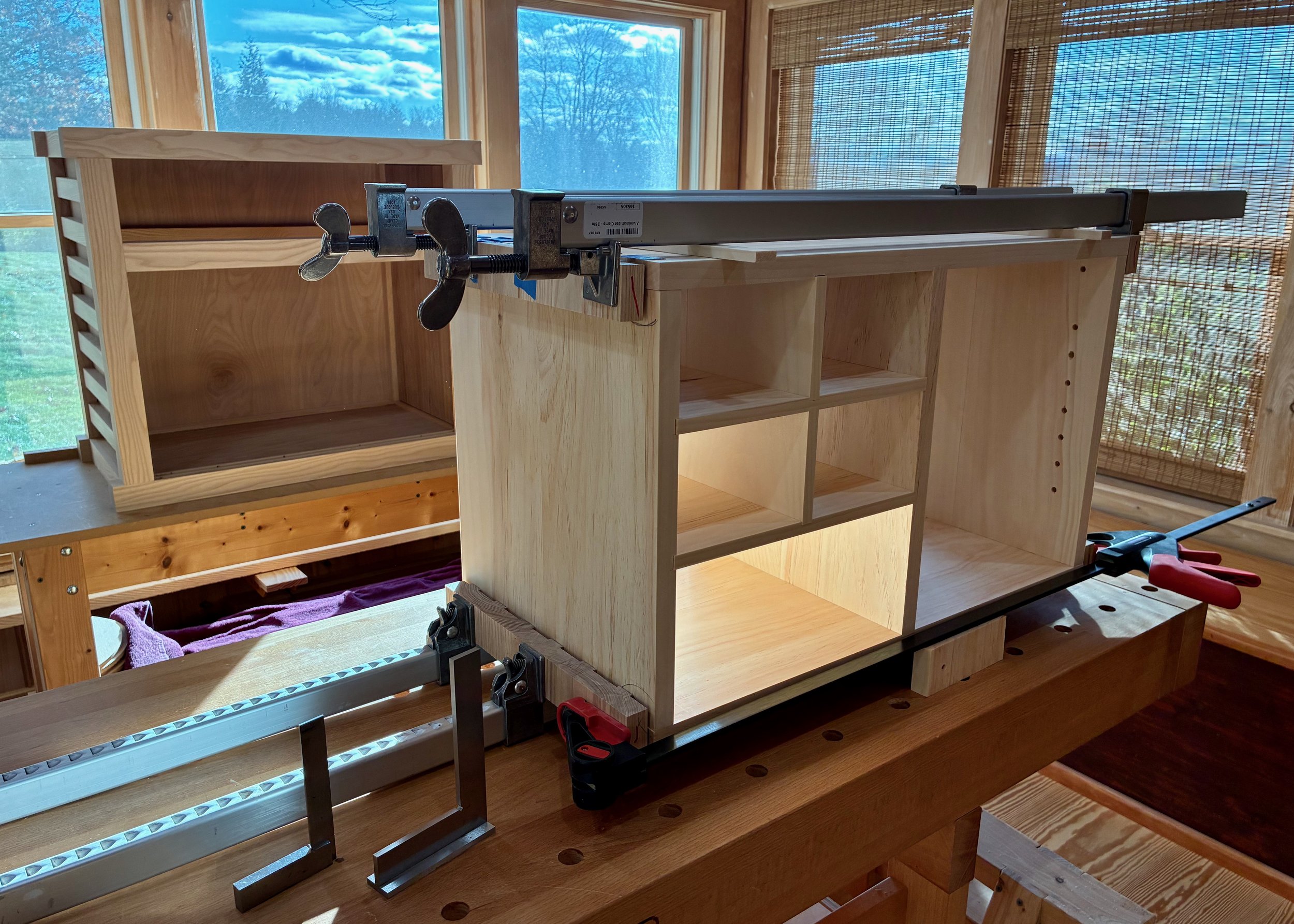
There are a lot of things to get “right” during assembly (while the glue clock ticks) and so I enlisted the help of my two sons. Together, we managed to agglutinate/hold/hammer/clamp the structure into being. Construction began with the top sub-assembly, followed by the bottom, back and sides. Next, the pine box was inserted and then enveloped as the front frame came together. Lastly, the top was lowered into place and the clamps applied. This was Super Bowl Sunday, and before my team even took the field it felt like we had already won! In fact, ours was a rare victory party on that sad day for New England.
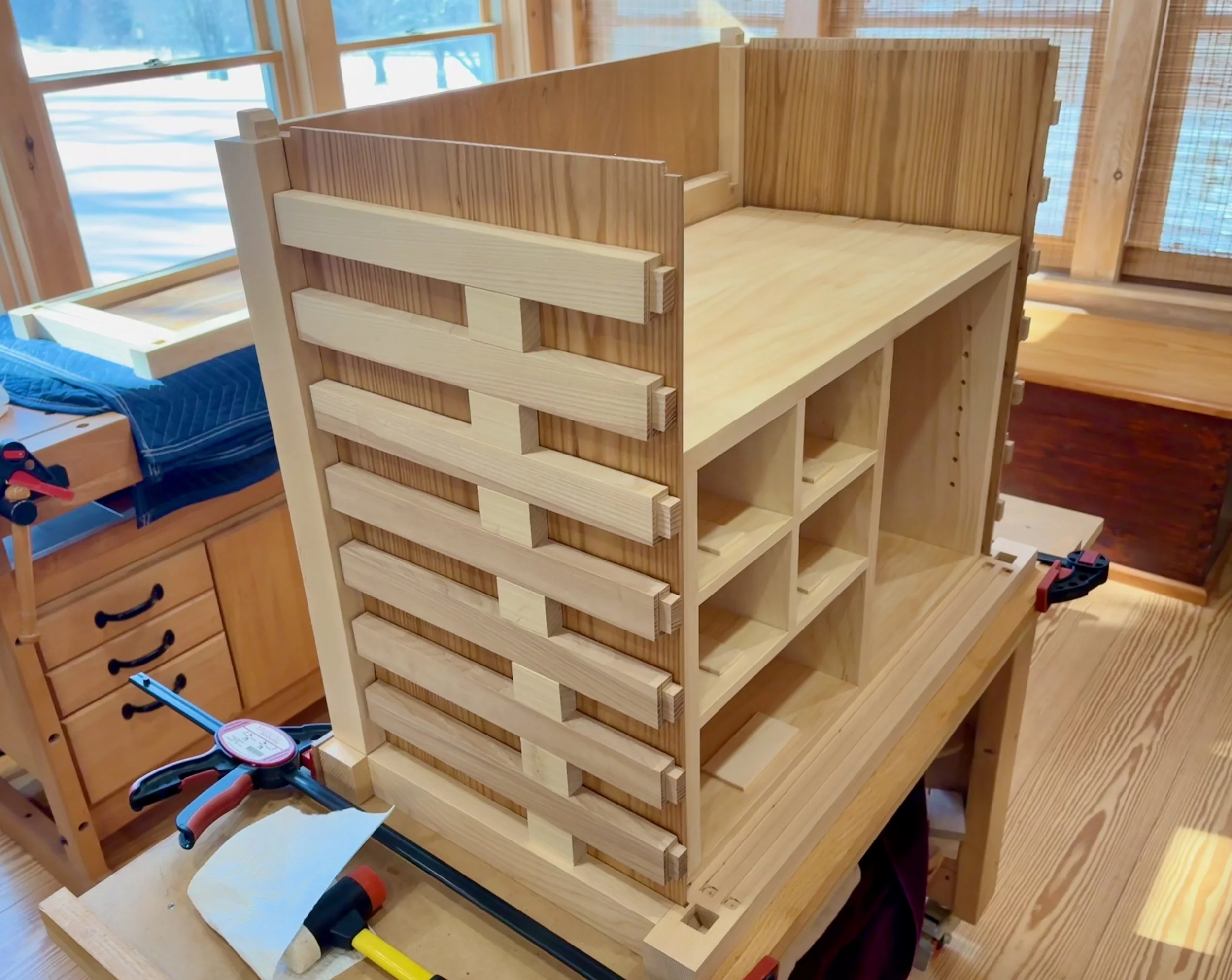
Halfway there …
Box inserted
Spacer blocks used to register the slats
Glue-up lockdown
Following assembly, the runners and kickers were glued in place and the case was sanded to remove clamp marks/even the joint seams. Finally, the big drawer was planed and sanded to achieve a cozy fit. The doors and drawers were then removed for the final finishing.
You may have noticed that the elm panels and the small drawers and doors had been finished earlier in the work. Prior to that I had experimented on a few finishing schemes. The desired goal was to highlight the wood grain, give the object some wear protection and keep the sheen warm but not glossy. I ended up preferring the look of satin gel polyurethane followed by treatment with Howard’s Feed-N-Wax. I have used this duo on a few of my recent Projects and have been pleased with the ease of application and, more important, the final look & feel. It may not be the best for either elm or ash, but seemed to work well on the combo.
Only the carcass and big drawer were left to finish. Over the next few days, two coats of gel poly, a light caress with a gray Scotch-Brite pad followed by a good kneading with Howard’s brought out the beauty in these woods. And as an encore, the contacting door and drawer surfaces received a layer of furniture wax to keep things running smooth.
Finishing the wood
Whew! That was a long build, but a fun one all the way. Thanks for sticking it out.
Over the course of five months, a pre-planned series of sub-assemblies, along with some on-the-spot problem solving, has combined to produce a solid storage space and lovely piece of furniture. That’s the appeal of furniture making: applying one’s mind and hands in the manipulation of raw materials to create new and useful treasures. Now it’s your turn to have some fun, Mike. Enjoy!
Coin Chest complete


Peaceful Patch

I like the word “patch”. It’s a nostalgic noun that evokes the scene of a neatly arranged vegetable garden (think: Beatrix Potter). It comes from the old French word “piece” which, apparently via the dialect variant “pieche”, had further evolved into a distinct English species able to coexist with the original (think: horses and zebras). According to the O.E.D., Brits like Beatrix will use the word “patch” to mean an area for which someone is responsible or in which they operate. I am happy to call the Red Top Workshop my patch.
Using the British definition, it’s likely that all of us can identify a “patch” that we tend, and this might be a useful way to reflect on our condition: What is your purpose while in the patch? How do you feel in the patch? What do you gain from your patch? Think about it.
In my patch I find tranquility. To be sure, challenges, frustrations and victories occur every day in my patch. These are all good experiences that, together, make up the creative process essential for our humanity (see also: win back art). I am at peace in my patch - working things out of wood and absorbing satisfaction from the act. Merely pausing to think about things in this way is fulfilling.
But patches are not just a dreamy sanctuary - things get accomplished in a patch. Food, furniture and [insert passion here] are produced in patches. In addition to a couple refurbishing Projects, in 2025 I produced new versions of the traditional hutch and storage cabinet; reproduced a classic Korean stand; and designed a set of cornices in the neo-bungalow style. The new term “neo-bungalow” was even coined in my patch. Not a bad year!
Just as the word “patch” has a traceable origin, surely one’s own patch does not spring from a vacuum. It comes from a prior concept, held by the tender, of that area for which they choose to take responsibility. I owe my father, Ed, a good deal of credit for the concept behind my Red Top Workshop patch. Upon retirement, Dad spent many hours in his basement woodworking shop, fulfilled in the act of making gifts and satisfying furniture requests from family. He accomplished a lot down there, and I own many big & small pieces produced from that patch.
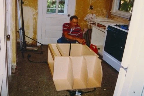
Edward Goulet putting the finishing touches on a homemade cabinet he contributed to our kitchen renovation in 1995.
These works are more precious to me, today, having lost my father at age 96 a couple weeks ago. I now appreciate that he gave me much more than towel holders, benches and boxes. He helped to build my patch. Thanks Dad.
Peace.

Me and Dad in my patch (2016)
Built for Service

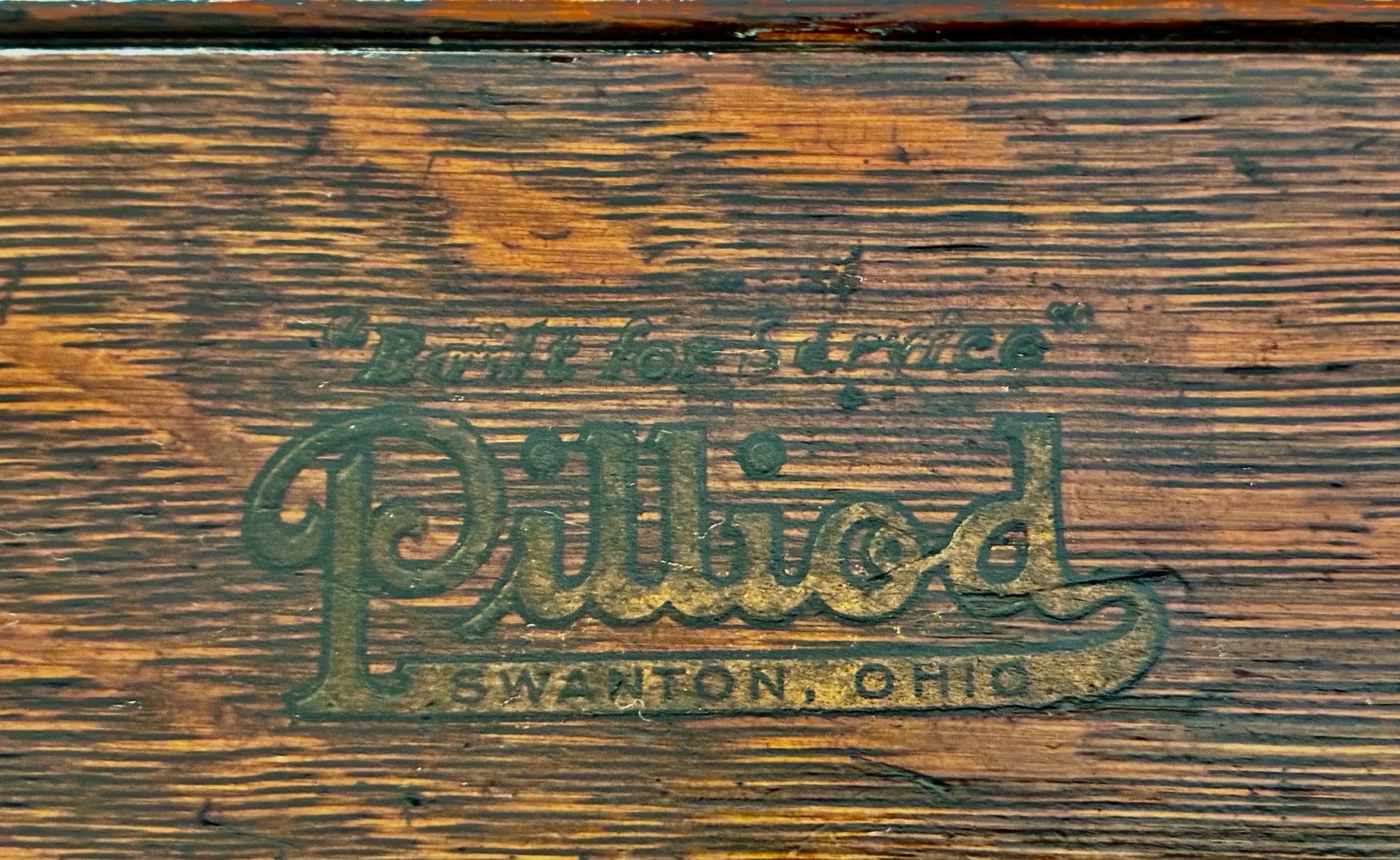
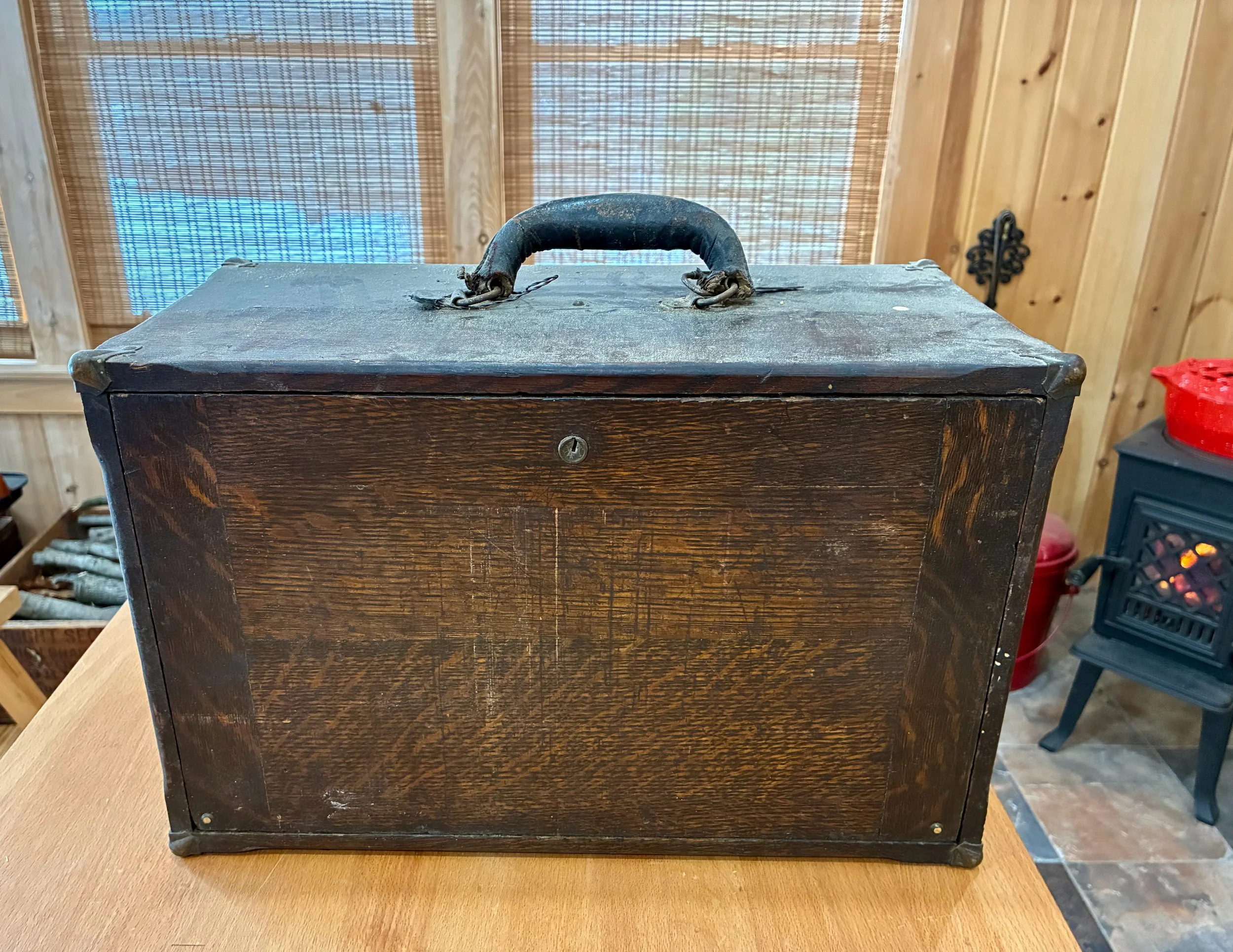
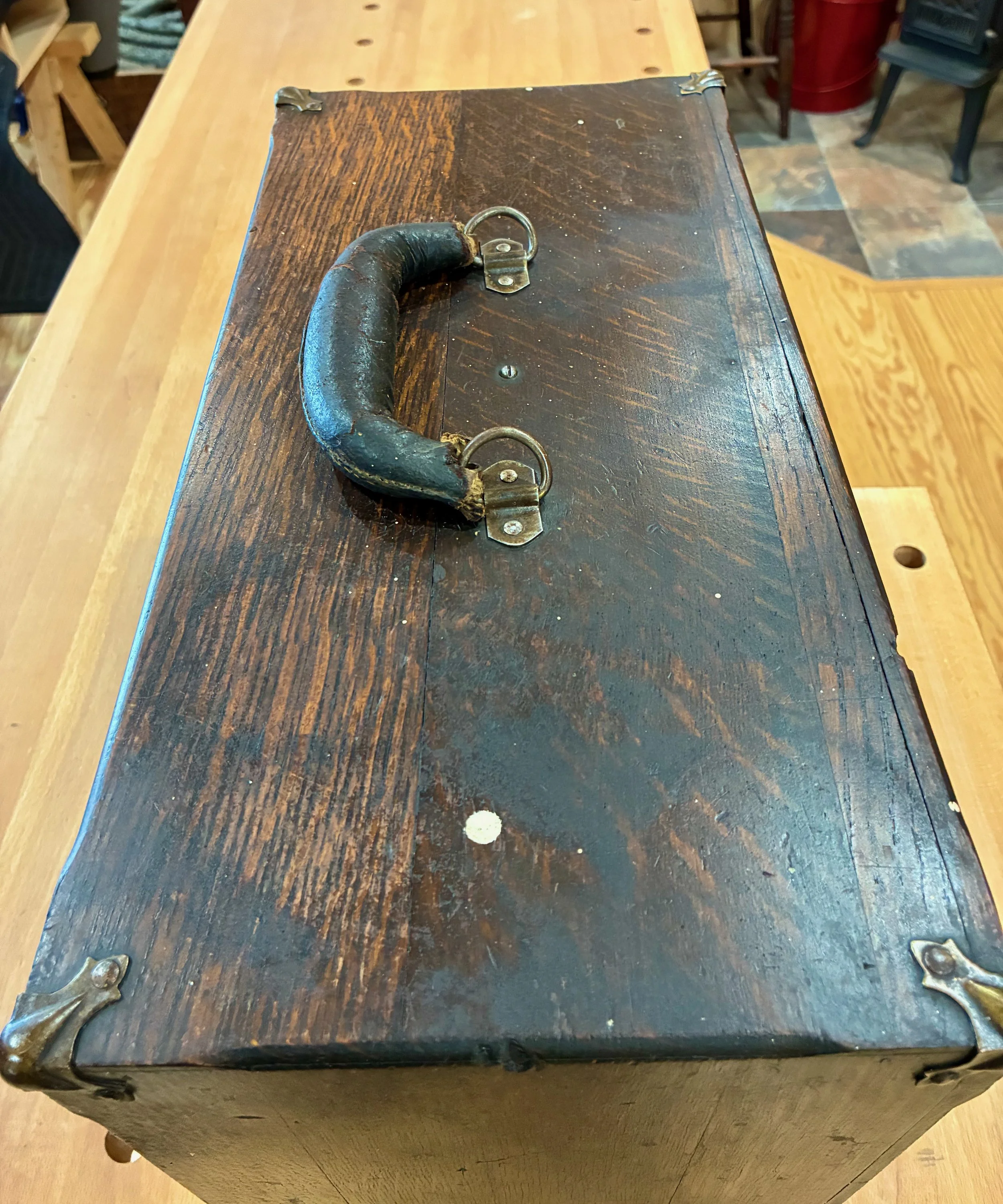
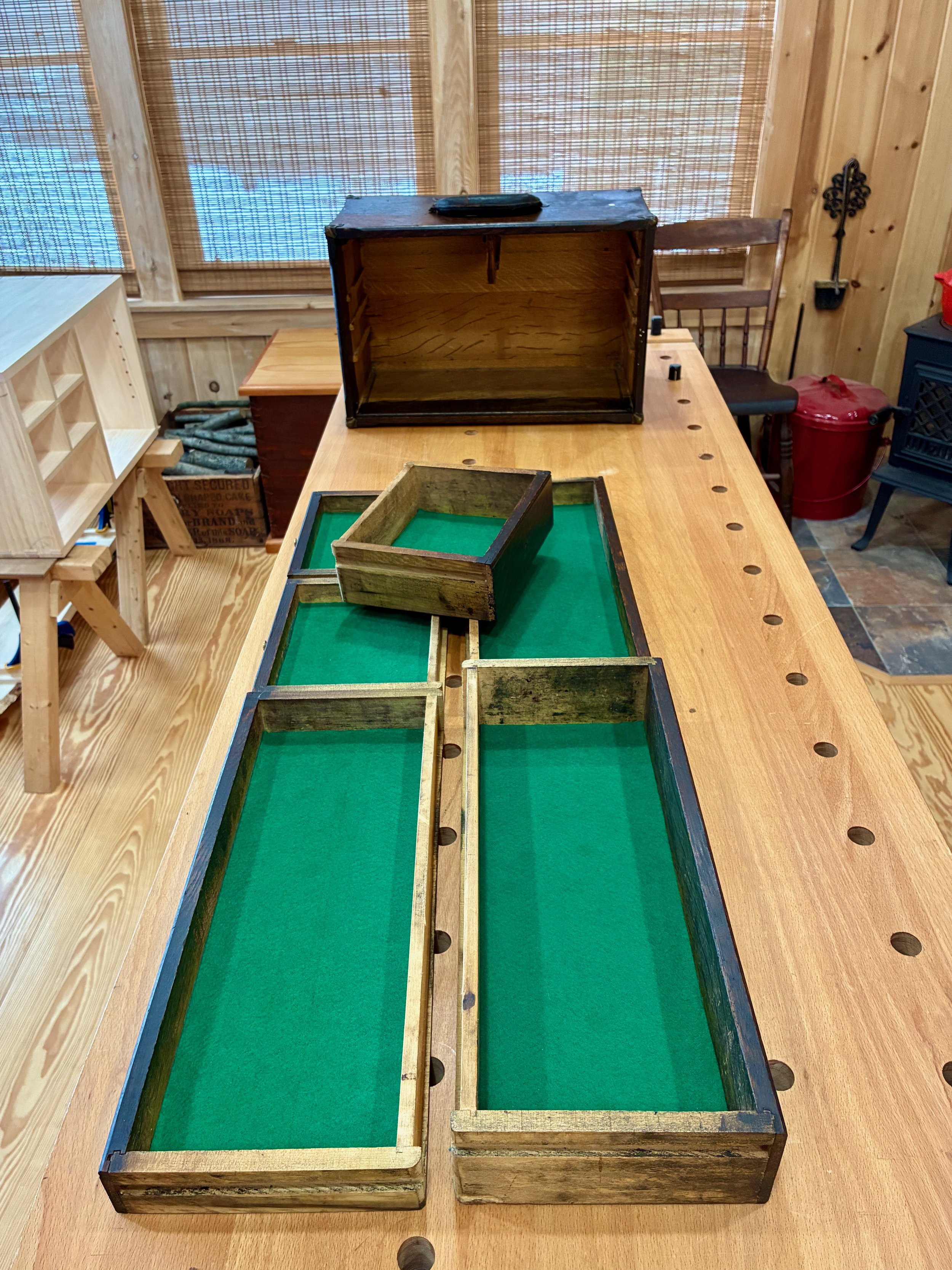
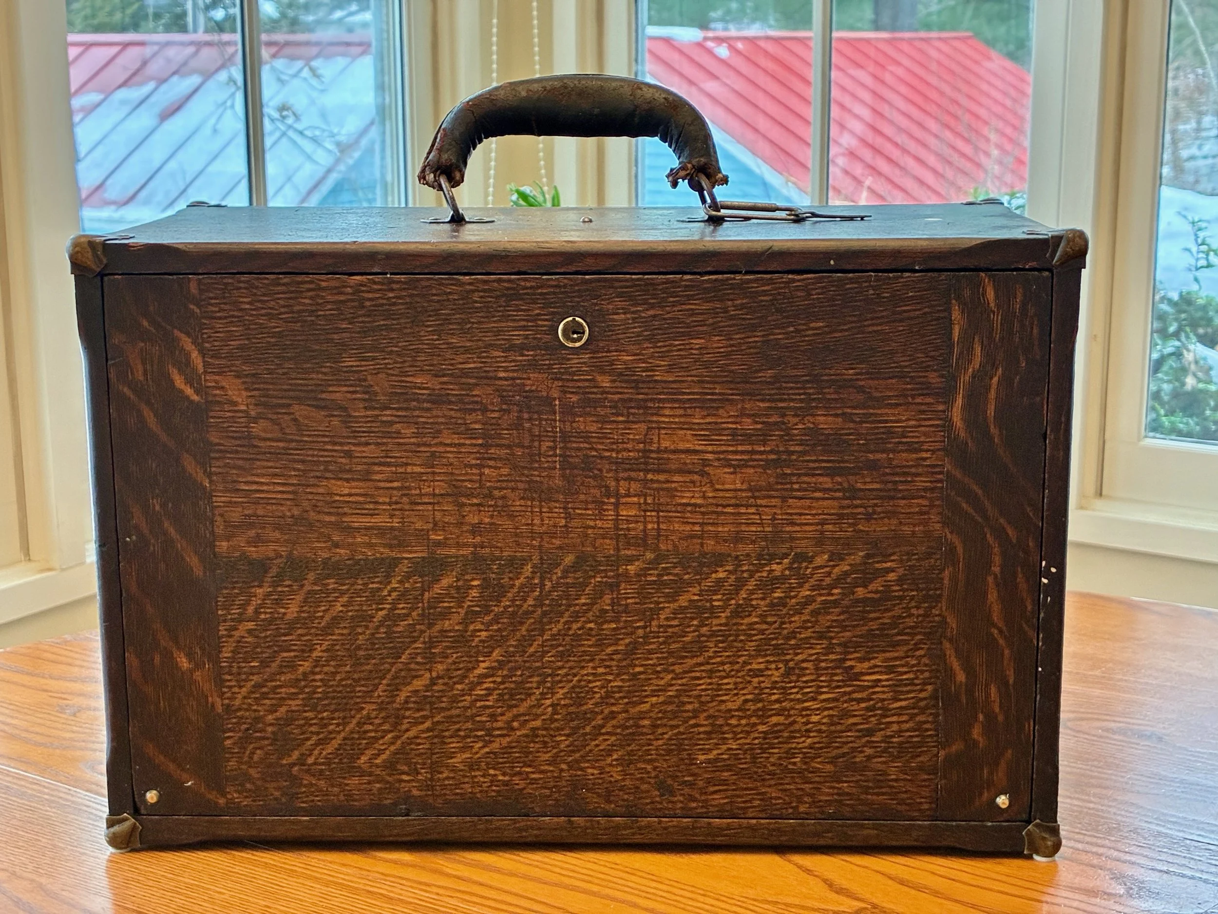
Last year I was gifted an item that once belonged to my grandfather, Otto, rescued by my brother-in-law, Brooks, during an earlier house clean out. It’s an old furniture piece that I had no idea existed until I was made the caretaker. Unexpected acquisitions like this are truly gifts to be savored. They bring instant joy along with a new responsibility, gladly accepted, for custody of an heirloom. I am talking about a machinist’s chest from the “Built for Service” tool chest series manufactured by the Pilliod Lumber Company of Swanton, Ohio.
Machinist chest of old
I don’t recall ever seeing this early twentieth century chest around my grandfather’s workshop and so I have nothing to add regarding provenance. What’s certain is that the chest (cabinet?) contains six small drawers behind a locking front panel. The contents: some metal lathe cutters, drill bits and hand taps, suggest that it once supported the work of a machinist - a precision metalworker. It contained some nice old measuring tools as well, but the value to me was in the container. Fashioned from quarter sawn white oak, stained dark, with a leather handle and stately brass hardware, this 17 x 10 x 8 in. chest had it all.
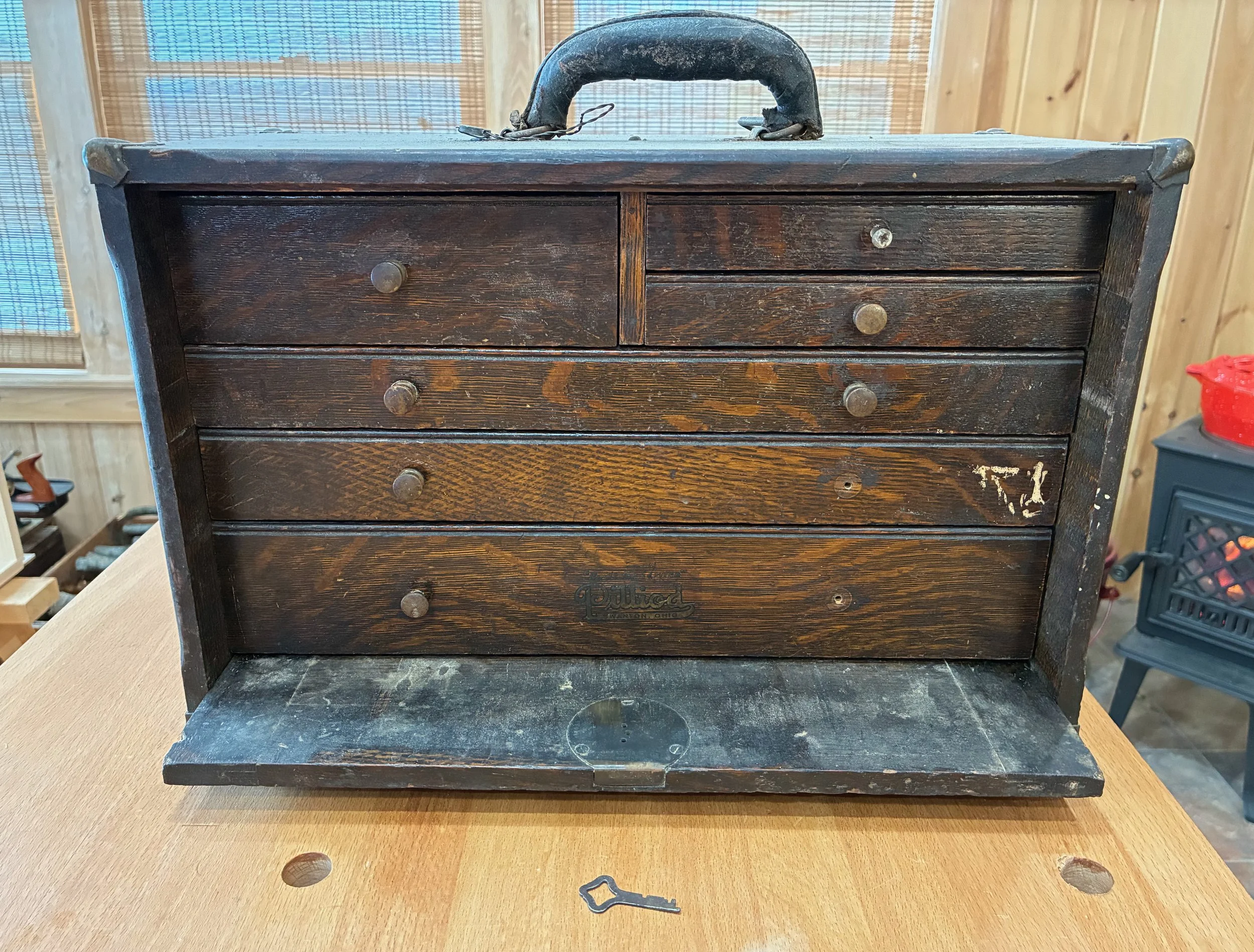
Six drawers nestled behind lock and key (note label on bottom drawer)
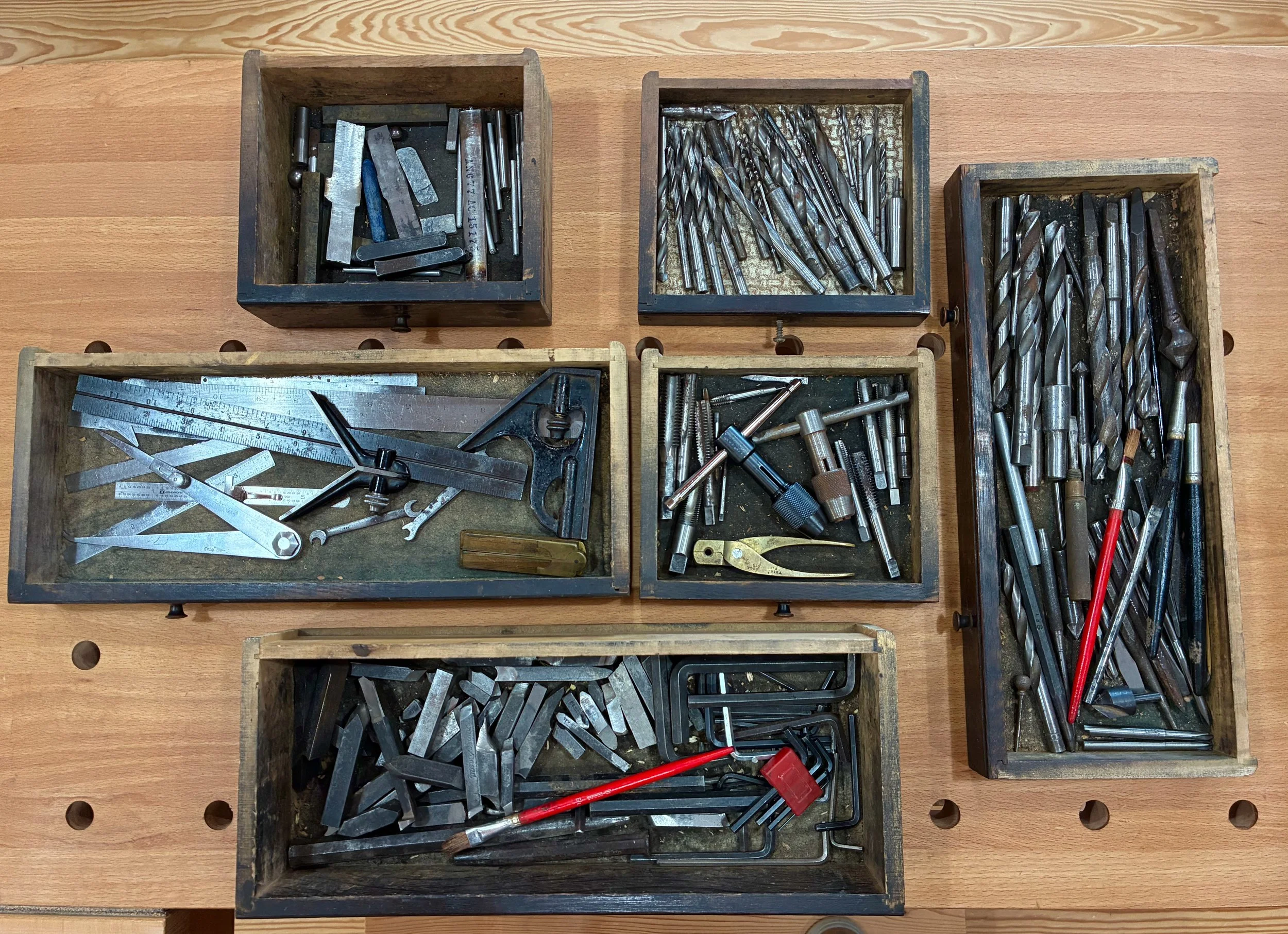
Loaded with tools and bits.
This was a refurbishing (i.e., not a refinishing) Project. By cleaning it up and replacing the missing parts, my primary goal was to make the chest useful again. I had no desire to botox the evidence of wear earned over a lifetime of service. A second goal was to create a tool box for my clockmaking paraphernalia.
History
Most of what I know about this piece comes from an informative blog post (they’re out there!) by a Canadian designer named “Mister G”. His blog, Progress is fine, but it’s gone on for too long, is an entertaining historical commentary on items that he refers to as “old forgotten mechanical crap, things with wheels and/or wings”. If you like any of that stuff you’ll find it worth a look.
According to Mr. G, The Pilliod Lumber Company was founded by T. J. Pilliod in 1896, and they manufactured a variety of small chests for the home and workplace. As with any enterprise, a history of The Pilliod Lumber Co., found in the blog post, records the adaptations necessary for survival amidst the ever shifting selection pressures associated with new technology and market demand (read: acquisitions and restructurings). The final remnant of Pilliod’s business succumbed earlier this century and that final fact makes this refurbishing effort even more meaningful, to me.

Popular Mechanics advertisement, March 1924
from: Mister G. (2013, March 6). “Vanished Makes: Pilliod Cabinet Company, Swanson, Ohio” [Blog post]. Progress is fine, but it’s gone on for too long.
Refurbishment
All refurbishing begins with a dust cloth and vacuum cleaner, though these are seldom listed in the credits. That initial sweep was followed by a wash with Murphy’s Oil Soap in warm water, a rub down with mineral spirits to remove decades of oily grime, and then a second Murphy’s treatment which sufficiently cleaned the surfaces. There is a line between unwanted dirt and valued patina, and care was taken not to cross into the patina zone.
In addition to dirt there were those usual white spots. Anyone who has refinished furniture knows what I’m referring to. It’s hard to fathom, but the conversation must have gone something like this:
“Honey?! I think I’ll paint the ceiling today.”
“That’s nice, Dear. Don’t forget to spread out all our furniture to catch the drips. Need help with the piano?”
Am I right??? (I added the piano part.) Anyway, those dots of lead were not easily scratched-off the chest and so I decided they could stay. Sheesh!
Collateral damage
Unfortunately, the filthy felt drawer liners were beyond hope and needed to be replaced. Their removal was accomplished by the two step process of: skinning what could be pulled away by hand; followed by a shave using that one shop chisel applied to everything except woodworking. I resorted to mechanical methods because the crystalized glue securing the felt appeared to be the same hide glue used for drawer construction and I did not want to loosen any parts by soaking those drawers in water. Curiously, one drawer had already been re-lined with contact paper. Wouldn’t you love to know the story there? “These five, oil-soaked and smelly felts can stay, but THAT one has to go!”
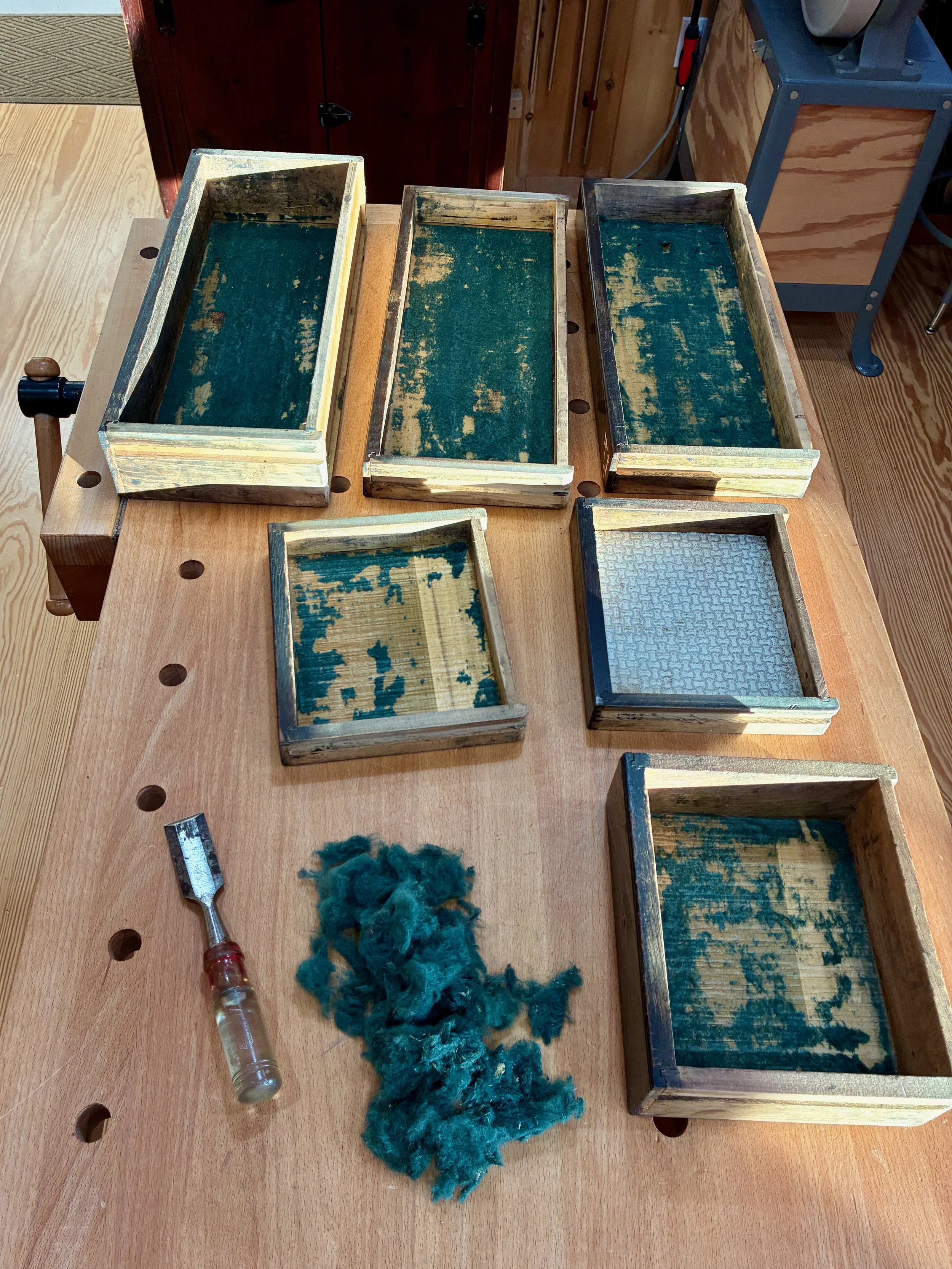
Shaving Pilliod’s pelts
The drawers were re-lined using today’s 100% polyester felt, and I took it easy on the glue. Next, all wood surfaces were perked-up with an application of Howard’s Feed-N-Wax. I was able to rejuvenate the dry leather handle a bit, too, using prosoft® baseball glove conditioner. Things were beginning to brighten.
Green New Deal
The final step involved the drawer knobs. As evident from that earlier picture, 3 of the original 9 knobs had pulled loose and were missing, one being replaced by a Phillip’s screw implant. In vain, I searched the Web for duplicates. What I found were some small brass knobs from Timesavers, an online clock parts store, that would serve as suitable substitutes. The remaining originals were cleaned-up with mineral spirits, waxed and re-mounted.
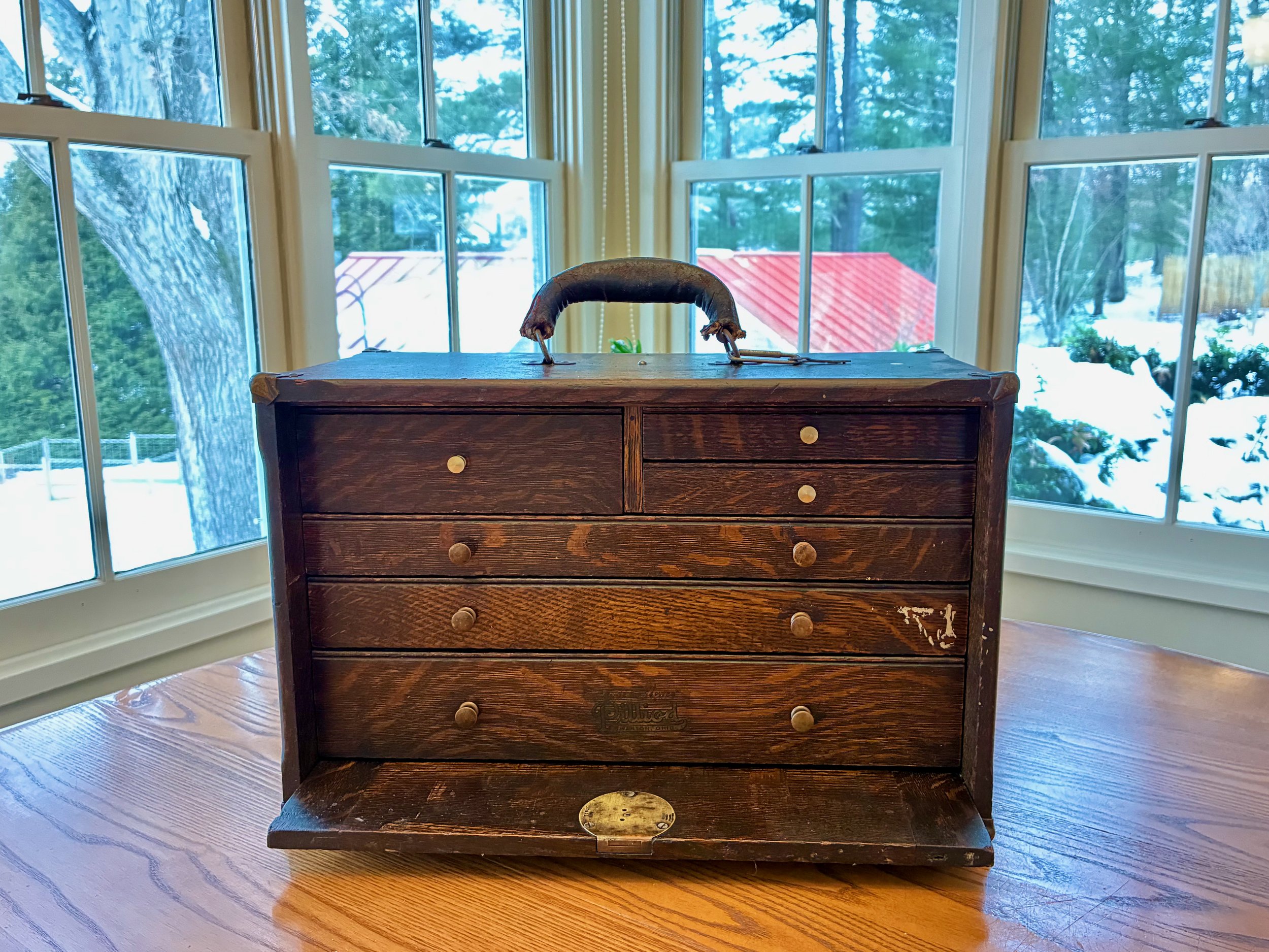
All parts in place
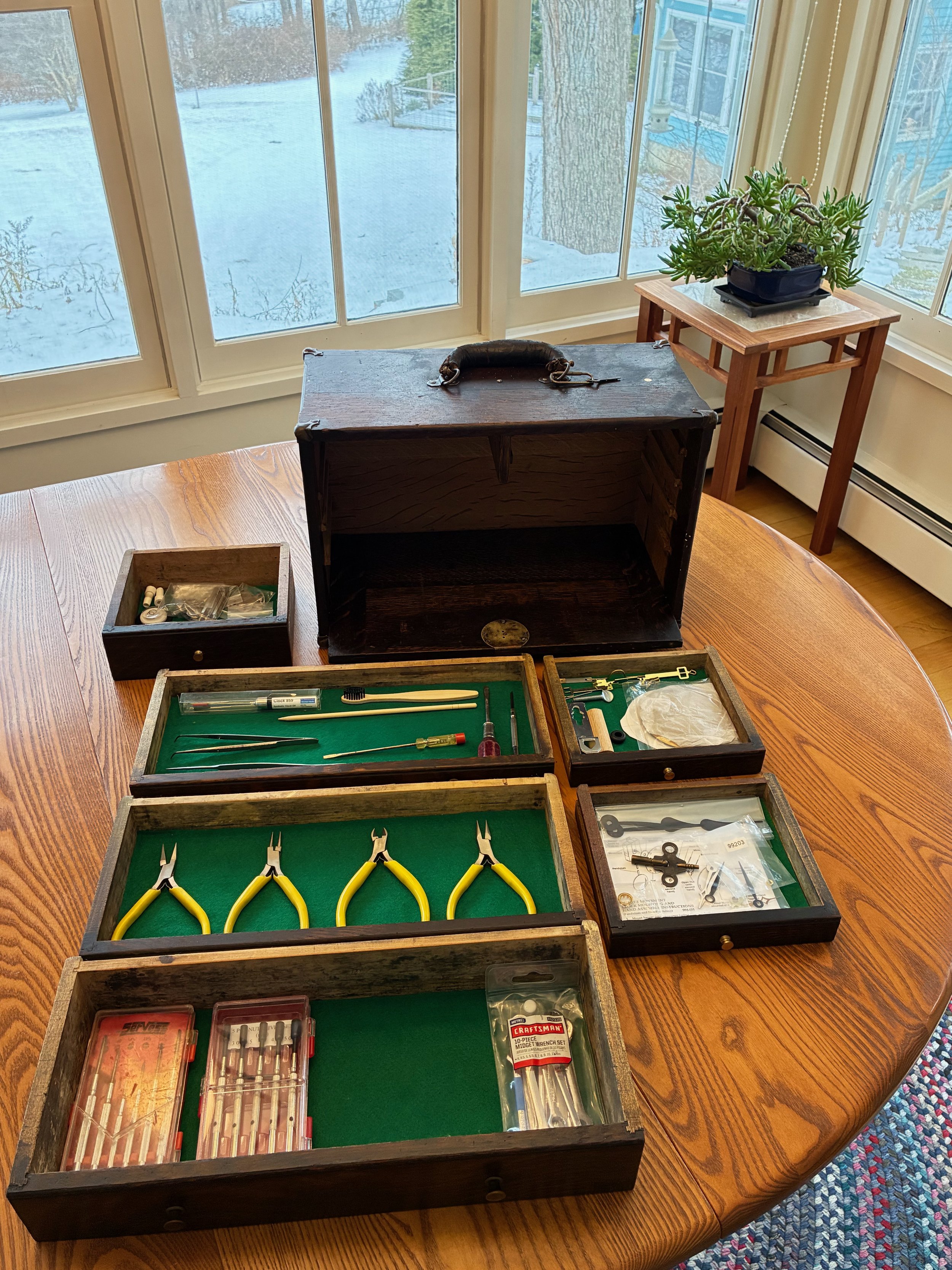
Drawers re-loaded
Back in Service
Thanks for reading. And thank you Mister G. for the service you do to humanity by keeping history alive and accessible.
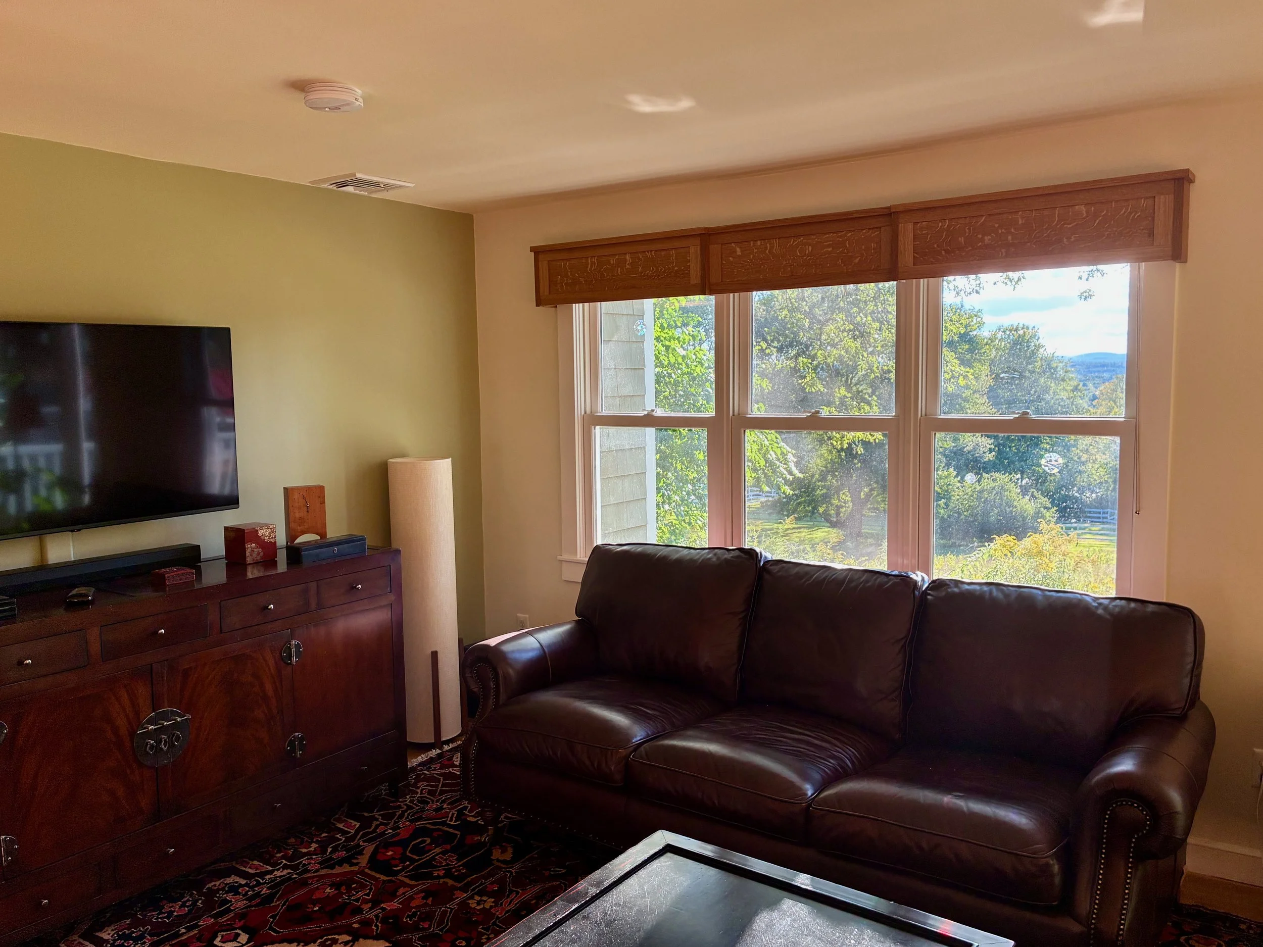
The Big One

According to my father Ed, his father, Sam, when coming to the end of a big job would often say: “Here’s the one we were looking for.” It was a simple observation, no doubt meant to elicit joy in his farmhands: Ed and three older sisters. I like to utter that one, too, when completing certain jobs. To be clear, my “jobs” are nothing compared to farming chores of the early twentieth century; when fields were plowed with horses and hay was pitched with forks. Still, it is satisfying to declare that you have, at last, finished the final task. The job under discussion here is the fourth and final cornice for our living room: the Big One.
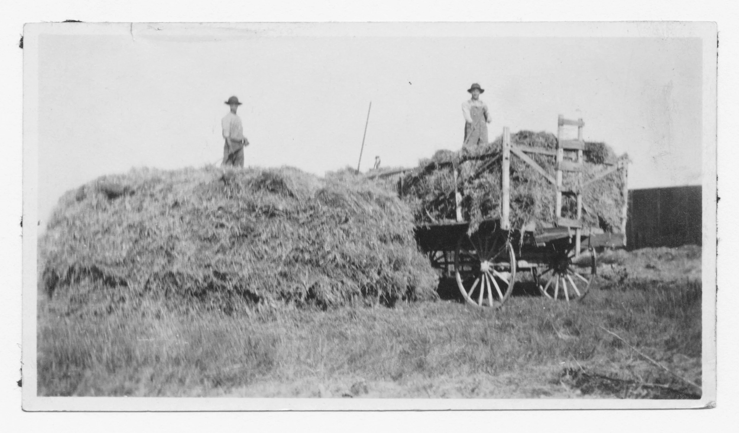
Once upon a time on the farm
Design
The design for this cornice is very similar to the last one, with just the panel dimensions changed to accommodate the new window sizes. I hope it works. That so-called “sophomore cornice” was mounted atop three windows of identical widths, whereas this one includes a large, 5 foot central window flanked by two smaller versions in what was once a dining room that overlooks the backyard.

“Dining room” windows
It should be a straightforward build, but before getting started a simple plan was produced to put the dimensions on paper and glimpse the ensemble’s relative proportions.
Rough plan
Materials
Four 4/4 white oak boards, three quarter sawn and one rift sawn, were procured from Reader’s and marked with chalk for processing into stiles, rails, panels and trim.
White oak cornice wood
Dimensioning, Assembly & Finish
Using a few oak pattern pieces saved from the prior build, to help set the tool fences, there is nothing remarkable about this construction story and so I’ll spare the details and just leave you to imagine the fun. <pause>
Once the cutting and dressing operations were finished, the panels were constructed as 3 sub-assemblies.
Cornice panels
To complete the build, the end caps were attached to the smaller panels with pocket screws, and then these sections were connected to the center panel in a similar manner. At almost 9 feet in length it was a challenge to support and hold the thing square while it was coming together. I’m not saying I need a bigger workshop, just maybe more clamps.
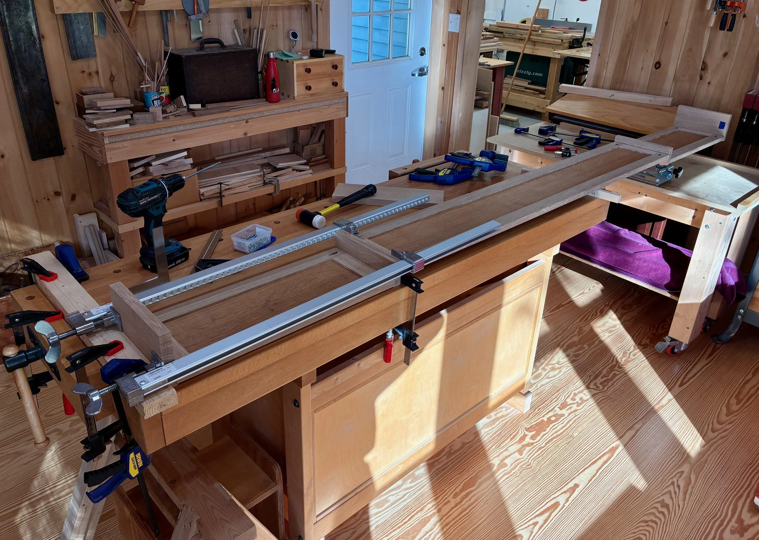
Connecting the panels together
Following assembly, the top trim was fabricated from rift sawn wood and attached as before. The cornice was then treated with two applications of boiled linseed oil and allowed to cure for a few days afterwards.

Finished cornice (upside down)
Lastly, my furniture hand (son), Ben, stopped by to assist with installation and to find “the one we were looking for”.
The Big One in its place
Coin Chest ep. 1

In for a penny, in for a pound
Growing up, my brother Mike and I collected coins - in addition to stamps, fossils, baseball cards and other treasures common to a 1960s-70s youth. Curating our small collections taught us a lot of things not covered in school, and spawned many happy memories in the process. Those passions were precipitously “parked” to make room for college and subsequent responsibilities but, following 45 years of adulthood, Mike is back into his coins and now has the resources to move them out of their cigar box abode. He has requested a suitable cabinet to store his collection and I am most happy to oblige.
Design
Where to begin? Well, it turns out there is a canonical “coin cabinet” that has been around for ages. It is a fine wooden case, typically made from mahogany, with layers of thin drawers that feature circular cut-outs to nestle each individual member of your collection. Beautiful, but that’s not what he was after.
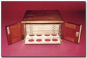
Mahogany coin cabinet from the fine craftsmen at coincabinets.com
You see, Mike intends to enjoy his collection, not entomb it. He needs a place to keep things organized, and one that can handle a variety of coin holders, rolls, books and small boxes. A cabinet for this purpose needs to provide small storage spaces with easy access and room to grow. Considering this mission not a lot of Western furniture items come to mind, however, there are some East Asian pieces that could readily do the job. The multi-drawered Asian apothecary cabinets could work, but their monotonous configuration might not suit the access requirement so well. (Where did I put those buffalo nickels, again?) Various Japanese merchant chests, a version of which I have made previously, might also serve the new purpose of housing a coin collection.
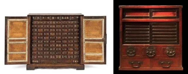
Apothecary cabinet (Korean) and Merchant chest (Japanese), examples of small, multi-compartment furnishings found online
The Japanese chests (tansu) seemed most appropriate, and there are many to choose from. Over time, the versatile tansu form has been adapted for the storage of almost everything, with some providing safe-like security. And every tansu type has distinct sub-species that differ by their geographic region of production, which means there is a lot of design inspiration out there. After some back and forth, we decided that a specific merchant’s chest, a zeni to-dana (translation: money chest with sliding doors), from the Echigo province would be a great choice. This particular specimen from the early Meiji era (1868-1912) was also a wheeled chest (karuma dansu), useful for exiting a burning dwelling with your most valuable possessions in tow, but we plan to omit the wheeled base on ours.
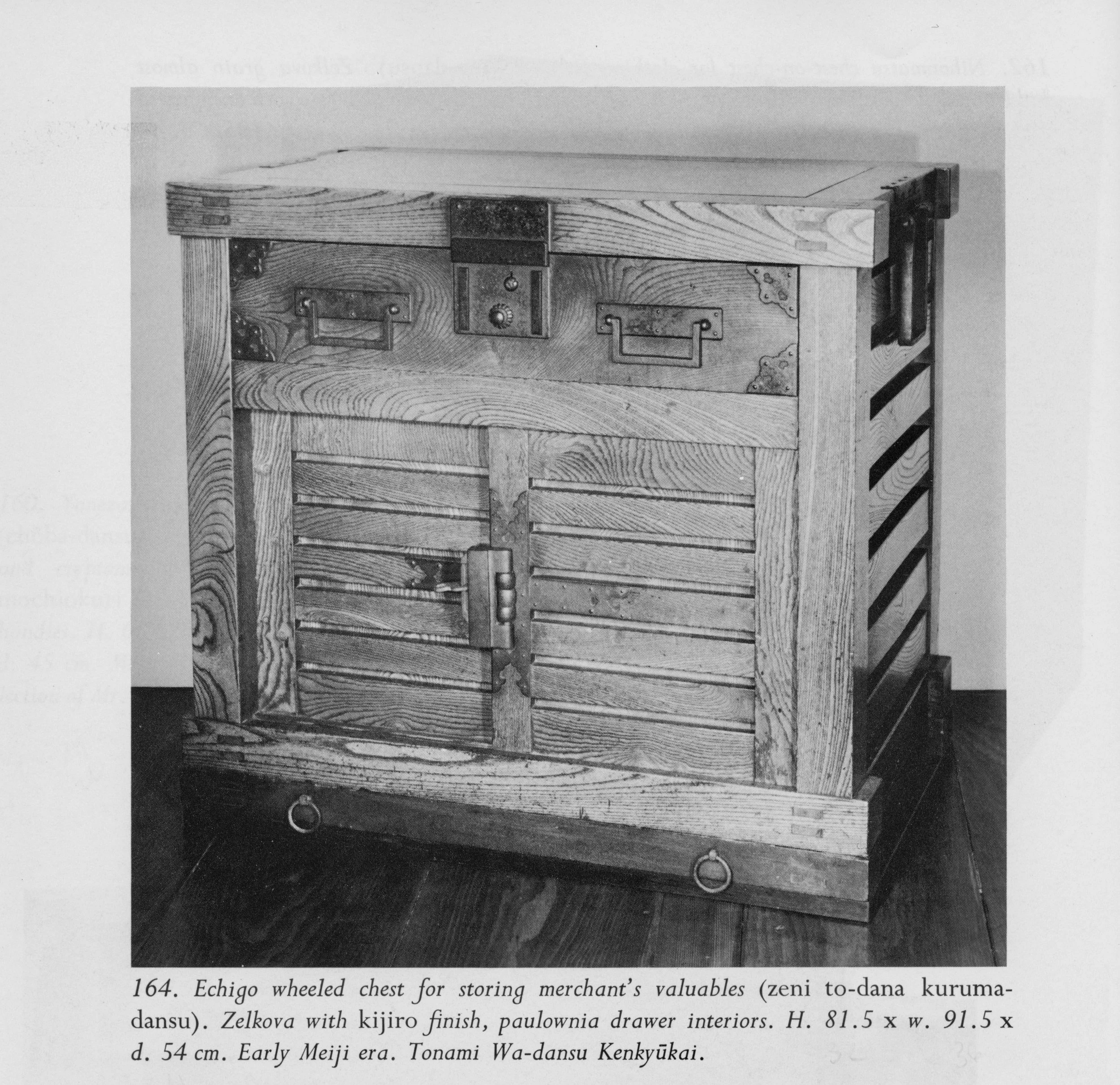
Zeni to-dana exemplar from: Tansu: Traditional Japanese Cabinetry, by Ty and Kiyoko Heineken.
Behind the locked sliding doors of this chest there are a set of drawers that could be further locked for security. We liked this “compartment within a compartment” feature, but would dispense with the locks. The plan for ours would be for one side of the cavity to contain drawers while the other would have open, adjustable shelving. The large, upper drawer might also be compartmentalized. In this first episode we will complete the carcass, saving the doors and drawers for later.

Coin chest, rough plan
Materials
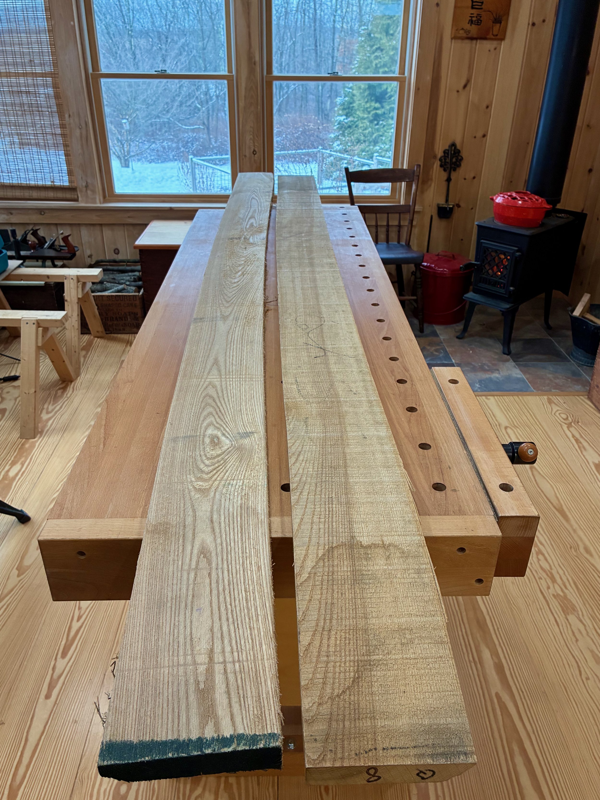
That original zeni to-dana was made from zelkova, a member of the elm family native to East Asia. Zelkova was a popular furniture wood in Japan and I find the grain character of this species to be most fetching. It is not readily available as lumber in the West, however, but there is elm and ash and those were my quarry as I entered Reader’s Harwood Supply, my new go to yard for quality boards. Elm comes in two varieties at Reader’s: red and gray. On the day of my visit they had much more of the red in stock and so I picked through their 4/4 boards and got a few of the best ones. I needed bulkier material for much of the carcass and so an 8/4 (2 inch thick) ash board was selected as well as some 4/4 quarter sawn ash for the slats. The plan was to construct the framework from ash and the mirror boards and drawer fronts from elm. Should look nice!
Lumber (L to R): quater sawn ash, plain sawn ash, red elm
Dimensioning
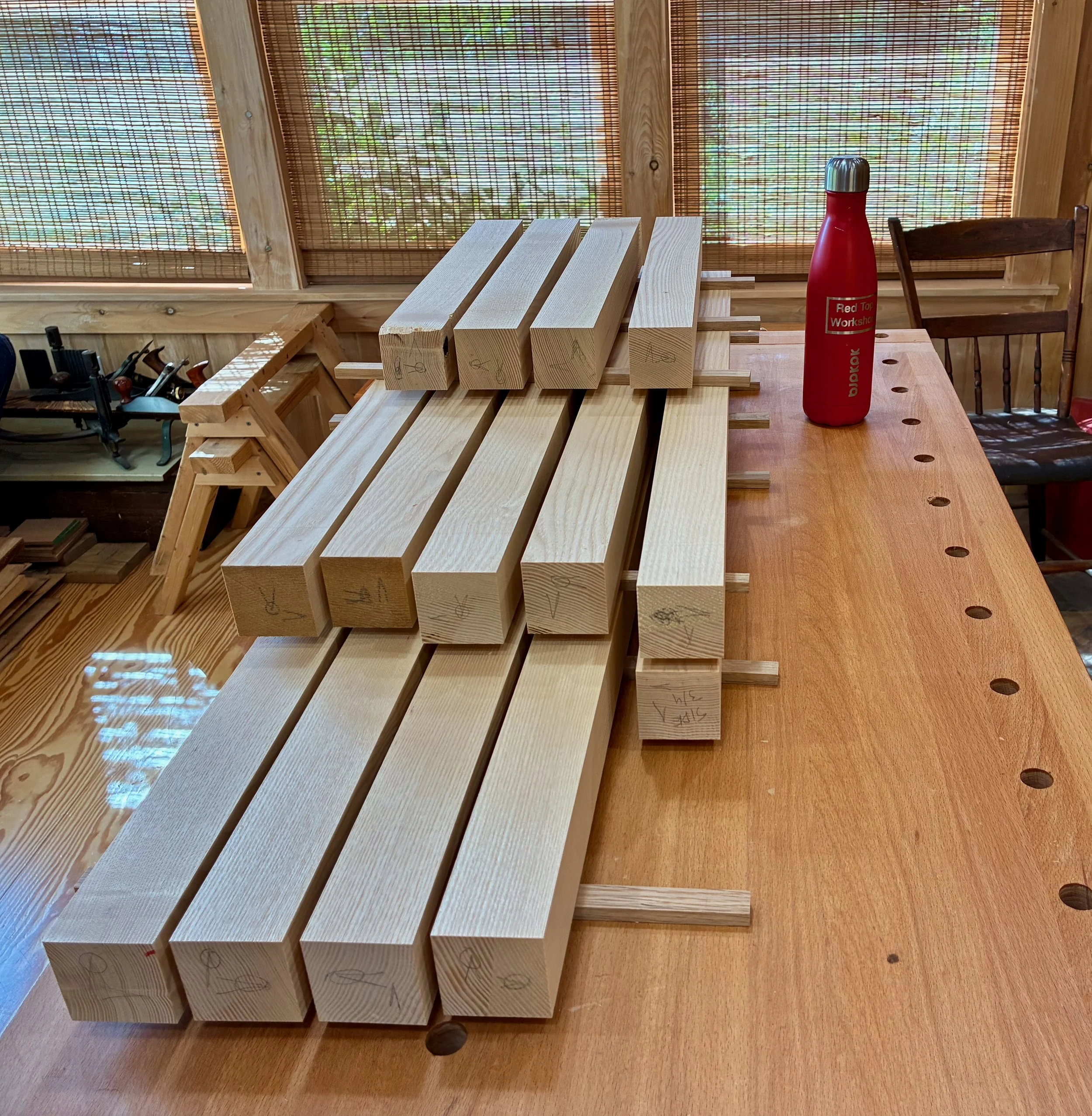
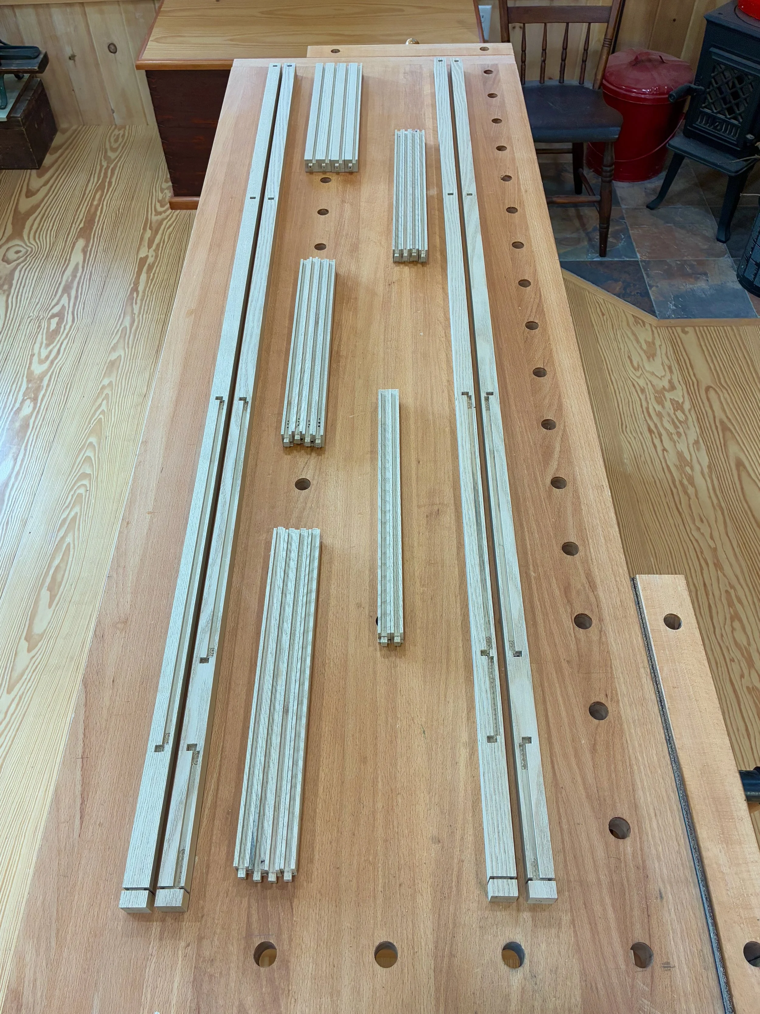
The bulky frame for this chest is constructed of 2 x 2 in. ash material, and to create these that large 8/4 plank was cross cut into rough lengths, ripped at the band saw and then made square at the jointer and thickness planer. This produced a stock of 14 poles for further modification.
Frame stock
From here it was a matter of cutting everything to final length and then fashioning the tenons, mortises and grooves of the joinery. Everything starts with the top and bottom rails and the mortises within these that would hold the side posts and cross rails. Ash is a tough wood to mortise and I needed to bore sixteen 1 in. square holes that were 3/4 in. deep. To make the experience pleasurable, I hollowed out the centers of these sockets with a Forstner bit at the drill press before squaring them off at the mortiser - much easier this way! A simple slot jig was constructed by clamping a few boards onto the drill press table to allow for quick and uniform production.
Drilling out the mortise centers
Following a bit of chisel clean-up the mortises were complete. These were then used to define the tenons to be fashioned at the ends of the rails and posts. After cutting the members to final length the tenons were formed in a two step process. First, the shoulders were defined at the sliding miter saw, where a shallow cut was made on all four sides of the post to create a joining edge. Next, the cheeks were cut at the table saw using a tenoning jig - four passes per tenon. Creating tenons by this manner is a bit more involved than using a dado stack and cross cut sled, but the result is a clean joint element that is easy to fit.
Making the first of four cuts with a tenoning jig to create the cheeks (note the finished tenon at top of rail)
After a bit of chisel work, the parts were made to fit snugly at each joint, but in order to dry-fit the entire frame I needed to shave a corner off of most tenons to accommodate their perpendicular mating within adjacent mortises. This was done by marking and then slicing-off these corners with my dovetail saw.
Paring a corner off of the tenons
With the tenons pared, the frame came together during a maiden dry-fit. From here, the positions of all subsequent grooves and mortises could be marked in pencil to ensure their accurate formation. It is easy to get the ends and faces of 14 frame parts confused when disassembled into a pile of poles, so this marking step is key!
Dry-fit frame
Every frame member would receive at least one groove to house a sliding door or panel. Each side post also required a series of seven mortises to secure the tenoned slats. Lots of secondary joint work to do here. Variously employing the table saw, mortiser and router table, each series of cuts were set up and then executed as a batch to maintain uniformity. Two side panels called “mirror boards” were also prepared from red elm, whereas plywood was used for the out-of-sight back and bottom. Steadily, over a weeks’ time, the carcass came together component-by-component.
Clipping the edges off of 28 slat tenons at the band saw
Gluing-up the elm mirror boards
Test fitting the sides
Back and bottom fashioned from plywood
The top came last. Construction-wise it is identical to the bottom, but instead of 3/4 in. plywood for the panel I used red elm. One of the elm boards selected at the lumberyard possessed a wild and flowing grain pattern which I thought would make for a lively top. That untamed grain was also responsible for the undulating surface, which twisted and warped its way along the entire 7 foot length.
Red elm “diamond” in the rough
After lopping-off 14 inches of “whip tail” from both ends, the remaining board was cut in two. Even after surgery, both sections were twisted by up to 3/8 of an inch along their 28 in. length and this would need to be remedied before processing further. I decided to use the thickness planer for the job, but first needed to create a new jig to assist the operation. The trick is to first make one side of each board perfectly flat. That flat side can then be placed on the thickness planer’s bed (sans jig) and the uneven, opposite side made parallel by repeated passes through the planer. A “sled” jig to enable the operation was made from a sheet of mdf and a scrap piece of oak. In the event, an elm board was laid onto the sled surface and shimmed underneath to create a stable situation with no rocking action. The sled-mounted elm was then repeatedly passed through the planer, making light cuts, until the entire upper surface was flat and smooth.
Twisted elm board mounted on the planer sled
Elm and sled exiting the planer on its way to becoming flat
With a bit of care and patience, the elm/sled/planer combo produced two flat boards ready for mating together. Biscuit slots were cut into jointed edges and the boards were glued-up to make a full-sized panel. After trimming to final dimensions, filling some crack defects with epoxy, and then smoothing the surfaces, the underside was rabbeted at the table saw to fit within a groove in the top frame.
Elm panel dry-fit into the frame
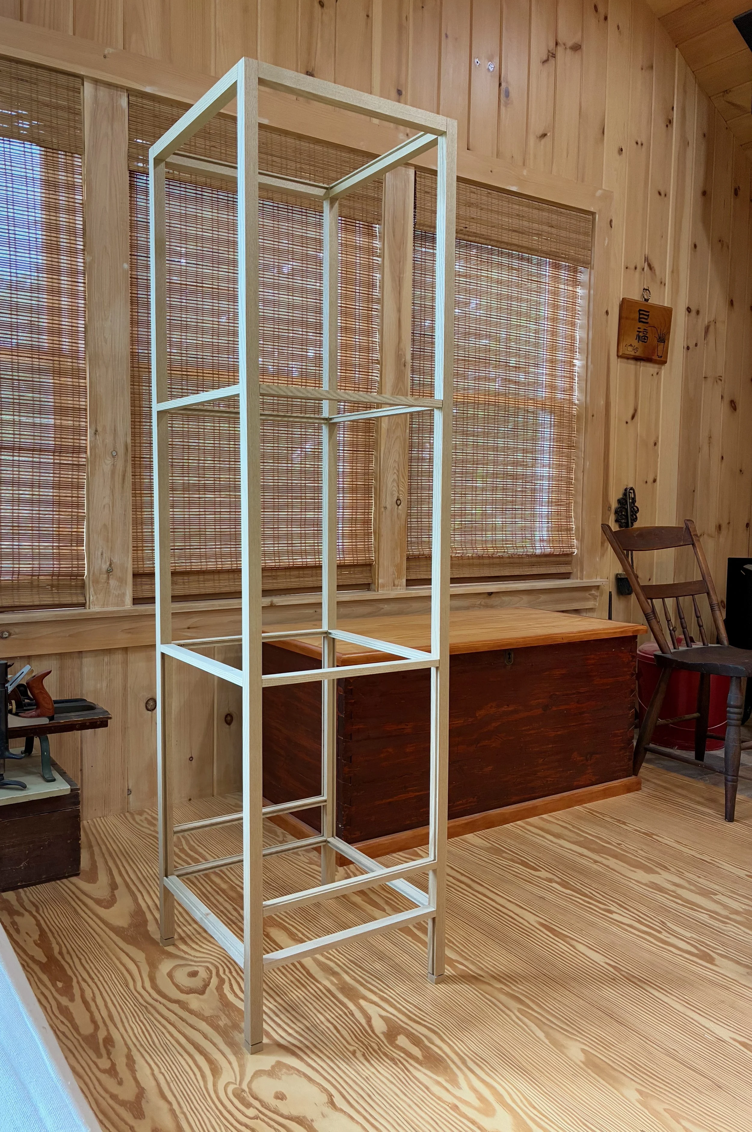
Finally, I routed some grooves into the front framework to serve as sliding door channels and then the entire carcass was assembled in a dry-fit - 34 parts, in all. The next steps are to create: 1. the sliding doors and drawer for the chest; 2. a case for the interior drawers; and then 3. the interior drawers themselves. I believe I’ll need to squeeze that drawer case into the carcass frame prior to a final glue-up and so I am leaving the Project at this stage for now. Please stay tuned for the completion story in episode 2.
Coin chest carcass
Sophomore Cornice
Here’s a timeless question fraught with feelings:
I liked the last one, but how will the next one compare?
This natural query can elicit thrills or, when the stakes are high, dread. For me, it brings back memories of hope; as in tearing the plastic from a band’s new album and hoping you will like it as much as you enjoyed their last. Sometimes you do - sometimes you don’t. More than a feeling, that was my state while embarking on this Project.

Notable first and second efforts
I took a break after completing the Craftsman Cornices for the purpose of working with a different wood and joinery scheme. But, to complete my neo-bungalow living room there were two more window banks to outfit so I’d best keep at it. The window areas were different enough that it seemed prudent to tackle them one at a time. The current Project addresses a trio of identical windows on the West wall that, today, are a feature of our living room but were once part of a bedroom (it’s complicated).
Target windows
Design
Much like those Boston album covers the new design would be a variation on the old; no new features, just a new take. The big idea was to add some dimensionality to the sequence of three framed panels by protruding one or two beyond the other(s); just enough to add interest without overpowering the scene. All of the part dimensions would match the “old” cornices, as would the materials, so the only remaining choice was: one lump, or two?
Hastily jotted construction plan and mill bill
I know of no existing design precedent, and think both patterns would look fine. The deciding factor for the use of two lumps was the peculiar fact that the wheel for this window’s blind cord was temperamental, and prone to coming unhitched when operated inattentively. It was hoped that a protruding panel on the end would provide enough extra space to rig something (TBD) that would allow for re-threading the spool, as needed, without dismounting the heavy cornice.
Materials
White oak boards, two quarter sawn and one rift sawn, were procured from Reader’s Hardwood Supply. I purchased these among a bunch of boards for use in the next project and so forgot to take a picture before diving in.
Dimensioning
With forethought, I had saved a few cut-offs from the original Craftsman Cornice. By definition these are milled to the exact dimensions (thicknesses, dado widths/depths, etc) required here and so were used to set the fences and blade heights for the new build. This made everything super easy and within a couple days I had all of the major parts prepared for the three panels.
Dry-fit panel sections
The cornice would be constructed from the inside out. This meant getting the dimensions of the central section properly established so that the two connecting boards could then be added, followed by the flanking sections, trimmed to their correct final length. I decided on a 1 inch offset for the center section and, using rift sawn stock, constructed two connecting boards with shallow dadoes to impart this pattern. A rift sawn board was also used to create the top trim in three sections, as well as the two end panels.
Playing with a connecting board (center) and trim joint
Assembly and Finish
Prior to assembly, the panels were treated with their first course of boiled linseed oil. Following this the central section of the cornice was glued together and clamped. The connecting boards were then attached to each end of the section with glue and pocket screws. With this section now resting on the actual window sill I could take final measurements to determine the exact lengths of the remaining sections. Back in the workshop, the outer section rails and panels were trimmed to final length and then assembled.
Glueing the outer sections, central section in background
To mount the end panels I drilled holes for pocket screws on the left side, but I left the right (window blind cord) side alone. Next, the sections were put together with pocket screws, forming an 8 foot long cornice body. The trim parts were then mitered on a 45° angle, modified with chisels on the underside to accommodate profiles of connecting and end pieces, and then trimmed to their final length.
Sizing the top trim on the fully assembled body
To cover the end grain where the trim boards jog around the central section I glued a small piece of homemade veneer before sizing and mounting the center trim span.
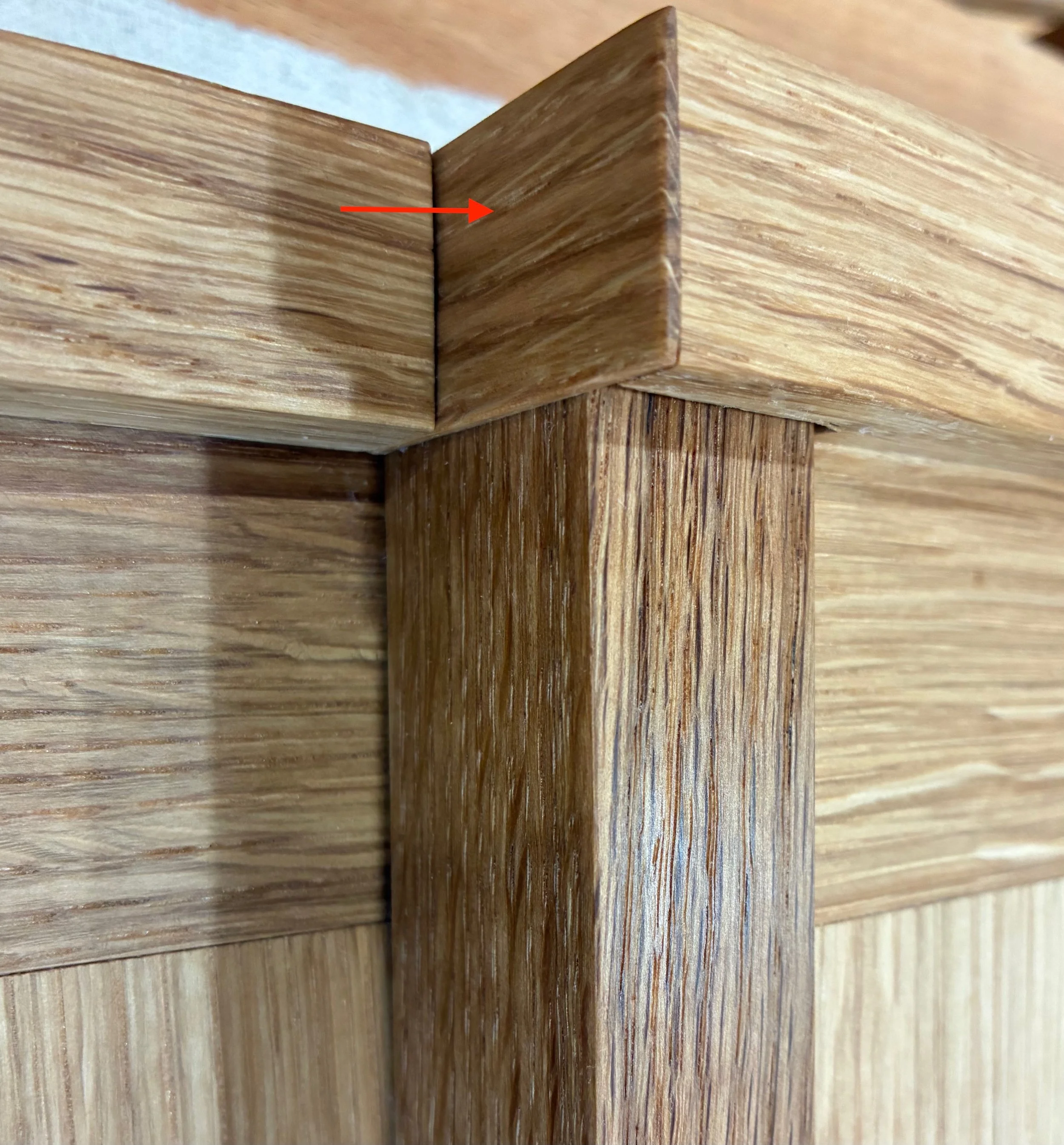
Veneer covering end grain of trim
To solve for the removable end panel, the right side panel was attached using magnets along the edge; the trim’s top resting on an auxiliary board behind. These can be modified further if they are not able to keep things tight, but I think they will work.
End panel with magnet next to a reclining cornice section with matching magnet and auxiliary board (after finish)
At last it was time to complete the oil finish by applying two coats of boiled linseed oil, 24 hours apart. This livened the grain while adding some color to the cornice.
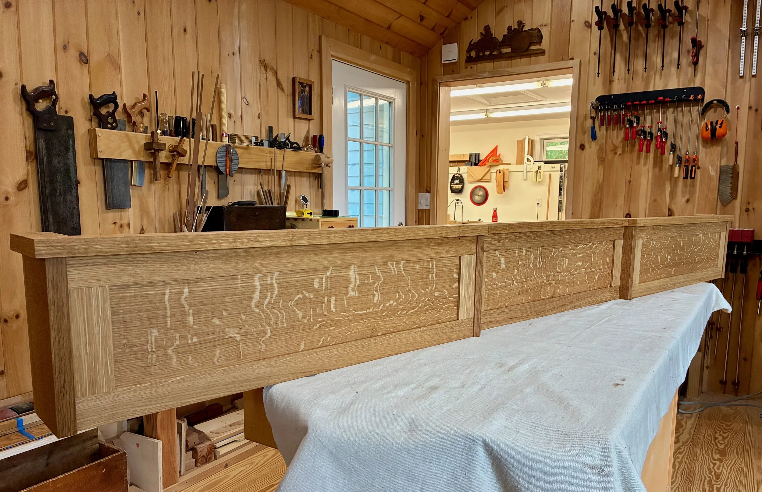
Finished cornice
Installation was just a matter of settling the piece onto 4 pre-installed angle brackets along the top of the window trim and cinching things tight with a couple of zip ties. It also looks like the removable end panel will work as intended. Terrific!
Feelin’ Satisfied
Three Story Table
Actually, it’s not a “table”, it’s a sabang-t’akja. But, unless you speak Korean, that name can be a mouthful and maybe that’s why it has been translated into so many aliases over the years. Anyway, this Project is my own translation of the classic sabang-t’akja. Please come along.
I’ll admit that it’s hard to nail down the exact English definition of the Korean “sabang-t’akja”. The t’akja part is easy, generally translated as “open-shelved stand”. But when preceded by sabang, a word that in Korean can variously mean: 1. four sides; 2. in all directions; or 3. everywhere, this two-word noun literally translates to “ a shelf that is opened in four ways”. And I have seen that exact “name” for this item online, however, my furniture books tend to rely on real world function when they refer to it as a “book storage and display stand”. We’ll go with that one for now as use defines meaning. Astute readers may also recall that “storage and display” was the purpose of a hallway hutch, recently completed under the Red Top. One can contemplate the structures of these Eastern and Western furniture items and marvel at the products of convergent evolution underway in opposite hemispheres of the earth.
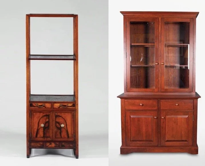
Examples of a Korean sabang-t’akja and American country style hutch found online
In the late Joseon Period (1392-1897), when sabang-t’akja were popular, they were furnishings found in the Master’s room (sarangbang) of a Korean home (hanok), what today we might call a study, where book storage and the display of “manly” objects was its function. I visited the Namsangol Hanok Village museum in Seoul during a visit in 2016 and saw many sabang-t’akja among the furnishings in their collection. This picture of a sarangbang scene was snapped there.
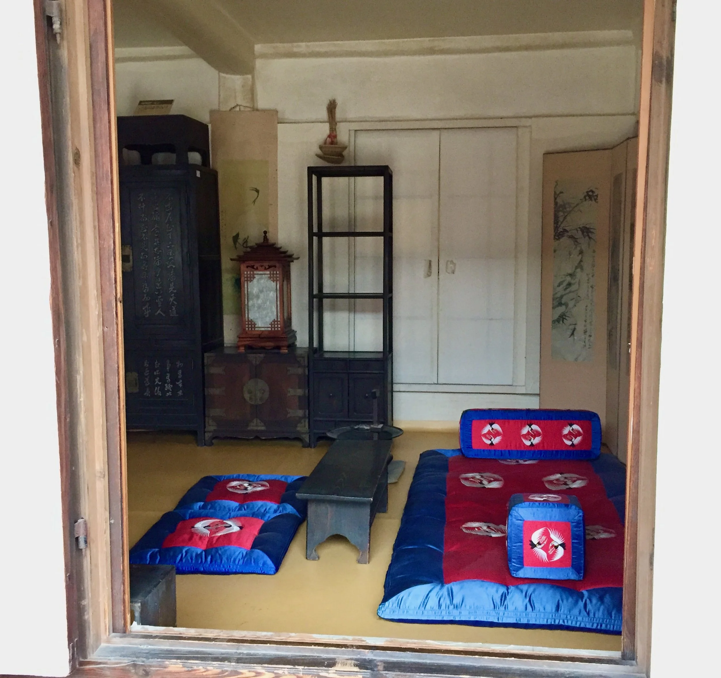
Book storage and display stand (sabang-t’akja) in the sarangbang
The sabang-t’akja Project described here is different - it’s for my wife, Joung. You see, she is becoming quite the knitter and has accumulated many skeins and needles in the process. She deserves a proper place to store these and to display some of her favorite things. I aim to please.
Design
It was easy to choose the version of a “storage and display stand” for this build as I have had my eye on it ever since the 2016 Korea trip. During that visit I picked-up a nice little book called Making Traditional Wooden Furniture and was smitten with the dainty version described in the back section where some construction plans could be found. Oh, and according to Google Translate, they give it a new name: “Three Story Table”.
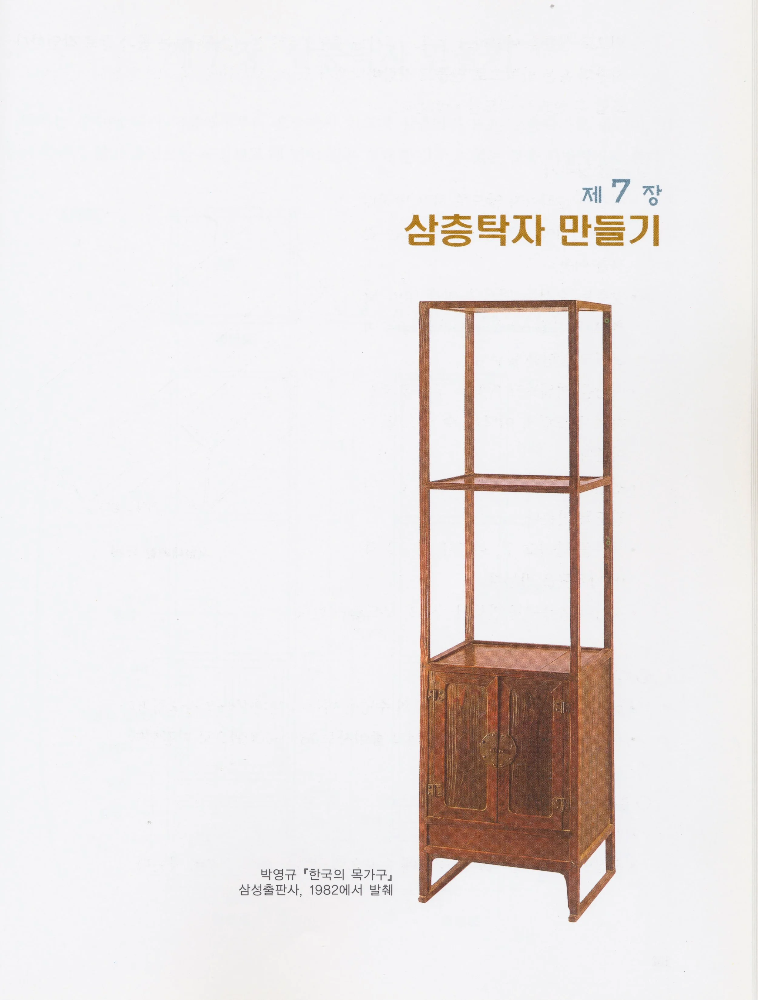
“Chapter 7
Making a Three Story Table”
The construction plan was carefully rendered on page 105 and dimensioned in millimeters, a language almost as foreign to me as the accompanying Hangul write-up. No worries, I have apps on my phone that can translate both!
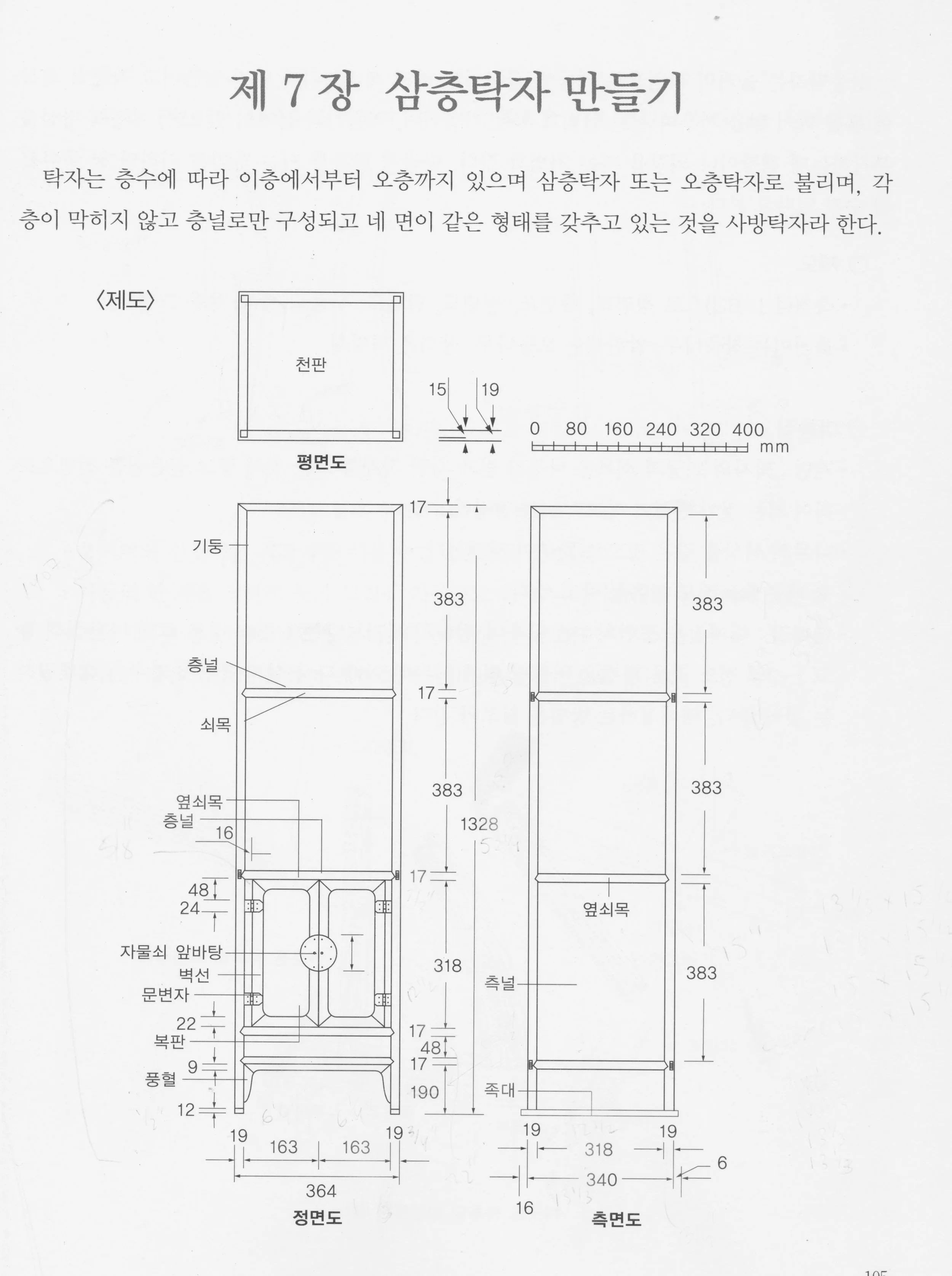
Three Story Table plans (original)
I converted the mm spans into inches and then encountered a problem: at a finished height of just over 4 feet, the piece described would be too short. A “three story table” of that height might be perfect for a floor-sitting Korean lifestyle, but it would not blend well with the other furnishings in our living room. No worries, I figured I could apply a 1.3x scaling factor to every number and enlarge the item proportionally. That works fine in “decimal land” but it gets cumbersome when translating things back to inches, the language of my workshop tools. (One millimeter = 197/5,000th of an inch). I was about to begin the tedious conversions, rounding numbers up or down to the nearest 1/16th of an inch, when I recalled I had essentially made this furniture piece two years ago: the Korean Stand. For that Project I had divined the measurements from a small photograph and used those plans to produce a beautifully proportioned set of open shelves. I could essentially use the same part dimensions for this one, tweak a few details to add the cabinet section and make a respectable version of the sabang-t’akja depicted in the plans above. Reduce, reuse, recycle (and stay sane)!
Starting from the Korean Stand work, a rough plan was sketched at 3/32 scale (in inches) of a 3 shelf unit with a doored cabinet enclosing the bottom section and standing 5 feet tall. It looked nice. My only change would be to convert the panel below the doors into a handy drawer for storage.
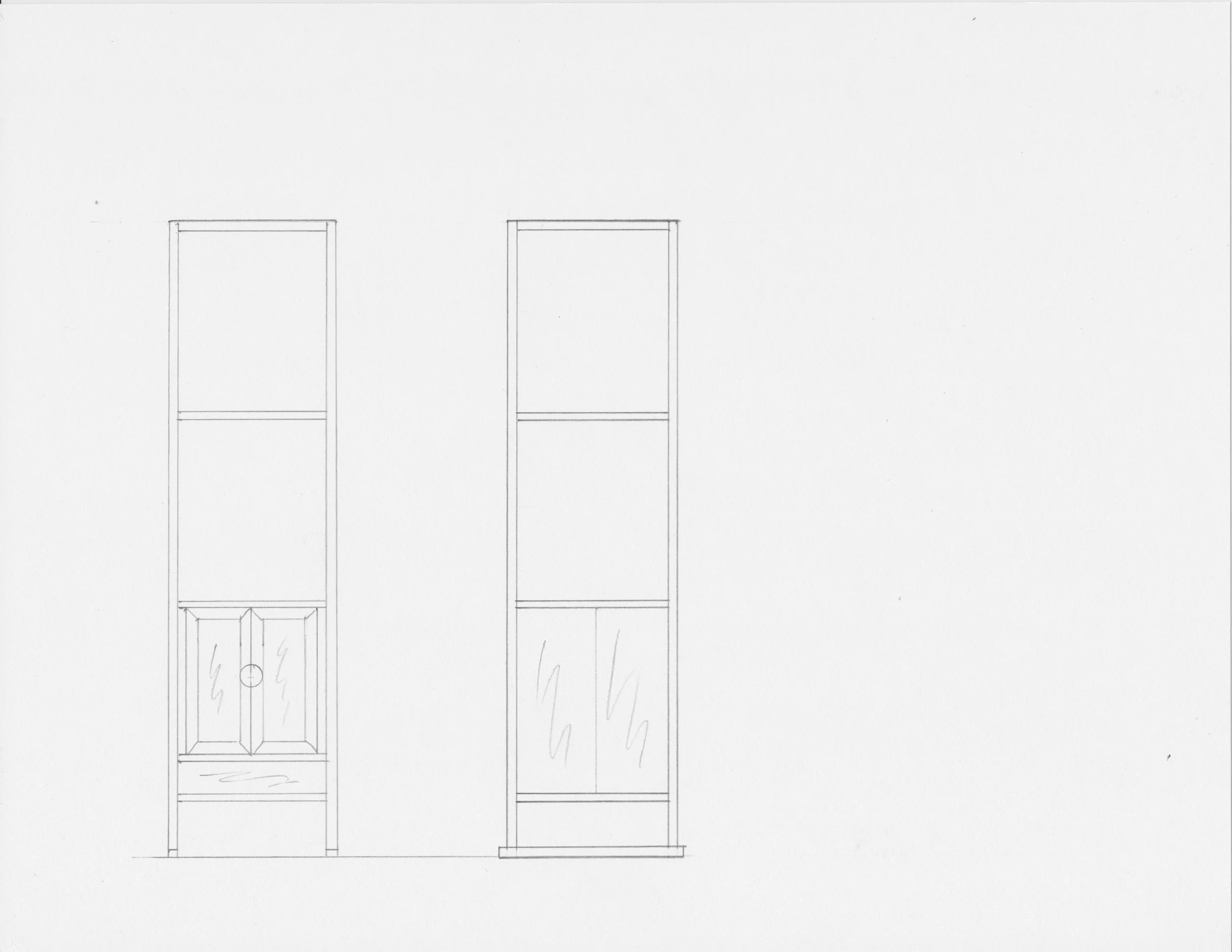
New and Improved “Three Story Table”
Materials
I wanted a special wood for this piece that in nineteenth century Korea would almost certainly have been fashioned from paulownia. Paulownia, second only to balsa as the softest hardwood, was favored in the East for its lightness and supposed insect resistance, however, it is difficult to source in the Eastern United States. There is sassafras though, a wood that has always intrigued me. A bit tougher than Paulownia, but still a weakling according to the The Wood Database strength index, this North American hardwood is not common but, if you can find it, the lumber is also not particularly expensive. I got 20 board-feet from the nice selection available at Reader’s Hardwood Supply. The hinges and other hardware for the cabinet will be selected later, once I can assess the character of the piece.
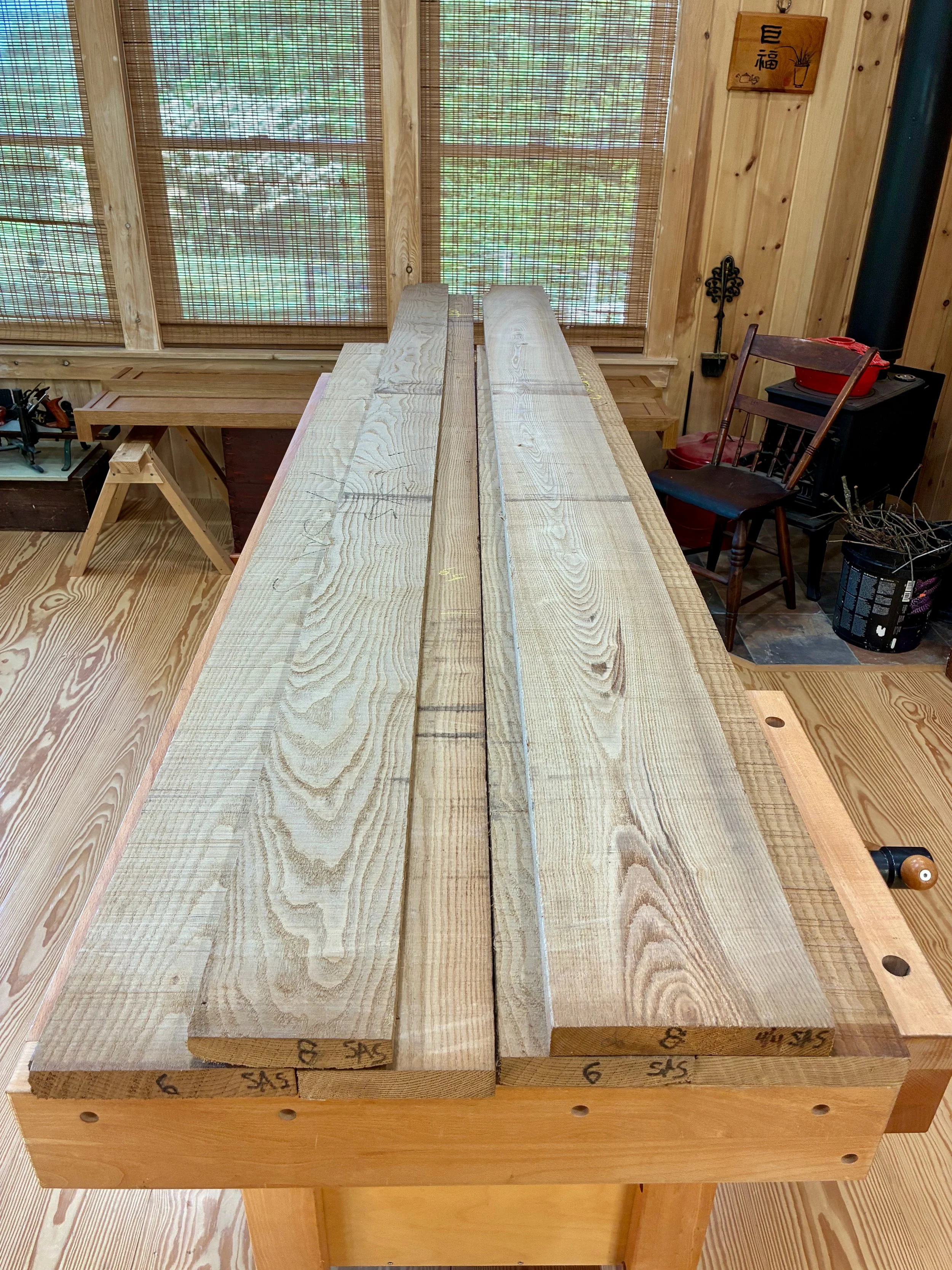
Sassafras boards
Dimensioning
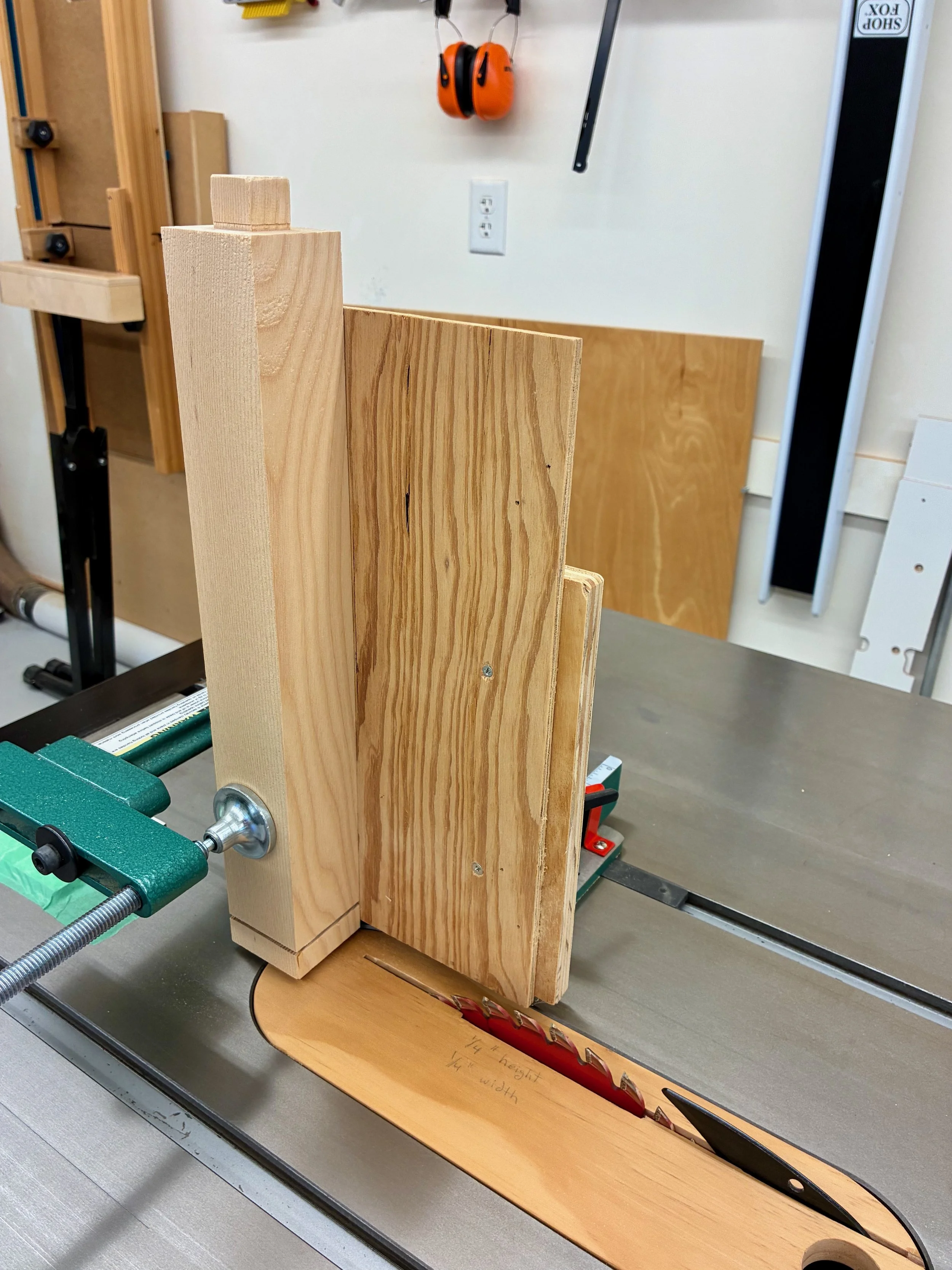
To begin, I went back and studied the blog post for the Korean Stand to refresh my memory on its production. Not much has changed in the workshop since then and so I set about on that same path, replacing red oak with sassafras. If you have never worked with sassafras I suggest you give it a try. It smells so sweet at the saw, cuts like warm butter and stays “true” when ripped into thin poles. Fashioning the frame parts for this piece is all about ripping these rectangular poles at the table saw: all 7/8 in. wide and either 7/8 or 1/2 in. in the depth dimension. Ripping narrow slices, such as the 1/2 in. thick rails required for this piece (n = 14), can be tricky and I found that my homemade “straddle fence push tool” worked great to cut accurate parts, safely.
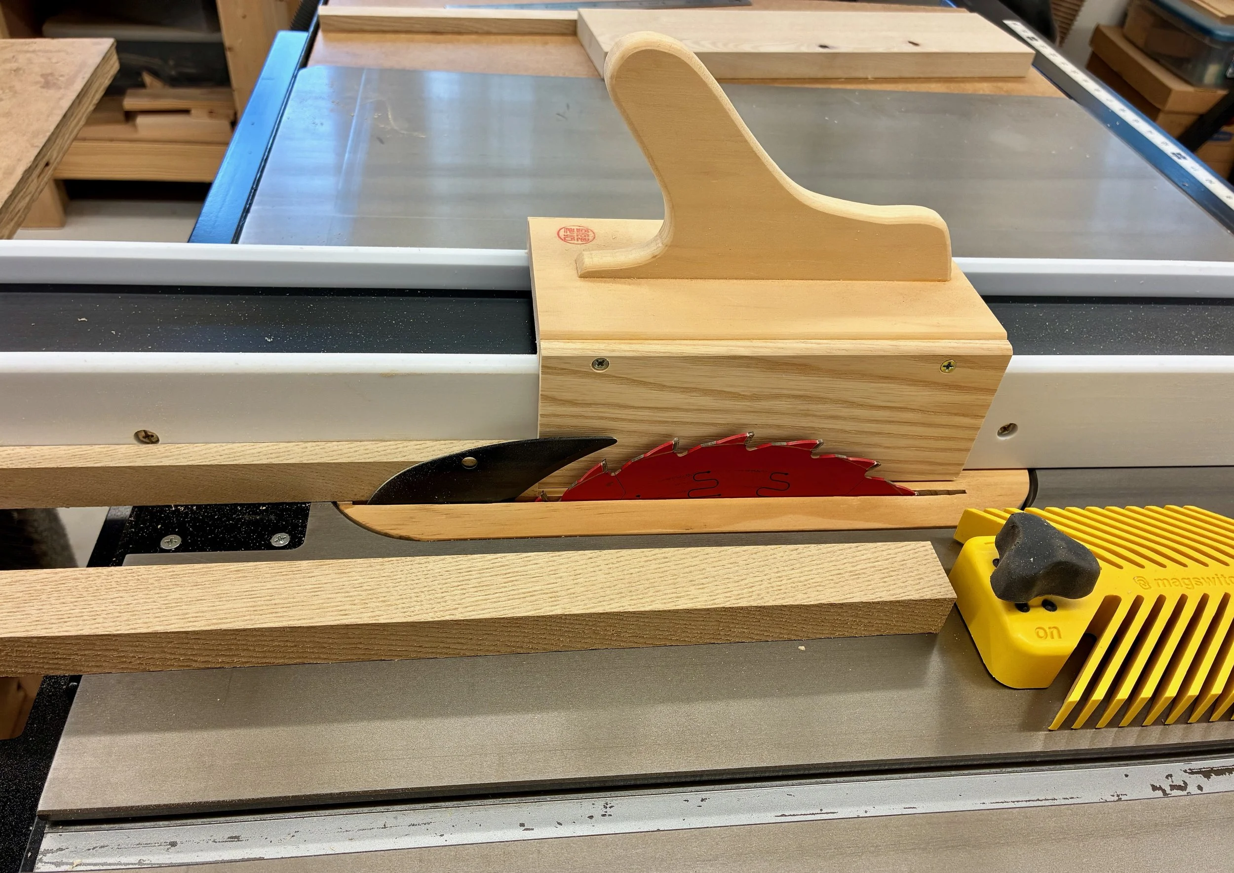
Ripping 1/2 in. wide rails at the table saw
After all the leg poles and rails were cut-out and trimmed to final length, I needed to assign them each a “role” and then fashion the mortises, tenons and grooves for the joinery. These operations variously employed the mortiser, miter saw, table saw, and router table, as well as a Sharpie for labeling what’s what. When complete, 22 value-added parts had been produced.
22 Frame parts
After some fine-tuning at the joints, the parts could be metamorphosed into a frame.
Dry-fit frame
The next step involved re-sawing sassafras boards to make the three shelf and four side panel parts. I decided to use birch plywood for the (out of sight) cabinet floor and drawer support layers. Each sassafras shelf/panel would be comprised of three narrow boards glued together - a result of the plank widths available at the lumberyard. Fortunately, the three shelves for this piece could be fashioned out of a single plank, thereby ensuring consistency of color and grain. After chopping that plank into four segments of approximate final length, the boards were re-sawn at the band saw into thinner parts which then were all thickness planed to a depth that snuggly fit the rail grooves, ~1/4 in. To create the 14 1/2 in. square shelves, a 2 1/2 in. wide board would be sandwiched in between two 6 in. boards. Attention to grain pattern and direction helped to create visually pleasing shelves that were also warp-resistant. The components were glued together and the resulting shelves trimmed to their final dimensions using a combination of track saw and table saw. Small notches were made at all the corners to accommodate the frame poles. The side panels were constructed in a like manner, whereas, the plywood layers were fashioned from 1/2 in. material by rabbeting along the sides to make “tongues” to fit the grooved rails.
Glueing 3 boards together to make a side panel
After some easing of the edges with a hand plane, the panel parts were dry-fit with the poles and rails. This serves to stiffen the structure and gives a first glimpse of the final form.
Dry-fit frame with panels
Two final case parts were fashioned to serve as hinge boards along the sides of the doored cavity. These were rabbeted so that the front edge would fit within a groove on the side poles, thus recessing the door frame the same amount (1/8 in.) as the side panels. With that completed, the parts were disassembled and all surfaces card-scraped and sanded to #220 grit. The last step before glueing-up the carcass was to liberate the tenons at the bottom of the poles. The tenons will join to the tatami-zuri boards later in the build and their positions were marked with grooves at the very beginning.
Assembly and Finish
There is still much to be built, but it was now time to pause and assemble the carcass. The first step is to decide on the final finish and whether this would require treating the panels prior to glue-up or not. I have come to favor simple oil finishes that let the wood glory in natural hues. However, I found that when surfacing my yellow-brown sassafras to a final state, a dreary gray chatoyance was produced that made the panel boards look “dirty”. Further, I found that oil finishes on a scrap piece did not “clean” things up. This odd coloration might change as the boards age, or it might not. Thus, it was worth experimenting with some colored finishes to improve the look. I liked the orange-brown color of the exemplar piece and so I aimed in that direction.
A variety of dyes, glazes and stains were tested with the goal of imparting a better “look” while not going overboard. I picked among the products that I already owned, and after a few days of play landed on a nice ZAR® stain by the name of “Salem Maple” (Red Top Translate: “reddish brown”). On my scraps it seemed to bring the grain to the fore while imparting a more uniform background red that worked better with gray. Sold! I would also wait until the very end of the build to stain and varnish the piece.
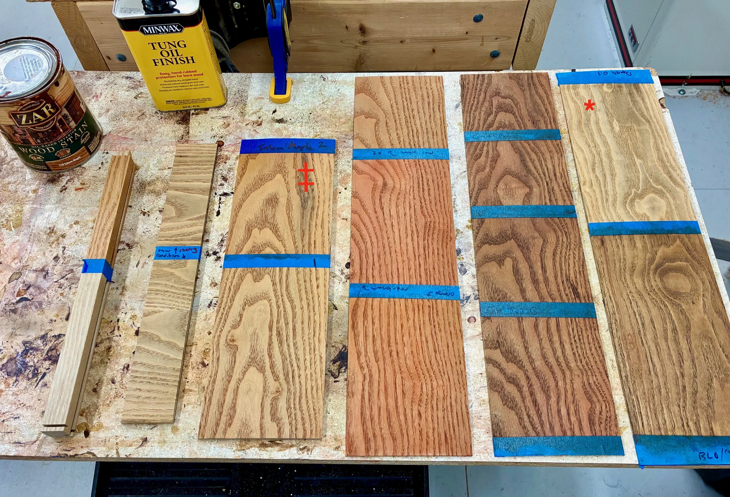
Finishing test panels
*Oil-only (note gray tones)
‡ Salem Maple stain “winner”
Assembly of the carcass was a smooth operation given the prior labelling of parts and some assistance from Joung. I’ve hit upon a favored sequence for these cabinet builds: assemble the back flat on the workbench; then raise the sides; and finally cap-off the front before standing the thing upright to cure.
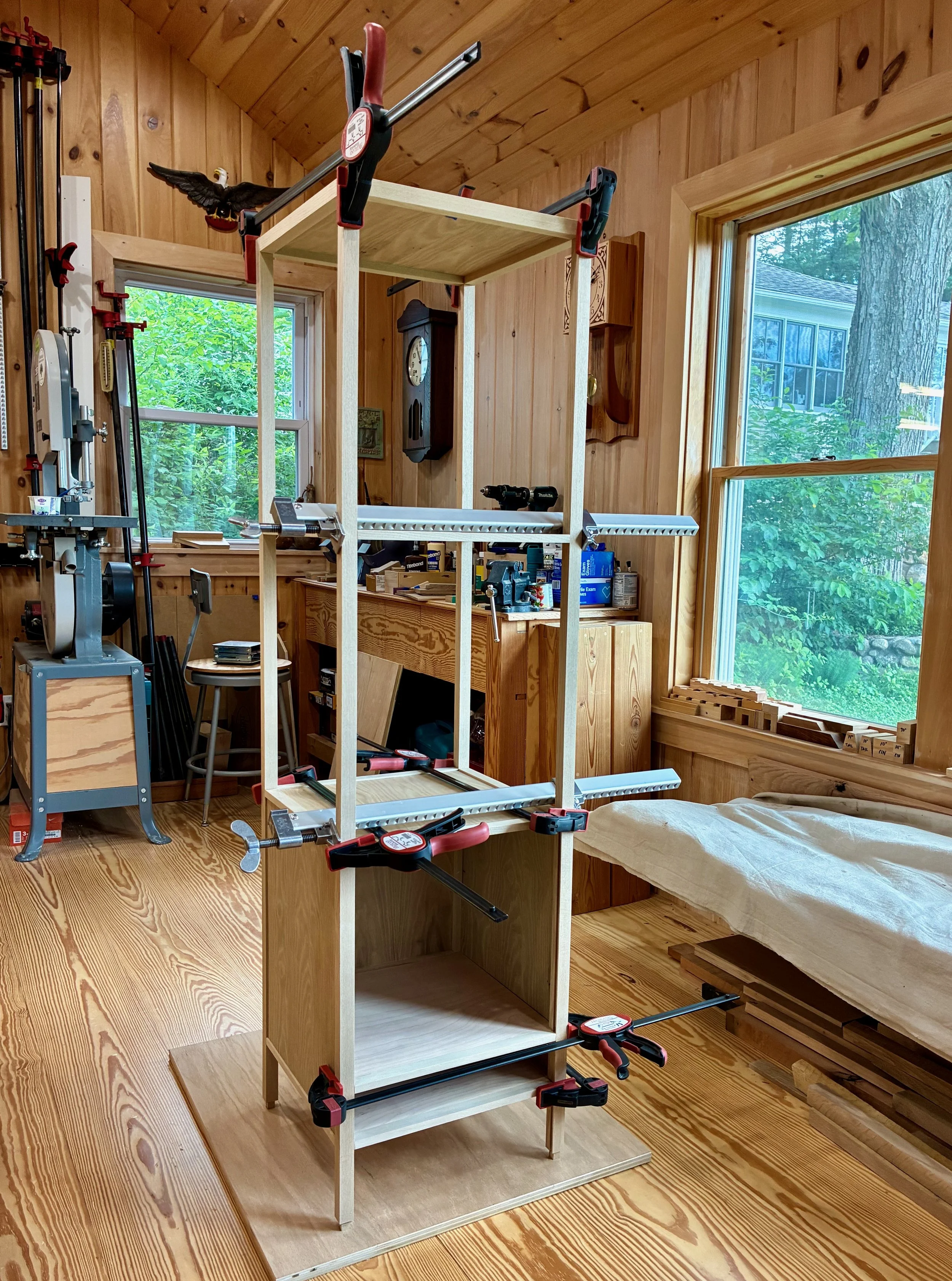
Carcass with glue and clamps applied
Next came the doors. These are simple framed panel doors that I chose to make even simpler. You might have noticed on the exemplar that the interior edge of the door’s stiles and rails had been eased to create a “rounded” rectangular opening for the panel. It is a subtle way of softening the look which adds appeal. I tried to reproduce this on some practice parts, but all of my attempts were unsatisfactory. In the end, I made two rectangular doors and a vow to keep noodling on how to create the rounded version next time.
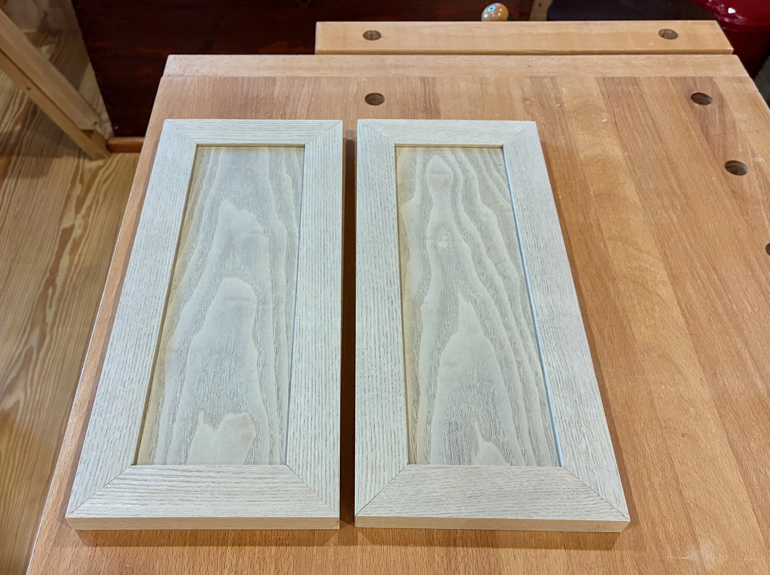
Mitered panel doors
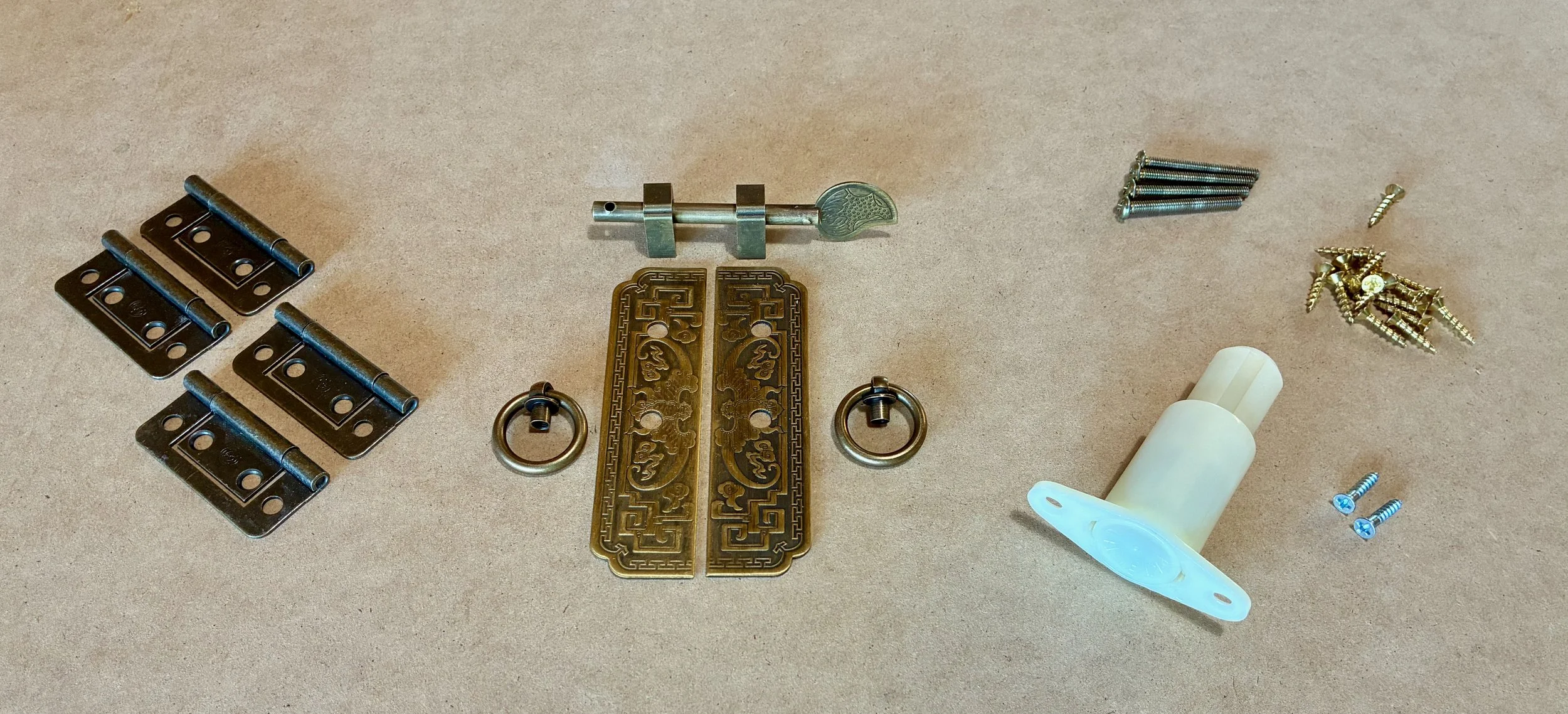
Let’s talk hardware. Alas, procuring traditional Korean furniture hardware is a challenge in the 21st century. Over time, I have accumulated a small assortment of these treasures, almost exclusively in black, mimicking the iron fittings used for kitchen cabinets, trunks and such. The brass stuff is very hard to find, but that is the material I wanted for this piece. What I did find was a Chinese-inspired latch in antique brass from an Etsy merchant (FashionLook4U) that might look nice to anchor the cabinet portion. What I could not find was a suitable surface mounted hinge set in antique brass to match. Rather than resort to a mis-match that would distract from the latch, I went with non-mortise butt hinges, where only the barrels would be visible. As to the drawer, I wanted it to be a secret so no hardware was required here, just a spring-loaded drawer kicker with a mechanism akin to that of a retractable ball point pen. The hinges and kicker were obtained from Lee Valley Tools, a nice Canadian firm.
Door and drawer hardware
Before completing the drawer and doors I needed to finish up the base. A decorative punghyeol or “ventilation cutout” was constructed by joining 3 thin pieces with miters and slipping them into grooves on the legs and rail. Next, two tatami-zuri boards were fashioned from straight-grained stock, with mortises cut at each end for the joinery. These slipped around those tenons at the end of the leg poles to form the characteristic “feet” of East Asian furniture.
Tatami-zuri and mitered punghyeol trim in place
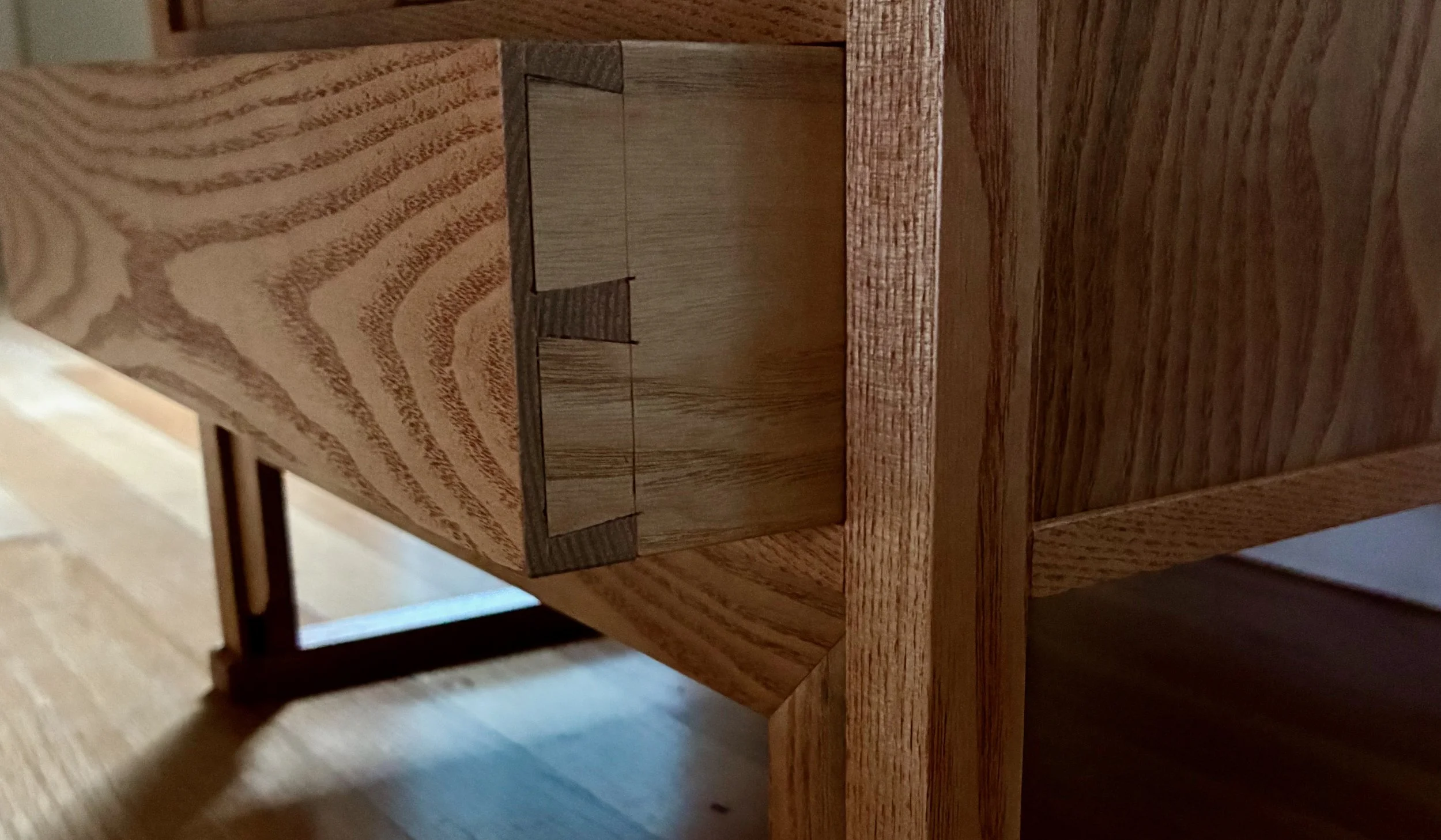
Time to tackle the drawer. Since the original was drawerless, I would be co-opting the space below the doors for this feature. An inset drawer here would be nearly indistinguishable from the original, yet provide useful space for knitting needle storage. This slim, 3 inch drawer would be constructed using half-blind dovetails in front and lock joints for the back. A thin plywood board would be used for the bottom to maximize cavity height. After choosing the best grain from the remaining stock, the drawer front was cut to exact dimensions and then the sides were cut to a matching height from less-distinguished sassafras. Once the boards were marked I used my new dovetail saw to cut the joint elements. Sassafras is a soft wood to saw and chisel, making this an easy maiden voyage and one of my better dovetail experiences.
Cutting the tails on both side boards taped together
Chiseling pins out of the drawer front
After dadoing slots for the back and bottom, the drawer snapped together nice and neat. Along the sides of the cabinet cavity, two “guide” boards were glued to keep the drawer tucked snug while running in and out. The back board was modified to accept the kicker and then all drawer parts were glued together. Once dry, a hand plane and sandpaper were used to perfect the fit.
Drawer glue-up
Finally, it was time to mount the doors. The first step was to attach the hinges to the hinge boards and then glue those boards in place along the sides of the cavity. As prepared, the doors were a bit too large to squeeze into this opening so I used a run across the jointer to get things “close” and then, with a thin spacer beneath, I did my best to measure, mark and mount the doors. This was tougher than anticipated. I think mortised butt hinges would have made for easier job, but I could not find the right size and color in a non-finial hinge. (They must be out there, I just need to accumulate more sourcing sites.) Anyway, the attached doors were still a bit too wide to close on each other and so a block plane was used to gently shave them to a proper fit.
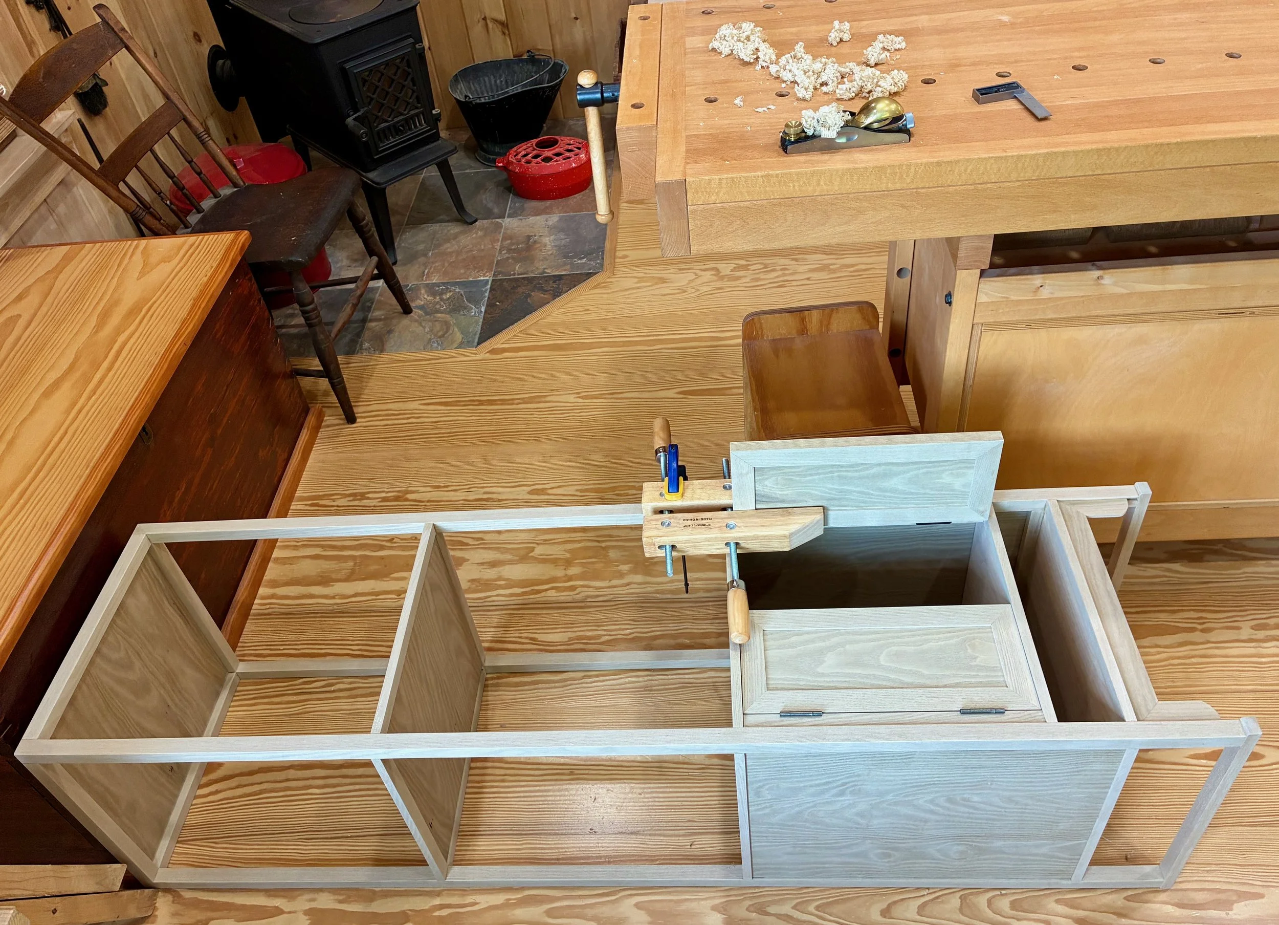
Carefully trimming the doors
That completes construction. From here, bolt holes for the latch hardware could be marked and then the doors disassembled for drilling and final finish.
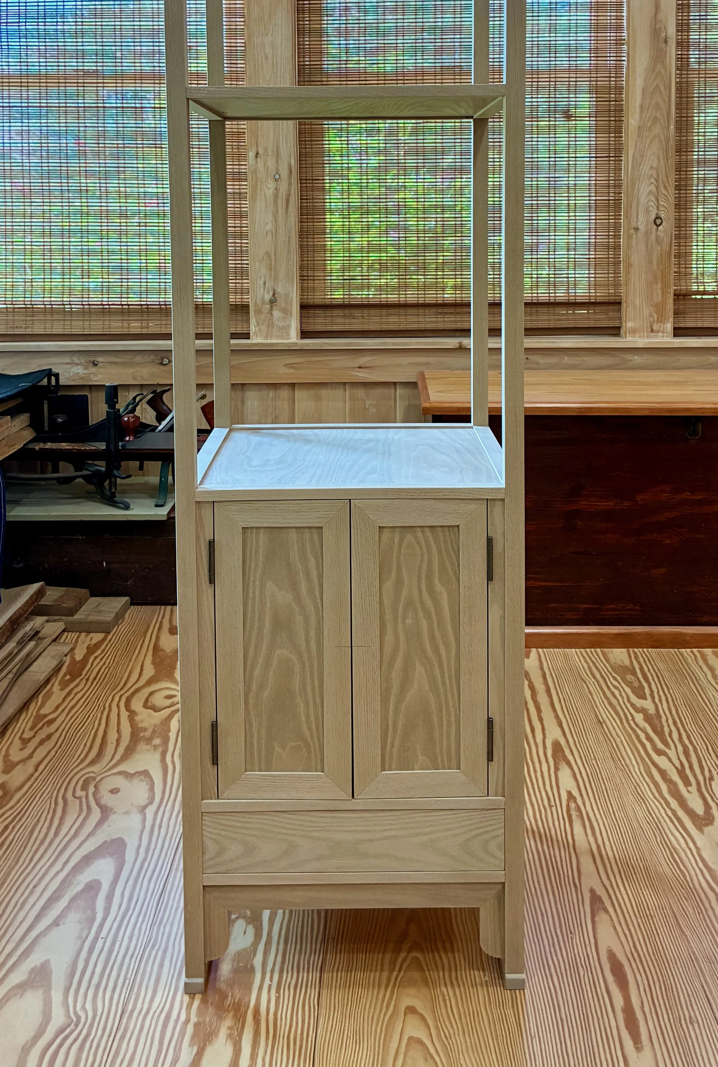
Doors and drawer in place.
After a final sandpaper touch-up, the finishing step was a snap. The Salem Maple stain was applied and, after a 24 hour drying period, the toned wood was smoothed using a piece of brown paper grocery bag. I learned this trick from watching the furniture refinisher Thomas Johnson on YouTube. By whatever mechanism (burnishing, maybe?) the rough Kraft paper serves to smooth out the nibs without creating dust, nor risk sanding into the stained surface. This was followed by an application of satin sheen gel polyurethane to protect the surfaces. After a 3-day cure, the piece was rubbed down with a soft cloth and then treated with Howard Feed-N-Wax. The wood now had a nice mellow glow without feeling “over-finished.” The drawer sides and cavity were treated with a stronger furniture wax to promote a smooth glide and then the door hardware and doors were attached to complete the build.
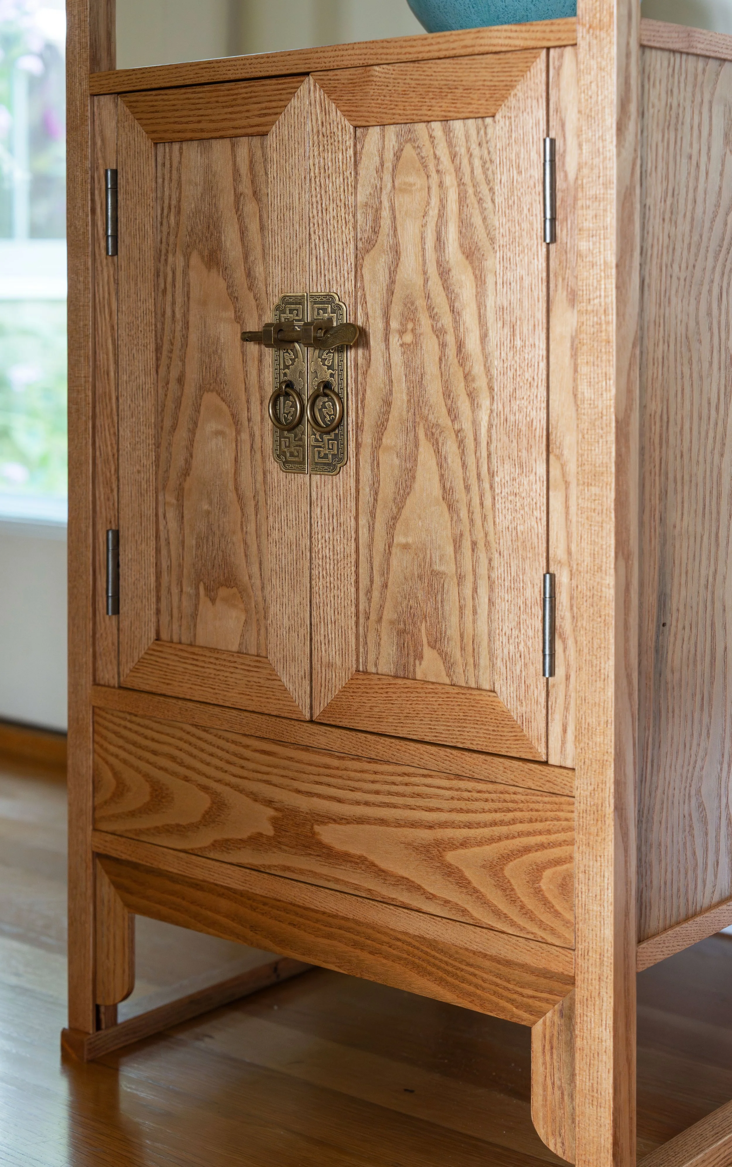
Doors back on and latched
I like the character of this quintessentially Korean piece. It enables our hobbies and ennobles our room.
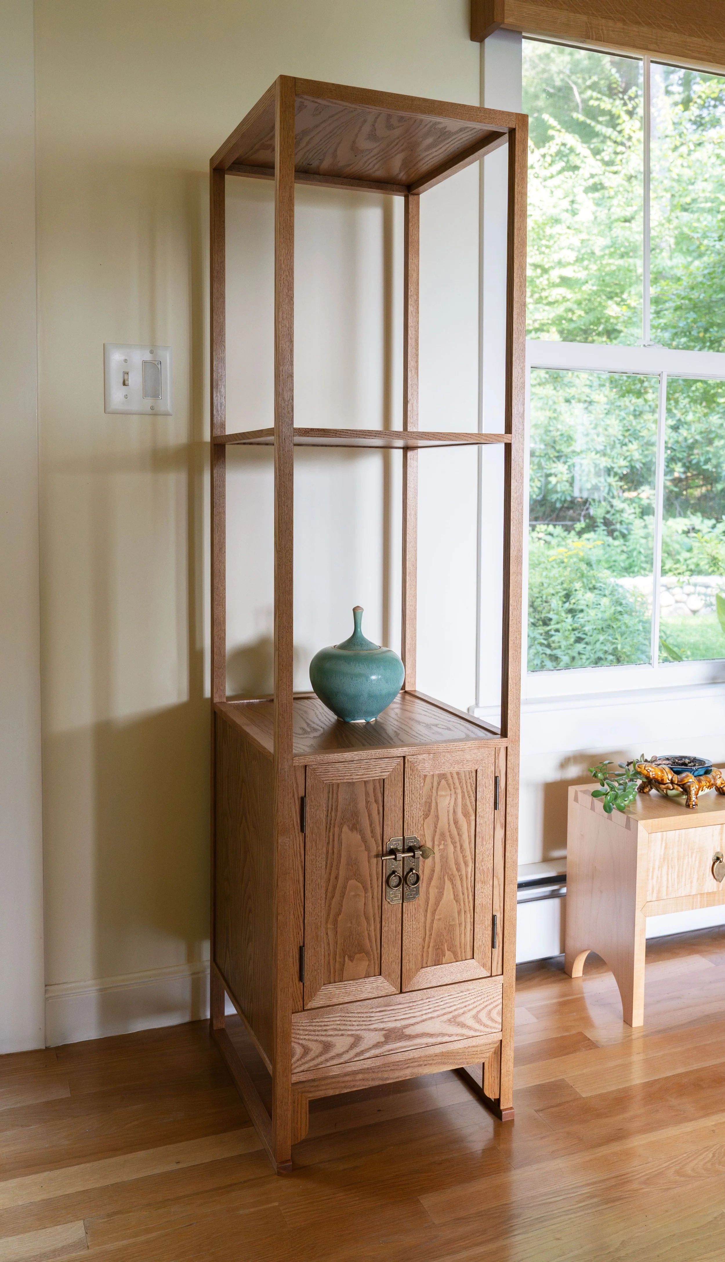
Three Story Table