

The T-Shirt

Picking up on a prior post, let me share a new endeavor with you.
After reading my recent analysis of a William Morris quote, you might be thinking: “Wait! If ‘win back art’ is such an important mission, how come I am only learning about it now, some 150 years after it was proposed?” I was thinking the same thing, too; and then it began to gnaw at me. Not that it matters, but I’ve never seen the phrase on a poster or a T-shirt where it might raise awareness, or at least expose itself in places we expect bold ideas to reside. To me that felt like a miss. And so I decided to design that T-shirt - why not?
Design
Now, I have never created a T-shirt before but I have watched my sons make several. In high school they had taught themselves the craft of screen printing and occasionally turned our basement into a “sweat shop of friends” cranking-out fund raising shirts for their school’s bands. I had always admired their stick-to-it-iveness on these projects, as well as their skills, and it continues to inspire me. My plan for the current shirt was to stop after the design phase and project manage the rest of the endeavor using trained professionals.

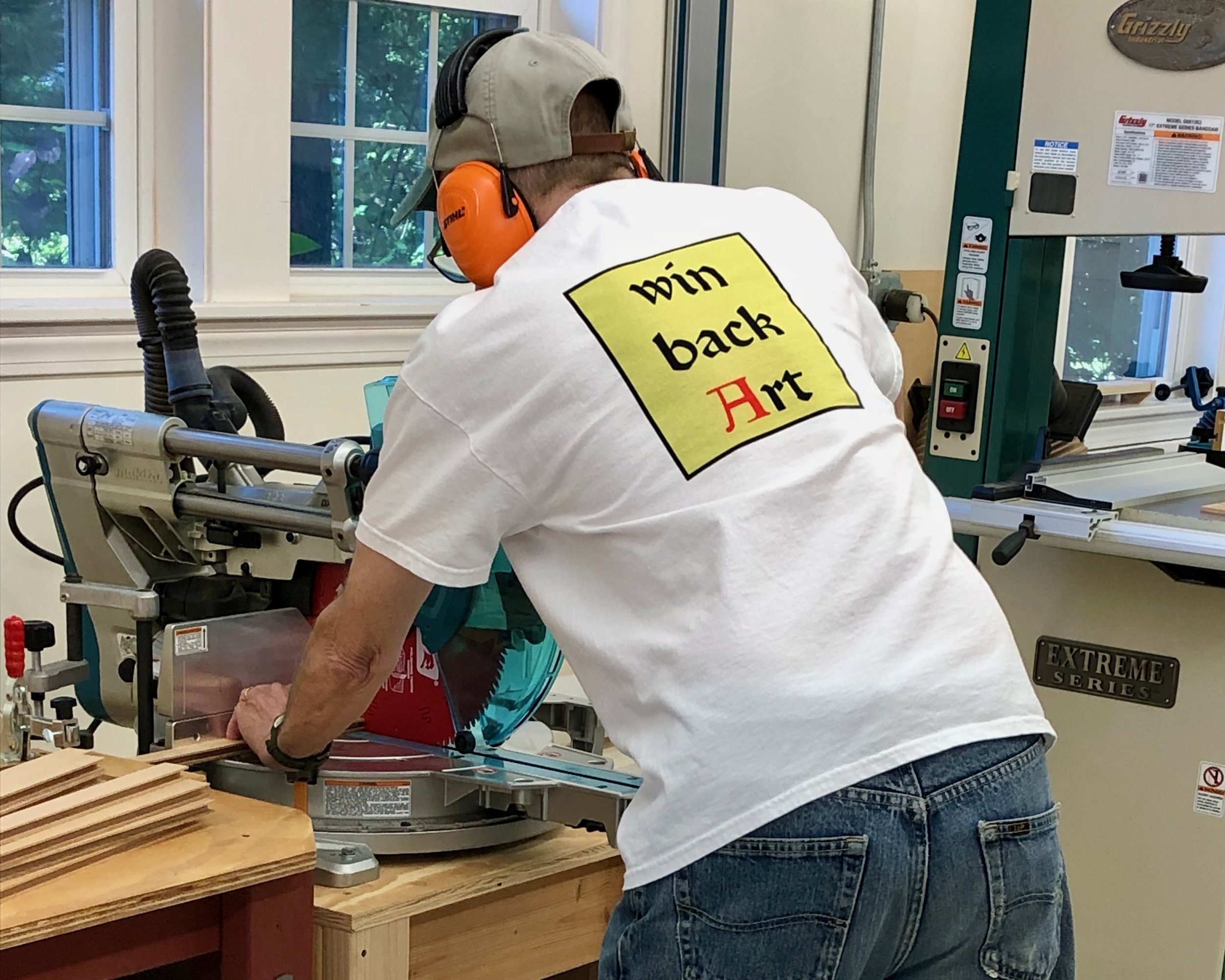
“Winning back art” in the basement (2010)
Following a discussion with my friend, Bob, and a brief internet search, I learned that there are plenty of companies out there ready to create custom printed shirts for those with an idea and extra cash. Heck, they’ll even supply the idea; they really just want to make T-shirts. With an idea in hand, all that’s required is: 1. a properly formatted file of your graphic; 2. a method (direct print, screen print, embroidery); 3. a position for printing (front/back); 4. an ink color scheme; 5. a shirt choice (style/color); and 6. the quantity (by size). They also need a credit card number, which I imagine one is happy to supply after having successfully burrowed all the way to level 7. Seriously, the whole thing is made as simple as possible. Now understanding the process, and with a couple production companies in mind, I set about creating my design.
The graphics for this one will just be text. Easy, right? … you try it. The challenge here is that, if all you have is text and you want your message to stimulate something, you had better get that font right. Fonts are the product of typography; a complex & nuanced art form, or a cunning & manipulative science depending on your perspective. And perspective - the way we look at things - is key. After all, you are trying to send a message that will stick!

Fonts help the message stick
And here’s where fortune smiled upon this Project. William Morris was, himself, a self-taught typographer. During his printing days at the Kelmscott Press, a high end book publishing business and the last of his creative endeavors, he developed three new fonts (Golden, Troy and Chaucer), as well as a series of elaborate initial letters for use at the beginning of chapters. Morris thought carefully about typefaces and was among the first to use photography in their development. His most treasured of the Kelmscott types was Troy. Described as “semi-Gothic” this design was modeled after a few of his favorite medieval typefaces. In his own words, Morris intended Troy to “redeem the Gothic character from the charge of unreadableness which is commonly brought against it”.

Morris’s Troy font
I decided to make Troy the font for this shirt and found a free download for my Mac. I also downloaded the William Morris Initials font too, just for fun. As to the actual design, my idea was that the text could be displayed on the back of the shirt in three lines. I started with no capitals as the quote, itself, was merely a sentence fragment. However, Morris did choose to capitalize the word “Art” at all instances in that 1884 pamphlet. Anyway, a bunch of iterations were sampled, six of which are shown below.

Trial designs
They all looked fine but, in order to pick one that I would be willing to live with, I needed to think more deeply about the function of the font.
1. The font should make the words memorable, and spark interest - all designs check that box.
2. The font should make the message unambiguous - uh-oh. There is potential for confusion with the unpunctuated fragment “win back art”, due to the polysemantic nature of the words back and art. For instance, given the dorsal location of printing, might one wonder about some sort of “back” art contest underway? What does it take to win it? Or, a reader might ask: who is this Art guy? Is he being held hostage? It’s tricky. I think a no caps version could serve here as that assigns “art” to be an improper noun, but that also happens to be the most boring choice. Using color for the capital “A” in Art would properly focus attention on that word, instead of “back”, and perhaps indicate it to be other than a person’s name. I liked that. A red colored initial letter was used frequently during the heyday of medieval monastic calligraphy. However, according to Fiona MacCarthy in her captivating 1994 book, William Morris: A Life For Our Time, Morris did not favor this practice and only used it on one occasion when publishing a collection of poems by Wilfred Scawen Blunt, a middling poet who at the time was also moonlighting as Morris’s wife, Janey’s, lover. Hmm … Despite the dubious endorsement, I think that is the right choice for this shirt. As a final touch, I tried giving the text a background block so that it might look good on dark colored T-shirts, as well.
And that is where I left things for the summer as I worked to finish some deadline projects and jetted off on vacation. Back in June, I had told my sons of the idea, thinking they would get a kick out of it, and even shared my test creations for their comment. They must have feared that I would let this idea languish for they secretly took it into their own hands and finished the Project for me. Much to my surprise I was gifted with the T-shirt on my recent birthday. What a nice surprise! They used a T-shirt vendor this time, and also added a new “Red Top Workshop” logo, in Troy, on the front. I love it, and plan to print more (let me know if you are interested).
Thanks Ben & Andrew!